Monday, October 31, 2016

Linocut in Progress: Could this be the end?

It's definitely the end of this linocut, and for a day or two I thought it might be the end of me. But we both survived. Let's see how it went, eh?

One of the most amusing (to me) things about this particular piece is how many greens there are and how little green ink I actually used. Take a look at the Step 10 rollup:

Step 10 rollup

Yep. A top-to-bottom, gray-to-blue blend. But do you see any blue or gray in the printed result? Nope.

Step 10 printed

I was generally satisfied with the shapes at this point, but still wanted to tone down the brightness of the greens. Step 11 employed another blended roll. THIS time, however, the blend went from left to right, instead of top to bottom. As for color, it was a transparent gray, dark to light. (Sorry, no photo.)

Step 11 printed

NOW we're getting somewhere! The image was soooooo close at this point, but I felt it needed just a tiny bit more contrast in the background. I carved away all of the "simple" parts of the background and added quite a few more shapes (perhaps it's more accurate to say I removed more shapes) in between the leaves and flowers.

But what color to print? After a couple of tries I settled on this ridiculously transparent brown for the next pass. Doesn't seem like it would do much of anything, does it?

Step 12 ink rollup

But it did! The difference is subtle, but that's what I wanted: A wee bit more contrast behind the flowers and further "dulling" of the background greens. If you click on the image you should be able to scroll between the stages in a slightly larger size and hopefully see what happened.

Step 12 printed

I had hoped this would be the last step, but unfortunately it's wasn't. There are a LOT of small flower centers that stayed too blue-green, and some of the larger centers could use a little more oomph, too. (I think the one in the lower middle is just about perfect.)

Sigh.

I was resigned to one more VERY fussy step.

I didn't like the idea of carving away all of the remaining block other than the flower centers. Tiny raised shapes over a wide carved area? Too much risk of paper slippage, uneven rolling, stray ink marks, and damaged prints. However, I didn't want the unCUT areas that also needed to be unINKED to damage the prints, either. Enter one more annoying mask.

Masks cut for final step

The only consolation here was that each mask could be reused a few times, so I only cut six of them.

Step 13 ink rollup

The advantage of cutting the masks is that I could be loose with the ink rollup and it wouldn't matter. Below you can see the inked block and its mask in place on the press, ready to print.

Step 13 inked block and mask in place

Suddenly I am reminded of that kids' game of the late 60s/early 70s: Operation. The one where you had to remove internal organ and bone shapes from an electrified "patient." If your metal tweezers hit the metal sides of the openings the electrical circuit would be completed and the buzzer would sound. Seriously. Who thinks of these things?

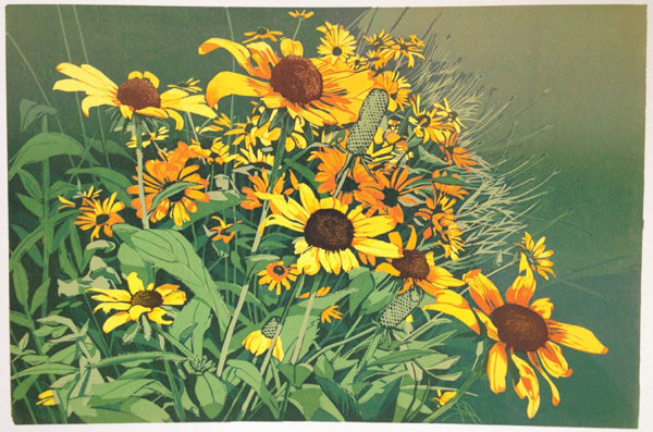
ANYWAY... I was finally ready for the last color pass.

Step 13, final

It probably doesn't look significantly different from the previous step, but the small flower centers are no longer blue and there's a wee bit more contrast in the large flower centers. Trust me.

So, whew! Talk about squeaking in under the wire! I wanted this one finished by the end of the month and here it is the last day of October.

No rest for the weary, though. Tomorrow morning I'll take a better photograph of this piece and then upload the image to the exhibition's website. (Done, and better shot substituted here.) After that I must produce at least one more complete edition (and photograph and upload it to the aforementioned website) by November 28. Two editions would be better, but I'm not counting on it.

I'll spend the remainder of today and tomorrow catching up with all the little things that have been neglected for the past week and prepping paper for the next piece. Then it's off to the races again by Wednesday!

Tuesday, October 25, 2016

Linocut in Progress: Those pesky greens

Ugh... this is taking longer than I wanted it to. I do keep telling myself that it's all in the name of Art, but this Art fellow is going to need the witness protection program when I'm through with him.

Because now I'm fussing with greens.

I thought I had a brilliant idea to create a blended roll from left to right in the image, dark to light.

It wasn't a horrible idea, but I was still kind of attached to that pale green in the upper right. It's not good to get attached to a particular color in an area that hasn't really been resolved in the design stage. (Bad Sherrie.) I compromised by cutting a rough mask to protect that upper right corner and added a mid-green everywhere else.

Reduction linocut in progress: Step 8

Okay. Workable, although this green felt... cheap. A bit wimpy. Thankfully I  wasn't going to keep a lot of it.

I tried the blended roll idea– dark to light, left to right. (Oooh! Poetry!) Meh. Not really what I wanted.

Instead I did a top-to-bottom roll that was, believe it or not, a very pale transparent blue to a darker green with a fair bit of brown in it.

Step 9

Hm. Okay, but I was still avoiding the problem of the background. I started carving away some more bits, with an eye to printing a blue-grayish color next... but GEEZ. The block was getting really confusing at this point. Don't tell anyone, but I decided it was time to grit my teeth and engage the P word. (shudder) Planning.

I've done this a few times, to tell the truth... and it's helpful for everything except my impatience. I took the image above and flipped it in Photoshop so it was the same orientation as my block. I printed an 8" x 10"-ish version from the computer, got out my trusty pencil, and started filling in shapes so I could see what NOT to cut. (If you click on this image you'll get a slightly larger version and hopefully get a better idea of what I'm talking about.)

"Mapping" the next pass with pencil.

It's getting close, although I still haven't come to grips with that darn background. I think I have one side sorted out, but the other... well. You can see I've even been experimenting with some swoopy abstract shapes, but I'm not sold on them.

With perseverance I might be ready to print again tomorrow, although I would encourage you not to hold your breath.

In the meantime... I thought you might be amused to see one of my "testers" on this project. I started with 24 prints, but of course several of them will not be part of the edition because they've been used for color tests. This particular print is the very first one in every color run, and you can see I've made some alarmingly bad first choices. You can also see what a print looks like with out the laborious masking that I've been doing. Lovely green flower centers, don't you think?

I think it looks like some sort of 1960s or 70s wallpaper. With a little metallic ink it will be ready for someone's retro bathroom.

Color test. A wee bit over the top, wouldn't you say?

Thursday, October 20, 2016

Linocut in Progress: More fun with weird color

When we last saw our linocut-in-progress the flower petals were oh-so-close to completion. They needed one more red-orange, but not too bright.

This sounds like a straightforward enough idea, but the color red and I just do not have a good relationship. I own one piece of clothing that's red, a cardigan sweater. I wear it a couple of times in the winter because it's SO soft and comfy, but I almost never go out of the house in it. Red. It's just so... obstinate.

I'm not kidding. Red has a mind of its own.

I am a tidy, tidy printmaker, as a general rule. I wipe my hands constantly and might even stop to have a proper wash several times during a color run.

Which is why, I am certain, my tube of red ink decided to do THE most annoying thing. You know what I mean. That thing where the ink (or the toothpaste, or whatever) just keeps coming out of the tube so fast you can't get the cap back on. (Sigh) SO much red, everywhere. Hands. Table. Tools. Towels. By the time I got it cleaned up my trash can looked like I was trying to cover up a murder.

And of course the trouble didn't stop there, oh no.

Geez. I never use these colors. I wonder why.

After I got my work surface back in order I had to mix my red, keeping in mind that it would be affected by the yellows already printed. It took a lot of mixing and testing (and turning several prints into "testers") before I found the color that worked. Guess which one it was?


The lightest raspberry sherbet color, of course. 

In the photo above, the transparent color is roughly spot-inked on to the block. (Sorry the image will be upside-down in the next few shots, but the light from the other direction caused too much glare.)

Since this color wasn't going everywhere on the image and I didn't want the un-inked portions of the block to damage the prints, I cut a newsprint mask. 


Well, actually, I cut 24 masks. Because...


The ever-so-slightly tacky prints provided more surface for the mask to grab than the barely-inked block. The mask was no more firmly stuck to the prints than a sticky-note (more like strong static electricity), but I couldn't re-use it. It wasn't the trickiest mask I've ever had to cut, but it took a while to make the 24 of them that were required. 

Linocut in progress, Step 6. Embiggenable with a click.

Step 6 printed, mask removed (and right side up).

Okay, that was fun. Time to make a light green. It needed to be somewhat opaque, since it had to cover all this orangey, reddish goodness.

Enter weird color number two: A lovely minty green. Bleah. Plenty of white in it, of course. Nasty-looking on the block, especially next to the print in its present state.


And here's where I made a decision that would make my printing session very, very long. You see those little pieces of newsprint? It wasn't really necessary to keep the green out of the flower centers, but I wanted to maintain the darker value there. Why? Because I hoped it would make it easier to assess the overall value range after this color pass was printed. 

So, yes. Those are six little pieces of paper, cut to fit their individual flower centers. 24 times each. And just as with the previous mask, these stuck to the prints and pulling them off was time consuming. 

But I think it was worth it, because I still have darker value reference points. If all the flower centers had gone green it might have been confusing.

Oh... and look how not-minty the green turned out. 

Linocut in progress, Step 7. Embiggenable with a click.

Fun, eh? Now I get to start carving stems and leaves, and I can no longer put off decisions about the background. My intention (at the moment) is to make the upper left corner dark so that the flowers stand out, but what about that right side? There are some spent stems that will reach into that space, but what else? I kind of like this color, so it could be nice to keep more of it, but we are firmly in the Sherrie-didn't-plan-ahead-and-it's-catching-up-with-her stage now. Let the nail-biting begin!

Monday, October 17, 2016

Linocut in Progress: When printmakers think like watercolorists

Yellow, yellow, yellow. How.... yellowish! Time to start toning this linocut down a bit.

Step 4 was a duller transparent orange. It brightened up on the print because of all the yellow below it, but I think it hit the right value note. And besides, it's autumn! Pumpkin-colored inks are probably appropriate.

Step 4, definitely flowers... but pumpkin-colored?

After Step 4 I'm almost done with the flower petals, which is good because I'm tired of the color AND I'm starting to sweat the greens which need to be added soon. I thought about cutting a mask at this stage, but it would have been too, too fussy and a pain to work with. Yep, there's gonna be some white ink in my future. Again.

But right now I need to push a few blooms into shadow. Back in the days when I was primarily a watercolor painter, one of my options would have been to carefully brush a blue or purple wash across existing color. Hm. I wonder...

Transparent purple!

Yes! It's a transparent purple! How fun to roll out something new, even though I was quite sure that it wouldn't read as purple once printed. In the end I thought perhaps it could have been MORE purple, but it did what I wanted.

It made a darker, duller orange. Seriously. See for yourself:


Step 5: Darker orange from purple. Embiggenable with a click.

And now I have a little head scratching to do. Some of these flowers have streaks of deep red in their petals. I absolutely do NOT want to roll red ink across this entire image when I know I have greens coming up. But again, cutting a detailed mask would be horribly complicated, especially since I would have to cut 24 of them.

I think I will be able to get away with some spot inking if I use a very small brayer and if I am prepared to do a lot of wiping out of stray color before each impression.

I have a day or two to sort it out now, as these five layers of ink are very sticky. Once I have carved everything away from the flowers except those red streaks (and the dark centers) I'll have a better sense of how careful my spot inking needs to be.

Until then, let's give your eyes and mine a break from all that yellowy, orangey, flowery stuff. I was out for a walk before the supermoon set this morning. There's something about a big moon at daybreak that seems particularly wonderful. Especially since the world is blue. Not yellow.


Friday, October 14, 2016

Linocut in Progress: Here we go again!

Seriously! I'm already 3 colors in to the next linocut. I told you there was no rest for the weary.

Can you guess what it is from the first pass?

Step 1, a yellow rectangle

Trick question! The first pass was a solid yellow rectangle. (It's not really warped in one corner. Blame the photographer.)

I bet you can identify the subject from the second pass, though.

Step 2, are those flower petals?

I printed the third color pass this morning and now we must pause for a bit. Partly because the ink is very wet, partly because I've had to spend the afternoon running around packing and shipping work to an exhibition, and partly because I didn't sleep well last night and am so tired I'm almost running backward.

But here's Step 3. I'm a little concerned that the second color, which seemed sufficiently dark in value in Step 2, will end up visually indistinguishable from Step 1, but there's nothing to be done about it now.

Step 3, definitely flowers. (You can see this step slightly larger with a click.)

Of course to make room for all these new, wet prints I've had to resort to an "overflow" drying system for the aspen trees. Yes, this is the binder-clips-on-dowel-prints-back-to-back-strung-across-chairs method. Does it look precarious? It is. But once upon a time this was the way I always dried my prints. Shudder.


The current system is so much more posh, don't you think? Unfortunately it doesn't provide enough room to work on more than 30 large prints at a time. Larger sheets of BFK Rives paper are too heavy to clip back-to-back with clothespins, plus it's a pain in the neck to manage double-hung prints while work is in progress.

The aspen trees seem to be drying fairly quickly, so hopefully by the time these sunflowers are finished I'll be able to rotate them to this "overflow" rack. Why? Because there's at least one more edition after these flowers that must be finished before December 1. Eek!


Tuesday, October 11, 2016

Linocut in Progress: the Finish...

Alrighty then! Here we go with the final push on this crazy aspen tree linocut.

Of course I have to start by admitting that I neglected to take a photo of Step 10, another subtle brownish/ochre-ish tone in the grasses along the bottom. Probably no one would have noticed the difference but me, but hey! There's a good reason printmakers are often viewed as a bit obsessive.

Step 11 was yet another pass of a mostly-white ink with a little more reddish-brown to knock back more of the underlying greenish tone. I don't mind a little green... the white trunks of aspen often reflect the colors of leaves and grasses around them. But too much is too much.

Step 11

I think you can see in this shot that the two trunks just behind the three foreground trees are a tiny bit darker. The overall light in this image is not dramatic but I did want to suggest a little distance, even if it was subtle.

And then the fun part finally happened. I got to work on the details of the tree trunks.


Here's the Step 12 rollup, a transparent gray. Very little of this color will remain in the tree trunks in the final image, however it was important for the last bits of contrast in every other part of the image. The thin saplings in the lower left, the slightly darker leaves in the upper right both benefitted from this pass. And after it I finally got to remove ALL of the background.

Step 12

At this point I finally started to believe the image was going to work. Whew. The temptation to keep plowing forward was strong, but everything was very wet at this stage and we all saw what impatience wrought last week.

Step 13 was a transparent brown-black. I was a little worried that it might end up reading TOO brown, but again a lot of this color would be covered up in the final pass.

Step 13

This is really the first time that all the swoopy, tangly branches became clear. It seemed a little much here, but I planned to take out those two background trees entirely before printing the final color pass. Some of their branches would go, too.

I added some more black to the transparent brown aaaaaaannnnndddddd......

Step 14, final. Slightly embiggenable with a click.

I need to take a better photo (and soon, since it's due Friday for exhibition promo), but this gives you the idea. Clicking on it will bring up a larger version and the image will be a little sharper. There are always things I wish I would have done differently, but overall I'm satisfied.

And I'd better be, because it's way past time to get the next one underway. Paper is prepped, image is drawn on the block, and the first color should be drying on the rack by lunch time tomorrow. No rest for the... um... weary? Wicked? Wobbly? All of the above?

Monday, October 3, 2016

Linocut in Progress: Lots of it now!

Last time on "Linocut, The Next Step(eration)"*....

Our heroine had tweaked her neck and back and lost of couple of studio days, but she's back at it and making progress. Slower than hoped for, but this time it's not been a physical delay. It's been a mental one. Just watch:

As soon as my gimpy-ness subsided I dove as fast as I could into the next color pass. With the success of the previous light-green-to-light-ochre roll I decided to do another. This time I rolled a darker green blended to a darker ochre. Because, you know... value changes.

Step 5, another green-to-ochre blended roll

I was feeling rather satisfied until I realized what I had just done. These large foreground tree trunks are supposed to be LIGHT. Not white, but certainly a lot lighter than they are now. I had intended to run a solid white pass on the trunks before this stage, but I was so twitchy to get back to work that I just plain forgot. [Insert bleepable words here.]

Nothing to do except print the white now. I knew it wouldn't get me where I wanted to be, but at least it would be a start. I rolled a plain white ink onto the trunks and part of the lower foreground and...

Step 6, solid white pass, masked

Like I said. Not where I wanted to be. A day or two of pacing around ensued. How the heck was I going to salvage THIS mess?

By doing what I should have done from the beginning. I slowed down and took the time to cut some masks. First step - Trace the trunk shapes onto clear acetate.


I cut the shapes out of the acetate sheet and then traced them multiple times onto newsprint and cut them out again. Voila! Custom masks.


I needed to make another white or mostly white pass, but I decided I should resolve the lower part of the image first. This meant lots of pesky masking for a couple of stages, but it's my own darn fault.

Step 7 blended roll

But, hey. Here's a weird little blended roll. I wanted some shadows below the background trees and I needed to keep the grasses light. Note that the ink is only rolled across the lower part of the block.

Step 7, inked and masked

And here are the masks in place. Foreground tree trunks and the top of the block are masked off. I decided to run the dark blue higher on one side for more variety in the background leaves.

Step 7 printed

Things were firmly in the ugly duckling stage at this point and I was trying hard not to panic. Geez. More pacing. More masking. And another brownish-to-ochre pass along the bottom.

Step 8 printed

Okay. Now we're getting somewhere. Time to try to lighten the foreground trees and create some paler trunks in the background. This pass was white, tinted with a little reddish-brown to counter the minty-green mess.  Careful inking and masking got the color where I wanted it on the block. Tedious, but necessary.

Step 9 printed

Alrighty, then. I am finally feeling like I might be able to salvage this mess. A couple of the foreground trunks will retain this color, but some of them will also get one more light pass. Before that can happen I need to resolve the grasses in the lower part of the image so I can carve all that material out and be done with it.

Trying to work light and dark simultaneously with a zillion little tiny bits to carve has given me worse brain freeze than a supersize slushy and I'm ready to move on. I hope this print is ready to come with me.

(*If you don't get it, I'm not going to explain it to you. But if you DID get it, I bet you read it in Majel Barrett's voice, didn't you?)

Linocut in Progress: Color in a gray season

 Mud season came early to the midcoast this year. So. Much. Rain. Seemed like a great time to get started on a piece with a little more colo...