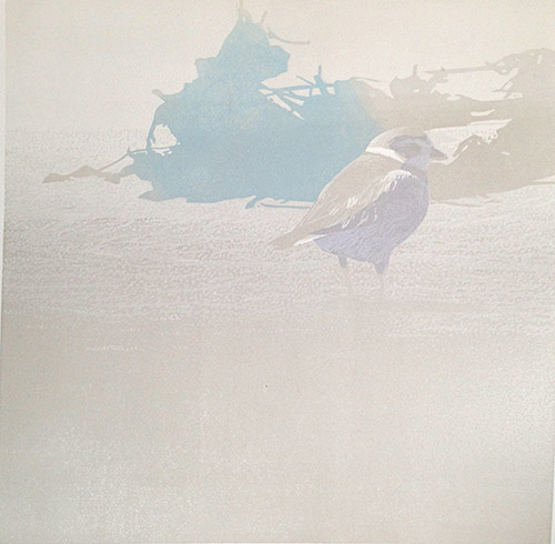
Tuesday, January 26, 2021

Linocut in Progress: Hey! That's not gray!

Long-time followers of Brush and Baren know that planning, at least in terms of linocuts, is not one of my strong suits. In the early days of my printmaking adventures, however, I would at least think about my image and make a list of colors to be printed and the order in which printing would happen. Sure, I'd usually throw that list out after step 3 or 4, but at least I put some effort into thinking about it.

Lately it seems that my planning stops at composition. Is my drawing on the block? Good enough... let's start printing! 

It could be argued that my non-system is working, since I do usually get to the end of a piece in a satisfactory way. But, geez, do I cause myself excessive amounts of angst.

This time I've really gotten myself into a pickle, though, because I've decided to change something about the drawing. Yes, after I've done a boatload of carving I'm going to try to "retrofit" an object into a shape that was meant to represent something else. 


I'm not going to say much more about the change at this point, because I haven't really figured out how I'm going to do it, and the entire idea may just fall apart before it gets very far. 

In the meantime... look at this nice blue-that-isn't-gray! Purdy, ain't it? This is color pass... hmm. Seven already? That seems a bit ridiculous, but here we are. 

I didn't want this blue everywhere, so I inked just one section of the block. The previously-printed color was still a tiny bit tacky on the prints, though, so I made a newsprint mask to prevent damage from the un-inked portion of the block.

Step 7 mask in place

And here we are. Blue blob in gray universe with purple-bellied bird. Having trouble picturing the end result? I'm not surprised.

Reduction linocut in progress: Step 7 printed

The blue is nice, but let us confuse the issue a little more by adding another non-gray color to the mix. How about a sort of light ochre? These blobby shapes behind the bird are beach detritus, mostly dark seaweed and eel grass, but with a few twigs and other things mixed in. Ochre could be a nice twig color. 

Step 8 spot ink

Again I want to contain the color, so I cut a mask to fit in the top portion of the block. Initially I tried to print the ochre right after the blue, but the newsprint mask stripped off the freshly-printed blue ink, so I had to stop and wait a day or two. 

Step 8 mask

It's both amusing and annoying how the addition of the ochre color changes the way the camera reads the color balance. I've tried to adjust the balance in this photo, but the upper background still reads as ridiculously pink. No. It's gray, I promise.

Step 8 printed

So now I have these strange color shapes to contend with. I think for the next color pass I am going to go back to a transparent gray, which I hope will make things feel a little more cohesive again. 

Or not. There's one more little bit of oddly bright color that needs to be in this image and now may be the time to do it. Hm. Could be a fiddly bit of inking, though. I might have to make... a plan!

Wednesday, January 20, 2021

Linocut in Progress: It's not a demented chicken!

Let me start this post by stating, for the record, that if I decide to do another linocut with a preponderance of subtle grays any time soon, you all have my permission to suggest (in the kindest, yet most firm way) that I might be helped by professional psychiatric evaluation. 

The two color passes I am about to share with you are both gray, and I think there are at least two more gray passes to go. The changes are so subtle you might wonder what the point is... and you would not be wrong to do so. I'm not entirely convinced I know what the point is, either. But onward we go. 

Step 4, you may or may not recall, was a strange purple shape, spot inked and masked on the block. Let's put it here again as a reminder, shall we?

Reduction linocut in progress, Step 4 revisited. 

I think it's going to be important to have that image close by for comparison when I show you Step 5, because, as I mentioned, it's gray and it's subtle.

Step 5 printed

See what I mean? If you look carefully you will see some changes in texture creating a bit of light-to-dark gradation from top to bottom of the image. This could be done with a blended ink roll, but our little avian hero is standing in an expanse of sand and I thought it could be nice to suggest that environment. The trouble with that decision is that I have been doing a lot of time-consuming chipping out of tiny bits of lino for not a lot of visual reward. But I'm going to stay with it a while longer... because now that I've started down this road I just have to see where it goes. 

(Keep this attitude in mind, anyone invited to "come take a walk" with me. You might want to be sure you have snacks and water and emergency flares in your daypack.)

Anyway... you might also notice some subtle changes in the shadowed face and belly of what is now more clearly a shorebird and not the demented chicken suggested by the shape of the newsprint mask cut for Step 4. 

On to Step 6! Which is... drumroll, please.... gray! How exciting. 

Searching for the right gray

As I prepared to print Step 6 I had a boatload of angst to deal with. In the "real world,"–in natural, non-contrasty light– the gray back and head of this bird lean toward something a bit warmer than what I'd used so far. The cooler grays are okay in the shadows and the brightest areas, but I needed to nudge the overall color temperature just a bit. That was Problem 1.

Problem 2 was (and will be for a few more color passes) the question of the sand. It's already become a little darker than what I ultimately I want (I think), so should I cut a mask to isolate the next color in the bird, or should I let the new color print over the foreground? For more cohesive color over the entire image I absolutely wanted to include this new gray in the foreground, but the darker value had me concerned.

In the end I decided to print a lighter gray than originally intended (hence the need for a least two more gray passes after this), print it in the lower 2/3 of the image, AND probably print white over the foreground in a later pass. 

Does your brain hurt yet? Mine does. 

After all that nail-biting, here's where the image stands now.

Reduction linocut in progress, Step 6 printed

By golly, this is feeling pretty okay now. The purple-y shadow shape, which seemed so obnoxious when printed, is now reading much better. There's a nice sense of light developing in the bird, and the foreground remains subtle. 

It's probably time to turn my attention to those background shapes now. There is a part of me that really wants to hurry up and finish the bird, but the value and temperature of the remaining grays is going to be strongly influenced by whatever I do with the background, so I'm going to have to rein in that impulse and focus elsewhere for now. 

In the meantime... any guesses about the identity of our subject yet?


Tuesday, January 12, 2021

Linocut in Progress: Subtle... and strange

Work continues, in fits and starts, in the studio. Focus is still elusive, but in part this is because the beginning of a new year tends to have a lot of activity to distract me! Tedious things like year-end bookkeeping, but also fun things like the 121st Christmas Bird Count. The CBC was, of course, different this year with virus protocols in place. I spent the day by myself, surveying a subsection of the territory I usually cover with a group of friends, and sent my results via email rather than gathering with all our counters at the end of the day.

But we had good weather for it... some sun, not too windy, not too cold... and I was able to cover more ground on foot than usual. I didn't find anything out of the ordinary, but it was nice to be out and about.

Step 3... more gray!

Back in the studio the color palette and progress on the current linocut remained subtle. Gray, gray, gray. It's difficult to tell what's happening yet, but if you use your imagination you might be able to find hints of the main subject. (Yes, of course it's a bird, silly.) 

Reduction linocut in progress, Step 3 printed

And now... hm.

All the hard thinking of this image seems to be happening in the early stages. The foreground needs to stay a fairly light gray, but I don't want it to be flat and boring, so I have been carving lots of tedious little dots... stippling, as one might do in a pen and ink drawing.

But the hero of my image is also gray. Gray on the back with a white belly. (And a few other white areas.) The tricky thing is that most of the white areas are in shadow... AND the shadowed white area is darker than the sun-lit gray area! What the heck color should I print the underside of the bird so that it reads as "shadowed white" rather than just another gray? Ooph. 

First things first, though. I think the decision about the shadowed-belly-color needs to happen now, and it needs to be contained. There can be some of the shadow-color influencing the bird's wing, but not its back... so it's time to cut a mask.

Cutting newsprint masks

The strange shape of this mask makes me laugh. I can't decide if it looks like a demented chicken, or maybe it's a hamerkop. Look at it on the block! Definitely hamerkop.

Mask in place on the block

It took a couple of tries to get to a color that I liked, and I'm still not entirely sure this is the right one, but I'm going to carry on and hope it works. The advantage for you is that you can at least see where our hero is standing, even if you can't quite identify the species yet. Or maybe you can. Any guesses?

Reduction linocut in progress: Step 4 printed

From here I think I will have a few days of chipping out tiny stippled dots in the foreground. I will also remove material from the belly and face of the bird to preserve that strange purple-gray color. What, me nervous? 

As for the next color... I think there's one more pale gray pass and then I can get going with what I hope will be the more entertaining bits of the background.  Stay tuned!

Sunday, January 3, 2021

Linocut in Progress: Rolling in(k)to the new year!

Wow. It has been a while since I've had photos like these to share. YES... there are fresh lino chips on the studio floor... YES.... there are sheets of paper hanging on the drying rack. YES. This is ink rolled out on the slab.

Yes. I have a new linocut in progress. 

Step 1 rollout

As usual, the early stages are subtle. For Step 1 I only had to carve two small areas, and then I rolled a pale transparent gray over the entire block.

Reduction linocut in progress: Step 1 printed

I was amazed that things went so smoothly for this first color pass, especially after a rather protracted period out of the studio. I had zero issues with coverage or viscosity... the only adjustment I had to make after I pulled the first print was to lighten the color a bit. (In the top photo you can see my first gray all the way on the right, and the one that I ultimately printed is on the left. That dark one in the middle... never mind about that. Pretend you didn't see it.) 

The tricky thing about this piece (well, I think it's going to be ONE of the tricky things about this piece) is that most of the image area is going to be subtle, pale grays. The main focus will be in the the upper third of the space. Compared to a lot of images I've worked on lately it seems to be quite simple... even a bit minimalist. Except you know me. I really doubt I'm going to be able to keep it simple. 

In fact I've already started making a bit of trouble for myself by adding some texture and temperature changes in the second pass. Probably you won't be able to really tell on a computer monitor, but the second color pass is a blended roll, from a cool gray to a warm gray. Both very light and very transparent. There's a little bit of texture happening right along the edge of the top third.... and there will be more of that as this progresses. 

Unfortunately I don't have a photo of the rollout for Step 2, but here it is printed.

Reduction linocut in progress: Step 2 printed

Although the temperature change from the blended ink color isn't very obvious, you might see that this particular print had a little bit of the dreaded "Sharpie bleed." After I transfer my drawing to the lino I usually draw over it with a Sharpie brand permanent marker. The Sharpie drawing will hold up through multiple inking and cleaning stages, but sometimes it also will bleed back to the prints during the first color pass. I thought I had avoided that this time... After I made the Sharpie drawing I sanded the linoleum and cleaned it with a citrus cleaner. It was mostly fine, but a couple of prints did show some transfer. No big deal, this will all be covered up in subsequent color passes, and as an extra measure of "safety" I moved the Sharpie-bled prints to the front of the printing queue. This makes them first in line for mistakes on subsequent color passes.

So! Things are moving again, albeit a bit slowly. The next stage COULD have gone really quickly if I had decided to keep the background simple... but, let's say it together, "Oh, nooooooooooooo. Why would I want to keep things siiiiiiimple?" Instead, let me embark on what can (in a G-rated blog post) be called a boatload of tiny detail carving. Because it might be a new year, but some things never change. 

Linocut in Progress: When "simple" things go cattywampus

  Cattywampus , in case you didn't know, is a technical printmaking term. It can be used to refer to registration problems, but in my st...