Showing posts with label bird. Show all posts

Tuesday, January 26, 2021

Linocut in Progress: Hey! That's not gray!

Long-time followers of Brush and Baren know that planning, at least in terms of linocuts, is not one of my strong suits. In the early days of my printmaking adventures, however, I would at least think about my image and make a list of colors to be printed and the order in which printing would happen. Sure, I'd usually throw that list out after step 3 or 4, but at least I put some effort into thinking about it.

Lately it seems that my planning stops at composition. Is my drawing on the block? Good enough... let's start printing! 

It could be argued that my non-system is working, since I do usually get to the end of a piece in a satisfactory way. But, geez, do I cause myself excessive amounts of angst.

This time I've really gotten myself into a pickle, though, because I've decided to change something about the drawing. Yes, after I've done a boatload of carving I'm going to try to "retrofit" an object into a shape that was meant to represent something else. 


I'm not going to say much more about the change at this point, because I haven't really figured out how I'm going to do it, and the entire idea may just fall apart before it gets very far. 

In the meantime... look at this nice blue-that-isn't-gray! Purdy, ain't it? This is color pass... hmm. Seven already? That seems a bit ridiculous, but here we are. 

I didn't want this blue everywhere, so I inked just one section of the block. The previously-printed color was still a tiny bit tacky on the prints, though, so I made a newsprint mask to prevent damage from the un-inked portion of the block.

Step 7 mask in place

And here we are. Blue blob in gray universe with purple-bellied bird. Having trouble picturing the end result? I'm not surprised.

Reduction linocut in progress: Step 7 printed

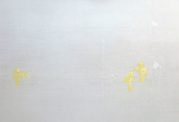
The blue is nice, but let us confuse the issue a little more by adding another non-gray color to the mix. How about a sort of light ochre? These blobby shapes behind the bird are beach detritus, mostly dark seaweed and eel grass, but with a few twigs and other things mixed in. Ochre could be a nice twig color. 

Step 8 spot ink

Again I want to contain the color, so I cut a mask to fit in the top portion of the block. Initially I tried to print the ochre right after the blue, but the newsprint mask stripped off the freshly-printed blue ink, so I had to stop and wait a day or two. 

Step 8 mask

It's both amusing and annoying how the addition of the ochre color changes the way the camera reads the color balance. I've tried to adjust the balance in this photo, but the upper background still reads as ridiculously pink. No. It's gray, I promise.

Step 8 printed

So now I have these strange color shapes to contend with. I think for the next color pass I am going to go back to a transparent gray, which I hope will make things feel a little more cohesive again. 

Or not. There's one more little bit of oddly bright color that needs to be in this image and now may be the time to do it. Hm. Could be a fiddly bit of inking, though. I might have to make... a plan!

Tuesday, January 12, 2021

Linocut in Progress: Subtle... and strange

Work continues, in fits and starts, in the studio. Focus is still elusive, but in part this is because the beginning of a new year tends to have a lot of activity to distract me! Tedious things like year-end bookkeeping, but also fun things like the 121st Christmas Bird Count. The CBC was, of course, different this year with virus protocols in place. I spent the day by myself, surveying a subsection of the territory I usually cover with a group of friends, and sent my results via email rather than gathering with all our counters at the end of the day.

But we had good weather for it... some sun, not too windy, not too cold... and I was able to cover more ground on foot than usual. I didn't find anything out of the ordinary, but it was nice to be out and about.

Step 3... more gray!

Back in the studio the color palette and progress on the current linocut remained subtle. Gray, gray, gray. It's difficult to tell what's happening yet, but if you use your imagination you might be able to find hints of the main subject. (Yes, of course it's a bird, silly.) 

Reduction linocut in progress, Step 3 printed

And now... hm.

All the hard thinking of this image seems to be happening in the early stages. The foreground needs to stay a fairly light gray, but I don't want it to be flat and boring, so I have been carving lots of tedious little dots... stippling, as one might do in a pen and ink drawing.

But the hero of my image is also gray. Gray on the back with a white belly. (And a few other white areas.) The tricky thing is that most of the white areas are in shadow... AND the shadowed white area is darker than the sun-lit gray area! What the heck color should I print the underside of the bird so that it reads as "shadowed white" rather than just another gray? Ooph. 

First things first, though. I think the decision about the shadowed-belly-color needs to happen now, and it needs to be contained. There can be some of the shadow-color influencing the bird's wing, but not its back... so it's time to cut a mask.

Cutting newsprint masks

The strange shape of this mask makes me laugh. I can't decide if it looks like a demented chicken, or maybe it's a hamerkop. Look at it on the block! Definitely hamerkop.

Mask in place on the block

It took a couple of tries to get to a color that I liked, and I'm still not entirely sure this is the right one, but I'm going to carry on and hope it works. The advantage for you is that you can at least see where our hero is standing, even if you can't quite identify the species yet. Or maybe you can. Any guesses?

Reduction linocut in progress: Step 4 printed

From here I think I will have a few days of chipping out tiny stippled dots in the foreground. I will also remove material from the belly and face of the bird to preserve that strange purple-gray color. What, me nervous? 

As for the next color... I think there's one more pale gray pass and then I can get going with what I hope will be the more entertaining bits of the background.  Stay tuned!

Sunday, January 3, 2021

Linocut in Progress: Rolling in(k)to the new year!

Wow. It has been a while since I've had photos like these to share. YES... there are fresh lino chips on the studio floor... YES.... there are sheets of paper hanging on the drying rack. YES. This is ink rolled out on the slab.

Yes. I have a new linocut in progress. 

Step 1 rollout

As usual, the early stages are subtle. For Step 1 I only had to carve two small areas, and then I rolled a pale transparent gray over the entire block.

Reduction linocut in progress: Step 1 printed

I was amazed that things went so smoothly for this first color pass, especially after a rather protracted period out of the studio. I had zero issues with coverage or viscosity... the only adjustment I had to make after I pulled the first print was to lighten the color a bit. (In the top photo you can see my first gray all the way on the right, and the one that I ultimately printed is on the left. That dark one in the middle... never mind about that. Pretend you didn't see it.) 

The tricky thing about this piece (well, I think it's going to be ONE of the tricky things about this piece) is that most of the image area is going to be subtle, pale grays. The main focus will be in the the upper third of the space. Compared to a lot of images I've worked on lately it seems to be quite simple... even a bit minimalist. Except you know me. I really doubt I'm going to be able to keep it simple. 

In fact I've already started making a bit of trouble for myself by adding some texture and temperature changes in the second pass. Probably you won't be able to really tell on a computer monitor, but the second color pass is a blended roll, from a cool gray to a warm gray. Both very light and very transparent. There's a little bit of texture happening right along the edge of the top third.... and there will be more of that as this progresses. 

Unfortunately I don't have a photo of the rollout for Step 2, but here it is printed.

Reduction linocut in progress: Step 2 printed

Although the temperature change from the blended ink color isn't very obvious, you might see that this particular print had a little bit of the dreaded "Sharpie bleed." After I transfer my drawing to the lino I usually draw over it with a Sharpie brand permanent marker. The Sharpie drawing will hold up through multiple inking and cleaning stages, but sometimes it also will bleed back to the prints during the first color pass. I thought I had avoided that this time... After I made the Sharpie drawing I sanded the linoleum and cleaned it with a citrus cleaner. It was mostly fine, but a couple of prints did show some transfer. No big deal, this will all be covered up in subsequent color passes, and as an extra measure of "safety" I moved the Sharpie-bled prints to the front of the printing queue. This makes them first in line for mistakes on subsequent color passes.

So! Things are moving again, albeit a bit slowly. The next stage COULD have gone really quickly if I had decided to keep the background simple... but, let's say it together, "Oh, nooooooooooooo. Why would I want to keep things siiiiiiimple?" Instead, let me embark on what can (in a G-rated blog post) be called a boatload of tiny detail carving. Because it might be a new year, but some things never change. 

Monday, May 25, 2020

Linocut in Progress: Scoter-ing to the finish

Well. It's finished... but I'm honestly so confused about how I got there that I'm not sure I can describe it in a way that makes sense. Let's see, shall we?

I had to go back to the previous post to see where I'd left off. Oh, right. Step 7 was the fiddly details of the birds' faces... yellow in the males' bills and pale cheek patches for the females.

Step 8 brought on the drama! Hooray! Finally some darker values to kick everything up a notch. I rolled up a transparent sort of licorice green....

Linocut in progress: Step 8 rollup

And cut some newsprint masks to contain the color...

Mask in place, ready to print

Here's a side-by-side with Step 7, just to get us re-oriented.

Step 8 above, Step 7 below.

At this point I thought, "Easy peasy! All that's left is to warm up the bodies of the females with a brown and then print a black for the bodies of the males. A little spot inking and I'm done!"

But then impatience struck, and I made a right headache for myself.

When there isn't much raised surface left on the block the press roller can jump up and down as it hits empty and raised areas. This can cause smears and slippage and just overall poor printing. To avoid the problem I decided NOT to carve away the areas that were printed in Step 8, but to keep them from printing by using another mask. This is generally a fine idea... except that the previously-applied inks need to be dry enough on the actual prints not to be stripped off by the newsprint mask.

Step 9, ready to print!

Guess who didn't wait long enough for the prints to dry.

I printed the first test print. The newsprint stripped off a little color. Okay. Not bad. The second print had slightly tackier ink, because I had adjusted the intensity of color and inking in the previous color pass. Hm. That stripped off quite a bit more color.

I stopped. I thought about it. I decided it wasn't that bad... and went on.

The next day when I went back to the studio I realized I had been wrong. The stripped color was now entirely too light, and the darker birds seemed to float in space, disconnected from their background. [Insert inappropriate language choices here.]

Nothing to do but reprint Step 8... which I could do because the whole problem was caused by not removing that material in the first place. So much for being almost finished! I carved away the shapes of the female birds so they wouldn't cause the same problem, and printed Step 9b.. which was really Step 8 all over again, if you can follow that. (sigh)

Unfortunately I was so frustrated with myself at this point that apparently I didn't take a photo of everything resolved. But once the prints were appropriately DRY I cut one more mask and printed the small areas of black on the male birds.

Step 10... which is sort of 11, since I had to print 8 twice. Get it?

 The differences between the dark brown of the female birds and the black of the males is extremely subtle, but I'm satisfied that I took the time to do it, even if hardly anyone but me will ever notice.

So... here's the final image... embiggenable if you click on it. It still needs a title, but at the moment all the ones I can think of are rather grumpy.

Needs a better title than "Sherrie Got Impatient and Made a Mess,"
which is the current frontrunner.

What's next? I think I'm going to try to focus on some smaller images for a little while, and I'm going to get back to finishing up work on my online linocut course! Yes, it's been a long time coming... I have a thousand excuses for why it's taking so long... but I'm trying to get past them all and wrap up this project. At least it doesn't involve waiting for ink to dry.

Monday, May 18, 2020

Linocut in Progress: A little bit of excitement and a little bit of fiddly...

Things continue to move slowly in the studio, but they ARE moving. Part of the slowdown is continuing problems with my own focus... but part of it is that the season is changing and drying times are slower.

Yep. It's warm enough to have the windows open and to forego a fire in the wood stove. Well, most of the time, anyway! There is still the occasional chilly morning that requires a little help in the temperature regulation department, but otherwise my wood-burning method of dehumidifying the house is over until next fall.

And, I confess, I've been playing a bit of hooky and taking walks to look for spring migrants. The disruption to all of our lives caused by the pandemic is still very much a problem, but the bright light has been the ability to get out and pay attention to the changing of the season in ways I have not previously been able to. Because, you know... usually I'm running around like a headless chicken this time of year, delivering work to galleries and facilitating workshops.

But I digress....

I'm closing in on the current lino in progress, although, as usual, I've added another step to the process. I had a vague hope that Step 6 would finish off the water... but not quite...

Step 6 roll out

It took me a ridiculously long time to get this color sorted out. I wanted it to lean towards a gray-green... but with all that underlying blue it was a struggle to hit it right. I'd get the hue right but the value wrong.. or vice versa. Of course in the photo it all just looks blue, but trust me... there's a little more variety in it than it appears.

Reduction linocut in progress, Step 6

That problem solved... it was time to work on the small details of the birds' heads. I think by now you can see that there are five of them.. two females and three males. The males need a chunk of yellow on their beaks and the females need some light gray patches in their cheeks. With some fiddly masking and spot inking I did get there... but it was rather tedious and I didn't remember to take any photos until after I had finished and cleaned up.

But here's where we are now:

Reduction linocut in progress, Step 7

And here's a closeup of just the birds:

Step 7, detail

Okay, then! I am hoping I can wrap this all up in another 2 passes, although I might also need to do a little spot inking in two areas. That would technically be two-and-a-half passes, which still qualifies as less than 10, doesn't it?

As for the excitement I promised in the headline... here's a little video reveal of Step 7. Because... fun!


Tuesday, April 7, 2020

Linocut in Progress: Finishing the geese....

Spoiler Alert: Nope. I didn't finish in ten color passes.

Like all of us, I've been trying hard not to dwell on the challenges of life during a global pandemic. Everyone's got challenges, and everyone is trying to find their way through unfamiliar territory. The greatest issue for me right now is that March was supposed to be the start of my busy teaching season, and of course all my workshops are cancelled for an undetermined period of time. Galleries remain closed, as well... all of which is wreaking havoc with that minor life detail known as income.

But when I can push those concerns aside and focus on today, then I can say that I really appreciate having the unexpected time to do a few things around the house and to work in the studio. Because, hey! It's only the end of the first week in April and I've already finished 3 new linocuts!

When we last left our heroine, she had turned her attention to completing the birds and their reflections. It was hard to call the water finished, to be honest. So simple.... so quiet. Shouldn't I put some big, dramatic... something... in there?

No.
Birds.
Focus on birds now.

Step 9 ready to print. Spot ink and mask.

So here's Step 9, all inked up in a transparent brown and ready to print. I'm using a newsprint mask here to protect the already-printed areas from any potential stray bits of color. I didn't remove all of the background material on the block, both to hedge my bets about whether I was going to need another color in the background and to support the prints as they travel through the press. If the press roller were to dip down into uncarved background and then have to jump back up on the the beak of the first adult bird.... well. Slipping... crunching... mooshing. All sorts of bad things could happen.

Reduction linocut, Step 9 printed.

This was feeling pretty good. I liked that the birds were starting to show some form and the overall feel was still very peaceful.

So I mixed a darkish, transparent brown-black for what I thought would be the final color pass, number ten. You can see there's not much to print in the birds... and you can also see the material still left on the block that will support the roller. And you can see why I need a mask, since there's so much color outside the bird's necks.

Step 10 rollup (Yes, there was a mask, but no photo of same)

Of course I neglected to take a photo of the mask at this stage, but it was basically the same one I used in Step 9. Here was the print at the end of Step 10. Is it finished?

Step 10 printed

Well... bummer. I don't think so. It's okay like this... but the morning after I printed Step 10 I still felt that the darkest bits of the adults (and maybe a little section of the twigs that have the stray chick's attention) need one last bit of oomph.

Step 11 spot inking. Hardly anything left!

And we're talking little bit... because there's hardly anything left on the block to take ink. This color looks completely black in the photo, but it's really a leftover scrap of the Step 10 color with a tiny bit of black added.

Step 11 masked

New mask to contain the color. Probably one of the easiest masks I ever cut. Amazing.
And here it is, all finished!

"Come Along, Dear..." Reduction linocut, 12" x 18"

The title of this piece was known long before I even drew it up in the lino... in fact I've been thinking about this concept for a couple of years. It's a quiet family outing... the adults are creating very few ripples because they are moving slowly to accommodate the speed of their offspring. One curious chick is distracted by a twig. A parent lets the little one wander for a bit... and then gently encourages the young explorer to rejoin the group..."Come along, dear." 

Thursday, April 2, 2020

Linocut in Progress: Big changes, quiet mood

As if it weren't difficult enough to focus right now, the weather gods have elected to grace us with rainy, dreary weather here on the coast of Maine. I find it extra challenging to get anything done when the whole world is insisting I take a nap in front of the wood stove.

But somehow I've managed to move this print forward in the last few days. The previous orangey-brown color pass was a bit alarming, and I didn't want to have to stare at it for too long, so I rolled out a nice transparent purpley-gray (I have such great color descriptions, don't I?) and ran it over the entire block. At last.

Hey! There are some birds in this linocut! Step...um... 7

That's okaaayyyyy... but somehow it still feels a bit too wishy washy. Ethereal would probably be a kinder word. I'd probably use kinder words if those nap gremlins weren't whispering in my ears. Again. Now. Constantly.

After a bit more carving in the foreground water I was ready to print Step 8. You can see from the roll-out photo that I'm using a variant of the previous purpley-gray color, but with a little twist. The darker-looking ink is semi-opaque, while the lighter is a much-more-transparent version of about the same hue. I did this in part because I felt the background was looking a bit "splotchy," and an ink with a little more oomph would (I hoped) even things out. I did not want the foreground to go dark, however, so the more transparent ink was applied to that area.

Step 8 ink rollout

I dunno. I really like this color. Maybe it's just the influence of the weather this week....


Oops! I realized after I had cleaned up that I took this photo without the block on the table!

Okay, I think that might be it for the water. Maybe. Mostly. (Wait, did I say the print was looking wishy washy? Clearly it's not the print.... it's me!)

I'm definitely going for a softer mood with this image than the last two bird/water pieces I've completed, and that kinder, gentler tone is turning out to be less-comfortable territory for me. Sometimes I find it hard to resist the temptation of big visual drama. But I'd like this piece to feel quiet and gentle... without getting too sentimental.

Step 8 printed... on to the details of the birds!

At any rate... here's where we are at the end of Step 8. There are still many details of birds and their reflections to do, but I might be able to pull them together in just two more color passes. What do you think? Can I be three-for-three in finishing a reduction print in ten passes or fewer? Stay tuned!

Friday, March 27, 2020

Linocut in Progress: Out of Order

Have you ever noticed how the simplest ideas can sometimes be the most complicated to execute? Well... you would have noticed if you were me. I've spent a lot of time on the current linocut the last couple of days, and all I've really managed to do is confuse myself.

The issue is the balance of warm and cool tones... basically blues vs browns. This image has some of each reflected in both the water and the birds, but since I'm working in reduction this presents problems with order of printing. How do I prioritize for the influence of one color next to or over another? I have a sinking feeling that I have already messed this up, but there's naught to do but carry on and see where this piece takes me.

Step 5, spot ink and mask

Here's a good example. After the previous color pass the print was dominated by blue, but of course the bodies of Canada geese (for that's what these are) are brown. These brown bodies are very light in the sun, dark in the shade, and, just to make things more complicated, reflected in the water. But they aren't reflected in the water at the exact same value at which they appear on the birds, are they? Nooooooo, of course not.

So for Step 5 I cut yet another mask, once again to contain color. I spot inked a light tan-ish color, and got this:

Reduction linocut in progress, Step 5 printed

That all seemed fine. I spent... gosh... a lot of hours... carving and carving at this point. I thought I knew what color I wanted to print next... a sort of purpley-gray. But I pulled one print and decided that was a mistake. There were some warm undertones in parts of the water and a mid-tone to do on the birds, and I decided I should do that first. I cleaned up the block, and the brayer, and the glass, and rolled out the warmer color.

Step 6 ink rollout

It seemed quite alarming rolled out on the glass, but it was fairly transparent and my first test print seemed pretty good, so I went ahead and printed it.

Step 6 printed

Once I finished this color pass, I went back to my first (rejected) test print and ran this orangey-brown on top of the purple-y gray, just to see what it looked like. ARGH! It made EXACTLY the color I want next! But now it's too late, because in a test of my purpley-gray over the top of the orangey-brown color that I did print... well. It's not right. I should have stuck with my first inclination for color order. Rats.

It's not the end of the world (or the print), I don't think. It just means a change of tack and mixing a new ink color. But hey, I have lots of time. It's not like anybody's going anywhere right now, eh?

Monday, March 23, 2020

Linocut in Progress: Changing my mind

It's been several weeks since we've had any snow here on the coast of Maine... so it was a bit of a surprise to check the weather forecast this morning and see a prediction of 3-7 inches of white stuff tonight. I filled up the bird feeders and brought in more wood for the stove... and spent the morning in the studio.

There weren't many areas of the linocut in progress that were going to retain the transparent gray I printed in Step 2. So few, in fact, that I had considered cutting masks and spot inking instead of running gray over the entire block, but the shapes I needed were going to be so tiny that cutting a mask would be ridiculously difficult and probably not very effective. I knew that printing a gray over the entire block would affect all the colors that would follow... but how bad could it be, really?

Well.

After I printed the gray I decided on a straightforward light blue across the entire block for Step 3. I put a little white ink in my mix, on the theory that it would cut down on the influence of the previous gray. 

Reduction linocut, Step 3 printed

It did, but after the prints sat overnight I was concerned that the blue still felt too gray. Much hemming and hawing ensued. 

I had initially considered a blended roll, with the blue changing from top to bottom. This can be really effective for suggesting a sense of depth in the image, but in this case a major element of the composition is very complex horizontal lines of reflection. If I leave the color flat, it could really emphasize the abstract nature of those lines. What to do?

I decided to try to beef up the blue along the bottom half of the image. I knew that I didn't want this more intense color to influence the light-struck backs of the adult birds, so I cut some more masks. When I used masks on Step 1 my goal was to keep the ink contained to a small area. This time my goal was to keep ink out of a small area.

The first idea, masks included

I printed this on probably 6 of my 20 sheets before I started second-guessing myself. I just wasn't convinced it was the right approach.

So I tried a print with a flat blue over the entire block.

Yep, I think that's going to be better. (sigh)

Changing my mind

So... I crossed my fingers that I had mixed enough ink and carried on printing the flat blue for Step 4. Then I went back and ran blue along the top of first six prints that had only been printed on along the bottom. They're not great, but I think they'll be okay once the other colors go on top.

Here's where the print stands now. It's quite clear how gray that first blue pass was when you see it in the areas that were masked off for this stage.

Step 4 printed. It's not a gradation, just an artifact of overhead light.

It's still impossible to really get a sense of where this image is going, but I think all that will change at the next step. There is a LOT of carving to do before that can happen, though... so go wash your hands and find some enjoyable way to occupy your time, and I'll check back in a few days.

Saturday, March 21, 2020

Linocut in Progress: Inside Out and Backwards

It's amazing how quickly things change. Just over a week ago I was finding it hard to get anything done because I was distracted by the looming specter of too many projects and not enough time.  Now it's absolutely the other way around, with workshops, travel, and exhibitions being cancelled or postponed left and right. I'm still distracted, but for totally different reasons. I don't know about you, but global pandemic was definitely not on my A-list of Imminent Challenges.

Still, relief printmakers are no strangers to thinking inside out and backwards. I know I'll feel better if I get some work done, so I've launched a new linocut. Naturally it's already turning out not to be particularly straightforward. Which does seem to be a worldwide theme just now.


The image calls for three little blobs of yellow, widely spaced on the page. Yay! Yellow! A bright and cheery color in an otherwise rather gray week (both literally and figuratively).

There's also going to be a lot of blue. Goodness knows I don't need the interference of yellow in blue... so before any lino was carved I found myself cutting little newsprint masks. Like this:

Newsprint masks

Ink mixed, masks cut... I spot inked two areas of the block. Like so:

Yellow spot-inked on the block

And then I carefully placed my newsprint masks. Like this:

Spot ink, masks in place

And I printed this thoroughly exciting start:

Step 1 printed. Exciting, isn't it?

The best part about that step was how fast it was to clean up. 

You've probably been able to suss out the subject by careful scrutiny of the photos above. If you haven't... well... I'm not going to tell you yet. Give me at least a little bit of fun here.

Step 2 printed. Slightly embiggenable if you need more clues.

As usual, the photography of this step leaves a lot to be desired. But basically it's just a transparent gray printed over the entire block. And just like magic I now have white, gray, and two shades of yellow on my image. Nifty.

There's not a lot of carving to do before the next color pass, but I'm debating the use of another round of masks. This time they would shield small areas from ink rather than define a space for ink. Maybe. Possibly. Or maybe I can just plow forward without masking. It's all a big question mark right now... but at least it's the sort of question mark for which I feel confident I can find an answer.

Thursday, February 27, 2020

Linocut in Progress: Almost there!

Work... or at least the person doing the work, continues to stumble forward with the current reduction linocut in progress.

Step 7 could hardly be called a step... as it only involved the addition of two orangey spots and one tan spot on the birds. That's a male harlequin duck in the lead of the foam, and his female companion moving to intercept him. Female harley ducks are mostly brown, but there are a couple of areas of this particular bird that are hit by sunlight... hence the odd little tan shape. These areas were printed by hand rather than mucking about with the press, and I have my fingers crossed that it will all eventually resolve into something coherent. I might even have my toes crossed, also.


Step 7 detail


And look! "Artistic" photography... I took the photo on an angle to try to avoid the glare of wet ink, but that meant the birds looked like they were tipping up on their tails. Go ahead, make fun of me, but I am that person who has to align her yoga mat and her furniture with the wood or tile on the floor. It was a real wrench to decide whether I wanted the edges of the photo squared up or the birds turned in their appropriate direction for the purposes of this post. I went with the birds, and you will also... if you know what's good for you.

Step 8 rollup

Step 8! Thankfully there's a clear separation between the background and foreground material on the block at this stage, so I could ink each area separately. A transparent browny-gray was rolled in the background, and a gray-green in the foreground.

The working environment. Such as it is.

Clever viewers will note that the print on top in this photo is post-printing of Step 8, while the lower print is still at Step 7. Yes, it's a subtle change, but so, so necessary. Here's where we are now:

Step 8 printed.
Click to embiggen.

It's hard to believe that I still have quite a bit of carving to do when there is so little material left on the block, but I do. HOWEVER... it does look like I might get this one together in just 10 color passes again. I'm on a roll! Of less rolling. Which doesn't make sense now that I think of it, but you know what I mean.

Linocut in Progress: Finishing the Scoters

Let's wrap up this scoter linocut, shall we?  There has been some serious neglect going on for the one female bird in this image. Overal...