Friday, March 27, 2020

Linocut in Progress: Out of Order

Have you ever noticed how the simplest ideas can sometimes be the most complicated to execute? Well... you would have noticed if you were me. I've spent a lot of time on the current linocut the last couple of days, and all I've really managed to do is confuse myself.

The issue is the balance of warm and cool tones... basically blues vs browns. This image has some of each reflected in both the water and the birds, but since I'm working in reduction this presents problems with order of printing. How do I prioritize for the influence of one color next to or over another? I have a sinking feeling that I have already messed this up, but there's naught to do but carry on and see where this piece takes me.

Step 5, spot ink and mask

Here's a good example. After the previous color pass the print was dominated by blue, but of course the bodies of Canada geese (for that's what these are) are brown. These brown bodies are very light in the sun, dark in the shade, and, just to make things more complicated, reflected in the water. But they aren't reflected in the water at the exact same value at which they appear on the birds, are they? Nooooooo, of course not.

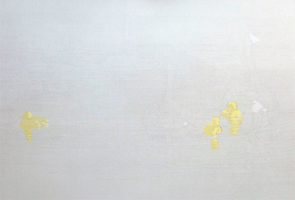
So for Step 5 I cut yet another mask, once again to contain color. I spot inked a light tan-ish color, and got this:

Reduction linocut in progress, Step 5 printed

That all seemed fine. I spent... gosh... a lot of hours... carving and carving at this point. I thought I knew what color I wanted to print next... a sort of purpley-gray. But I pulled one print and decided that was a mistake. There were some warm undertones in parts of the water and a mid-tone to do on the birds, and I decided I should do that first. I cleaned up the block, and the brayer, and the glass, and rolled out the warmer color.

Step 6 ink rollout

It seemed quite alarming rolled out on the glass, but it was fairly transparent and my first test print seemed pretty good, so I went ahead and printed it.

Step 6 printed

Once I finished this color pass, I went back to my first (rejected) test print and ran this orangey-brown on top of the purple-y gray, just to see what it looked like. ARGH! It made EXACTLY the color I want next! But now it's too late, because in a test of my purpley-gray over the top of the orangey-brown color that I did print... well. It's not right. I should have stuck with my first inclination for color order. Rats.

It's not the end of the world (or the print), I don't think. It just means a change of tack and mixing a new ink color. But hey, I have lots of time. It's not like anybody's going anywhere right now, eh?

Monday, March 23, 2020

Linocut in Progress: Changing my mind

It's been several weeks since we've had any snow here on the coast of Maine... so it was a bit of a surprise to check the weather forecast this morning and see a prediction of 3-7 inches of white stuff tonight. I filled up the bird feeders and brought in more wood for the stove... and spent the morning in the studio.

There weren't many areas of the linocut in progress that were going to retain the transparent gray I printed in Step 2. So few, in fact, that I had considered cutting masks and spot inking instead of running gray over the entire block, but the shapes I needed were going to be so tiny that cutting a mask would be ridiculously difficult and probably not very effective. I knew that printing a gray over the entire block would affect all the colors that would follow... but how bad could it be, really?

Well.

After I printed the gray I decided on a straightforward light blue across the entire block for Step 3. I put a little white ink in my mix, on the theory that it would cut down on the influence of the previous gray. 

Reduction linocut, Step 3 printed

It did, but after the prints sat overnight I was concerned that the blue still felt too gray. Much hemming and hawing ensued. 

I had initially considered a blended roll, with the blue changing from top to bottom. This can be really effective for suggesting a sense of depth in the image, but in this case a major element of the composition is very complex horizontal lines of reflection. If I leave the color flat, it could really emphasize the abstract nature of those lines. What to do?

I decided to try to beef up the blue along the bottom half of the image. I knew that I didn't want this more intense color to influence the light-struck backs of the adult birds, so I cut some more masks. When I used masks on Step 1 my goal was to keep the ink contained to a small area. This time my goal was to keep ink out of a small area.

The first idea, masks included

I printed this on probably 6 of my 20 sheets before I started second-guessing myself. I just wasn't convinced it was the right approach.

So I tried a print with a flat blue over the entire block.

Yep, I think that's going to be better. (sigh)

Changing my mind

So... I crossed my fingers that I had mixed enough ink and carried on printing the flat blue for Step 4. Then I went back and ran blue along the top of first six prints that had only been printed on along the bottom. They're not great, but I think they'll be okay once the other colors go on top.

Here's where the print stands now. It's quite clear how gray that first blue pass was when you see it in the areas that were masked off for this stage.

Step 4 printed. It's not a gradation, just an artifact of overhead light.

It's still impossible to really get a sense of where this image is going, but I think all that will change at the next step. There is a LOT of carving to do before that can happen, though... so go wash your hands and find some enjoyable way to occupy your time, and I'll check back in a few days.

Saturday, March 21, 2020

Linocut in Progress: Inside Out and Backwards

It's amazing how quickly things change. Just over a week ago I was finding it hard to get anything done because I was distracted by the looming specter of too many projects and not enough time.  Now it's absolutely the other way around, with workshops, travel, and exhibitions being cancelled or postponed left and right. I'm still distracted, but for totally different reasons. I don't know about you, but global pandemic was definitely not on my A-list of Imminent Challenges.

Still, relief printmakers are no strangers to thinking inside out and backwards. I know I'll feel better if I get some work done, so I've launched a new linocut. Naturally it's already turning out not to be particularly straightforward. Which does seem to be a worldwide theme just now.


The image calls for three little blobs of yellow, widely spaced on the page. Yay! Yellow! A bright and cheery color in an otherwise rather gray week (both literally and figuratively).

There's also going to be a lot of blue. Goodness knows I don't need the interference of yellow in blue... so before any lino was carved I found myself cutting little newsprint masks. Like this:

Newsprint masks

Ink mixed, masks cut... I spot inked two areas of the block. Like so:

Yellow spot-inked on the block

And then I carefully placed my newsprint masks. Like this:

Spot ink, masks in place

And I printed this thoroughly exciting start:

Step 1 printed. Exciting, isn't it?

The best part about that step was how fast it was to clean up. 

You've probably been able to suss out the subject by careful scrutiny of the photos above. If you haven't... well... I'm not going to tell you yet. Give me at least a little bit of fun here.

Step 2 printed. Slightly embiggenable if you need more clues.

As usual, the photography of this step leaves a lot to be desired. But basically it's just a transparent gray printed over the entire block. And just like magic I now have white, gray, and two shades of yellow on my image. Nifty.

There's not a lot of carving to do before the next color pass, but I'm debating the use of another round of masks. This time they would shield small areas from ink rather than define a space for ink. Maybe. Possibly. Or maybe I can just plow forward without masking. It's all a big question mark right now... but at least it's the sort of question mark for which I feel confident I can find an answer.

Wednesday, March 4, 2020

Linocut in Progress: Swimming to the finish...

Spoiler alert! I did manage to finish this piece in 10 color passes! That's two editions in a row, by golly. Don't expect it to happen again any time soon.

But I am jumping ahead. Let's go back to Step 9, shall we?

Step 9 ink rollup

And here we are. Although I have to stop momentarily to go off on a tangent and have a little chuckle, because....

Some times when I take a meal break I will watch a random video that YouTube suggests for me. Today's offering was, weirdly, about organizing/decorating tiny studio apartments. But, hey! I just realized that there IS a connection. Not that it's one YouTube would have known about, mind you.

The narrator of the video I watched spoke frequently of the need to have every piece of furniture in a small space serve multiple functions. A chair that is also a storage compartment. A sofa that's also a bed.

If you can follow my (sometimes odd) logic... It's the same thing with every color pass on a reduction linocut. In the case of Step 9, I was trying to 1) create some deeper shadows in the waves, 2) "gray down" a sort of triangular shape within the overall image to contrast with the brighter foreground colors already printed, 3) define some details in the birds, and 4) keep all those elements cohesive.

And that was a much shorter wish list than I sometimes have for a single color pass.

So here's the multitasking Step 9 printed:

Reduction linocut, Step 9 printed
As always, embiggenable with a click.

Unfortunately this photo is a bit shadowed on the right hand side, so the overall value/tone difference between that area of the background and the area to the left isn't terribly clear... but it's there.

At this point it was so, so close to being finished... but I still wanted to get one more darker tone in there. I didn't want to go as dark as black. That would definitely be too much. But I wanted a few more little bits of contrast that would sharpen the birds but still keep them settled in the water.

Step 10 rollup

Yes. This ink color really is as brown as it looks. Printed over blues it will read as a warmer gray (I hope)... but the female bird IS brown, so I want to be sure that she reads that way. Remember that funny little tan shape I printed a few steps back? Part of the reason for that was to create a warm undertone in the shadowed parts of the female.

BTW: I took this photo of the ink rollup early in the print session, when I thought I could leave the rest of the background material on the block since I wasn't going to ink it. However, it turned out the prints weren't quite dry enough. The areas of "dry," un-inked lino stuck to the still-tacky prints and pulled up bits of ink. So much for saving time! I had to stop and carve all of that material away.

Reduction linocut, Step 10 printed. Final!

This photo is a bit better than the previous in terms of light. I think you can see the subtle differences in the background, and in the area immediately around the birds, and in the birds themselves!

So, whew. I think it's done. I'll let it sit for a couple of days while I walk in and out of the room and scowl at it... that's my usual MO.

Which means it's time to start thinking about what's next. I'm feeling some pressure to get another image started right away, because in a few more weeks my schedule really starts to ramp up again with workshops and some travel. Once that happens, studio time will be erratic straight through to August. What does it mean if I'm already looking forward to autumn and the spring hasn't even arrived yet?

Linocut in Progress: The Third Act

Time to wrap up this linocut ! And we are wrapping at warp speed (see what I did there?)... because there are deadlines. Exhibition deadline...