Friday, January 30, 2015

Linocut in Progress: Curioser and curioser

You know that saying "Some days you get the bear, and some days the bear gets you?"

Perhaps as printmakers we should just say "Some days you get the print.... other days the print gets you."

Progress is happening here, but in the most roundabout manner.

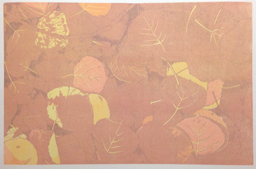
After the last transparent gray I wanted to swing everything back around to the yellow ochre realm. I mixed up a nice ochre with plenty of white to make it opaque... and I got... this:

Aspen leaves linocut, Step 6

Definitely NOT yellow ochre. And look at my dull red shadows! They now look PURPLE! Oh, color! Why do you torment me so? If I were the paranoid sort I might start to think my inks get together at night and plot ways to mess with me.

I walked away from those conniving inks and their conspiratorial prints for a few days. Well, actually I drove away from them, since I had business to attend to on the Front Range. Thursday it was back to the press... and trying to figure out what to do next. My original plan was to go straight to bright yellow from here, but it didn't seem likely that I'd get a nice, clean yellow on top of that... whatever it is. Orangey browny ochrey. So. I did a little more carving and then printed....

Aspen leaf linocut, Step 7

White. Believe it or not, this is a pure white layer. No transparent base added. Not very white, though, is it?

But... I didn't really mind. I didn't WANT white... I just wanted a better base on which to print....

Aspen leaf linocut, Step 8

Yellow. Finally. And look how the relative colors have changed again! It's really rather ridiculous, don't you think? I am reminded of college class called "Problems in Color." We spent the semester mixing little paint squares, matching values and trying to solve visual puzzles: How to make two different colors look like same by changing the color around them... or the reverse... how to make two swatches of the same color look entirely different.

I wonder if this print is a sign of how much I did learn.. or how much I didn't learn.

But I think I'm back on track now. The next couple of colors will also be brighter, and then I'll get the darks going and hopefully the visual relationships will start behaving themselves again. It all needs a day or two to dry now, so I'll be turning my attention to some illustration projects. But don't worry... I won't turn my back on these prints. Who KNOWS what they might get up to if I did.

Thursday, January 22, 2015

Linocut in Progress: Aspen leaves

We don't have much in the way of deciduous trees here in the Rockies and our autumn color can be decidedly monochromatic. (Read: Lots and lots of yellow.) I've done several linocuts of our iconic aspen trees and leaves, but none quite like this one.

There ARE certain stands of aspen that turn not yellow, but orange, and sometimes even brilliant red in the autumn. I've never heard an adequate explanation for these renegades, but coming upon them is like finding a glowing treasure. (I swear one might even hear music.) Yes, there appears to be a pigment (anthocyanin, if you want to know) present in red and orange trees that isn't present in yellow ones... BUT... just because a tree turns red one year doesn't mean it will do so the following year.

This past September a large, rich stand of red and orange aspen flanked the Marshall Pass road, one of my favorite autumn haunts. I lined my pockets with leaves of red and orange and salmon and pink and gold... some of which are still on my window sill, although quite brown and crunchy by now.

Aspen leaf linocut: Step 4

Of course all that lovely color variety just begs to be made into a linocut. It took me more tries than expected to get to this salmon-pink color, which will only remain in a few leaves when the next color goes on.

Aspen leaf linocut: Step 5
Next, a transparent gray. Again, not much of the resulting dull red will remain in the finished print. The next color.... (more of that dramatic music now) will be a yellow ochre. Slightly risky, given all the red underneath it, but the ochre pigment is naturally a bit opaque, and I'm aiming for a color that will say "leaf past its prime," so I'm hoping it doesn't give me too much trouble.

Depending on what the roads look like this afternoon I may still try to make my run out of the mountains, so it will be a couple of days before much new happens. Plenty of time to screw up my courage and move on to the next step.

Wednesday, January 21, 2015

What's It All About Wednesday: Snow Shadows

Well. I had intended to make an overdue run to the Front Range today, but the forecast calls for snow everywhere. It's a 2-3 hour drive for me each way (depending on where I'm headed) in GOOD weather. Forget trying to navigate mountain passes when the weather's questionable.

Staying home means getting other things done, though, so be prepared for an update on the linocut-in-progress tomorrow. And in the spirit of a snowy day, I'd like to share a little bit about "Snow Shadows II."


First things first (or maybe that's second things second): It's called Snow Shadows TWO because I did a smaller black-and-white version back before I started making color reduction prints.

One of my art heroes is Francis Lee Jacques, who worked as a fine artist, illustrator, and painter of  dioramas in the 1920s-40s, first at the American Museum of Natural History in New York and later at the Bell Museum in Minnesota. Jacques was a great painter, but it is his black-and-white scratchboard illustrations that knock my socks off, particularly those he did to illustrate several books by his wife, Florence Page Jacques. I went on a major eBay binge in the 1990s and bought everything I could find, since all of Florence's books were out of print. Several of them have since been reissued, but I'm quite fond of my 1940s-vintage first editions, thank you very much.

Jacques was a master of design and a consummate draftsman. He was, in my opinion, the king of negative space, making fantastic choices about what to render and what to suggest. Florence was an equally charming writer, documenting her adventures as the new bride of an avid outdoorsman. Here's a little snippet from Canoe Country to give you a taste of both.


It's simple but dramatic images like this one that showed me the design possibilities of water ripples and snow shadows. And Jacques' trees are darn lovely, too.

So what's that got to do with my linocut? Eight or nine years ago I was out driving with a friend on a sparkling, post-snowfall morning. We came around a bend and I shouted STOP! and was out of the truck in a flash. There... right there! was a shadow pattern worthy of Jacques. I snapped a few quick photos and vowed to "do something with them sometime."

My first black-and-white effort to "do something" showed promise, but once I started to feel more confident about reduction prints I gave it another try in color. It's no Jacques, but I like to think he'd approve of those snow shadows.

Monday, January 19, 2015

We now join this linocut already in progress

It's a wee bit crazy around here. I have illustration jobs for three different clients on the table, plus a commission project, a website redesign, and all my year-end paperwork/tax prep in progress.

So of course all I want to do is print. I've been sneaking in a little printing between all this other stuff, but neglected to take any photos. Sorry, but I'm bringing you in to the loop here at Step 3... the fourth color is ready to go, maybe today.

Aspen leaf linocut in progress. Step 3

This linocut-in-progress represents a biggish step for Presston and me. So far all of the reduction prints we have done together have been 8 x 10 inches. This one is 12 x 18, which more or less represents the full reach of what I can comfortably print by hand. (I have done larger pieces, but not often.) So far I'm not having any problems, other than some rather extensive transfer of the Sharpie pen I used to draw the image. It's a puzzle, because I made a point to scrub the block before the first printing, but I'm not too worried about it. The places where it's most obnoxious will all be covered by dark ink as the image progresses.

The carving is finished for Step 4, but I'm undecided about the next color to print! I have one more pale-but-clear color to go, a rosy-orange that I tried to get to at this stage, but didn't quite achieve. (The color I printed was a bright transparent pink, but not enough to overcome the two yellows underneath.) I don't want to resort to opaque color just yet, I want to maintain the luminosity of transparent ink as long as possible.

My other option is to print a transparent gray overall and then build other colors on top. I'm leaning towards trying one more time to rosy things up as is and then doing the gray, we'll see what I decide.

Wednesday, January 14, 2015

A rare "brush" post for Brush and Baren...

Perhaps I should have titled this post "Where-the-heck-did-she-go Wednesday."

The answer is that she got chained to the drawing table for the past week. Trip to the Front Range? Cancelled. Mostly because of weather, but also because I had multiple illustration deadlines in head-on collision. The good news is that I have work, the bad news is that it's keeping me away from the press.

Illustration in progress for an interp panel in the local state park.
In between bouts of sitting at the drawing table I've been sitting at the computer. (How dumb is THAT?) A major overhaul of my website is underway! It's going to be great when it's finished, but right now it's just tedious. I'm switching everything out of Dreamweaver and learning to use WordPress... trading one persnickety beast for another. But as I said... it's going to be great when it's finished.

I sent files for two jobs off to proof last night, and as a reward for good behavior I started prepping paper for a new print. Going to make the leap to a slightly larger image this time: 12 x 18. And something landscape-y rather than birdy. Can't wait to get started!

Thursday, January 8, 2015

Linocut exhibition at Heart of the Rockies Regional Medical Center

On Monday, with the help of the ever-capable photographer and hospital liaison Dan Downing (go look at his work), I installed my first exhibition of the year at the Heart of the Rockies Regional Medical Center (HRRMC).

The blank wall awaits, and the puzzle commences. What goes where?

When this facility opened in 2008, board members had the fantastic insight to approach local artists first when they established their art collection. I was, of course, delighted when six of my linocuts were included in that initial purchase. One of those pieces hangs in the emergency room, and it's always amusing when someone approaches me with "Hey, I was in the emergency room with a broken leg, but it was nice to see your work," or better yet, "I was really pleased to see your work while waiting for my colonoscopy."

Still shuffling, but getting close.

This exhibition hangs in the main hallway between reception and the cafeteria, so I anticipate less traumatically-inspired commentary. At least I hope so! The work will be up for the entire first quarter of 2015, show ends March 31.

Finished! Two views, since it's hard to get a good shot down a hallway.

Monday, January 5, 2015

Bitty Birdies For the New Year

American Robin
 Alright, sports linocut fans. I finally finished painting enough of the "Bitty Birds" to put a set up on my Etsy store, Rio Salida Art.

Each image is approximately 3" x 5," printed on Arches 140# cold press watercolor paper and hand painted with an assortment of Holbein, Winsor Newton, and Sennelier watercolors.

It was fun to putter around with watercolors for a change, and a good warm-up for the extensive watercolor illustrations I'm working on for a client right now.

These are a few of my favorites, but there are 18 in all! (And only $20 a piece, totally giftable.)

I've got more ready to go in addition to the ones in the shop, but since they're all hand painted and variable I decided to put them up separately. (And hey... if you want a short cut to the store, there's a page on this blog that will take you there, too. Up there in the menu bar where it says, oddly enough... Etsy Store!)


Audubon's Warbler

American White Pelican

Barred Owl

Common Goldeneye
Wilson's Phalarope


Linocut in Progress: When "simple" things go cattywampus

  Cattywampus , in case you didn't know, is a technical printmaking term. It can be used to refer to registration problems, but in my st...