Thursday, September 21, 2023

Linocut in Progress: The Finish and the Rescue

 In the first post about the process of this linocut I mentioned that I was distracted and unfocused during the time I worked on it... which has been super clear from the erratic photo documentation! The funny thing is that when I started the image I had designs on thoroughly documenting it and making a video of the process. But when the warping problem became apparent fairly early on... well. Not a good candidate for video documentation if the whole thing ended up being scrap paper.

So let's not prolong the agony, shall we? Let's roll up some ink and finish this thing.

Step 8 ink rollup

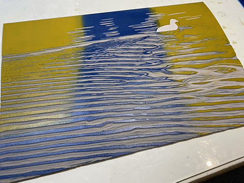
Wow. Okay. That's some ink, alright. I did say I wanted to break up all that green... but this seems like a bit... extra. It's so orange! Remember your color theory, though. Red and green are opposites on the color wheel, with a tendency to dull each other down and, I hope, create a warm brown.

Still, it must have seemed like a lot at the time, because I have no photos of what the image looked like at this stage. Coward. 

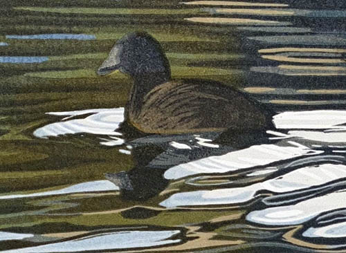
But it's clear I did create a ninth color pass, because there are two values of what reads as a brown in the final image. It looks like this!

"Bobolink," reduction linocut, 7" x 5" - Edition of 20

There are a few more little darks in the green areas of the vegetation as well as the second value of brown, so I'm guessing the final pass was one last transparent gray.

So here we are. The images look nice... I managed to hold the registration together even though the paper was so warped. But when I say "so warped," I mean So. Warped. 

Look:

I mentioned in previous posts that I knew this was a problem fairly early on, and that the issue kept compounding as I carried on with printing. It was not a problem of too much press pressure. The block was not pressing into the paper enough to cause any embossment. But the ambient humidity was enough that even light press pressure was enough to stretch the paper. 

About halfway through the process I did stop and try to flatten them. I was away teaching for a week when the prints were about half finished, so I stacked them under glass and weights and hoped for the best. It did help. A little. But as you can see in this photo, it wasn't enough, and by the time I finished all the color passes I had prints that were so wobbly they couldn't be made to lay flat even under a mat. 

Time for Plan B. 

I was away for another week at the beginning of September, which was enough time for the finished prints to dry completely. 

There are many reasons why I prefer to use traditional oil-based inks for my prints, but this Challenge of the Warped Linocuts added another to the list. Once the prints were dry, a little water wasn't going to hurt them. At least I didn't think it would. Luckily I had a few "reject" prints to experiment with. 

I first tried just spraying one side of the paper with a light spritz of water and tacking the print out on a board. It helped a little, but not enough. 

Desperate times called for desperate measures. Enter Plan C! I took the prints to the sink and ran cold water over both sides of the paper. Yep. I held my prints under the faucet. I pressed them between sheets of blotter paper until they were merely damp, and then taped them out on a board like watercolors (or etchings):

And it worked! Whew. Luckily I had printed these with plenty of paper margin, because of course the tape damaged the edges of the paper. But there's plenty of extra to trim these down and still have a nice image with plenty of space. 

As I am writing this, we are just saying goodbye to the remnants of Hurricane Lee, which blew through here yesterday. The air behind it is cooler and drier than we've had in a while, and I'm hopeful that we've left the worst of heat and humidity behind for a while. I'm not sure what the next image will be, but I'm looking forward to working on it without warping issues. 

And I'm happy to know that a solution I have long regarded as theoretical has turned out to be viable. Just in case.

Monday, September 18, 2023

Linocut in Progress: Confusion and... warping?

 Right off the bat I will explain that the "confusion" of this post title is mostly to do with the fact that I dropped the ball on documenting the process of this linocut and I have struggled to sort out which of the (very few) photos I have goes with which step. (Yes, there are time stamps, but sometimes I shoot things out of order, or some steps look a lot like other steps!)

All of which is to say, "hang on, it's a bumpy ride."

But it starts well enough. Here's the ink rollup for Step 4:

Linocut in progress: Step 4 rollup

Pretty, right? A blended roll of light and cheery greens for the vegetation. You'll note I didn't ink across the bird. It wasn't necessary for the image, and it keeps an extra layer of ink out of that area.

Apparently at this stage I only took a photo that looks like this:

Step 4 printed

I also mentioned in the previous post that I had printed a second pass of the light yellow in the bird's head. I thought I had done that right away, but in this photo it appears I did it after this stage. Let's call the "head brightening" stage Step 4.5, because by Step 5 it's clearly in place. Yep. I'm confused. 

So confused that I didn't take a photo of the rollup for Step 5, but I'm going to guess it was a light transparent gray, because:

Step 5 printed

Actually, now that I look at this photo, I think there were two things happening in Step 5. There was a gray applied to the bird, and another blend of greens in the vegetation. You can see in the place where the bird and the leaves meet that there's a sort of fuzzy line... I believe I inked these two areas at the same time and just let them overlap. (Hey! It was a month ago! I can barely remember what I had for breakfast this morning.)

The next image in my photos looks like this:

Step 6 rollup

That seems like a nice, strong blended roll, which I think goes with the print on the right in this photo:

Step 6 printed (on the right). Step 7 on the left. And warping... everywhere.

And here is the point at which we need to address the issue that was causing me complete consternation. Can you see that these prints are not laying flat? They are buckled and warping. I have never had this much issue with stretching paper before! But then again... I have never experienced a summer as wet and rainy as this one before. 

Which is one reason I don't usually do a lot of printing in the summer. Other reasons are too much heat and a too-busy teaching schedule. But I was determined to get something done, so I kept plowing forward. What else was I going to do? Abandon the whole thing? I could... but... stubborn. My reasoning (such as it is) was that I could either throw all the prints away NOW.... or I could finish them and experiment with trying to flatten them. If those experiments failed, well... I'd still lose all the prints. But there was a chance I'd figure out a solution, so.....

Onward.

Step 7 ink rollup... nothing fancy.. just a transparent gray over all the block. 

Here's the ink rollup for Step 7:


Step 7 printed

And, judging by the look of it, I think I used another transparent gray (maybe the same one) for Step 8:

Step 8 printed

These are looking okay... but I'd like to break up all that green with some sort of red-brown. Maybe two color passes to go? And then... we'll see if they can be salvaged. 

Saturday, September 16, 2023

Linocut in Progress: Oh, look. Starting with blue. How unique.

Okay... where the heck were we? Or, more accurately, where the heck have I been?

The story of that is long and sort of boring, involving tedious experiences with illness and such that have left me with distracted focus. Distracted focus has meant some disasters in the studio.... You know how it goes. 

A couple of weeks ago I decided to take on a "simple" and small piece, just 5 x 7 inches, to remind myself that I do know what I am doing. Ha! Just wait until you hear what happened. 

But for now... let's begin as though we DO know what we're doing. 

Step 1 rollup

Linocut in progress: Step 1
Look! It's a blue blended roll! We haven't seen that more than, oh, a zillion times. But it's certainly comforting to start with something familiar. Bird geeks... any guesses? Because of course there's a bird in here.

It's a nice background, but a bit blasé, so I decided that a subtle texture could make it a little more interesting. 

Enter the chipping of many small dots. Well, not dots, really. I think of dots as round and regular. These are more random in both shape and distribution. Let's call them... divots?

I created many divots in the upper portion of the background, but completely cleared the area around the vegetation in the lower portion. Don't want things to get TOO crazy, do we?

Step 2 rollup
Step 2 printed

Carrying on... time for another blended roll. Oh look! It's exactly the same as the previous blended roll. Okay, maybe not exactly. I darkened the gray slightly. I did say I was going for subtle here. 

Things felt pretty satisfactory so far, but we are only two steps in, so there haven't been many opportunities for things to go wrong. 

However.

If you've followed this blog for any length of time, you will know that every summer since I moved to Maine, I have trouble with the bed of my press. Despite a small dehumidifier in the studio, the heat and damp conspire to buckle the laminate. My neighbor has helped me fix it a few times, and right now the upper surface is cooperating... but the lower surface is buckled and it's causing some uneven pressure problems. 

On a small piece like this it isn't too much of an issue, but there were other problems lurking. I almost always print on dry paper, but when the humidity level inside the studio creeps towards 75%, "dry paper" is a relative term. I eased back on the press pressure from the beginning, but as we will see soon... it wasn't enough.

Step 3 rollup

Step 3 printed

But let's not worry about that just now. Time to clear away all those meticulously-carved divots and call the background finished. And time to do a little detail work on the bird. 

The male of this species has a lovely straw-colored back-of-the-head featherdo (not to be confused with hairdo), so it's time for a little spot inking. No need to be particularly careful here, as most of the yellow will be covered by a much darker tone later. 

Full disclosure: I went back and printed this color a second time, just in the bird's head, because I felt it needed to be a bit more intense. I neglected to take a photo, though... maybe because I went with friends to the fair... for the first time since 2019... and got distracted by THIS FACE. I mean, come on

Yep, I'm distracted again now. Wandering off to think about cute goats. More.... later.....


Sunday, July 2, 2023

She's ba-ack! Sort of...

 Well... heck.

It's been a super long time since I've posted anything to Brush and Baren. There's been a lot going on, and I have just needed a break!

I'll be getting back in the saddle here soon, promise. 


Thursday, May 11, 2023

Linocut in Progress: All the little ending bits

Okay, wow. I have at least four steps remaining to show you, but they are kind of a snooze. AND... full disclosure... I was trying to finish this piece for a deadline back in April, so when it got down to the crunch I stopped taking photos of ink rollouts and masks and all of the interesting bits. I promise I'll try to do better next time.

So here's Step 10. You'll have to trust me that is was another transparent gray pass. The goal was to create some darker greens, and it also darkened up the background blues a bit.

Reduction linocut in progress: Step 10

And now I can no longer avoid the bird. It's a small thing (Literally. It's maybe an inch and a half long), but a big thing... if you know what I mean. 

Of course because I've been largely ignoring it, I need to go back and lighten some small shapes. I knew this was coming, and it's always a bit of a risk, but I did it anyway. 

Here's a closeup of Step 11:

Step 11 detail

I lightened the beak area, plus a couple of shapes in the reflection. Rolled out the ink looked almost white, but as you can see, it doesn't appear white as printed. That is a good thing. I didn't WANT white. But it did take a couple of tries to get this to register as a lighter warm tone with all that green and gray underneath. 

Here's the overall view: 

Step 11 printed

So NOW I can really start try to resolve the creator of all these lovely reflections. An American coot has a dark gray body and a black head, but I wanted to suggest at least a little light hitting the bird, so I left some lighter gray-brown areas when I rolled out... Another transparent gray. Darker this time. But still gray.

Here's a detail:

Step 12 detail

Okay, so close now! I think one last dark transparent gray... not quite black... will do the trick.

But first, the overall image at Step 12:

Step 12 printed

The final dark finished off the bird, plus I carried it down a little way into the reflection... you know... 'cause that's how reflections work. 

Step 13, final

So there you have it... "After Effect," reduction linocut, 12" x 18" in an edition of 15. It's even up on my website already. Wait... before it was officially finished? Well, yes, because: deadline. 

The only question left now is.... what's next?

Tuesday, May 9, 2023

Linocut in Progress: The bright and the blah....

When last we checked on the current linocut in progress, we had just stepped away from a lovely, harmonious color palette and started to stir things up. Prepare yourself... because we're still on that path!

Step 7 rollup

Okay, okay... yes. This going back to blue, so maybe not TOO wild, but it is definitely a big blue after the much more quiet tones of the first few color passes. This composition is really all about the contrast of the wake and ripples behind the bird, so we might as well start cranking it up to 11. 

I'm not ready to do much with the bird itself yet, though, so that will get a little newsprint mask to keep it clear of additional ink layers.

Step 7 printed

But, hey... look at the cool color that resulted from putting this rich blue over the top of the orangey ink laid down in the last color pass! Nifty, eh? 

It's all still very blue, though, and what this image really needs is some greens. Of course mixing a green or two and applying it would be one solution, but you know me... let's try something a little more... um... Well...  A little more. 

Step 8 rollup

This is definitely more. More blue, plus a big ol' bright ochre-y yellow. That ought to do something, right?

Step 8 printed

And, indeed, we can call that... something. It's a nice green... sort of olive-y, but bright. Plenty of room here for adding some more subtle greens without ever actually using green. How about some gray, for example?

Step 9 rollup

At this stage you can see that I've decided to start letting some of this color influence the bird, so there's no mask. Just a transparent gray... and if you look closely you might be able to tell that I didn't roll it all the way down the block. Maybe just halfway?

Step 9 printed

I feel like I have a fair sense of where the image is going at this stage. I think perhaps one or two more gray passes to sort some more subtle details in the water, and then of course the bird needs some serious attention. Stay tuned! 

Wednesday, May 3, 2023

Linocut in Progress: Moving right along

 Okay! The "easy" part is over... all of the related and harmonious blues are in place. Time to start making things more complicated. Why? Because that's how I roll, silly. 

Linocut in progress: Step 5 spot ink

So for Step 5 of this linocut, let's do a bit of spot inking for some tiny gray shapes that in the end probably no one will notice except me. Why? Again, I tell you, it's how I roll. Unfortunately you can't see the actual roll of ink, because I neglected to take a photo. But you get it... it's some gray, and I rolled it around in the middle of the image. 

Step 6 rollup

But, here! Here's a rollup that you can see! Interesting color, eh? This is also something that won't be prominent in the final image, but I just felt like it needed to be in there.  I want to contain the color through the middle of the block, but I don't want to create a hard line, sooo... let's cut a mask, shall we? 

Step 6 mask

Okay, two masks, really. Just a sort of random wiggly, watery shape.

Step 6... printed!

Fun, eh? I quite like this from an abstract perspective. In some ways it seems a shame to cover most of this nice color up in subsequent color passes, but that's what I'm going to do. Onward!

Thursday, April 27, 2023

Linocut in Progress: Starting a new one...

 As I teased in my previous post, it was time to step away from the confusing linocut that might or might not have been finished and start something new. In part I needed to get some perspective on it, and in part I needed to deal with an impending Big Deal deadline. 

So... new piece of lino, new image, new format. And an often-explored bit of subject matter, hopefully expressed in a new way. 

Three guesses what I'm after, and the first two don't count.

Reduction linocut in progress: Step 1

The photo looks weird and blotchy and kind of pink, but trust me... it's just a light transparent gray.

Step 1 rollup

And from here I was definitely in more comfortable territory. Let's do some light transparent blue!

Step 2 rollup

Oops. Wet ink glare. But you know where we're going. Step 2 printed.

Already I felt better about this image because it has a strong graphic composition, even in this early stage. So why not do some more blue layers? I tweaked the blue slightly for each of the next two stages.. and apparently decided that the rollup looked similar enough not to bother you with it, since I didn't take any photos.

Step 3 printed

Step 4 printed

Whew. It's a good start, and although the deadline drumbeat is still pounding away, the additional pounding in my head has backed off a bit. Time for some sleep, and then we'll see what's happening at the next stage!

Monday, April 24, 2023

Linocut in Progress: The.... end? Sort of?

Okay. At this point I was super aggravated with this linocut and ready to be finished. Plus... truth be told... there was a major exhibition jury deadline approaching and I could hear the beating of the drum. Let's just wrap this up, shall we?

Step... hm... 18? rollup

I decided that I would spot ink one more dark in the birds, and then, hopefully, just one more dark overall and the piece would be finished. There's not a whole lot of material left on this block, so things will need to be resolved soon! 

Step 18 printed

The changes are so subtle here that probably no one will notice them except me. The camera certainly doesn't. For all the 80 zillion pixels (of COURSE that's the actual amount) involved these days, there are some things a digital camera just can't deal with well. Or at least it can't if I am the one doing the photography. 

One more dark.

Step 19 rollup

See what I mean? There isn't much left here to accept ink.

Aaaanddd.... Step 19 printed

Okay! Finished. 

I guess. 

Maybe.

I dunno.

It's a funny thing, attempting to stretch outside one's comfort zone. I tried to do something different, and I did. But is it successful? I'm not sure. I can't tell. It's just... different. Some folks who have seen it like it a lot. Some, like me, are less certain. I suppose that's image-making for you... not everything appeals to everyone. 

Or maybe it's not finished. Maybe I need to push things even further. Get a second block going and overprint some areas and see what happens. That could be interesting.

It could also take time, and right then time was not something I had. Deadline, remember? So I did the only thing I could be sure about in the moment: I put these prints aside and....

Something totally new. Step 1.

I started something completely new, a little bit smaller (12 x 18 inches), and more within the creative comfort zone. At this point I had maybe three weeks to the deadline, and I had already spent two months on a piece that just confused me. Which is part of why I stopped making blog posts! The last thing I needed was more pressure. I'll get back to the other piece later, but right now.... focus! Deadline. Deadline. Deadline.

Friday, April 21, 2023

Linocut in Progress: MORE birdy bits...

It was really nice to be getting the birds resolved in this linocut, but dangit! Already I've made a problem for myself.

The good news is that most of the makers I know agree that making is really just one long series of problem solving. The bad news is... making is just one long series of problem solving.

The problem now? The female's crest, while still brown, tends to be a bit more golden than what I had going on at this stage. 

The good news is there's a solution: Pochoir!

Mini-step... 18?

I've talked about pochoir several times here at Brush and Baren. It's a technique that has been used historically to hand-color printed images, and I know of a printmaker or two who use the process entirely to create their images. It's basically stenciling. In this case I cut a stencil out of acetate and then pounced the color directly onto each print. 


The color seems super bright now, but other browns and grays will go back over it, so it will be fine. I hope.
The print after Mini-step18

And speaking of grays. How about a gray-brown, just to cover all the bases?


Yes, okay. Problem solved. I think that's better, don't you? 

Image status after Mini-step 18. 
The next question is: Now what? 

Linocut in Progress: The Third Act

Time to wrap up this linocut ! And we are wrapping at warp speed (see what I did there?)... because there are deadlines. Exhibition deadline...