 |
| New linocut in progress, Step 1! |
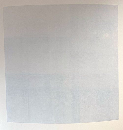 |
| Step 1 printed |
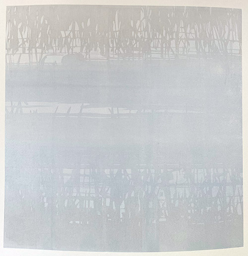 |
| Step 2 printed |
 |
| New linocut in progress, Step 1! |
 |
| Step 1 printed |
 |
| Step 2 printed |
The UP:
I was able to attend the opening of Birds in Art at the Woodson Art Museum for the first time since 2019. I knew it would be good to be at this superb venue with the tribe of bird artists gathered once again, but I don't think I realized just how good it would be. My poor pandemic-weary heart got a much-needed energy boost.
 |
| Woodson Art Museum entrance |
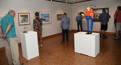 |
Visitors taking in the view at Birds in Art |
 |
| Exhibition views at the Wendell Gilley Museum |
 |
| Autumn color on the Pemaquid River. |
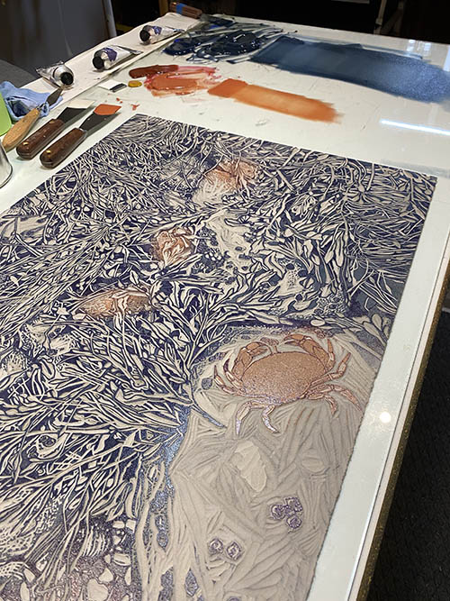 |
| Step 6 rollup |
In this photo the dark value for the rockweeds looks very blue, which indeed it was. After I took this photo I corrected the color a bit and toned it down before I pulled any more prints. Here's how it all looked after that correction:
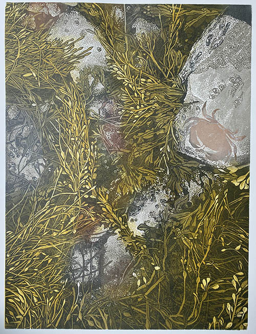 |
| Step 6 printed |
I'm feeling good about the rockweed, but the crab is a bit behind because of printmaker neglect. (Although notice how even though the color looked intensely orange on the rollup, the crab now looks a light peachy color. That's the effect of putting a bright transparent color over a semi-transparent white that was printed over gray. Are you confused now?)
What else should I fuss over? Oh, of course. The periwinkles (little sea snails). There are a few in this image, but they've gotten lost. I'll try the semi-transparent white ink trick again to see if I can't lighten them up.
Here's the roll up, spot ink only, on the press:
 |
| Step 7 spot ink (colors 14 and sort of 15) |
You can probably tell I was doing this late at night (note the dark window behind the press), which is no doubt why I didn't take a photo of the print at this stage. And of course I forgot to go back and do it in the daylight before I went on to the next step.
Not much changed, although the periwinkles became alarming. Fingers crossed I can tone them back down in the next pass.
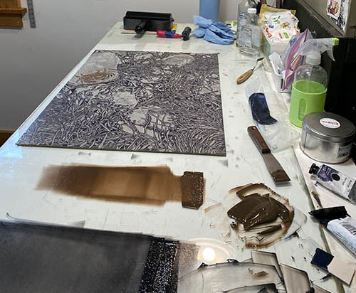 |
| Step 8 rollup |
Which iiiiiis... press pull Step 8 (colors 16 and 17). This time it's a nice crabby brown and a dark gray made from sepia and leftovers of the previous too-blue dark. (Always save and use your ink leftovers. They can create a tasty color!)
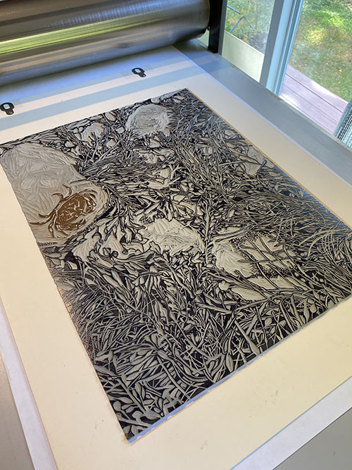 |
| Step 8 on the press.... |
You can see here that the areas of the block that define the rocks have been mostly carved away by now. I'm thinking this will be the final stage of dark for all of the image except the crab.
 |
| Step 8 printed |
We're in the home stretch now! I'm still not thrilled with how the periwinkles are standing out (even more predominantly here), so they'll get spot inked with one more dark.
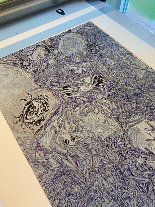 |
| Step 9 (color 19) rollup |
Aaaaaannnnndddddddd.....
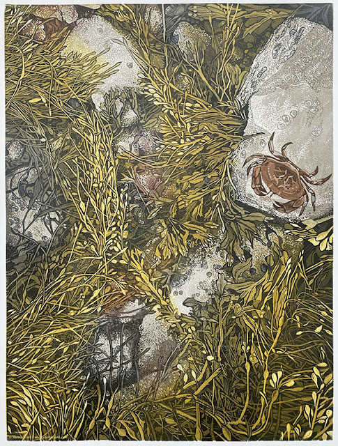 |
| All done! This image slightly embiggenable with a click. As-yet-untitled reduction linocut, 24" x 18" Edition of 10. |
Whew. That was definitely more than I thought I was headed for, but I'm not mad about it. In fact, I am weirdly inspired to jump in to another piece with similar subject matter. I'm a huge fan of an intertidal zone, and there is so much to explore!
But first I think I need a nap.
So this supposedly simple thing has, as is typical for a certain printmaker you know, gotten somewhat less simple. A single-color linocut idea has turned into a multi-color reduction lino epic, and we're not finished yet.
 |
| Step 4 rollup. Tasty, if I do say so myself |
But seriously. When one gets a chance to mix and use these yummy colors, how can one refuse?
 |
| All the purdy step 4 colors |
In terms of individual passes through the press this image is at Step 4, but color-wise we are on colors 7, 8, and 9. My attempt to try something radically different from my usual process has run right off the rails, EXCEPT for one thing. In my usual process it's likely I would be on a press pass of 7 or 8, because I would have made a point in the early stages to mask areas and ink more selectively. For this image I have done zero masking, and have let colors overlap where they will. This has led to some parts of the image having... what shall I call it? Not really color bleed. More like color creep.
I am, indeed, allowing color outside the lines.
Which is all to say that while this isn't drastically different from my usual process, it does represent at least a little relaxing of my (ahem) control issues!
Here's where things stood after the application of some greens, reds, and more gray.
 |
| Linocut in progress: Step 4 printed |
I suppose it might have worked to stop at this point, carve for a final black pass, and call it done... but I was teetering dangerously on the fence. Have I gone too far in the addition of color to be able to jump to a single final pass and have it be successful? Am I at the point at which I need to abandon all pretense of trying to keep things "simple?"
 |
| Step 5 rollup |
I decided I needed a mid-dark value so the jump to a final dark wouldn't be too harsh. Plus... I had unfortunately been ignoring the crab, too. It had gotten a bit too dark and needed lightening. But surely after "just one more" color pass I'd have a good feel for where I was. Right?
I rolled up a nice olive green for the entire block, and ran a semi-transparent white over the crab.
 |
| Step 5 printed |
At this point I felt we were at the good news/bad news stage. The good news was that I was starting to feel quite optimistic about the image overall. The bad news was that the "keep it simple" line definitely had been crossed. Plus there's the problem of the crab that needs resolution. Yep. It's anybody's guess how this finishes now!
 |
| Step 1 rollup |
Sure. Why not? I mean, if I hated it, I could always just finish the carving and print as straight black-and-white. Right? Right?
 |
| Step 1 printed |
 |
| Step 2 rollup |
I carved the block some more, darkened the leftover inks from the first color pass, and did a second haphazard roll-up.
 |
| Step 2 printed |
 |
| Step 3 printed |
Okay.
That's more like it. I can go ahead and just cut the whole block now for a final pass. Four steps... that's more than I expected, but okay. This is a BIG block. It's taking a long time to carve even for these not-very-intricate stages. It will be good to just focus on carving for several days and be done with it.
Except that, of course, that's not what I did. Because as the prints sat there staring at me with their mottled ochre-and-gray attitudes, the little voice in my head started suggesting that the color could be just a bit more interesting if I stopped and did "just one more" stage.
Sure. Just one more.
 |
| Reduction linocut in progress: Step 6 rollup |
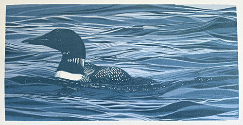 |
| Step 6 printed |
 |
| Step 7 pochoir stencil |
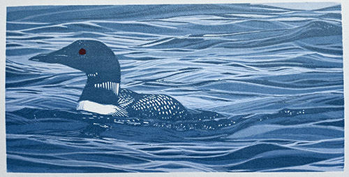 |
| Hardly worth calling a step, but here's Step 7 printed |
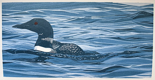 |
| Step 8 printed |
 |
| Step 9 rollup |
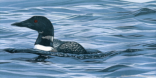 |
| "Lone Loon" reduction linocut, 6" x 12", edition of 16 |
And there it is! An entire reduction print of 9 colors in about a week! Whew. It was really nice to spend some concentrated time in the studio, especially since I am now moving at high speed to prepare for the busy summer season. I've been framing, labeling, transporting, hanging work... all the glamorous bits of the artist's life. (It's all about "stuff into the car, stuff out of the car.")
I've got a bit of excitement on the not-too-distant horizon... an opportunity to get away with a sketchbook and my thoughts for a couple of weeks. More about this as it comes closer!
Continuing with the little loon linocut... it's a festival of blues. Not really a blues festival, though. That's a whole other thing. (sigh) Remember concerts?
But I digress.
The strange phenomenon of how relative colors change the overall look seems to be even more dramatic when trying to photograph an image with a lot of blue in it. Digital cameras just freak out for some reason. At this point I had started to add a slight greenish tone to my blue inks, but in the photo of the completed Step 3, you really can't tell.
 |
| Reduction linocut in progress, Step 3 printed |
 |
| Step 4 printed |
Yeah, really. Why do I even try to take photos at each stage? It's all so visually confusing.
Let's add something a little more green again and see what happens, shall we?
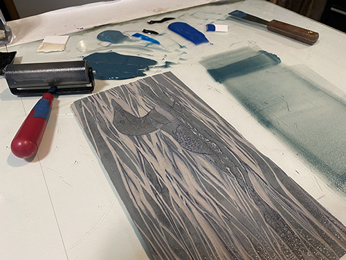 |
| Step 5 rollup |
 |
| First color... let's go! |
If you follow me on any other social media channels you know that this piece features a common loon, so no reason to be cagey about the block in the early stages. The format this time is just 6" x 12", and it was amazing how quickly I could proceed at that size.
(Note to self.)
So, as is often the case, the first step was a pale blue. In the interest of full disclosure, however, I will confess that I printed this first step twice, because I was having all sorts of weird problems with streaky ink coverage. I ended up stopping and completely re-adjusting the press, which wasn't the entire problem, but it did help.
 |
| Reduction linocut in progress: Step 1 printed |
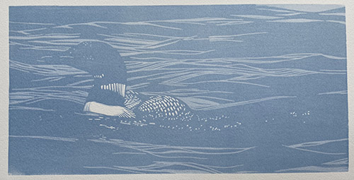 |
| Step 2 printed |
Reservations are required, contact the Damariscotta River Grill (207) 563-2992. (A click on the image above will embiggen it for better readability. Honest.)
 |
| Reduction linocut in progress, Step 9 revisited |
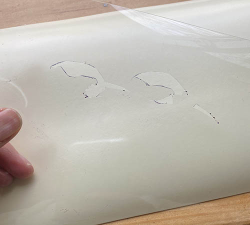 |
| Pochoir stencil |
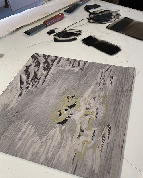 |
| Step 10 rollup |
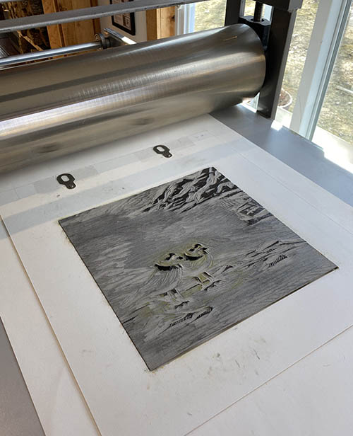 |
| Ready to roll. The final pass? |
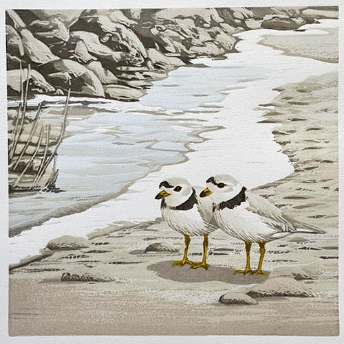 |
| Step 10 printed |
Hmmm. I do not have a sense of triumph here. It's nice, but something is missing. Some little bit of oomph or sparkle or... something.
I think the birds need some bling. Something small. Tiny, even.
Oh.
I know.
How about some tiny, tiny bits of bright orange in the legs and beaks? Yep. I think that's it. Pochoir to the rescue again!
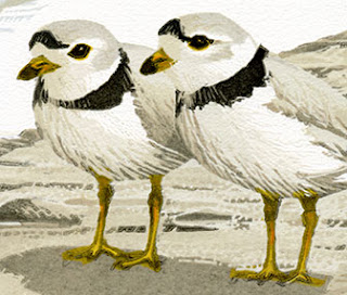 |
| Tiny pochoir bits, Step 10 1/2 |
Did I mention these bits would be tiny? So tiny. But in the end, so necessary.
 |
| "Companions," reduction linocut, 12" x 12", edition of 12 |
Yep. NOW it's finished. And the intended recipients for the first print of the edition have seen it and approved, so I can tell you now that it's an image to celebrate a wedding! This pair of plovers is headed out on a new adventure... sometimes across smooth sand, sometimes tripping along rocky shores... sailing through gentle waters or holding on tight over wind-swept waves. Wherever the path takes them, they'll travel it together, and I wish them success and delight every step of the way!
Okay, let's wrap this thing up, shall we? How much more can there be? There's almost nothing left on this block! The background is ...
