Showing posts with label #linocut. Show all posts

Tuesday, May 24, 2022

Linocut in Progress: Wrapping up the loon

Alrighty, then! Let's wrap up this loon linocut so it can swim off to new horizons.

We've finished with blues, although because I am working with transparent color, everything will continue to stay in that blue range. For Step 6, though, I'm rolling out a nice gray.
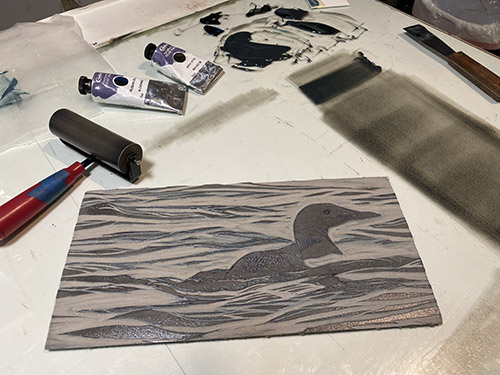
Reduction linocut in progress: Step 6 rollup

Looking good! I quite like how well the bird seems to be settled down into the water. Loons and cormorants are both heavy-bodied birds, and their low posture in the water is really characteristic. (Cormorants sit so low that sometimes all you can see is their head and neck, like a mini Loch Ness monster.)
Step 6 printed

Now we have the tiny (not-quite-1/4-inch-diameter) area of the loon's surprising red eye to contend with. In this case it's fairly shadowed, so doesn't have to be bright, but it does need to be there. This calls for some pochoir! I cut a little stencil from a piece of acetate, and "pounced" this color directly on to the prints. 

The really exciting thing about this print has been how fast it's been drying. I guess that's usually true for something that's only six color passes in to the process, but it has seemed to go along faster than usual. Smaller image, warmer days, less ink because so much of the block is already carved away... all these things contribute. But it was so nice to be able to just pop in and pounce this little red shape without having to wait long.

Step 7 pochoir stencil

It looks a bit alarming here as just a big, flat red spot, but I'm counting on subsequent layers in the bird to tone that down. Let's move on!

Hardly worth calling a step, but here's Step 7 printed

Oops. And then I got distracted and didn't take a photo of the Step 8 rollup. Although I think it was the same as Step 6 or perhaps a wee bit darker. I almost always save leftover ink at any print stage, and if the next color pass is in a similar or related hue, I will use the previous ink to start the mix for the next. Kind of like continuing to add vegetables every day to stretch a pot of soup. Or maybe like sourdough starter. You get the idea. 

There's very little surface left on the block now. Here's Step 8... 

Step 8 printed

Really, really close now, which means... hey! I might actually finish this in fewer than ten color passes! When was the last time THAT happened? It's certainly been a while. 
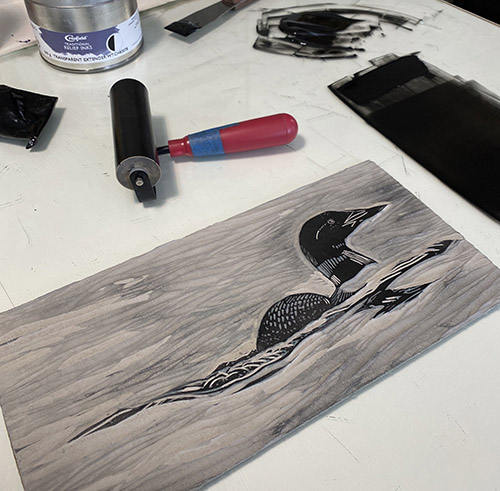
Step 9 rollup

The Step 9 rollup was almost-but-not-quite black, maintaining a good bit of transparency. As you can see on the block, the only places this color will be printed are the bird and its reflection. 

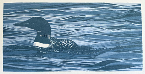
"Lone Loon" reduction linocut, 6" x 12", edition of 16

And there it is! An entire reduction print of 9 colors in about a week! Whew. It was really nice to spend some concentrated time in the studio, especially since I am now moving at high speed to prepare for the busy summer season. I've been framing, labeling, transporting, hanging work... all the glamorous bits of the artist's life. (It's all about "stuff into the car, stuff out of the car.")

I've got a bit of excitement on the not-too-distant horizon... an opportunity to get away with a sketchbook and my thoughts for a couple of weeks. More about this as it comes closer!

Wednesday, May 18, 2022

Linocut in Progress: Onward with the loon

Continuing with the little loon linocut... it's a festival of blues. Not really a blues festival, though. That's a whole other thing. (sigh) Remember concerts?

But I digress. 

The strange phenomenon of how relative colors change the overall look seems to be even more dramatic when trying to photograph an image with a lot of blue in it. Digital cameras just freak out for some reason. At this point I had started to add a slight greenish tone to my blue inks, but in the photo of the completed Step 3, you really can't tell.

Reduction linocut in progress, Step 3 printed

For the next step I decided that I wanted to create the impression of an overall lighter shape zig-zagging through the waves. I removed a good amount of material from the block in this area and then printed another blue. So of course, weirdly, when Step 4 was printed the effect of the previous greenish tone in Step 3 became more apparent. 

Step 4 printed

Yeah, really. Why do I even try to take photos at each stage? It's all so visually confusing.

Let's add something a little more green again and see what happens, shall we?

Step 5 rollup

And hey, while we're at it, let's do a little video of the reveal at Step 5, just for fun.


It might not look like anything's happening, but look in the darkest shapes and you can see that they've been broken up a bit more. Lower right corner is a good spot to compare with the previous photo. 

Step 5 printed

Part of me wanted to just jump in with the final dark at this stage and call it finished, but you know me. I have to complicate things a bit more first. It's kind of a rule!

Thursday, April 14, 2022

Linocut in Progress: The image is done, but the adventure is just beginning!

Reduction linocut in progress, Step 9 revisited

In my last post I tried to explain my concerns about the visually too-light appearance of the bird's heads.  

I'd been watching (and, let's admit it, agonizing over) this phenomenon of visually-changing value since the first stages of the print, and at this point I decided something needed to be done. But the portions of the block that created the birds' head shapes have long been carved away. To make an adjustment to the value I either have to cut a second block for just those shapes (tedious, time-consuming, and difficult to register) OR... do a little pochoir action. 

Pochoir it is! 

Pochoir stencil

I placed a sheet of clear acetate on top of a print and traced the shapes I wanted to ever-so-slightly darken. I cut these out with a sharp Xacto blade, and used this stencil to "pounce" color directly on to each print. I don't seem to have taken a close-up photo of the "before" and "after" stages, but I think when you see the final image you'll be as relieved as I was that the heads did not disappear. We'll call this brief, undocumented, side trip into another technique.... hmm... Step 9 1/2, shall we?

So! Problem solved (hopefully), it's on to Step 10! 

Step 10 rollup

The nice thing about there being so little material left on the block at this stage is that I could do some spot inking with two different dark values. The shadows in the rocks, sand, and birds' legs are a lighter, warmer, more transparent color than the details of the birds' faces, which are not-quite-black. 

Ready to roll. The final pass?

Step 10 printed

Hmmm. I do not have a sense of triumph here. It's nice, but something is missing. Some little bit of oomph or sparkle or... something.

I think the birds need some bling. Something small. Tiny, even.

Oh. 

I know. 

How about some tiny, tiny bits of bright orange in the legs and beaks? Yep. I think that's it. Pochoir to the rescue again! 

Tiny pochoir bits, Step 10 1/2

Did I mention these bits would be tiny? So tiny. But in the end, so necessary.

"Companions," reduction linocut, 12" x 12", edition of 12

Yep. NOW it's finished. And the intended recipients for the first print of the edition have seen it and approved, so I can tell you now that it's an image to celebrate a wedding! This pair of plovers is headed out on a new adventure... sometimes across smooth sand, sometimes tripping along rocky shores... sailing through gentle waters or holding on tight over wind-swept waves. Wherever the path takes them, they'll travel it together, and I wish them success and delight every step of the way! 

Wednesday, December 29, 2021

Linocut in Progress: Into the subtle blues...

Well. 

Despite the uproar that is the holidays (even for those of us grinches who don't necessarily feel celebratory), I have been spending a little time in the studio. I have three subtle color passes with which to catch you up (wow, that was a sentence), and if you don't have time to read a narrative right now the summary goes like this: Step 4: Okay, Step 5: Disaster, Step 6: Back on track. Hopefully. 

It's a mildly cinematic arc, and from time to time I wonder if I shouldn't turn Brush and Baren into a vlog, but for now you're stuck with old skool still photography. And honestly, hair-pulling isn't one of my better looks, especially on video.

STEP 4! 

Time to get away from subtle grays and engage the subtle blues. Yep, it's time to work on the water. The overall tone of this image is going to be soft and subtle all the way through to the end, I think, so we're sneaking up on these next stages. 

As you can see in the upper edge of this photo, it took a little bit to find a blue that felt just right, but I got there eventually. 

On the press you can barely see that the block has any color on it...

And the resulting print stage is similarly... um... not dramatic.

Reduction linocut in progress: Step 4 printed

In fact, in this photo you can barely tell there's any blue at all... but, trust me. 

This step was achieved before the winter solstice, and the prints hung on the drying rack for about a week before I could get back to them. When I finally did... disaster struck.

I use a LOT of transparent base in my ink mixing. For probably close to a decade now I've been using the Graphic Chemical 1911. It's not a relief printing ink, specifically, but it can be worked to a good consistency, and it has served me well. From time to time, however, I've received a batch that might have been a bit old... and took a lot more effort to get into shape. 

At the conclusion of Step 4 I had used up the last bits of my open can of 1911, so for Step 5 I cracked a new one, from a shipment I received maybe a month ago. I was alarmed to see that there was some discoloration and skinning along one edge, but thought I could work around it. This turned out to be a bad decision.

Second can. Worse than the first.
It's hard to explain the problem, but the short description is that although the ink seemed to work to the proper consistency, I couldn't get it to roll out evenly OR transfer evenly from block to paper. I tried changing the press pressure a bit, since the ambient humidity had changed since the last session and the previous ink was very dry. I also added some Setswell, which loosens the body of the ink and helps with adhesion. I tried and tried and tried, and soon I was halfway through the edition with very mixed results. I did finally get to something sort of workable and finish the run, but it was painful. 

And yes, I did open a second can of 1911. And it was worse. 

I cleaned up and turned out the lights and walked away. 

Here's what the linocut looked like at the end of Step 5, though. Mostly.

Step 5 printed. Painfully.

The next day I went back to carving, because that's what one does. But it was clear I needed to solve my ink problem. I do have a third can of 1911... but it's from the same order and I have no reason to believe it's going to be any better. 

I dug around through all my ink stash, and voila! I found a small tube of Cranfield's transparent base. I bought it to try some time last year, but had never used it. 

The base is very loose right out of the tube... much softer than I ordinarily like, but it mixed well with my pigmented inks (some of which are also Cranfield, so no surprise there) and rolled out nicely. And in fact the entire color pass went off without a hitch. Whew.

Step 6 printed. Without problems. Whew.

So. The good news is that I seem to have a solution for my problem. The bad news is two-fold. First... I don't have any more of the Cranfield base, so forward motion is stalled. (But I do now have some on order.) The second problem is that the Cranfield product is almost twice the price of the 1911. (sigh) But what price does one put on lowered anxiety levels in the studio, eh? 

There are some small details of the birds' beaks that will require some spot inking and masking, so probably this will be a good time to turn my attention to that step... and of course I need to carve for Step 7. Yes, I'm going to experience some more delay with this piece, but it could be much, much worse. And I'll start the new year with a new solution for my transparency needs, so that's a positive! 

So, friends of linocuts, Brush and Baren, crazy studio antics, and... well... me... Thank you all for sticking with me through the last couple of very strange years. Here's hoping that the new year brings us all more opportunities to see each other in person and to share some joy and laughter and beauty. See you in 2022!

Tuesday, December 14, 2021

Linocut in Progress: And we're off! In a blaze of... gray.

And here it is the middle of December! How the heck did that happen? 

I've been flailing around a bit since the completion of the merganser linocut, not certain what I wanted to do next. I do have a list of "requests," thematic ideas that have been mentioned to me or that I want to explore, but somehow none of them grabbed my attention. Oddly, it was something quiet and (yes, yes, here's that word again:) "simple" that came to the front of the line. Let's see how it goes, shall we?

We're having a couple of gray days here just now... a skiff of snow, but not really enough to measure. A mere dusting. That's fine with me... I'm sure there are plenty of snow days ahead and I am happy to wait for them. And since the first two (and probably three) color passes on this image were grays, well... it just seemed appropriate.

Yep. That's gray, alright.

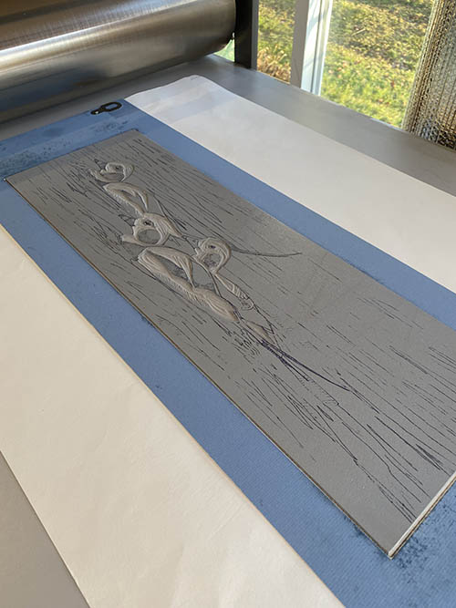
So. It's gray. It's very transparent. And we're working with that format that I just can't seem to get away from! Long and skinny, 8" x 24." Even with just one color pass, though, I'm guessing there are a few bird geeks enthusiasts out there who can already identify the species. 

Reduction linocut in progress, Step 1 printed

Off to a good start... a little more carving and... let's print another gray! This color was made from leftover scraps of the first color with a little tiny bit of warmth added by using a skosh (technical term) of sepia. (And this gray ink, BTW, was actually a leftover from the merganser linocut. Another reason to love traditional oil-based inks.)
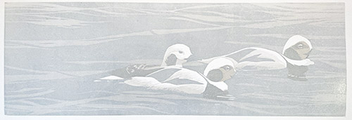
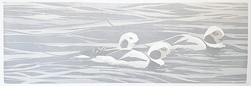
Step 2 printed, more gray. Can you tell what they are yet?

So here's that second, warmer gray printed. Have you identified the bird species yet? I'll give you a hint: They are in their winter (non-breeding) plumage. 

Still not sure? Okay. Let's print another gray, but this time... ooooooh. Let's cut a mask. Because not cutting a mask by the third step just wouldn't be, well... Sherrie enough.

It's a bird! It's a plane! It's a newsprint mask!

Intriguing, eh? I did manage to keep it not too fussy, and the trickiest part of this entire step turned out to be finding the appropriate gray. Again I wanted to warm it up a bit, so I started with the leftovers of the previous pass and added yet another skosh of sepia. 

Pick a gray, any gray.

Aaaannndddd.... here we are, all printed.

Reduction linocut in progress, Step 3 printed

Have you identified them yet? No? Here's another hint: they used to go by another name. The new name is a bit boring, but descriptive. 

From here I'm moving on to some pale blue-grays. (Because: water.) The entire image is going to be much more subtle (I hope) than the merganser piece, with a softer and less contrast-y color palette. At least that's where I think we're headed. Only time and rolling out some ink will tell.

Sunday, August 22, 2021

In-Person Demo at Ann Korologos Gallery


It's hard to believe, but it's been nearly four years since I left the mountains of Colorado for the coast of Maine. Harder still is the realization that I haven't been back since I moved! Like the rest of us, my travel plans for 2020 were scuttled, so even though I still have some trepidation about it I am glad I can make at least a short journey this week.


I will be kicking off the adventure with a live, in-person printmaking demonstration and conversation at the Ann Korologos Gallery in Basalt. This coming Thursday, August 26, 4:00-6:00pm. Reservations are required. Please call the gallery at (970) 927-9668 or email art@korologosgallery.com. I hope to see some local peeps there!

Sunday, January 3, 2021

Linocut in Progress: Rolling in(k)to the new year!

Wow. It has been a while since I've had photos like these to share. YES... there are fresh lino chips on the studio floor... YES.... there are sheets of paper hanging on the drying rack. YES. This is ink rolled out on the slab.

Yes. I have a new linocut in progress. 

Step 1 rollout

As usual, the early stages are subtle. For Step 1 I only had to carve two small areas, and then I rolled a pale transparent gray over the entire block.

Reduction linocut in progress: Step 1 printed

I was amazed that things went so smoothly for this first color pass, especially after a rather protracted period out of the studio. I had zero issues with coverage or viscosity... the only adjustment I had to make after I pulled the first print was to lighten the color a bit. (In the top photo you can see my first gray all the way on the right, and the one that I ultimately printed is on the left. That dark one in the middle... never mind about that. Pretend you didn't see it.) 

The tricky thing about this piece (well, I think it's going to be ONE of the tricky things about this piece) is that most of the image area is going to be subtle, pale grays. The main focus will be in the the upper third of the space. Compared to a lot of images I've worked on lately it seems to be quite simple... even a bit minimalist. Except you know me. I really doubt I'm going to be able to keep it simple. 

In fact I've already started making a bit of trouble for myself by adding some texture and temperature changes in the second pass. Probably you won't be able to really tell on a computer monitor, but the second color pass is a blended roll, from a cool gray to a warm gray. Both very light and very transparent. There's a little bit of texture happening right along the edge of the top third.... and there will be more of that as this progresses. 

Unfortunately I don't have a photo of the rollout for Step 2, but here it is printed.

Reduction linocut in progress: Step 2 printed

Although the temperature change from the blended ink color isn't very obvious, you might see that this particular print had a little bit of the dreaded "Sharpie bleed." After I transfer my drawing to the lino I usually draw over it with a Sharpie brand permanent marker. The Sharpie drawing will hold up through multiple inking and cleaning stages, but sometimes it also will bleed back to the prints during the first color pass. I thought I had avoided that this time... After I made the Sharpie drawing I sanded the linoleum and cleaned it with a citrus cleaner. It was mostly fine, but a couple of prints did show some transfer. No big deal, this will all be covered up in subsequent color passes, and as an extra measure of "safety" I moved the Sharpie-bled prints to the front of the printing queue. This makes them first in line for mistakes on subsequent color passes.

So! Things are moving again, albeit a bit slowly. The next stage COULD have gone really quickly if I had decided to keep the background simple... but, let's say it together, "Oh, nooooooooooooo. Why would I want to keep things siiiiiiimple?" Instead, let me embark on what can (in a G-rated blog post) be called a boatload of tiny detail carving. Because it might be a new year, but some things never change. 

Wednesday, September 2, 2020

Project Postcard in the time of pandemic...

'Way back in March, when everything started to go pear-shaped, many organizations with big annual events on the horizon were obliged to peer into the murky future and make decisions about the rest of the year. Each change or cancellation was painful, but one of the toughest ones for me was the weekend shenanigans events at the Woodson Art Museum's annual Birds in Art exhibition. 

Birds in Art is one of the most prestigious wildlife art exhibitions in the world, and I have been lucky enough to have my work selected again this year. The exhibition is always a beautiful celebration of all things avian, and the gathering of artists from around the globe for the September opening is a highlight of every year.

This year the exhibition will open to the public on schedule (with precautions in place, of course) on September 12. But there will be no "Artrageous Weekend" festivities... no gathering of the tribe. (Insert sad face emoji of your choice here.)

But some activities will still go on, albeit in a different format. Each year Birds in Art artists donate 4 x 6-inch art "postcards," which are mounted on the walls of a secret room. Anyone who wants to play pays $50 for a chance to go in to the room for 1 minute and select a piece that appeals to them. Signatures are all on the back, so there's no way to know for certain if a piece is by a particular favorite artist. 

Funds raised through Project Postcard are used to buy work from the exhibition for the museum's permanent collection, so it's win-win-win! Buyers get a little artwork gem, several artists get their work purchased, and the museum gets new work for their collection. Full disclosure, I myself have had work purchased for the Woodson Museum's collection through Project Postcard, so I am always happy to contribute. This year the museum is having to forego the "secret room" aspect, but the clever staff have worked out a "contactless" system. Hooray! 

Here are my two submissions for this year; distorted, of course, to keep them at least a semi-secret for a few more days until they're winging their way to new homes. 

Thursday, July 30, 2020

Linocut in Progress: It's all heating up...

And I mean that quite literally. It is HOT here on the coast of Maine just now-- the kind of heat that makes this formerly-of-the-high-desert printmaker wonder what she was thinking when she moved to a place where 90-degree temps can be accompanied by equally high humidity levels. To make matters worse... it just doesn't cool down at night. Back in Colorado we might have 100-degree days, but at least I could always be sure that once it got dark I could cool the house down and be ready to meet the next day's onslaught.

Here? Not so much. And I am cranky.

But I'm trying to work, despite doubts about how ink and paper behave in these conditions. It's slow going, since I frequently have to stop to wring myself out, but at least I'm trying!

I'm back to a square format for this piece; and although it will have a few of my usual subject elements (birds and water, of course), there will be a twist of complexity in the foreground that I am both intrigued by and nervous about.

But to get started, here's a soft blue in the background.... not over the entire block, it's not needed everywhere.

Linocut in Progress, Step 1

Not much information there, but that's okay. Let's try to keep some suspense going for a while. 

The second color pass was a blue-to-green blended roll, again just in the upper half of the image.

Reduction linocut in progress, Step 2

It was all feeling fine at this point, but I started arguing with myself about whether or not I should be masking color out of the foreground, since the color temperature of the bottom two-thirds of the image will be much warmer than all the color that's been printed so far. My concern is with the interaction and influence of the already-printed color and the color-to-come, but I am too hot to think clearly and my brain cells are dripping down my back along with the rest of me. 

It is, however, quite satisfying to see my studio look as though there is something happening in it again. And look above my drawing/carving table! Can you see that all my carving tools are now in a nifty little rack attached to my shelf? You can thank my friend and neighbor, J, who has a lovely habit of taking an idea vaguely described by me and making it appear as if by magic.

Studio view... so nice to be working, even if I'm melting
and the paper is curling.
Sooo.... studio view and sweltering heat aside, I think I can manage one more color pass for the upper third of the image. This time it's a sort of gray-blue to lavender-blue blend... and, surprise! Some of the subjects are starting to be revealed.

Reduction linocut in progress, Step 3

It's time to make yet another pitcher of iced tea and check on the status of the ice cube trays, and then it's back to the carving table. 

Monday, September 9, 2019

Birds in Art 2019!

One of the highlights of any year (but especially of those years in which I have a piece in the show) is the annual Birds in Art exhibition at the Woodson Art Museum in Wisconsin. Birds in Art is the museum's flagship juried show, highlighting work by some of the world's best wildlife artists.

Of the approximately 130 artists with work in this year's exhibition, 73 attended the opening. Some travelled from as far away as Australia, Japan, the Netherlands, and Sweden.

The opening weekend is always a stellar event, and a fun opportunity to visit with friends, colleagues, and the amazingly supportive and enthusiastic citizens of Wausau and its surrounding communities. In addition, colored-pencil artist Alan Woollett of England was named this year's Master Wildlife Artist. Birds in Art includes a mini show-within-the-show of fifteen of Alan's pieces, and Saturday visitors were treated to his presentation under the big tent in the museum's sculpture garden.

At the Saturday morning public opening. Find the linocut on the wall in this picture!

Funny thing about trying to shoot a panorama when people are moving around.
One tends to get some funny camera effects. Anyway... there are actually TWO
linocuts on the opposite wall... mine in the corner and Sue Medaris's by the door.

A better look at that corner, except missing Sue Medaris's piece.
To my left, Chris Maynard, to the right Paul Rhymer.

Patron dinner... only half of us in this room!

Alan Woollett's Saturday morning talk.

An added bonus for me (and hopefully for exhibition visitors) is a short video put together about the process for my piece, Four on the Fence, which is included in the show. The video can be seen on the Woodson Art Museum's YouTube channel, or on the museum's app. Or right here:


Birds in Art continues at the Woodson Art Museum until December 1, so don't miss it!

Monday, August 27, 2018

Linocut in Progress: A mask and muddle

Whew! I don't know about you, but hot weather just makes me move like I'm under water. I started this edition with 26 prints (I've already trashed one), but it seems like it takes forever to print each color pass. This morning I got through three NOVA programs on PBS before I finished printing, and that didn't include clean up.

But I'm ahead of myself.

Things continue to be a bit weird in the color department. If you've been following along you know that the first color pass was a transparent peachy color and the second was a transparent lavender. Which of course gave me a rosier peach. But I needed to start dragging this whole image back into the realm of blues, soooooooo... the third color pass was a transparent blue.

Reduction linocut in progress: Step 3

Which is why everything now looks a bit gray. In good light with good photography you might be able to tell that it is blueish-gray... but in this case you'll just have to take my word for it.

And now the trouble. I seriously need the next color pass to look blue... AND I need it to be a rather pale blue, no darker than the current overall value of the image. What the heck am I gonna do?

Had I taken the time early on to cut a fussy mask and confined the peachy color to small areas, getting a light blue would be easy. But I traded the tedium of cutting masks for the anxiety of balancing opaque and transparent inks. I'm not sure that I did myself a favor either way.

ANYWAY. I got out the white. And my leftover bits of transparent blue from the previous color pass. And a little more blue ink. And just because I didn't have a large enough pile of ink, I got out some more transparent base, too.

The good news/bad news about using white is that it's opaque. Using it will help reduce the influence of the previous color passes on the new one. But it's also... opaque. (Have I mentioned that?) It's not as luminous as a transparent ink, so it's going to influence the quality of every single color that comes after it.

Hm.

I decided to take a weird sort of middle-ground. I mixed leftover scraps of the previous transparent blue with a blob of white. This made a nice pale blue that was more opaque than not. It was also unpleasantly... chalky.

So I added more transparent base. This might seem counter-productive, since my purpose here is to put down a color that looks blue, but my hope was to reduce that icky flat quality of the white ink.

I also decided to keep the color entirely out of the body of the bird. (What? You didn't know there was going to be a bird? Clearly you have not been paying attention. Water + bird = typical Sherrie linocut.) This meant cutting a mask, but a much simpler one than I faced 'way back at the beginning. Here it is in place on the inked block:


And, boy. That block looks kinda opaque, doesn't it? (Did I mention that white ink is opaque?)

Fingers crossed, breath held, assorted printmaking gods invoked.... and....

Reduction linocut in progress: Step 4

It worked! The blue is perhaps not quite as pale as I might have liked (although it's lighter than it appears in the photo), but it is definitely blue and I can work with it. In fact I think the next layer is going to be back to another transparent blue, but this time I'll let it interact with the bird.

Naturally we've got two days of hot and humid ahead of us, so I don't expect to print before Thursday. But I'll get the carving done and maybe start playing around with another idea while these prints get to the correct stage of dryness.

Any guesses about bird species yet? North American birders worth their waterfowling salt ought to be able to figure it out. The cool thing? It's a bird found in both Maine and Colorado in the winter. (Although when they do turn up in Colorado, everyone gets their birding knickers in a twist.)

Monday, August 20, 2018

Workshops everywhere, and some linos, too!

Whew! July and August... what happened to them?

After two weeks of workshops on at Hog Island Audubon Camp and a short workshop at Maine Coastal Islands National Wildlife Refuge I immediately... led more workshops!

The first week of August I was joined by eleven fun and inspirational women for a week-long field sketching adventure, hosted by the Farnsworth Art Museum in Rockland. Naturally it was a week of record heat and humidity, but we were fortunate that our class met mornings and we were able to avoid the worst of the oppressive afternoons. We spent time at Owls Head Light, the Rockland South Beach, and in the garden (complete with chickens!) of one of our group members.

Sketching at Owls Head Light

We spent the hottest morning inside the museum, first drawing from Ai Wei Wei's Circle of Animals gold zodiac heads, and then taking a close look at the preliminary drawings for a number of Andrew Wyeth's paintings. Fun!

Sketching in the Ai Wei Wei exhibit at the Farnsworth Art Museum

The group had such a great time that we've scheduled a "reunion" sketch date next week in Rockport Harbor. I'm looking forward to seeing everyone again and filling a page or two of my own this time!


I thought I'd be getting back in the studio the following week, but I was called to sub for some workshop sessions back on Hog Island for Family Camp. This time I was sketching with kids and parents and grandparents...

Sketching in the gardens on Hog Island


Whew! All done now, right? Not quite! I had a pile of framing, packing and shipping to do for upcoming shows at Ann Korologos Gallery in Basalt, Colorado and Oh Be Joyful Gallery in Crested Butte, Colorado. It was the first time I had to manage all that in my new place, so it took extra time to figure out new working systems. But I got it all done, and I know at least some of the work has already made it to its destination.


At long last I got into the studio last week, to work on two small linocuts for Project Postcard, coming up during the Birds in Art exhibition at the Woodson Art Museum in Wisconsin. Carving went well, but the morning I set up to print... disaster!!!!

If you've been following along since my move you might know that Presston, my lovely 30 x 60 Takach press, came out of his 6-month storage adventure with a buckled laminate surface on the bed. After some panicked correspondence with the good folks at Takach I was just about to order a new press bed when my neighbor asked if he could take a look at it. 

He pronounced it fixable, and proceeded to help me pull up the loose portions of the laminate and re-adhere them. Hoorah! I got a couple of editions through the press in between the chaos of workshops and workshop prep and kept my fingers crossed.

Unfortunately, no doubt encouraged by our two weeks of record heat and humidity, the portions of the laminate that had been intact in June decided to pull up, creating a big bubble on half of the bed. There was enough flat space for me to print the two tiny (4 x 6) pieces I was working on, but once again I was dead in the water for anything else. 

This time when my neighbor came by we agreed that the best thing to do would be to remove the laminate across the entire press bed... including the areas we had fixed in June... and stick it all back down again. 

As you can imagine, this was a multi-hour, multi-day project. The old adhesive came up fairly easily, but the new stuff we put on in June? Ooph. We finally finished it yesterday. So far it all seems good... so tonight I tore down some paper and started to prep for a new, largeish lino! What a relief. No pun intended.

As for the little pieces created for Project Postcard, I'm afraid I can't show them to you. At least not in full until after the event. But I can make a silly warped image of them...


Assuming I don't run into any more press-related disasters I expect to have this new piece underway tomorrow, so hey! It looks like we might be getting back to our regularly scheduled... schedule. Stay tuned!

Linocut in Progress: The final step... twice. No. Three times.

 Okay, let's wrap this thing up, shall we? How much more can there be? There's almost nothing left on this block! The background is ...