Showing posts with label demonstration. Show all posts

Sunday, August 22, 2021

In-Person Demo at Ann Korologos Gallery


It's hard to believe, but it's been nearly four years since I left the mountains of Colorado for the coast of Maine. Harder still is the realization that I haven't been back since I moved! Like the rest of us, my travel plans for 2020 were scuttled, so even though I still have some trepidation about it I am glad I can make at least a short journey this week.


I will be kicking off the adventure with a live, in-person printmaking demonstration and conversation at the Ann Korologos Gallery in Basalt. This coming Thursday, August 26, 4:00-6:00pm. Reservations are required. Please call the gallery at (970) 927-9668 or email art@korologosgallery.com. I hope to see some local peeps there!

Monday, July 5, 2021

Printmaking workshop and presentation at the Wendell Gilley Museum, Maine

The 2020 edition of the Woodson Art Museum's flagship Birds in Art exhibition is on national tour, and hooray! It's in Maine at the Wendell Gilley Museum in Southwest Harbor. My linocut, A Tern of the Tide, is included in the exhibition, so I am delighted to be presenting some workshops and a talk about my process at the Gilley on July 16 and 17.

July 16: Single color intro to relief printing workshops. Choose either 9:00-noon or 1:00-4:00. 

July 17: A live presentation about my process that will also be streamed via Zoom. 7:00pm

Details and registration information available on the Gilley Museum's website.

Monday, April 16, 2018

From Battleships to Bird Art at the Camden Library

Hey, Maine peeps! This Thursday evening, April 19, I'll be giving at presentation at the Camden Library, 55 Main Street. Event is free and open to the public, so come on out!

"Dinner Party," reduction linocut, © Sherrie York

Sherrie York presents “From Battleships to Bird Art” as part of the Midcoast Maine Audubon lecture series on April 19, 2018, at 7:00 pm. The talk aligns with Maritime Month 2018 at Camden Public Library.  How did a material created for battleship flooring become a medium for bird art? Linoleum block prints, or linocuts, share their origins with naval ships, their process with woodcuts, and their history with artists from Picasso to Queen Elizabeth. Visually, linocut styles run the gamut from graphic social commentary to delicate floral, landscape, and wildlife images. 

Internationally recognized linocut printmaker Sherrie York will share her own linocut process, inspiration, and frequently bird-focused work. Her linocuts have been presented in national and international exhibitions, including the Woodson Art Museum’s prestigious “Birds in Art,” and the Society of Animal Artists’ “Art & the Animal,” and her work is represented in corporate and museum collections in the United States and abroad. She serves on the board of the Society of Animal Artists and is the Coordinator of the Audubon Artist Residency at Hog Island Audubon Camp in Bremen.

Monday, April 24, 2017

It's that time of year!

Ah, spring. Migrants are arriving. Grass is turning green. And warp speed must be engaged. 

April and May are The Crazy Months for me– a time when jury submissions are due and show notifications are received and the Colorado Governor's Show opens. I'm also getting together and delivering summer work for the galleries, especially since I'll be headed back to Maine at the beginning of June. Holy cow! That's not much more than a month away.

There hasn't been much happening in the studio in way of new linos, but it doesn't mean there hasn't been work going on. Quite the opposite, in fact!

First up was a commission piece for the Bird Conservancy of the Rockies, to honor a long-time staff member who is leaving the flock for another position. Jason has spent much of his time at BCR studying black swifts, a mysterious little species that nests behind waterfalls and whose insubstantial little feet oblige it to cling to rock walls instead of perching. 

"The Coolest Bird," hand-colored linocut ©Sherrie York (embiggenable with a click)

Their secretive nature and difficult-to-reach nests make it difficult for me to collect my own reference, so I'd like to give a big shout-out to photographer Bill Schmoker for his help there. I did see a black swift once. It was a black dot in the shade on wet rocks behind a waterfall. Not very helpful.

After the swifts were winging their way to their final destination I started work on an illustration project for Colorado Parks and Wildlife. Long-time readers of Brush and Baren may remember that the early posts of this blog (ten years ago now!) had more paint than ink in them. Funny how times change, although it's nice to revisit watercolor once in a while. 

Illustrations in progress. Western meadowlark, great horned owl, dusky grouse.
(No, this isn't the rare subspecies of footless grouse. I just haven't gotten there yet!)

Tomorrow I'm off to Colorado Springs to present a demonstration for the Colorado Springs Art Guild, and then Friday it's back to Loveland for the opening of the Governor's Show. In between I'm hoping to get a new reduction lino ready to roll. But of course there's framing to do and... 

I'll freak myself out if I think about it too much, so it's back to work. If in the next couple of weeks you happen to see a short, blonde-ish woman running around in circles with a brush in one hand and a brayer in the other... well... say hello. It's probably me.


Wednesday, April 12, 2017

Demo at Colorado Springs Art Guild

No rest for the weary around here! Next week I'll be delivering work to the Loveland Museum for the upcoming Governor's Show (more on this soon), but in between delivery and the opening of the exhibition I'll be giving a presentation and demonstration in another part of the state, at the Colorado Springs Art Guild's monthly gathering.

Click to embiggen

CSAG members and non-members are both welcome, non-members are asked to make a small donation to the program, so if you're in the neighborhood, please think about stopping by. The gathering starts at 6:30 pm on Tuesday, April 25th. Check out the Colorado Springs Art Guild website for more information.

Friday, December 9, 2016

Rosebud, Part II: More Cuteness. Can't help it.

Little Rosebud is the devoted companion of a good friend who moved away this past summer. I miss both of their smiling faces around here, so it was delightful to work on this demonstration piece and think about them as I did so.

No demo would be complete without a scary "ugly duckling" stage, and while this isn't the worst one I've had to contend with, it was hard to give up work on Rosebud's face to put in a background color.

I briefly considered doing something flashy for the background... maybe a blended roll... maybe two. However, you and I both know that if I started down that path I ran the risk of making this too complicated and less effective as a clear example of reduction printing. Restraint was difficult, but I managed it. Somehow.

Rosebud reduction linocut, Step 5

Blue. Just plain old blue for the background. Step 5.

Of course I wanted to jazz things up at least a little, so for Step 6....

Rosebud, Step 6

I left a border, but let Rosebud break up the boundary with her lovely doggy shoulders and some of her tousled, furry head. Subject-breaking-a-border is a design element that I've always liked for adding a little more dimension and presence to a simple piece.

Almost finished now. One more dark. I think.

Rosebud, Step 7

Geez, is that cute, or what?

I thought about calling it finished at this point, but decided that a little touch of color would be fun.

Rosebud, Step 8. Finished?

There was, however, a minor complication to this decision. I couldn't carve anything more out of the block, because Step 7 is the one I'm going to print at the demonstration*. (I pulled out one print at Step 6 to save for this purpose.)

The most logical thing to do would be to wait until after the demo, when I could carve away all the material around the collar shape and have a nice, straightforward print step. But, nooooooooo. Impatient Sherrie wanted to put this color on all of the other prints in the edition now.

Of course this means using a mask, but the shape is too small and fussy to make an accurate one. Instead I cut one that was only "approximate" to protect the rest of the image and spent time carefully wiping extraneous color out of areas of the block that the mask didn't cover.

The funny thing is that once the red was printed I was no longer sure that the Step 7 dark was dark enough. But, again, I have to leave the block at Step 7 until after the demo, so this decision will have to wait until next week.

I had so much fun with Rosebud that I'm thinking about doing a few more furry pets in a small format like this. There's a big, complex image in my not-too-distant future, but it could be a nice change of pace to make a few more prints like this one.

Until then, I've left one little Rosebud print pinned to the studio wall, where her silly cuteness makes me smile every time I look at her.

---------------------------------------
* Artist Talk and demo: Saturday, December 10 at Ann Korologos Gallery in Basalt, Colorado.

Tuesday, December 6, 2016

Can a demo be cute?

Darn right it can. This one will be.

I've been preparing for my Artist Talk and demo at Ann Korologos Gallery this coming Saturday.

To help visitors understand the reduction linocut process, I like to have a print mostly finished before I arrive at a hands-on presentation like this. For these destined-to-be-a-demo pieces I also pull out one print at each color pass so people can actually handle them and compare the changes.

For a demo it can be helpful to present a simple image, maybe 4 or 5 colors, but you know me. The fact that I've kept it under 10 is some sort of minor miracle.

The final reveal will, of course, be saved for another post, but here are the first steps of "Rosebud." (It's not what you think.)

Rosebud linocut, Step 1

This is a very small piece, just 5 x 6.5 inches, so it went very quickly. Not quite three days, start to finish. Well, finished enough. Here we have a nice light blue and some odd white shapes for the first step. Any guesses yet?

Don't worry, it will actually be fairly obvious by Step 2:

Rosebud, Step 2

Something furry with a button nose, apparently. This ink was a transparent gray.

Rosebud, Step 3

And another transparent gray for Step 3. At this point, however, I decided I wanted to lighten things in the hairs of our subject's chinny chin chin. It's as good a reason as any to have an example of selective inking and masking to show visitors, right?

Rosebud, Step 4

I masked the area below the mouth and printed a slightly warmer white. It looks clunky, but a lot of it will be covered up by subsequent color passes.

At this point the strangest thing started to happen. I started giggling as I worked. A small piece, a small edition, no pressure? After the last few intense months it was a joy to just play around, and who can't smile at this subject? (And believe it or not, it's already half finished at this point.)

Stay tuned for Rosebud, Part II.

Sunday, May 29, 2016

Linocut in Progress: The demo's end

So here we are, back in Salida with an unfinished reduction linocut demo piece that needs resolving.

I decided that the best way to prevent continual mucking about in the background was to carve it all out. So I did. From this point on the only printable surface on the block is bird and wire.

I wanted some highlights in the bird's wings, something a little warmer. I didn't want this color to influence the face, though, so I wiped it out before printing.

Step 8
The next step was a gray to keep those highlights crisp and get the twisted wire in to the proper color range.
Step 9
I was tempted, as I often am, to just leave it at this point. But the bird needs a little more definition to pull it away from the background.

Step 10
Again I thought about stopping here at Step 10, and part of me wishes that I would have done so. But the shadow on the bird's belly is so dark that to make it read "shadow" instead of "blue feathers" I'm going to need one more hit of contrast and oomph.

Step 11
The last color wasn't solid black, although it reads that way in the scan. But overall... okay. I think to be really effective the background on the left of the image should have been lighter to start with, but that color went down at Step 4 and after it was carved away I was stuck with it. If I REALLY wanted to correct it I could cut a second block and overprint something lighter, but that would cause its own problems, and this was supposed to be just a simple demo piece! Time to move on.

One thing I neglected to mention at the beginning of this piece is that it represents my first return to the printing on the thinner Awagami kozo paper since I got my press. Because I would be working by hand at the demo location I wanted something I could manage with a baren and spoon... and the 250# BFK Rives that I have been using was not going to work. The thinner paper was a little trickier to manage in the press at first, but once I got the feel for it I didn't have any problems. And I didn't tear anything, which would sometimes happen with a too-vigorous application of spoon pressure when hand printing.

Overall a satisfying experiment, even if it turned out to be a bigger deal than intended. (And I got a good set of step-by-step prints and an edition of 10 or 12 out of the effort, too!)

Friday, May 27, 2016

Linocut in Progress: When good demos go bad

For the past month several of the artists exhibiting in the Colorado Governor's Show have been presenting demonstrations of their work throughout the town of Loveland, where the show itself continues through this weekend.

As part of the demo series, I made the journey north last weekend to participate in the Print Day Open House at Artworks. Since it can be a challenge for folks unfamiliar with reduction linocut to wrap their heads around the process I usually like to have a "simple" print in progress before I arrive for a demo, with a print pulled out at each stage so visitors can see how the image evolves.

Ahem.

Simple. Four or five colors should be enough to get the idea across, right? Right. But longtime readers know me well enough to know that the best laid plans... don't actually exist. At least not where I am concerned. The line between creating a print example and making an example of myself is often very, very thin.

To wit:

Step 1

Step 2

Step 3
Step 4: Might be able to finish this in two more steps, except....
Squirrel!* Now I'm headed down a whole other path. Step 5
Step 6 (Which was getting too dark, so I had to go lighter.)
Step 7 (And then was too bright, so time to tone it back down.)

Yep. By the time I went to do my demo I was already at seven stages and nowhere near done. My original intention was to leave the background quite plain, as in Step 4. But then I thought perhaps it would be fun to play with blended, or rainbow rolls... and things started to get a wee bit out of hand.


I rather foolishly thought that after this stage the finish would be simple... but as you'll see in my next post, it didn't quite turn out that way. I did enjoy experimenting, however. I think you can see that Step 6 was a lighter and brighter blended roll than Step 5, and that I toned everything back down with the blended roll in Step 7.

It's my tendency to ask "what if" that sends me off on these printmaking tangents. Sometimes they work and sometimes they don't, but I always learn something along the way. (Sometimes all I learn is how to clean up messes, but hey... that's a useful skill, too.)

(* You know... it's that joke about a dog's focus disappearing when a squirrel appears. Printmaker's focus distracted by blended roll.)

Wednesday, September 16, 2015

Birds in Art, duckies, and what comes after

Once again the Leigh Yawkey Woodson Art Museum outdid itself with the opening of their annual Birds in Art exhibition.

More than 600 international artists in a wide variety of media submit more than 1,000 hopeful pieces to the jury each year, and only a lucky 120 or so are included in the show. The caliber of art and artists is absolutely top notch, and the museum staff go out of their way to make the exhibition experience a great one for artists and art-lovers.

It's always a special honor to be included in the show, but it was extra-fun to be a part of this year's 40th anniversary festivities.


The opening weekend is a busy one, with multiple receptions, an artists' luncheon, a patron dinner, and "Artists in Action" demonstrations. And of course someone you know had to take the opportunity to talk to people about reduction linocuts.

Sharing the reduction linocut process during "Artists in Action."
And hey! That's Calvin Nicholls and his wife Ann looking on.
Calvin's papersculptures were recently featured on Colossal. (LYWAM photo)


A great variety of media were represented by demonstrations: including oil and acrylic by Robert Bateman and charcoal by Karen Bondarchuk. Wendy Brockman and Derek Robertson shared watercolor techniques, scratchboard got its day in the sun with Cathy Sheeter, and owlman Clarence Cameron demonstrated stone carving magic... but the real show-stealer was sculptor Paul Rhymer, who poured bronze right there in the museum garden. (And sorry, I don't remember who else was giving demos because I never got out from behind my table!)

Paul Rhymer pours bronze. Show off. (LYWAM photos)
Also during the Saturday morning opening, previously-honored Master Artists shared their Birds in Art memories in a presentation called "7 x 7 x 7." The seven artists each had seven minutes to share seven slides... and if they went over time museum Director Kathy Foley was there with a gong to shoo them off the stage. Great fun.

 LYWAM Director Kathy Foley keeps speakers on track. (LYWAM photo)

One of the best aspects of the show is the opportunity for the participating artists to just spend time together, talking shop (and sometimes talking smack) and catching up with what everyone's up to. The bulk of this happens "up north" at a barbeque at the Woodson family property. The icing on the cake? How about a cake decorated with details of the work of all the exhibition artists!

Can you find my pelican? Lower right.
Yep. I think I've mentioned that the Woodson staff go all out for this event.

This year each of us also received a new little buddy: a Birds in Art ducky! Our duckies are charged with going forth into the world and sending back photos of their exploits, so of course mine is already getting around. If you want to follow them, then #birdsinartducky is your hashtag. Me, I don't use Twitter, but the museum does, so you can follow along with the fun. Or you can check out the Woodson Museum's Facebook page, which has gone quite humorously yellow already.


You might think it's impossible for the museum follow a weekend like that with any more excitement, but you would be mistaken. Yesterday morning I received an email from Curator Jane Weinke... letting me know that the Woodson Art Museum will be acquiring my piece, "Cruisin'," for its permanent collection. Holy duckies, Batman! Err... Birdman. It's a darn good thing the next exhibition is a year away. I'm going to need that much time to get down off this cloud.

In the meantime, I'll be facilitating an Illustrated Journal workshop at Buffalo Peaks Ranch this weekend and opening the autumn exhibition at Oh Be Joyful Gallery in Crested Butte next week. Of course I'll also be getting back to work in the studio with a full dose of inspiration and motivation. And a yellow ducky.

Sunday, September 6, 2015

Linocut in Progress: Where the demo stands

I've been back in Colorado about a week and a half, and suddenly I'm pulling out the suitcase to leave again! Next weekend the festivities for the opening of Birds in Art at the Woodson Art Museum will be underway, and I'm off to Wisconsin to join the goings-on. It's the 40th Anniversary of this prestigious international juried show, and if the strange images that are showing up in my Facebook feed are any indication, there's going to be a lot of goofiness to add to the celebration.

But before I could start packing again I had to get my demonstration piece into good enough shape to have it be meaningful in the 90 minutes I have to complete it on site.

As I show you Step 4, keep in mind that this was going to only be a two-color image.

Demo reduction linocut, Step 4.
 Yep, one more blue pass. Just because. And then a lot of carving to get to Step 5:

Hey! There are birds in this lino! Step 5.
Back when this was going to be a two-color print, this was going to be Step 2, but of course all that went out the window immediately. I seems a little cheezy to end with just a flat dark after all the fussiness with the blues, so this is not the final step. I'm going to carve some details in to the birds and maybe in to a bit of the branches and THEN I'm going to print black. There won't be a lot of contrast, but one doesn't see a lot of contrast when looking within silhouetted shapes, anyway.

I'm not sure that it's going to be a completely successful image, but for something cranked out in two days it will be good enough for the demonstration. I pulled out a print at each stage, so my audience will be able to (hopefully) wrap their brains around the reduction process.

Success or failure, I'll show you the final result when I return from Wisconsin. Until then... check out this great article in Scientific American about the benefits of drawing for art AND science. It made me want to grab my sketchbook and run outside. Maybe I will...

Tuesday, September 1, 2015

Is that INK I see?


Indeed it is, and a completely chaotic work surface, too. As I mentioned in my last post, I'm scheduled to give a demonstration during the opening weekend festivities for the Woodson Art Museum's Birds in Art exhibition on September 12. That's not a lot of time to put together a new linocut, especially since I've been out of the studio for three months. And double-especially because I have to produce this one "old skool," with a baren and a little portable registration jig.

You should have seen me this morning... On a quest for the jig (on shelf under work surface), paper (precut last spring, in a drawer), and most alarmingly, my baren, which remained elusive for a good 20 minutes while I tried to discover where I had stashed it. All my inks and carving tools had been stashed away, too...

I had this ridiculous notion that I would make a "really simple" demonstration piece: One blended roll for the first step, and then a solid black silhouette over the top. Piece of cake.

Bzzzzzt! Wrong! I made a horrific mess mixing all the wrong colors, creating ugly blends, and wasting several sheets of paper before I decided I'd better just start with a solid blue rectangle.

Remembering how to print: Step 1

Okay, then.

Obviously my two-step plan is out the window at Step 1. At least I am reassured that SOME things don't change during a long absence, chief among them my inability to keep things simple.

I decided that since I was already on Plan B I might as well experiment with the background. Here you can start to see some efforts at funky texture, printed with a subtle blended blue.

A little less wobbly: Step 2

Step 3 was to be another blended roll, but the first tests didn't look all that great, so I went back to a solid transparent blue (again) and more carved texture.

My two-step print reaches Step 3

Aaaaaannd... here we are already at Step 3.

Aaaaaannnnd..... now I think there will be at least 5, possibly 6 passes before it's finished.
Go ahead. Say it.

It felt great to be working, even with all the frustrations caused by plain ol' rustiness. Unfortunately hand-printing wreaks havoc with the tendinitis that I thought would get a rest this summer but which has in fact gotten worse. (sigh) Thankfully I had the presence of mind to schedule a massage before I left home in May.... it's tomorrow. I also scheduled a haircut, which is today. You may applaud my foresight now.

The focus of the next few days is clear, and happily so. I had a fantastic summer away, but these last few weeks I've been twitchy to get back to linos. Unlike the insect bites I acquired in Maine, this is one itch I am happy to scratch.

Sunday, May 19, 2013

Where were we? Oh, right. Magpie linocut demo.

So 'way back in April... almost exactly a month ago, in fact... I started a demonstration piece to work on during my residency at the Woodson Art Museum. Do you remember it? Magpie? Fencepost? Swoopy background?

You can go back and look at the steps in the April 22 post if you like, or you can be satisfied with this "steps-up-to-the-point-at-which-it-went-in-a-box-and-got-shipped" photo.


Remember it now?

All that was left was the final color, which for reasons of practicality I decided would be plain ol' black. Fortunately it worked out to pull a couple of prints during the demos, but I still had the rest of the edition to finish when I returned home.

Here's the completed piece. I didn't really have any expectations for it, since I threw it together rather quickly, but I like the way it turned out. A bit "designier" than I've been doing lately, and only seven colors! (What?)

"Magpie Waits," reduction linocut, 6" x 9"
 I may go back and mess around with the gerenuk demo piece some more now, or I may just put it aside and start something new (more likely). It will be good to get back into a working rhythm again.

Monday, April 22, 2013

Linocut demo: Magpie and fencepost

Go ahead, start laughing now, everyone. I'm four days from departure for my residency at the Leigh Yawkey Woodson Art Museum and two days ago I decided I wanted a demonstration piece other than the gerenuk linocut I worked on earlier this month.

The change was partly motivated by practicality. I've been gathering supplies to ship ahead and I have decided that my larger registration jig is more than I want to deal with. But of course that's the jig I used for the gerenuk, so something had to be started with my smaller setup.

Enter another little magpie piece. In total it will involve just seven color passes, and I can say that with confidence because the first six are already done! The seventh will be finished on site next week.

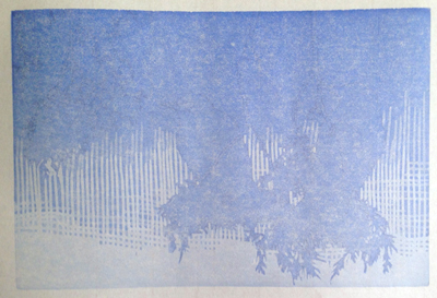
Step 1: Light blue

Step 2: Gray. The apparent bands of color are an artifact of my camera
phone and the fluorescent light over my table.

Step 3: Ochre to brown blend. 

Step 4: A second ochre to brown blend.
 I didn't want to get too crazy with the background on this demonstration piece, so just employed some "swoopy" lines.
Step 5: A rusty brown. It looks very orange in the photo, but it's not really.
Step 6: Would you believe this color pass was blue?


The apparent dark brown of Step 6 was achieved with the application of a transparent blue over the rusty brown. Basic color theory at work: complimentary colors (opposites on the color wheel) mixed together to create more neutral hues. The final color will be a blue-black, so using a transparent blue at this stage should support that and keep it from being too brown.

It's a "quick-and-dirty" demo piece, given that I didn't even have an image in mind three days ago, but I think it will do the trick. Whew. Now I can think about all the other things I have to do before I go!

Linocut in Progress: The final step... twice. No. Three times.

 Okay, let's wrap this thing up, shall we? How much more can there be? There's almost nothing left on this block! The background is ...