Showing posts with label Maine. Show all posts

Saturday, August 27, 2022

Linocut in Progress: Remember when this was going to be a simple single-color image?

Yeah, it was a thought, anyway. 

But that ship has left the harbor, as they say, so there's naught to do but complicated it all a bit more before wrapping things up. 

I think by now you can see there has been an intense amount of carving to this point. It's a lot to keep track of! But here we are, ready to print Step 6 (colors, um.... 12 and 13, I think). 

Step 6 rollup

In this photo the dark value for the rockweeds looks very blue, which indeed it was. After I took this photo I corrected the color a bit and toned it down before I pulled any more prints. Here's how it all looked after that correction:

Step 6 printed

I'm feeling good about the rockweed, but the crab is a bit behind because of printmaker neglect. (Although notice how even though the color looked intensely orange on the rollup, the crab now looks a light peachy color. That's the effect of putting a bright transparent color over a semi-transparent white that was printed over gray. Are you confused now?) 

What else should I fuss over? Oh, of course. The periwinkles (little sea snails). There are a few in this image, but they've gotten lost. I'll try the semi-transparent white ink trick again to see if I can't lighten them up.

Here's the roll up, spot ink only, on the press:

Step 7 spot ink (colors 14 and sort of 15)

You can probably tell I was doing this late at night (note the dark window behind the press), which is no doubt why I didn't take a photo of the print at this stage. And of course I forgot to go back and do it in the daylight before I went on to the next step. 

Not much changed, although the periwinkles became alarming. Fingers crossed I can tone them back down in the next pass.

Step 8 rollup

Which iiiiiis... press pull Step 8 (colors 16 and 17). This time it's a nice crabby brown and a dark gray made from sepia and leftovers of the previous too-blue dark. (Always save and use your ink leftovers. They can create a tasty color!)

Step 8 on the press....

You can see here that the areas of the block that define the rocks have been mostly carved away by now. I'm thinking this will be the final stage of dark for all of the image except the crab. 

Step 8 printed

We're in the home stretch now! I'm still not thrilled with how the periwinkles are standing out (even more predominantly here), so they'll get spot inked with one more dark. 

Step 9 (color 19) rollup

Aaaaaannnnndddddddd.....

All done! This image slightly embiggenable with a click.
As-yet-untitled reduction linocut, 24" x 18" Edition of 10.

Whew. That was definitely more than I thought I was headed for, but I'm not mad about it. In fact, I am weirdly inspired to jump in to another piece with similar subject matter. I'm a huge fan of an intertidal zone, and there is so much to explore!

But first I think I need a nap.

Tuesday, August 23, 2022

Linocut in Progress: Back into the studio!

Goodness. 

I knew it had been a while since I posted anything here, but good grief! More than two months? That is rather appalling, and it doesn't seem possible.

But then, that's summer. It always seems to disappear in a morass of busy-ness punctuated by stretches of lethargy when it's too hot and humid to move or even think. 

A couple of weeks ago the weather, my schedule, AND my attitude started to improve, and I got myself back into the studio. I've been feeling for some time that I wanted to try something a bit different, so I dug out a large piece of lino (18 x 24 inches!... about 46 x 61 cm) and drew up a complex image that I (ahem) intended to print in a single color.

If that quote about roads and good intentions just popped into your mind, well.... you're not wrong.

It took less than a day for me to stray from the path and wonder if perhaps a little color wouldn't hurt. I decided to carve for white and then print a layer of rough color... nothing special or careful... and then I would carve for the "final" black layer.

Step 1 rollup

Sure. Why not? I mean, if I hated it, I could always just finish the carving and print as straight black-and-white. Right? Right?

Step 1 printed

I slapped some color on to the block willy-nilly and printed it. Okay. Interesting, sort of. Any edition I might come up with will be variable, but I don't hate the idea. 

Althooooooough.......hm.

This color seems a little too sketchy. It would probably be distracting under a single black layer. "One more" random color pass to even things out couldn't hurt, could it?

Step 2 rollup

I carved the block some more, darkened the leftover inks from the first color pass, and did a second haphazard roll-up.

Step 2 printed

In general I felt better about that decision, but the color overall seemed a little too bright. Too yellow. (Which is hard to tell in this photo... the light has been terrible for photography lately.) If I were to go ahead and carve the entire image and then plop straight black over this...well... I don't think it will look as nice as it might if I tone things down a bit. 

(You can absolutely see where this is going now, can't you?)

I carved some more, telling myself the entire time that I could still print a "plain old black-and-white version" because I hadn't crossed the threshold of removing material from the block that would create awkward visual holes in the image. I mixed a color that was very greenish, and another slightly warmer gray... and printed a third layer.

Step 3 printed

Okay.

That's more like it. I can go ahead and just cut the whole block now for a final pass. Four steps... that's more than I expected, but okay. This is a BIG block. It's taking a long time to carve even for these not-very-intricate stages. It will be good to just focus on carving for several days and be done with it.

Except that, of course, that's not what I did. Because as the prints sat there staring at me with their mottled ochre-and-gray attitudes, the little voice in my head started suggesting that the color could be just a bit more interesting if I stopped and did "just one more" stage. 

Sure. Just one more.  

Sunday, May 1, 2022

Art at the Grill / Damariscotta, Maine


Things are starting to ramp up for the summer season in Maine, starting with an exhibition at the Damariscotta River Grill. Rather than the usual art opening, DRG is offering a special Prix Fixe Dinner on May 19, with a portion of the proceeds funding a scholarship for a local student who will pursue an education in the arts. 

Reservations are required, contact the Damariscotta River Grill (207) 563-2992. (A click on the image above will embiggen it for better readability. Honest.)

Tuesday, July 27, 2021

Coming up at the Wendell Gilley Museum!

Yes, indeed! It's time for live, in-person printmaking workshops at the Wendell Gilley Museum in Southwest Harbor, Maine!

Friday, August 6, 9:00am-3:00pm: Two-color Reduction Printing

Saturday, August 7, 9:00am-noon: One-color Introduction to Relief Printmaking

All materials will be provided! We'll be working with the easy-to-carve "speedy cut" type of block material, so classes will be appropriate for ages 10 and up. Details on the Wendell Gilley Museum website "Events" page.

Monday, July 5, 2021

Pemaquid Summer


 It's a spectacularly beautiful day here in midcoast Maine today, which is a wee surprise since the last week and a half has been all over the place, weatherwise. Record high heat (with attendant humidity, ugh) followed by almost record low temps, clouds, and rain. Wacky.

Somewhere in there I managed to carve out this little linocut of the lighthouse at Pemaquid Point. Although it's about 6.5 miles from my house, it IS literally at the end of the road I live on... so it's always nice to think of it as the lighthouse at the end of my street. In the winter time it's a favorite place to walk (in the summer it can be very crowded with visitors), and I have really loved watching many of the different aspects of coastal weather from this spot.

"Pemaquid Summer" is 5 x 7 inches, printed on 300# Arches watercolor paper and then hand painted. I waffled for a long time about whether or not I should limit the edition or leave it open, but in the end I decided that the projected lifespan could be 50. I haven't printed nearly that many yet (ran out of paper!), but it will be nice to have something that I can print in small batches from time to time when I'm either avoiding work on another project or longing for studio time when other commitments are keeping me away. A rather summery sort of attitude, in more ways than one.

Wednesday, March 10, 2021

Summer Workshops at Hog Island, Maine!

Well! It's been a long time since I've been able to announce an in-person workshop schedule. With improved and improving coronavirus and vaccine news, venues have started to make plans for amended summer programming. Yep, it's a spot of light at the end of the long, tedious tunnel.

Long-time followers will know that the highlight of my summers, long before I moved to Maine, was teaching at the Hog Island Audubon Camp. Summer camp for grown ups has run here every year since 1936, except for one summer during World War II...

... and last year.

So it's with delight that I announce the opening of registration for this summer's camp programs. There will be lots of changes, of course... participant numbers have been cut in half, masks and distancing will still be required. But the island will still be beautiful and even at arm's length the camaraderie and learning will be great.

I'll be on the instructional staff for Arts & Birding week, June 20-25. This year I am particularly excited that not only will I be working once again with the fabulous Jean Mackay, but we've also been able to add good friends and fabulous colleagues Barry Van Dusen and Sean Murtha to the team. The phrase Dream Team might be overused, but in this case it's totally appropriate.

Also new this year are "day camp" programs. If you're not yet ready to join a residential camp experience, but would like to visit Hog Island, I'll be leading a one day on-island sketching adventure on June 10! We'll start out with some skills practice and then roam the island filling sketchbook pages. 

I've got a few more workshops and demos in the works, so watch this space for announcements of firm dates. Yippee! Let's go draw outside this summer!

Thursday, July 30, 2020

Linocut in Progress: It's all heating up...

And I mean that quite literally. It is HOT here on the coast of Maine just now-- the kind of heat that makes this formerly-of-the-high-desert printmaker wonder what she was thinking when she moved to a place where 90-degree temps can be accompanied by equally high humidity levels. To make matters worse... it just doesn't cool down at night. Back in Colorado we might have 100-degree days, but at least I could always be sure that once it got dark I could cool the house down and be ready to meet the next day's onslaught.

Here? Not so much. And I am cranky.

But I'm trying to work, despite doubts about how ink and paper behave in these conditions. It's slow going, since I frequently have to stop to wring myself out, but at least I'm trying!

I'm back to a square format for this piece; and although it will have a few of my usual subject elements (birds and water, of course), there will be a twist of complexity in the foreground that I am both intrigued by and nervous about.

But to get started, here's a soft blue in the background.... not over the entire block, it's not needed everywhere.

Linocut in Progress, Step 1

Not much information there, but that's okay. Let's try to keep some suspense going for a while. 

The second color pass was a blue-to-green blended roll, again just in the upper half of the image.

Reduction linocut in progress, Step 2

It was all feeling fine at this point, but I started arguing with myself about whether or not I should be masking color out of the foreground, since the color temperature of the bottom two-thirds of the image will be much warmer than all the color that's been printed so far. My concern is with the interaction and influence of the already-printed color and the color-to-come, but I am too hot to think clearly and my brain cells are dripping down my back along with the rest of me. 

It is, however, quite satisfying to see my studio look as though there is something happening in it again. And look above my drawing/carving table! Can you see that all my carving tools are now in a nifty little rack attached to my shelf? You can thank my friend and neighbor, J, who has a lovely habit of taking an idea vaguely described by me and making it appear as if by magic.

Studio view... so nice to be working, even if I'm melting
and the paper is curling.
Sooo.... studio view and sweltering heat aside, I think I can manage one more color pass for the upper third of the image. This time it's a sort of gray-blue to lavender-blue blend... and, surprise! Some of the subjects are starting to be revealed.

Reduction linocut in progress, Step 3

It's time to make yet another pitcher of iced tea and check on the status of the ice cube trays, and then it's back to the carving table. 

Sunday, January 12, 2020

Linocut in Progress: Everything but the bird

It's a good thing I like blue, because there's been a heckuva lot of it going on in the studio for the last week and a half.

I entertained this vague hope that the next color pass on the water would be the final one, but, alas. T'was not so. But it was still satisfying to continue pushing the sense of depth by strengthening the foreground contrast.

It took me a couple of tries to get the dark right, and in the end I had a two-value blue blend across the entire block. Of course this was the one stage at which I forgot to take a photo of the ink rollout, so I can't show it to you. My bad.

Still.... it's looking pretty good, eh?

Reduction linocut in progress: Step 6

I'm rather irrationally happy about all those greeny blues in the background. It's a color palette that's new to me... a sure sign of the influence of my Maine surroundings.  And, hey! Lookie there. Can you finally see that there is, indeed, a bird in this image?

The problem I had at the conclusion of this step is that it was all just TOO blue. Yes, of course it's water and it's blue, but it all seemed a bit bright. One more color pass was in order, and it needed to accomplish the tasks of adding one more bit of oomph to the value contrast in the foreground, and cutting the overall brightness of the entire block.

This was a job for SOOP-er Neutrals.

Reduction linocut in progress, Step 7 rollup


At this point I didn't want to add much contrast to the background, so the upper 2/5 of the block was inked with a pale, transparent gray. The lower 3/5 got a transparent warm browny-black. Nary a blue in sight, because of course the colors already present would influence anything placed over them.... especially since the new inks are as transparent as the previous.

Step 7 printed, just the bird to finish!

Yes. That's it at last! The water is finished. I remain happy with the sparkly, bubbly feel, and the tonal gradation from background to foreground.

But there's still a tricky little bit to finish: the tern. A delicate touch is going to be needed to give it just the right amount of contrast. Too much will make it jump out of the environment, and will run the risk of the bird looking like a cutout. Also, if the bird is as dark as the foreground wave, it could flatten the feeling of depth in the entire image.

I really want to finish this now, but the ink is too wet to risk printing the tiny tern shapes. It's likely to need two days before I can safely tackle it.... ugh. Torment.

But in the meantime I have plenty to keep me occupied. The two biggest priorities are tax deadlines AND reviewing the videos for my online course. Did I mention I have plenty to keep me occupied?

Sunday, January 5, 2020

Linocut in Progress: In the pink!

Zooming right along... or perhaps, since the current linocut in progress is a seascape, I should say things are splashing right along. Whatever. Progress is being made.

It didn't take too long to get the block ready for the next color pass, as the first gray was really meant to show only as some subtle shadowing in the whitest bits of the wave, and the green is mostly under-color. But I wasn't ready to abandon that green yet, so for the next color pass I created a slightly darker and grayer version of it and blended that into a transparent blue-gray.


Step 2 rollup

Nice, eh? Very cheery colors to be printing in the winter.

Reduction linocut in progress, Step 2

It's all rather satisfying at this point, as it often is when I'm only two steps along. Now I really have to start thinking. Oh, dear.

As I work on this piece I'm interpreting a section of a (typically horrible) photograph. Most of these little white dots are the result of sun glare off the water, and around many of the larger spots in the foreground the camera lens created a sort of lavender aura. Hm. I wonder if I can suggest that in some subtle way....

Time to get out the pink! I rarely use pinks and reds... they just don't come up often in the sorts of images that I find most appealing. But deep in my ink stash I have an old tube of magenta.... let's give that a try. Why magenta? Because the color underneath it is blue, of course! And I am trying to get to lavender.

And oh, right. There's some gray here, too, blended alongside the pink to add another layer of value to everything else in the image.

Step 3 ink rollup. Transparent gray and magenta

Aaaannndddd..... success! I am pleased with the variety of hue and tone in the image so far. It's all rather pastel-y, which is an unusual palette for me, but that will change with the next color pass. For now it's more carving, a little bit of drying time, and a good amount of cogitating on what comes next.

Reduction linocut in progress, Step 3 printed


Thursday, November 14, 2019

Linocut in Progress: Well... finished, actually....

Whew! There's nothing quite so satisfying as a drying rack full of finished prints. Sometimes it takes a while to get to that point, as it did with this linocut, so sometimes satisfaction mingles with plain old relief. (See what I did there? Linocut? Relief? Get it?)

The end game, as often happens, was a bit subtle. First, some darks. Maybe the final, maybe not.

Linocut in progress, Step 11

Pretty good... but, yeah. I had avoided the birds. Why? Because I was afraid of them, of course! What if, after all this, they looked horrible in the final image? But they are so small... the larger one isn't even 3/4 of an inch tall... getting involved with little details seemed like a bad idea.

My best methods for dealing with indecision and anxiety are to A) avoid making the actual decision and B) eat chocolate. But neither of these can go on indefinitely without consequences, so I carved a few small marks into the birds, mixed up one last transparent dark, took a deep breath, and...

Hi ho, hi ho, to wipe the ink we go...

...wiped a lot of ink. At this stage there wasn't much lino surface left on the block, and no matter how careful I was about inking, I still had overrun. So I carefully wiped extraneous bits after every inking and before the prints went through the press. (Yes, that was a blatant attempt to draw out the drama. Did it work?)

And heeeeere's the result:

Slightly embiggenable with a click, if you'd like a better look.

Just enough simplification to the birds and one final dark in some of the rock and shadowed parts of the trees. Whew. 

If you've been following Brush and Baren for any length of time you know that I can go down some prolonged "just one more thing" rabbit holes. I did consider making one more little tweak to the image, but after a day or two I decided enough was enough.

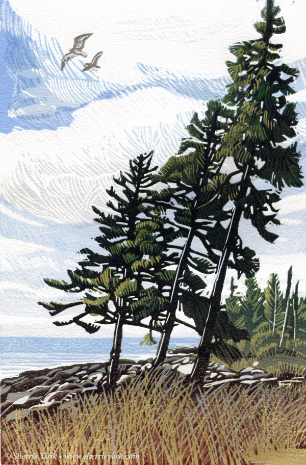
All that's left now is to title it. The prevailing breeze on Pemaquid Point has caused these trees to lean back... but the birds of course love to face in to the headwind. I like the idea of push/pull and two different ways to respond to the same situation... but haven't yet come up with a succinct way to express that idea. Perhaps it's a big enough concept to save for another, more dramatic image.

I'll mull it over for another couple of days (eating more chocolate and avoiding another decision), but then it's due for a frame and a trip to New Hampshire for the Pine Tree Pop-Up show and sale at the Woodman Museum, so a christening will need to happen soon!

Friday, November 8, 2019

Linocut in Progress: Sneaking up on the end

Alrighty, then! Progress continues on this little linocut... you remember this linocut, don't you? It's the one that's taking a ridiculous amount of time because it keeps getting interrupted. But it's going to get finished soon. Really it is.

To move that claim along, here is a nice little split roll-up. A transparent gray-green for the top and a more opaque light gray in the lower foreground.


Which ended up looking like this:

Reduction linocut in progress, Step 9

I was feeling pretty good about the rocks at this point, and the foreground grasses, but I wanted to add a little more color in the lower section. I also needed to start making some decisions about how to treat the birds.

I opted for a transparent gray-to-browny-red over most of the block and just a touch of a lighter transparent gray in the birds.

Reduction linocut in progress: Step 10

The camera didn't really pick up the subtleties in the darks of the foreground trees, but trust me, they are there. The grasses are feeling pretty good. I think overall it needs just one more dark to pick out some shadows in the rocks and grasses and then some resolution for the birds. With any luck I'll finally wrap this one up this weekend.

And then what's next? I've got a rather involved commission project to get underway after this, and would like to get started on another new small piece, perhaps a snow scene! We saw our first snowflakes of the season today... just a few little squalls interspersed with sunshine... but I know the winter is not far away. I kept a fire going in the wood stove most of the day today, and it won't be long before the stove is the first thing I tend to every morning and the last thing I tend to every night before bed. Part of me is really looking forward to that. Just think how much faster the prints will dry!

Tuesday, October 29, 2019

Linocut in Progress: Tree-mendous

After all the fussing about with the clouds and sky it felt good to turn my attention back to the trees and foreground on the current linocut in progress.

A green-to-ochre blend did the trick, bringing the start of some depth to the foreground. 

Green-to-ochre blend, Step 7

I was so pleased to be making progress that I tried to jump in immediately with another color pass, but it's been raining and cool this week and drying time has slowed down. It was chilly enough to light a fire the other day, so I moved the drying rack into the sitting room and hoped for some help there.

The next day everything seemed a little less tacky, so I crossed my fingers and went ahead with a transparent blue-gray to gray blend. I probably should have given the prints another day in front of the wood stove, but adhesion went okay and it was satisfying to finally get some more interest going in the rest of the image.

Blue-gray-to-gray blend, Step 8

Everything really needs drying time now, so I will carve for the next color and let these sit a bit.

But never fear! I have a commission project started, so won't be twiddling my thumbs. I should be able to share more details about this illustration project soon, but for now I'll just tease you with the idea of up to a dozen birds, printed and then hand-painted and assembled into a larger image. Fun, eh?

Stay tuned.

Saturday, October 26, 2019

Linocut in Progress: After the storm, the lino!

Well.. it's been an exciting week and a half! In the wee hours of Thursday, October 17, a nor'easter crashed along coastal Maine. It knocked down the power pole coming down my road from the main line and took the 21st century with it. We lost power, water (no electricity to pump the well), telephone, internet, and I lost forward momentum.

Luckily the town of Damariscotta got power back fairly quickly, so some computer work could be done at the local coffee shop and showers could be had at the YMCA.. but everything else pretty much ground to a halt. I did go on a nice hike, and I spent one very long and exciting day surveying storm-petrel burrows on an island Downeast, so I certainly found ways to enjoy myself.

We were four days without power and water, and another two without phone or internet. But we've finally shed our pioneer ways and everyone on the peninsula is settling back into a more "normal" groove.

With all that time to sit in the dark and think, I came up with a solution to the problem of the current linocut in progress! As a reminder, here's where the print stood at the last step:

Step 5 recap

The issue for me was the shapes of the large clouds in the upper portion of the image. They were too clunky overall, and the three little white "fingers" that trailed out to the left bugged me a LOT. I had hoped those shapes would be less prominent with the hatch marks around them, but they remained stubbornly awkward-looking.

Of course every area in this image that appears white had been removed from the block at the very first step... before a single color was printed. And by the time I made the first color pass on the trees ALL of the sky material had been removed. It was Just. No. Good.

After some hemming, hawing, and general head-scratching, I decide that the best thing to do would be to cut a second block. But not a complete second block... just a partial one!

The "fix-it block" in place on the press

Here it is in the registration jig. Unfortunately everything is upside-down to the viewer, so harder to understand what's happening, but at the time I took the photo the light was horrible from the other direction. (So, yes. I'm now asking you to think inside out, backwards, and upside-down. Terrible!)

After the "patch" block

Here's a another look at the small block just after the whole shebang has gone through the press. You can see that the top and sides align with the top of the registration jig, but the bottom edge was cut to follow the shape of the lower cloud.

I put a lot of "activity" in the mark-making on this new partial block. I hadn't done this originally because I thought it might distract from the trees... but that didn't turn out to be the case. In fact I think it's better this way... improving the suggestion of wind-tipped trees along the coast.

Here's the result:

"Corrected" linocut in progress, Step 6

Whew! Now I can turn my attention back to the trees and get this image wrapped up in the next few days. Time to start thinking about what's next, too.

But here's an interesting aside: This image is already historical. The middle of these three trees also came down in last week's storm... leaving a gap and a memory. And a linocut.

Tuesday, October 8, 2019

Linocut in Progress: Well, SOME progress... and a set-back

With just one more workshop on the horizon before year's end, I have really been looking forward to some concentrated time in the studio.

So it was with much excitement that I set out to put the next color pass on the linocut that's been languishing for a couple of weeks. I mixed up another transparent blue, checked the press pressure, stacked the dry prints and got started.

And had problems. My matboard registration jig didn't seem to want to lay flat on the press bed, and I was having some minor registration issues. I kept fussing with it all, and then, with a sinking feeling, realized what the problem might be. I pulled the stack of padding paper and jig off the press, and sure enough, there in the middle of the bed, was a bubble.

You might recall that about a year and a half ago, when I finally found a place to live in Maine and got my studio set up, I discovered my press bed had become delaminated while in storage. After much anxiety, and a few false starts, my neighbor and I were able to pull up the laminate and re-adhere it to the bed and I was back to work.

Things have been moving along well since then, but the busy summer workshop and exhibition schedule kept me away from the press most of the summer. I did have a couple little black-and-white projects, but they didn't require precise registration and if there were problems with the bed at that time I didn't notice them.

I notice them now. It's hard to miss a big bubble smack in the middle of the bed.

Luckily the piece I'm working on right now is small enough that I can continue to use a portion of the bed that isn't warped, so I should be able to finish it. The pressure settings might need a little tweaking, but I did finish pulling this color today. I've got a message in to the manufacturer again, and I'll be making a call to my neighbor this afternoon.

In the meantime....at least we're this far:

Linocut in progress, Step 4

Sunday, September 22, 2019

Linocut in Progress: (After too long away)

Hooray! Summer is officially over!

Yeah, I'm weird that way. Summer is not my favorite season.

There are a lot of reasons not to like summer, most of which are a bit whiney... but the greatest reason is that summer tends not to allow for much studio time. And studio time is kind of imperative if one intends to produce new work.

I've got one more week of workshop ahead of me, but in the past few days I did manage to squeeze out a couple of hours to start a small reduction linocut. This one is just 9" x 6"– sort of like going back to training wheels after one has been off of a bicycle for too long. Maybe.


Linocut in progress, Step 1

But here we go! First color pass was a flat, light, transparent gray. Nothing fancy.


Linocut in progress, Step 2

Of course I can never keep things simple for long... Step 2 employed both a blue-to-light blue blended roll AND a little selective wiping out of the block to keep the bird shapes clear. I'm not really settled about what I'm going to do with them yet... so I can avoid having to make decisions by not inking them at all.

Yesterday afternoon I gave a short, informal demo at the Stable Gallery in Damariscotta, Maine...but in the morning I managed to complete the third color pass... another blue-to-lighter blue blended roll.

Linocut in progress, Step 3

I'm still on the fence about how to handle the birds, but since they're so tiny I can continue to keep them clear of ink and make that decision after other parts of the image get a little more resolved.

Progress will slow down a little bit this week, since I'll be leading a Field Sketching course at the Farnsworth Art Museum in Rockland every day, but now that my tools are warmed up again and my brayers are rolling a more regular studio routine can't be far behind.

Monday, July 22, 2019

The Summer Sessions....

After a solid month of workshop facilitation I finally see light at the end of the one-thing-after-another tunnel. I've got two more short workshops coming up in the next week, but then, whew! I'll have some time back at home and in the studio, catching up with framing and shipping and getting ready to start some new linos.

The past few weeks have been great, though... a lot of time outside in the field! Right on the heels of my exhibition opening at the Museum of American Bird Art I had a grand group of field sketchers at the Farnsworth Art Museum in Rockland.

Farnsworth Field Sketchers in a friend's garden.

We enjoyed a busy week visiting the beach, the farmers market, and the garden of a friend who lives just a couple of blocks from the museum. We also spent a little time indoors working on drawing and watercolor skills.

Watercolor skill-building at the Farnsworth Art Museum

A few days after that class finished I was off to my annual gig at Hog Island Audubon Camp. "Back in the old days" when I lived in Colorado, coming to camp involved a couple days of travel on either end. Now I live 20 minutes from the camp's mainland dock! I'm still not sure if that's good or bad.

The Arts & Birding team: me, Jean Mackay, Derrick Jackson, Drew Fulton

My first week on the island was for the Arts & Birding session, which I co-facilitate with the fabulous Jean Mackay. If you don't know Jean's work, you owe it to yourself to check it out.

The photography section of our week is led by filmmaker Drew Fulton (he who made the short film about my work in the previous post) and photographer/journalist Derrick Z. Jackson.

Evening salon at Hog Island

One of the highlights of the Arts & Birding week is the evening salon. Every night, just before dinner, anyone who wants to share puts out sketchbooks or laptops with slideshows running, and lively conversation ensues. It's a lovely way to come together and see what everyone has been up to during the day.

My second week on Hog Island was for the high-energy Educators' Week. About 50 educators serving the spectrum of learners from PreK to college, schools to nature centers, came together to share ideas and experiences for outdoor education.

Sketching in the gardens at Hog Island

Of course I always make sure there are opportunities for field sketching at camp! We also make journals, and this year I even managed to squeeze a quick printmaking session onto the already-packed schedule.


And in an amusing twist, a few of the new printmakers decide their prints could translate well as temporary tattoos...


I came home this weekend, did the laundry, paid some bills, answered some email, and now I'm ready to pack a bag again! I'm headed back down to Massachusetts for another quick little workshop at the Museum of American Bird Art, and I'm looking forward to catching up with folks in the Boston area. Then it's back to Maine for a printmaking class at the Coastal Maine Botanical Gardens... at which point it will already be August! Stay tuned.


Linocut in Progress: The final step... twice. No. Three times.

 Okay, let's wrap this thing up, shall we? How much more can there be? There's almost nothing left on this block! The background is ...