 |
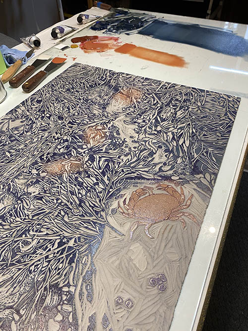
| Step 6 rollup |
In this photo the dark value for the rockweeds looks very blue, which indeed it was. After I took this photo I corrected the color a bit and toned it down before I pulled any more prints. Here's how it all looked after that correction:
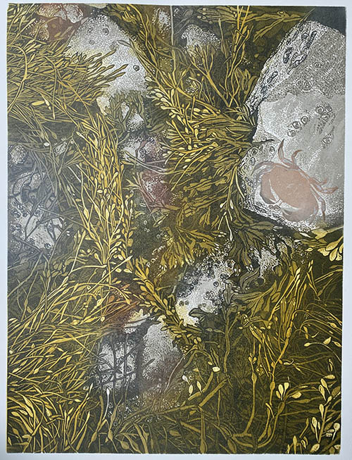 |
| Step 6 printed |
I'm feeling good about the rockweed, but the crab is a bit behind because of printmaker neglect. (Although notice how even though the color looked intensely orange on the rollup, the crab now looks a light peachy color. That's the effect of putting a bright transparent color over a semi-transparent white that was printed over gray. Are you confused now?)
What else should I fuss over? Oh, of course. The periwinkles (little sea snails). There are a few in this image, but they've gotten lost. I'll try the semi-transparent white ink trick again to see if I can't lighten them up.
Here's the roll up, spot ink only, on the press:
 |
| Step 7 spot ink (colors 14 and sort of 15) |
You can probably tell I was doing this late at night (note the dark window behind the press), which is no doubt why I didn't take a photo of the print at this stage. And of course I forgot to go back and do it in the daylight before I went on to the next step.
Not much changed, although the periwinkles became alarming. Fingers crossed I can tone them back down in the next pass.
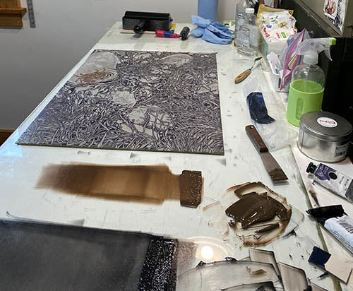 |
| Step 8 rollup |
Which iiiiiis... press pull Step 8 (colors 16 and 17). This time it's a nice crabby brown and a dark gray made from sepia and leftovers of the previous too-blue dark. (Always save and use your ink leftovers. They can create a tasty color!)
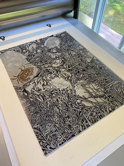 |
| Step 8 on the press.... |
You can see here that the areas of the block that define the rocks have been mostly carved away by now. I'm thinking this will be the final stage of dark for all of the image except the crab.
 |
| Step 8 printed |
We're in the home stretch now! I'm still not thrilled with how the periwinkles are standing out (even more predominantly here), so they'll get spot inked with one more dark.
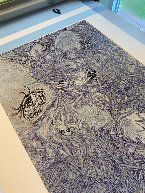 |
| Step 9 (color 19) rollup |
Aaaaaannnnndddddddd.....
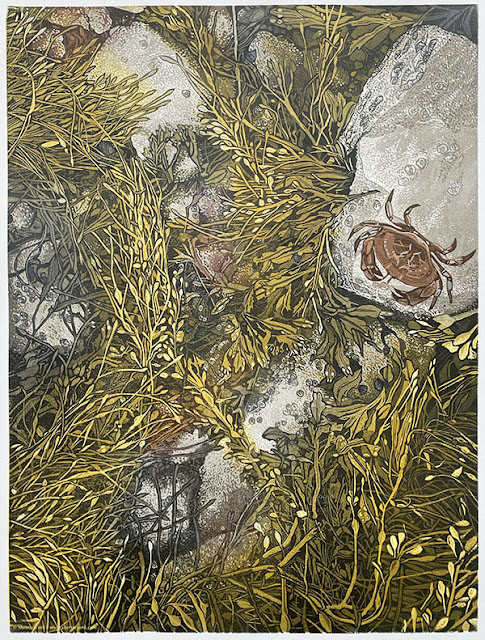 |
| All done! This image slightly embiggenable with a click. As-yet-untitled reduction linocut, 24" x 18" Edition of 10. |
Whew. That was definitely more than I thought I was headed for, but I'm not mad about it. In fact, I am weirdly inspired to jump in to another piece with similar subject matter. I'm a huge fan of an intertidal zone, and there is so much to explore!
But first I think I need a nap.


What a beautiful recording of this wonderful image. Thank you for the details of the reduction process.
ReplyDeleteYou are so welcome, Rich. Thanks for taking the time to follow along!
Deletesimple and you dont go together! but thats why we love you
ReplyDeleteA truer statement was never made! But it's nice to know it's an endearing quality rather than an annoying one. ;-)
DeleteGreat print!
ReplyDeleteThanks, Jay!
DeleteSherrie, congratulations, nap and start the next asap. This may drive you bonkers but I've turned the image, it reads well all four ways.
ReplyDeleteYes! I realized that when I had to hang some sideways on the drying rack for a bit! So I envisioned it this way, but I also like it turned horizontally. Eek. I guess I don't really have to decide until I start signing them. ;-)
DeleteAn amazing piece of artwork; especially as you originally planned a single colour plus black! Best wishes, Keith D
ReplyDelete