Sunday, September 30, 2012

Rollup yer sleeves and yer ink!

Oh frabjous day! Callooh! Callay!* There's ink on the table and under my fingernails.

I've started a new small linocut (with the upcoming holiday miniatures show ever in the back of my mind), just 5 x 7 inches, but –Callooh! Callay!– big enough that my beloved 8" Takach brayer could be employed for a full-height blended roll. Twice.

First pass: No carving! Just a blended roll the full height of the block.

Here's the first pass... a couple of shades of yellow. I'm printing on some more of that leftover Hosho that was giving me so many fits last year. It still seems to be blowing a lot of fibers, but since the piece is small and I'm aiming to limit the passes to 5 or 6, I think it will be okay.

The second pass was also a blended roll, a more ochre-y yellow to green. Everything has a lot of transparent base in it.

The block is inked in this shot, a testament to transparent base. And look at
that yummy roller! Love, love, love.

I'm pleased so far. The goal is something verging on abstract... just a tangle of bright leaves with a rich, dark background.


*With apologies to the fearsome Jabberwock.

Friday, September 21, 2012

Fieldwork Fishday, or, Let Sleeping Camels Lie

A few days ago I had to make the three-hours-each-way drive to Denver to deliver some (already sold!) work to Abend Gallery. Ordinarily if I need to go to the Front Range I try to make a multi-day journey out of it, but there just wasn't time for that this week. Still, it's a lot of driving for a 20-minute errand, so before I headed back I stopped in at the zoo for a quick sketching session. (The zoo is 5 minutes from the gallery, so at least ONE thing about the day was convenient!)

Seahorses, arowana, and that wacky toadfish.

I had my heart set on drawing birds and discovered once I was in the gate that the avian facilities are closed for remodeling. (sigh) Good for the birds, disappointing to the would-be bird sketcher.

My second choice was the tropics building. Fish and reptiles and a few other goodies. Argh. Too many people! But I managed to spend a few minutes with the ultra-bizarre-looking oyster toadfish before feeding time started and my semi-cooperative model became completely UN-cooperative.

I wandered through the new-since-the-last-time-I-was-there elephant habitat, spent some time struggling with giraffe shapes, and finally found a quiet, shady corner where I could sit and watch camels sleep. Sort of. They're surprisingly fidgety but I would be, too, if I had a habit of resting with my neck twisted all around like that. Silly things.

Dromedary camels. You know about the whole B=bactrian, D= dromedary thing,
right? One D-shaped hump= dromedary. Two B-shaped humps= bactrian.

Drowsy camels made me feel sleepy, not a great condition for someone with another 3-hour drive ahead of her, so I gave up and fled the city before rush hour started. Not the most satisfying drawing experience ever, but you know what they say: A bad day of drawing is better than just about anything else. Or something like that.

Thursday, September 20, 2012

Finishing the gull linocut


As often happens, the last couple of stages of the gull linocut have been giving me a few headaches, but I think I'm finally ready to call this piece finished.

There are three different grays visible in the bird's wings and back, but I changed them multiple times. The value steps were either too big or too small, which caused much weeping and gnashing of teeth. In the end I think I hit an okay balance. Not perfect. But okay. The bird's dark primary tips took a few tries to get right, also. Too black, and they seemed to separate from the bird. Too light and they didn't seem black.

But I'm pleased overall with the sense of light, and I like the half-border this time. It gives everything another layer of dimension.

From here I'm feeling twitchy to get on with some larger pieces again, but I was reminded yesterday that I'm participating in a miniatures exhibition in a few weeks and I need to have one or two other things ready for that first. This afternoon I started drawing up a complex little autumn leaf image that has some potential for bold colors and high contrast, which I'm looking forward to after all this weirdness with grays.

Saturday, September 15, 2012

Of Bird Art and Duck Demos

The day before the exhibition opening is like a big reunion party.
Here the exhibition's artists gather for a welcome luncheon with
museum staff. Imagine trying to get this bunch to quiet down
long enough to give instructions for the weekend.
It's a bit surreal to realize that a week ago today I was in Wausau, Wisconsin at the opening of the Woodson Art Museum's international Birds in Art exhibition. As always, it was a spectacular weekend of inspiring art, excellent colleagues, and extraordinary professionalism on the part of the museum staff.

The exhibiting artists get a sneak peek at the exhibition before it opens to the public.

I think almost 75 of the 125 artists with work in the exhibition were present last weekend, including several who made the long trip from countries in Europe, Asia, Australia, and other parts of the Americas. Last Saturday fourteen of us spent some time in the museum's sculpture garden giving demonstrations and, yes, I finally got back to work on that little duck piece.

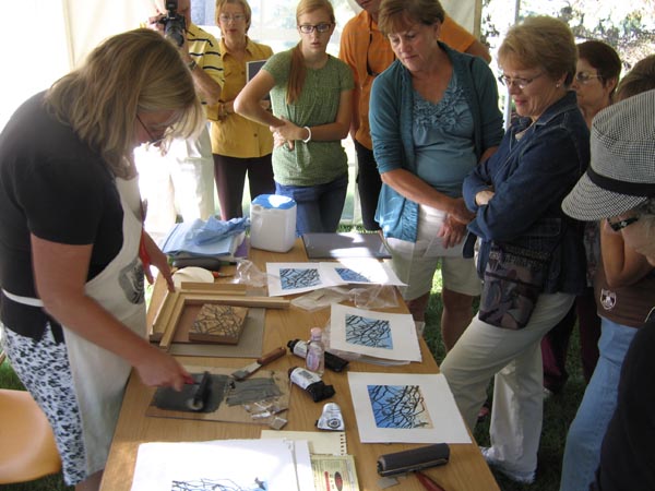
A shout out goes to sculptor Miki Harder, who had the
presence of mind to take pictures during the "Artists in
Action" sessions on Saturday morning. Recognize that
partially-finished linocut on the table?


If you were following along a couple of weeks ago you'll remember that I was working on a small linocut for this demonstration. I always like to have something "almost done" for a demo, especially since the last stage of a reduction print is frequently the most dramatic. I had just over an hour to do my bit, so I planned to carve for the "last" color and then ink up and pull a few prints.

Yep, ring-necked duck.

The "last" black was, indeed dramatic, and since I'd had the presence of mind (for once) to to pull out a sample print at each stage of the reduction process, I think the demonstration went well.

Except that I didn't like the black.

It's okaaaayyyy..... but just a bit too flat. I wanted something simple (oh, stop laughing), but this just didn't quite do what I wanted it to. Thankfully I only pulled 4 of the edition this way during the demo, and I resolved to apply another color before the black on the remaining prints when I got home.

Of course when I did get home and back to work I completely forgot to take a photo or pull out a print at the intermediate stage. You'll have to try to imagine everything that was black at the demonstration was printed instead in a sort of purple-brown. After that I carved some more, and THEN I printed the last black.

Click to embiggen for comparison.
MUCH more satisfactory, don't you think?


I am finally home now for a goodly stretch and anxious to get some quality studio time happening. There are still a few contract projects to finish and lots of administrative tasks to catch up on, but at least I'm not having to repack my suitcase any time soon. In fact, I put my suitcase in the closet! Bring on the brayers, I'm ready to get rollin'.

Tuesday, September 4, 2012

Birds in Art this Weekend!

Linocut demo at last year's Birds in Art extravaganza.
This year you all already know what my demo piece will
be! That almost-finished-duck will theoretically get finished
on Saturday.
I wasn't able to finish the gull today, just too much going on in advance of one more out-of-town trip. I start my journey eastward tomorrow and on Thursday I'll be in Wisconsin for the opening of Birds in Art at the Leigh Yawkey Woodson Art Museum. It's always an honor to have one's work selected for this prestigious event... and it's a delight to attend the opening festivities.

In the absence of a finished linocut, I'd like to share an article I came across earlier this week. "Art is Hard" is an excellent musing on "talent" and the perception of artistic skills. Thanks, Matthew Innis, for voicing some of my own discomfort with the "T" word.

I'll be back the beginning of next week, ready to wrap up that gull and hopefully to show you the end result of that crazy duck piece. Ta ta for now!

(OH! PS: If you're in the Wausau, Wisconsin area this weekend, come on by the public opening on Saturday morning. I'll be working on that duck from 9:15-10:30 in the Woodson Museum garden. I'm #8 on the map.)

Sunday, September 2, 2012

Back to the Gull, or, How the Linoleum Crumbles

With the duck piece ready for next weekend's demonstration, it's time to get back to "gullus interruptus," the linocut that should have been the demo, but wasn't.

(If you didn't follow that statement, it just means you missed this post here. We'll wait for you if you want to go read it and come back.)

So where were we? Oh, right. Here:


An interesting start, but before I went any further with it I applied a subtle reddish spot in the lower bill. Such a tiny section, and barely noticeable, but I wanted it to be there. I used a stencil and "pounced" the color in place. (More about the pochoir technique here.)


Then it was time to start defining the bird's body. I mixed a very transparent blue– so transparent that you can barely tell it's on the block in this photo. But it is. I promise.


The difference was subtle, but did what I wanted it to do: It separated the back of the bird's head a little more from the background and deepened the shadow below.


Next– define the bird's body, wings, and tail. More transparent ink, this time a soft gray.


And then things started to get a bit wacky. I wanted to define the volume of the bird's body, which seemed like something that could be accomplished with a second, darker gray. My first try was WAY too dark and contrasty, and the shapes looked all wrong! Argh! To make matters worse, when I tried to do some delicate carving around the eye, POP! Out came the pupil in a crumbled mess.

Dang.

I added more transparent base to the ink to lighten it and achieve a more satisfying value change.

Click image to embiggen

The image on the left is the first gray pass, on the right I've added the (improved) second gray. It looks good in the photo, but I'm not as happy with it in "real" life. There needs to be one more dark in the body and I need to figure out what to do about the tiny black pupil. (More pochoir, I think.)

The ink layers are too tacky to do any more today, so the resolution will either have to come tomorrow or wait until after I get back from Birds in Art. Hitting just the right value for the last pass will be an interesting challenge.

Linocut in Progress: Color in a gray season

 Mud season came early to the midcoast this year. So. Much. Rain. Seemed like a great time to get started on a piece with a little more colo...