Saturday, June 30, 2018

Linocut in Progress: Let's get loony!

Now that I've been through an entire reduction print in my new space I feel a bit more confident about working here... and a lot more anxious to just get on with it. Of course there will be another interruption shortly... I'll be off to two weeks of workshops on Hog Island in about a week and a half. It feels a little odd that getting to the island is now a 20 minute proposition instead of the 20 hour expedition it frequently was trying to get there from Colorado.

But I digress...

Among the connections I made soon after I moved to Maine was the Biodiversity Research Institute (BRI). BRI has a number of research focii, but they began with the common loon.

In the autumn of 2019 BRI will be hosting the International Loon / Diver Symposium here in Maine (Portland). Ahead of that event, three other artists and I have been asked to create works to be featured on promotional materials. I'm more than a little bit behind schedule, since it took so long to find a place to settle and to get Presston up and running again, so before the iris prints were dry I jumped right in to my next linocut.

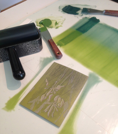
Loons were made for printmakers. Their lovely, graphic, black-and-white plumage begs for a relief print interpretation. Not that you can see any of it here in the first color pass.

New reduction linocut, blended roll, step 1

The tricky thing is that I am lacking in firsthand reference material. Sure, we have loons here, but I haven't been in Maine long enough to really spend time with them. I've been obliged to cobble together ideas and reference from a variety of sources, in much the same way I work as an illustrator.

To be honest, it's the thing I most dislike about illustration– being required frequently to render subjects I have never personally seen.

While I was working on the iris print I did take the time to do some pencil studies from photographic reference of loons. It helped to familiarize me with details, at least a little, and I'm having to squeeze every last drop out of my inadequate personal recollections and photography.

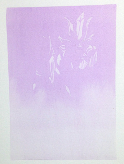
Two separate inks rolled up at the same time, transparent green at the top,
transparent blue across the remainder of the block. Step 2

But that's enough whining. Once I took a deep breath and got started a lot (but not all) of that anxiety moved to the back seat. And by the second color pass I started to feel that familiar anticipation that makes printmaking the sweet agony that I return to again and again.

Step 2

I'm completely making up this color palette, imagining blues and greens and browns in the land and waterscape.

Step 3

I did make a rookie error right off the bat, though. 'Way back in Colorado I had decided that I should always start with an even, solid ink color– even if it's very pale– before laying down a blended roll. I failed to do that with this print, because I just plain forgot, and as a result I have some uneven color and lap marks in the lower half of most of the sheets.

I think (I hope) that this will become less obvious with additional color passes. If not... well... there will need to be some creative problem-solving at some point. Which differs from my usual working method how?

Right. It doesn't.


Wednesday, June 27, 2018

Linocut in Progress: Wrapping up the iris

So where were we? Oh, of course. We were trying to figure out how I'd managed to put eleven color passes on this little (5x7 inches) linocut without actually resolving the image.

The answer is, of course, poor planning. Or more correctly: no planning. I was so anxious to be printing that I just dived in to a block that had been roughly drawn out probably 9 months ago... and I didn't really give any thought to the end goal.

After the last ochre-to-blue blend, which created some darker leaves in the lower part of the image and warmer tones in bases of the flowers, I finally sat back and assessed. And I wasn't particularly pleased. It just seemed too... something.

I thought perhaps I needed to do (ahem) just one more ochre-to-blue pass and create a few more details. So I did that.

Reduction linocut in progress, Step 12

And I still wasn't happy. These darker bits in the flowers were now too dark and they had become quite clunky.

So I did something I rarely do. I fished out some white ink, added it to a little bit of ochre, and then added some transparent base to it. I applied this color only to a few small areas within the flowers.... et voila....

"Iris," reduction linocut, thirteenth and final color pass. ©Sherrie York

The flowers now have a better relationship to the background and everything feels a bit more harmonious.

There were many ups and downs during the printing of this linocut. This was partly due to the lack of clear planning mentioned above, but of course I was also working in a new space and new environment... and I hadn't done a reduction print in six months. Can you believe it? Neither can I. No wonder I was getting a bit cranky.

But I've definitely dusted out the cobwebs now, and hopefully the next piece will go a little more smoothly. And yes... the next piece is already underway!


Monday, June 25, 2018

Linocut in Progress: Blooming ridiculous!

It turned out that slower drying times weren't much of a problem in the last week, since I found myself out of the studio as much as in. Bird artists gotta go hang out with birds sometimes, and I was lucky enough to be involved in nest surveys on a couple of coastal islands. Any action that involves boats, birds, and islands has the potential to turn into an adventure, so many of my out-of-studio days ran longer than expected.

But that's a whole other story. Back on the mainland things have started to take on a familiar routine. You remember... it's the one in which a certain printmaker keeps saying, "I think I need another intermediate color pass."


But first! I was thankful that I had saved the cut-away portions of the masks used on the last two color passes, because I was getting too much green influence in the centers of the flower petals. I wanted a little bit of non-purple color there in order to give the blooms a relationship with their background, but it was getting too intense.


Here's a closer look at the "inside out" masks. Sort of like using the donut holes instead of the donuts? And at Step 9 (another blended roll) printed.

Reduction linocut in progress, Step 9

One more step (another blended roll) to finish off the subtle texture in the background.

Step 10

Okay. Upper background is finished and all that material removed. I want a few more darks in the leaves... but I dislike the amount of green in the bud cases and centers of the flowers. The next ink roll was a kind of ochre-to-blue green blend.

Step 11

Step 11 ?!?!?! How the heck did that happen? Even more importantly, how am I going to finally wrap this thing up? I am feeling acutely those six months away from the studio... like being wobbly on a bicycle when you haven't ridden for a long time. Or maybe it's more like trying remember vocabulary in a language you haven't used in a while. The knowledge is in there somewhere, but it's jumbled and the access is a bit clumsy.

Let me assure you that resolution of this piece did come.. but let's save that for another day. Until then, here's a picture of two chicks on an island.

Wednesday, June 13, 2018

Linocut in Progress: Tone it down, will ya? Also... does it feel damp in here to you?

Gradually I am becoming more comfortable in my new studio space. The biggest issue at the moment is learning to work in a far more humid environment. I bought a temperature/humidity gauge for the studio and have been keeping an eye on it. So far the room stays fairly stable despite big humidity swings outside. Still, 40-48% indoors is a heckuva a lot different from Colorado, where humidity levels that high would have us all whining about how muggy it was.

That said, the biggest issue so far seems to be drying time. After the previous (rather entertaining) bright-green-over-lavender-makes-yellow pass I immediately jumped in to a color pass I hoped would tone everything down. Naturally I forgot to take photos during this, but here's a swatch of the color I used:

Inky!

It's a very transparent sage-y green... and in case you're wondering, in this photo the ink is sitting on a sheet of wax paper. I had already cleaned everything up and folded the leftover ink into a wax paper packet to keep it usable for later before I remembered, "D'oh! Photos!"

Here's the result. Light green now, and ochre, but less bright. I saved a few little lines of that bright yellow just because I could.

Reduction linocut in progress, Step 7

At this point I decided it was time to get more direct about greens, and to get some blended color going. I mixed a couple of lovely greens and again jumped in to print..

And immediately had to stop. Wet rejection! Argh! The prints were entirely too wet. Color wasn't adhering correctly, fine lines were filling in. Nothing to do but clean up and walk away.

When things were still really tacky the next day I did a little bit of  gentle "stripping" by hand. I took a fresh sheet of newsprint, placed it over the top of each print, and rubbed it firmly with the palm of my hand. This pulled up a tiny bit of ink, but not even enough to transfer color to the newsprint*.

(*Stripping freshly-printed ink will remove a lot more color, and stripping through a press instead of by hand will be even more aggressive. I recommend judicious and careful use, especially the first time you try this technique! If your ink is too tacky and you apply too much pressure you can also make the newsprint stick to your prints. This is bad.)

By the next day I was ready to print again, so I pulled out the lovely greens I had mixed previously (and folded into wax paper to keep fresh) and set up for a blended roll.


I'm trying to get some soft color in the upper background... sort of like the out-of-focus blur of photography, but not really. Just less hard edges. I carved some subtle texture in to some areas of the background, and a few less-subtle details in the stems and leaves of the flowers.

Step 8

Alrighty, then! Back on track. A little more fine texture in the upper background and then I think I'll be ready to eliminate it entirely. Three, maybe four passes left? It's a lot for such a small piece, but after six months away I'm not surprised I'm going a bit overboard.

Time to go downstairs and see how wet the prints are this morning!

Saturday, June 9, 2018

Linocut in Progress: When purple + green = yellow

When watercolor was my primary medium I used to complain that I painted like a printmaker. I love the soft, subtle effects that are possible with watermedia, but no matter how hard I tried my paintings still came out graphic and (I thought) kind of flat.

So I started making linocuts... arguably one of the most boldly graphic of the printmaking techniques. And what am I doing with it? Treating it like watercolor, overlaying transparent and blended color.

The surprise, delight, and (sometimes) frustration of working with transparent color is that one's rudimentary understanding of color theory can sometimes be pushed to its limits.

When chartreuse over lilac results in... yellow?

Take this step, for example. I wanted to start work on the background of these iris, which is not going to be lavender. I will, of course, be putting a lot of green around the blooms, so adding a green seems logical.

I didn't add any transparent base to my ink at this stage, because I wanted a light yellow-green color and knew that my yellow inks tend to be fairly transparent as they are. The chartreuse-y color at the top of the photo was mixed from a little permanent green light added to a couple different light yellows... dregs of an old Daniel Smith stash plus some Cranfield. I didn't expect the color to appear green when printed over the existing lavender, but I was a little surprised by how yellow it was!

But after one print I (of course) decided I needed one more darker violet pass in the blooms before I went all crazy with greens, so I cleaned off the block, cut MORE stencils (sigh), and did one more transparent blue pass.

Color is a little too... contrast-y... in the photo, but you get the idea.

Okay, onward. Back to the green. Some of it will print on to the flower blooms, which means we're about to enter an "ugly duckling" stage, but there's nothing to but dive on in.

Linocut in progress, Step 6
Geez, can you believe we're already at color pass #6 and we still haven't gotten away from the flowers? A bit ridiculous, really.

But in one pass of the bright green I now have an ochre, a yellow, and a dull green. Pretty good trick, eh? Now for some head scratching while I figure out where I'm going next.

Friday, June 8, 2018

Ebb and Flow at the Stable Gallery

"Mooch Brigade," reduction linocut, 18" x 18"

Join me tonight for the opening of Ebb and Flow at the Stable Gallery in Damariscotta, Maine! Reception from 5:00-7:00pm, 28 Water Street.

Wednesday, June 6, 2018

What's It All About Wednesday: Telling Fish Tales

"Telling Fish Tales," reduction linocut, © Sherrie York

It's been rainy the last couple of days here in midcoast Maine. The mainland vegetation is lush and green, but the sea reflects the overcast skies and the world seems a little muted. The ochre and rust of seaweed and the grays of granite ledges dominate the palette in Muscongus Bay.

While the humans scurry about in wellies and rain jackets, the animals carry on with business as usual.  Cormorants, comfortable in or out of the water, congregate on rocky ledges. Who knows what information they may share with each other at times like this, but I like to imagine the bird in the center talking about the fish that got away. "It was THIS BIG."

Monday, June 4, 2018

Linocut in Progress: Iris

How sad is it to have my studio door open out on to such green? Not sad at all!

Wow. It's been more than six months since I've been able to start a blog post with those lovely words: linocut in progress. The cross-country shift turned out to be even more epic than I expected, but now that I'm more or less settled in one place for a while I can barely remember the hard parts. Ain't that the way it goes?

So.... without further ado... let's start figuring out the reduction linocut process in a new space and new environment. (With a recently-repaired press, to boot.)

Linocut in progress, Step 1

Among the procedures I need to sort out is a set up for photographing work in progress. I have a combination of overhead lighting and table lamps in the new space, and I still need to make some adjustments to keep the unwanted shadows to a minimum. But no matter... this first step looks like a transparent lavender rectangle because that's what it is.

A little hand-wiping for Step 2

The second color pass is another run of the transparent lavender, a little darker. I don't need or want all this purple-y business everywhere on the block, but I really wasn't ready to start up the fussy mask cutting routine again. My solution was to roll ink in the top half of the block and then use a paper towel to hand-wipe the edge and make it more interesting.

Step 2, printed

At this stage I found it so satisfying to have a drying rack full of prints again that I kept wandering in to the studio just to admire them.

But then there was a four-day riot of busy-ness: Friends arrived from Michigan for a visit; high school graduation festivities ensued for a friend's daughter, our ukulele group played a gig at the annual Ukulele Festival up in Belfast, and I met with Hog Island Audubon Camp's first Artist in Residence of the season and got her settled for her session. Whew! Oh... and there was the distraction of a snowy owl that was caught on a seabird island and had to be transported to a rehabber. But that's a whole other story.

So the prints sat for a couple of days, getting more or less dry. Drying times and paper behavior are two of the things I'm concerned about in my new environment. The Upper Arkansas Valley in Colorado, where I moved from, is high desert, with fewer than 10 inches average annual precipitation and practically non-existent humidity most of the time. Where did I move TO? The coast of Maine. This is not desert, and it does have humidity. Lots of it, some days.

To help me sort out the conditions in my new space I got a temperature and humidity gauge for the studio. It's been raining all day today, but the inside humidity level stayed at a constant 47%. I'm having a little bit of issue with paper curling, but some of that might also be coming from incorrect pressure settings. I zeroed out the press after we repaired the bed, but I need to do it again now that it's been settled in its space. I loosened the pressure a bit today and the paper seems to be behaving better.

Ahhhhhhhh! Masks already!

Remember how I said, a mere 5 paragraphs ago, that I wasn't ready to mess around with cutting masks yet?

(sigh) I lied.

I didn't want to do it, honest. But it was the best decision for the next two color passes, so I cut masks. A lot of them. I'm starting with 30 prints this time around, since I'm assuming there could be technical issues as I learn new parameters. And naturally I needed this same mask for two different color passes.

Both Step 3 and Step 4 utilized a transparent ultramarine blue.


Here's the mask in place, ready to print.

Newsprint mask in place, Step 3

And here's color pass number three printed. The resulting color looks quite purple, which is not surprising given the lavender ink underneath.


Step 3 printed

More masks, more blue ink. Step 4:

Step 4 printed

I expect I'll need to leave these to sit now for a day or two, especially since it's going to continue raining. Most of the flower shapes will be carved away at this point, and then work will begin on stems, leaves, and background. Despite the fact this block has been drawn up since before I left Colorado I don't really have a plan for what will happen from this point on... so a day to consider where this is headed is probably a good thing.

Being able to write a work-in-progress post is one more indication of a return to what passes for normal in my world. Thanks for waiting so patiently to join me again on the printmaking rollercoaster!

Linocut in Progress: Color in a gray season

 Mud season came early to the midcoast this year. So. Much. Rain. Seemed like a great time to get started on a piece with a little more colo...