Showing posts with label birds. Show all posts

Sunday, March 13, 2022

Online Puzzles with the Woodson Art Museum!

Some months ago the Woodson Art Museum, home of the spectacular annual exhibition, Birds in Art, starting sharing online jigsaw puzzles of work in their permanent collection. 

I have been deeply honored to have several of my pieces accessioned there over the years, so imagine my great delight when some of them started appearing as puzzles! There are presently four of my images on the Woodson puzzle page (right now they are the last four on the page, scroll down!), along with dozens of others. 

Here are the direct links to "my" puzzles. You can change the number and size of the pieces, as well as invite other people to play with you... so... have fun!

Cruisin' - (American White Pelican)


A Tern of the Tide (Common Tern)


Shower With a Friend (Wood Ducks)


Oops. I guess I don't have a big image of this.
Ripples (mallard)


Wednesday, March 24, 2021

Linocut in Progress: Where were we?

For reasons unknown, the beginning of Garrison Keillor's weekly "Lake Wobegon" monologue just popped into my head... "It's been a quiet week in my hometown...." 

Perhaps it's precisely because it hasn't been a quiet week here. In fact things are starting to feel... well... sort of... not really normal, but certainly more positive. With the increase in available vaccine and the decrease in virus cases, summer exhibitions and workshops are able to be scheduled with more optimism, and possibilities are appearing on the horizon. (Read: Lots of emails and calls and Zoom meetings to discuss!)

Which is why I've been a bit lax about keeping you up-to date with the current linocut in progress. And yes, progress is being made, although still rather erratically.

But here we are at the rollout for Step 3: 

Step 3 rollout

Oh, look! It's blue. How many times have early print stages been blue? A lot of times. But hey! At least we're not stuck in Fifteen Shades of Gray like we were with the last image. 

Steps 3 and 4, printed

I am a bit embarrassed to admit that I am not entirely sure what color was printed for Step 4, since I didn't take a photo of the rollout. Short term memory... it's really a bit hazy these days. I think it was a transparent gray, because I am trying to drag the tree bark back in that direction. Yes... that's a tree snag with a bird perched on top. Does that help you sort out the species yet?

If not, I'm not going to be able to give you much more help on the next step because, again, I apparently didn't take a photo of the rollout... nor did I take a photo of it printed and hanging straight on. I am really falling down on the job here! 

I can tell you that Step 5 was a slightly more opaque, brighter blue, and show you an oblique image of the resulting prints on my drawing table as I was preparing to print Step 6. Hopefully I did a better job of documenting that particular phase, although it happened way yesterday ago and I can't possibly be expected to remember back that far. 

Step 5 printed and having a nice nap on the drawing table.

So, un-informed as you may feel, visually you are more or less caught up. 

Part of the reason for inconsistent recording of the process might be that I have been distracted by technical issues, especially here at Step 5. I don't know if it's the changing weather (we've been warmer and a bit more humid as we finally move more or less into spring), but I've had problems keeping the press pressure consistent. As a result of fiddling around with it at this stage I trashed at least 4 prints... so frustrating! I think I've got things evened out now, but we'll see. This might just end up being "one of those prints."

Tuesday, October 20, 2020

Linocut in Progress: Pulling things back together

Maybe it's too soon to celebrate, but I think that newsprint mask-making time might actually be over! After isolating the two female ducks and establishing their overall body color, it's time to pull the image back together with some unifying color passes. 

Step 11 is a rich, transparent blue that will create shadows in a few areas of the females and bring the overall tone and value of the male birds back into line.

Reduction linocut in progress: Step 11 rollup

And here's where it landed us:

Step 11 printed

It's starting to come back together, but the females are still visually overpowering the males. It's time to really focus on those handsome boys. Here's the roll-up for Step 12, an even richer blue-gray. You can see that the farthest-distant female is almost completely removed from the block, and just a few shadow textures remain in the closest bird. Additionally, all the water except for a few details around the birds and a couple of waves in the foreground has also been removed.

Step 12 ink rollup

Aaannndddd... hooray! A nice day and some indirect light outdoors, so I was able to get a decent photo of Step 12 after it was printed. I also uploaded this shot at an embiggenable size, so you can click on it to get a better look at where everything stands. 

Step 12 printed, embiggenable with a click

We are really close now. I think I only need one more pass to finish up the birds... but I am undecided about whether I should mess around with two little sections of water that haven't yet been carved away. It might not be necessary to put a different color on them, but it also might be just the right little zing! if I do it right. We'll see what I decide when I get there...

Sunday, October 18, 2020

Linocut in Progress: Grace and awkwardness

When we last left our heroic linocut ducks, things had gone from harmony to disharmony with the application of the rusty-orange bits in the males of the species. I did promise you that the next step would bring things back together a bit, and so it did. A bit. 

Reduction linocut in progress: Step 8 printed

Yes, 't'was a nice transparent blue applied to the entire block that seemed to set everything back on the right path, but of course it wasn't to last long. There are two female ducks in this group, and their plumage is brown, unlike the strong blues and oranges of the males. It was time to give them a little attention.

In order to keep the brown colors contained I cut another newsprint mask, and did some spot inking of a light brown. Here it is, on the press and ready to print.

Step 9 mask

And here's the result. Again I apologize for such lousy photos this time... I promise that when we finally do get to the end there will be a proper image of the entire print.

Reduction linocut in progress: Step 9 printed

Because this first, lighter, brown was of a similar value to the blue of the males, this step didn't seem to go too far astray. But don't worry. I'm gonna awkward this up right proper with Step 10.

The Step 10 ink was a darker, lush brown. Spot inked again, and masked again. I could use the same mask pattern as the previous color pass, since any areas that would retain the lighter brown had, of course, been carved away.

Here we are again on the press, mask in place, ready to print.

And here's that result. Quite clunky-looking now, isn't it? The overall value of the females is much darker than the males, which at this stage look a bit like ghosts of their selves-to-be. But never fear! These next few steps should (I hope) bring a little grace back to this raft of harlequin ducks... and give me a little reassurance as well. 

Step 10 printed

Saturday, September 5, 2020

Linocut in Progress: Slowly

Of all the headaches associated with this, the weirdest year ever, the one that has been depriving me of the most sleep (lately) is the ongoing quest for a new (to me) car. My current ride is 23 years old... going on 24. While it was never a practical vehicle for me in terms of cargo space (it's a sedan... not convenient for hauling around art), it has been completely reliable. The engine still wants to go, but after 200,000 miles everything else is wearing out. 

I started looking for a replacement in February, but then of course everything shut down for a couple of months. When I started looking again in May I found few vehicles available and prices elevated (as they have become with just about everything). I can't tell you how many hours of my life have been lost to car hunting and research... online... driving around. There have been a couple of vehicles that looked promising but in the end were disappointing... with entire days lost to driving back and forth. 

The search has reached critical stage... and it's occupying most of my brain cells... so it's been really hard to find momentum in the studio. But I did get another color pass down this week, and I think there's just one... maybe two... more to go.

Reduction linocut in progress, Step 9 ink roll up


Everything about this piece has seemed strange. The color palette, the time it's taking, my distracted attention. After the last color pass I really started to worry that the whole thing was going to fall apart, so my goal for this step was to try to create a bit more cohesion. I mixed up two rather odd inks... a greeny-brown and a reddish-brown. The red-brown was used somewhat loosely across the birds, and the rest of the block was inked with the green-brown. Both colors were very transparent, so they reacted with all the colors printed below them.

Reduction linocut in progress: Step 9 printed

Oooookay..... That feels better. Hard to say if I will be able to resolve it all in one more color pass, but that's the goal! 

Saturday, August 22, 2020

Linocut in Progress: Still in the ugly zone....

Is it just me, or have all the social media platforms decided to change their interfaces at the same time? Blogger, Facebook, Instagram. It seems as though they've all moved the controls, changed the appearance, and simultaneously conspired to cause user irritation. 

Maybe I'm just being ultra-sensitive, because if you follow me on either FB or IG, you know that last week some nefarious human being created an Instagram account impersonating me and subsequently spammed many of my followers. It caused no end of headaches, since it is impossible to reach a real human being at any of these companies anymore. I don't want to rattle on about it, but as a public service announcement I just want to say BE CAREFUL OUT THERE. I never send my readers any private messages asking them to follow links or donate any funds, and I immediately delete messages I receive under the same circumstances. Stay vigilant! 

But enough of the soapbox, let's talk lino

There have been a lot of distractions in the last couple of weeks. Between the IG woes, an online course, and a live workshop (my first since last autumn!) studio time has been erratic. But then again, so am I right now. Erratic, I mean. 

So where are we?

Right. We're at Step 6 already! There are four subtle layers of color in the background water area, and in my last post the print had just entered the Ugly Duckling Stage with the application of Step 5. I'm afraid we're going to be in this questionable stage for a while longer, so I hope you've got plenty of popcorn and don't mind a cliffhanger.

Step 6 was a straightforward orangey-ochre applied to over the entire block. It went a little way towards unifying some of the blobbiness that started to appear in Step 5, but not much.

Reduction linocut in progress, Step 6 printed

The seaweeds which cover the intertidal zone all along the Maine coast range in color from a sort of orangey-ochre to an ochery-green to a blue-gray and a green that's almost black. I find these colors really tricky to mix effectively, especially when I'm layering transparent color.

For the next color I mixed a fairly dark, transparent green-black. I wanted to dull some of the rusty orange from the previous pass, and "cool" it down a bit, without getting too dark.
Step 7 ink rollup
The tricky bit is trying to anticipate how colors will interact. On the block this color looked very dark and gray, but on the print.....

It produced a rather nice brown.

Step 7 printed

In general this is all feeling okayyyyyyy..... but I don't like how dark the birds' heads have become. And I want to start developing some of the cooler-toned rockweed that's mixed in with the more ochery bits.

This looks like a job for SOOP-er Weird Color Woman.

How about we roll some plain opaque white over the upper parts of the birds and a nice, somewhat opaque, blue-gray over everything else? That ought to do... something. Right?

Step 8 rollup: Spot ink white and blue-gray

Well. It's definitely done... something.

Welcome to the Ugly Duckling Stage, Part 2.

Step 8 printed. Hmmm.

Believe it or not, I'm actually not panicking at this point, although maybe I should be. There's a bit of wet ink glare in this photo, so it's hard to tell, but I am happier with the birds' heads. Not much of the gray color will remain in the final image, I don't think.... but it has put down an interesting base and will create some nice highlights in the darker rockweed to come. Well, that's the theory, anyway!

Saturday, May 9, 2020

It's World Migratory Bird Day!

It's migration season! All around the world, creatures large and small are on the move. In truth, migration isn't just "a spring thing" or "a fall thing," because the diversity of migration strategies is as broad as the diversity of animals that migrate! Short distance, long distance, elevational... North to south, east to west. Some ocean creatures even migrate vertically, living at different depths of the sea at different times of year.

Personally, I love the spring migration of birds. After a long, gray winter, it's so fun to suddenly see bright flashes of color in the landscape. Today a Baltimore oriole came through my yard for the first time, and yesterday I saw yellow warblers and common yellowthroats.

This year migration seems extra-delightful. It's a reminder that even if human movements are restricted at the moment, the rest of the natural world is going about business as usual.

In a typical year, today is a day that would see hundreds of events across the globe celebrating World Migratory Bird Day! Back in January, when I revealed the poster art I created, none of us knew that we'd be gathering digitally, but the folks at WMBD have gone all out to bring us a virtual festival! All day long they'll be streaming programming on Facebook!

I put together a couple of short videos that they'll be sharing on their social media channels today, but you can get a first peek at this one right now! In it I share a look at how I created the art for the poster, and a short demonstration of the reduction linocut process.


Friday, April 24, 2020

Starting a new linocut: Business as not-quite-so-usual

While human communities around the world remain in isolation, nature's wildlife communities are going about business as usual.

I had a birthday at the beginning of this week, and to celebrate I took myself and my sketchbook out for a walk on a nearby trail. Maine's landscape is still very gray and brown, but there are signs of spring everywhere. Skunk cabbage is one of the earliest blooming plants... its strange maroon flowers appearing even before its leaves.

Skunk cabbage in bloom...

The eastern phoebes are back, also, and busy reclaiming their nesting spot under the eave of my front porch. Earlier this season my landlord added a gutter to my roof because snow melt and rain were dripping on to my steps and causing serious icing problems. It's not a pretty solution, but the phoebes seem to appreciate the snazzy new perch that was added while they were away.


In the studio the progression of the season has been a bit bumpier. The phoebes might not be affected by the emotional, physical, and financial distractions of a global pandemic... but the rest of us sure are! Personally I find myself able to work only in fits and starts, with serious focus issues.

With all that's going on, I was thrilled to take a walk the other morning and discover inspiration for a new linocut! The weather down at Pemaquid Point was wild... sun, then clouds, then snow and wind... and the seas were fierce. There weren't many birds about, but then... oooooh! A group of more than a dozen black scoters appeared, bouncing in and out of the waves as they fed near shore. Black birds, bright yellow-orange beaks, and rich blue water? Yes, please!

I had so many potential combinations of birds and waves that it was hard to choose what to do first, but I finally settled on a composition and set to work on the line drawing.

line drawing for new linocut

I don't usually share this stage of the process on Brush and Baren because I like the element of surprise as an image unfolds. But, hey! This time I already told you we're doing scoters and waves. Talk about a spoiler.

When I have the line drawing finished I transfer it to the lino. In this case the image involves a fair amount of white, so I have carving to do before I can print the first color. I've already trimmed and tabbed the paper, so everything's ready to roll.

It's a relief (printmaking pun intended) to have something to work on again. Thanks for sharing the journey... at appropriate physical distance. Be well, everyone.


Wednesday, March 4, 2020

Linocut in Progress: Swimming to the finish...

Spoiler alert! I did manage to finish this piece in 10 color passes! That's two editions in a row, by golly. Don't expect it to happen again any time soon.

But I am jumping ahead. Let's go back to Step 9, shall we?

Step 9 ink rollup

And here we are. Although I have to stop momentarily to go off on a tangent and have a little chuckle, because....

Some times when I take a meal break I will watch a random video that YouTube suggests for me. Today's offering was, weirdly, about organizing/decorating tiny studio apartments. But, hey! I just realized that there IS a connection. Not that it's one YouTube would have known about, mind you.

The narrator of the video I watched spoke frequently of the need to have every piece of furniture in a small space serve multiple functions. A chair that is also a storage compartment. A sofa that's also a bed.

If you can follow my (sometimes odd) logic... It's the same thing with every color pass on a reduction linocut. In the case of Step 9, I was trying to 1) create some deeper shadows in the waves, 2) "gray down" a sort of triangular shape within the overall image to contrast with the brighter foreground colors already printed, 3) define some details in the birds, and 4) keep all those elements cohesive.

And that was a much shorter wish list than I sometimes have for a single color pass.

So here's the multitasking Step 9 printed:

Reduction linocut, Step 9 printed
As always, embiggenable with a click.

Unfortunately this photo is a bit shadowed on the right hand side, so the overall value/tone difference between that area of the background and the area to the left isn't terribly clear... but it's there.

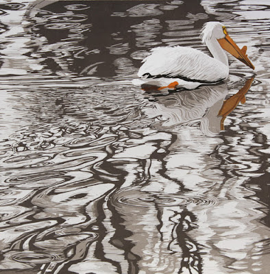
At this point it was so, so close to being finished... but I still wanted to get one more darker tone in there. I didn't want to go as dark as black. That would definitely be too much. But I wanted a few more little bits of contrast that would sharpen the birds but still keep them settled in the water.
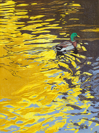
Step 10 rollup

Yes. This ink color really is as brown as it looks. Printed over blues it will read as a warmer gray (I hope)... but the female bird IS brown, so I want to be sure that she reads that way. Remember that funny little tan shape I printed a few steps back? Part of the reason for that was to create a warm undertone in the shadowed parts of the female.

BTW: I took this photo of the ink rollup early in the print session, when I thought I could leave the rest of the background material on the block since I wasn't going to ink it. However, it turned out the prints weren't quite dry enough. The areas of "dry," un-inked lino stuck to the still-tacky prints and pulled up bits of ink. So much for saving time! I had to stop and carve all of that material away.

Reduction linocut, Step 10 printed. Final!

This photo is a bit better than the previous in terms of light. I think you can see the subtle differences in the background, and in the area immediately around the birds, and in the birds themselves!

So, whew. I think it's done. I'll let it sit for a couple of days while I walk in and out of the room and scowl at it... that's my usual MO.

Which means it's time to start thinking about what's next. I'm feeling some pressure to get another image started right away, because in a few more weeks my schedule really starts to ramp up again with workshops and some travel. Once that happens, studio time will be erratic straight through to August. What does it mean if I'm already looking forward to autumn and the spring hasn't even arrived yet?

Monday, February 10, 2020

Linocut in Progress: Here we goooooooooo!

Although I hesitate to write these words "out loud," I think I have finally finished the last tweaks to the World Migratory Bird Day poster and t-shirt designs. Whew. Since the completion of the previous linocut (now titled "A Tern of the Tide") I also took a little time to carve and print a logo for my Learn Linocut online course that is still in development. (More about this later.)

But February is supposed to be my prime studio time, so I need to step away from all these other projects and get some linocutting done! 

It took a while for me to sift through several ideas and settle on a new composition. I'm going for something long and lean this time– 8" x 24." Fingers crossed that it turns out to be as interesting as I imagine it could be....


First stage carved and ready to print.

The subject matter is familiar... some birds and some water... but I'm trying for a different quality of water than I've attempted before, so I'm a little nervous about it. After a fair bit of carving I printed the first color, a transparent gray.

Oh, this long format is going to be hard to see... this image is slightly embiggenable with a click.

For a first color pass this gray seems a bit too dark, but I so often err on the side of too light that I decided to take a deep breath and go with it. Ultimately this image will have some very dark areas, and I'm counting on them to make this contrast seem less extreme.

Printing day for color pass #2 was gray and rainy. One might have hoped such a day would inspire immediate color mixing results when the desired ink color was a greenish-gray, but nope. It took me more than an hour to get the color and value the way I wanted it.
Color, color, who's got the color? Not me, not yet.

I planned to run a blended roll the entire length of the image, and luckily the other color was a straightforward transparent blue. Well, sort of straightforward. It still took me more than the usual amount of time to get the transparency level correct.

Some days you get the ink, and some days the ink gets you.

Finally rolling out some ink!

But I did get there eventually, and printing moved along relatively smoothly.

Reduction linocut in progress: Step 2 printed. Yep, you can embiggen it.

I think it's going okay so far, but it's early days. All this foreground white and gray is hopefully going to provide a good feeling of churning, foamy water close to the shore. That's the goal, anyway. I can't cross my fingers because that will make it impossible to carve the next stage, so you'll have to do the finger-crossing for me. Thanks in advance for your effort. I appreciate it!

Back to the carving table....

Tuesday, January 28, 2020

World Migratory Bird Day 2020!

Embiggenable with a click!

At long last we are settled on a poster design for this year's World Migratory Bird Day! Twelve linocut birds connect conservation efforts across the world, and hopefully bring smiles to bird-lovers along the way.

I'm honored and excited to be part of this year's global conservation education campaign. While the "official" date will be celebrated in the Americas on May 9, there are hundreds of events taking place throughout the year. For the poster design I created twelve different linocut birds-- species of focus for this year's theme. The birds were printed in black on watercolor paper and then hand-painted. (I also painted the map!) Watch for a video about this later this week!

In addition to the poster there will be t-shirts, stickers, buttons, temporary tattoos.... the works! Items will be available through the WMBD shop.... I'm guessing maybe late February. (Posters go to print early in the month.) The website also provides lots of resources for event organizers, so if you'd like to celebrate in your own neighborhood, the folks at WMBD can help you out!

Wednesday, December 4, 2019

Linocut in Progress: The Semi-secret Project

As I type this we're getting ready for our first significant snowfall of the season here on the coast of Maine and I find I'm actually looking forward to it. I've got hot cocoa in the cupboard and wood piled next to the stove... and plenty to do in both the studio and the office. Staying in and getting work done sounds fabulous to me.

It's not quite time to reveal the ultimate goal of the project I'm working on at the moment, but I think it's okay to show you some work in progress. I've been carving, printing, and painting a dozen individual linocut birds. When finished they'll be part of a larger image with a potentially huge audience, so it's all rather exciting.


I'm printing the birds on Arches 140lb watercolor sheets, and I've found that it works best to use damp paper. That's different from my usual working method, but once I found the right level of dampness and the right press pressure the printing process has been amazingly smooth. Maybe it's the fact that I'm just printing one color that makes it seem so miraculously painless. No 15-color-pass headaches in this job.


Of course I'm on a deadline, so to expedite things I added some cobalt drier to the ink. This is something I typically try to avoid, for a number of reasons. I dislike the smell for one... and if used over multiple color passes I dislike how it changes the sheen of the ink. But what I really hate is that it is toxic stuff, and I have a solvent-free studio. But sometimes you've just gotta do what you've gotta do.


The whole project needs to be done before the end of the month, so there's no time for messing about. Stay tuned for the big reveal and announcement, probably right around Christmas.

Tuesday, May 28, 2019

Linocut in Progress: It's the little things

Time is ticking away, but so is progress on harlequin duck linocut-in-progress. In fact, after a marathon weekend of printing the finished piece is hanging on the drying rack in my studio. It's no fun to just barge on through to the end in a single blog post (well, maybe it is for you, but remember...  dragging out the drama of a lino is sometimes the best fun I have all week)... so here's a look at the next... um... three steps.


Reduction linocut in progress, Step 4

The male harlequin duck (aka most of the ducks in this image) is largely a rich blue color, with a rusty cap and sides and crazy black and white markings. Ultimately I'm aiming for a strong effect of back light for these birds... so details of color will hardly be visible... but across the tops of their crowns there are some tiny, bright rust areas.  I didn't want the influence of the rust color across the entire block, so I cut a mask, did some spot inking, and printed this sort of rusty ochre color. Unfortunately I neglected to take a photo of the mask, so you'll just have to imagine it.

OR... you can extrapolate from this mask, which was used on the next step:


But I've gotten a little bit ahead of myself here. After the rust bits it was clear that I also needed to warm up and lighten a few areas of bird backs, as well as the faces of the three female birds in the foreground. I mixed a very pale tan from a semi-transparent sepia and opaque white inks. Like this.


It was unnecessary and undesirable to have all this opacity interfering across the entire block, hence the mask of the previous photo.

And the result. (This photo slightly embiggenable if you click on it.)

Reduction linocut in progress, Step 5

The next step would add a ton of drama, so I was anxious to jump on in. Unfortunately anything mixed with white takes a bit longer to dry, so I had to cool my heels and spend an entire day catching up with other work. SOOOO hard sometimes!

In fact I did try to print prematurely... got a mess of wet rejection on my testers (as I figured I would)  and cost myself an extra clean-up session without the satisfaction of actually getting anything done. But at least I had my color mixed and ready to go for the next day.

Step 6 color rolled up.

In this photo the color looks black, but it's really a lovely deep blue-green. Transparent, as always. It was rolled up over the entire block... my assumption (and hope) being that the rust-colored areas that hadn't been carved out of the block after Step 4 would be darkened but stay warm.

It's hard to tell from the photo, but it worked.  It was all so close to being finished at this point, except for one rather major problem.

Reduction linocut in progress, Step 6 printed

The shadowed whites are not shadowed enough.

This is a problem because their current color was the very first one printed and those shapes were carved out of the block long ago. This is one of the things I find most challenging about reduction printing. Each color and value printed is visually influenced by subsequent colors printed around and over it. The blue-violet printed in Step 1 seemed like it would be dark enough, but by the time I got this dark printed it was clear that that first color had been too, too pale.

What to do? Bwah ha hah ha! Wait! You will have to wait to find out the solution, because creative cliffhangers are sometimes the most fun I have all week.

Saturday, April 27, 2019

Linocut in Progress: A new tool in the printmaker's fixit kit

In the previous post I outlined a few ideas for dealing with a green that was both too yellow and too dark on the current linocut.

As a reminder, here's what the print looked like at the previous stage:

Step 6: The Problem Child

What was NOT included in my list of potential solutions was giving up and starting over. Novice printmakers frequently ask me if I ever abandon an edition before it's finished because I make a mistake. My answer? "Not anymore."

I can think of a few times when I walked away from editions in the middle of production. Most frequently this was because of technical problems... I was getting the ink too thick or printing unevenly, which caused problems on subsequent color passes. Once I gave up because the paper I was using was blowing so much loose fiber that I had to stop and clean the block after rubbing each and every print. Once or twice I got all the way to the end and had fewer than 5 good prints. And I can remember pitching a stack of almost-finished small prints into the trash because my original drawing was bad, and no amount of ink was going to fix that.

It happens. But these days, unless I am having serious technical issues, I try to work with whatever creative issues come up. There's a lot of ink and paper and time involved in printmaking, and I've learned that very few things are completely unsalvageable. Sometimes all they need is a re-think.

The Cranfield Traditional Relief Ink line has something called "Mixing White," in addition to their "Opaque White." I didn't know what a mixing white was, so I bought some. It turns out that it's a kind of nice, semi-transparent, NON-CHALKY white. Hmm. Could be useful.

Since I have so many "testers" (read: bad prints) in the line-up, I thought I'd go ahead and experiment with this mixing white. I rolled it out all by itself... no additional transparent base, no other pigmented ink. Just the white.

I cut some more bird-shaped masks, just to keep ink build-up out of that area, and then gave it a try.

Block rolled up with straight mixing white, bird-shaped mask in place.

Well. Whaddaya know.

Reduction linocut in progress. Step 7, the fixit step

That's pretty fine, don't you think? The value of the green is lighter and it's less obnoxiously yellow. And the bonus? The "mixing white" was an easy clean-up! Opaque whites can be really hard to clean off of blocks and brayers without a lot of elbow grease, but this little gem was no problem.

Whether or not it's leaving a white residue on the block I don't know yet, but I can't imagine that it will cause the problems that the yellow residue did at the beginning of this print, if indeed it leaves any.

Whew! Forward from here, with a new trick in my creative problem-solving arsenal. Although ARGH! I'm leading a workshop tomorrow morning and leaving town for a week on Tuesday, so I'm not convinced much more will happen before then. I hate leaving us all in suspense, but sometimes ya gotta do what ya gotta do.

Linocut in Progress: Finishing the Scoters

Let's wrap up this scoter linocut, shall we?  There has been some serious neglect going on for the one female bird in this image. Overal...