
When last we checked on the current linocut in progress, we had just stepped away from a lovely, harmonious color palette and started to stir things up. Prepare yourself... because we're still on that path!
 |
| Step 7 rollup |
Okay, okay... yes. This going back to blue, so maybe not TOO wild, but it is definitely a big blue after the much more quiet tones of the first few color passes. This composition is really all about the contrast of the wake and ripples behind the bird, so we might as well start cranking it up to 11.
I'm not ready to do much with the bird itself yet, though, so that will get a little newsprint mask to keep it clear of additional ink layers.
 |
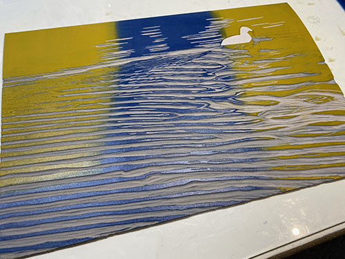
| Step 7 printed |
But, hey... look at the cool color that resulted from putting this rich blue over the top of the orangey ink laid down in the last color pass! Nifty, eh?
It's all still very blue, though, and what this image really needs is some greens. Of course mixing a green or two and applying it would be one solution, but you know me... let's try something a little more... um... Well... A little more.
 |
| Step 8 rollup |
This is definitely more. More blue, plus a big ol' bright ochre-y yellow. That ought to do something, right?
 |
| Step 8 printed |
And, indeed, we can call that... something. It's a nice green... sort of olive-y, but bright. Plenty of room here for adding some more subtle greens without ever actually using green. How about some gray, for example?
 |
| Step 9 rollup |
At this stage you can see that I've decided to start letting some of this color influence the bird, so there's no mask. Just a transparent gray... and if you look closely you might be able to tell that I didn't roll it all the way down the block. Maybe just halfway?
 |
| Step 9 printed |
I feel like I have a fair sense of where the image is going at this stage. I think perhaps one or two more gray passes to sort some more subtle details in the water, and then of course the bird needs some serious attention. Stay tuned!


So very fun to see this develop. I love when you use real colors and less of the greys. I understand (somewhat) why you use them but I'm in a hurry to see the finished piece! 😘 ❤️
ReplyDeleteNow, now, Wendy. Gray is a real color, too. ;-) But, yes, it's fun to go kind of color nuts once in a while... I can always tone it back down with that pesky gray!
Delete