I'm not going to say much more about the change at this point, because I haven't really figured out how I'm going to do it, and the entire idea may just fall apart before it gets very far.
 |
| Step 7 mask in place |
 |
| Reduction linocut in progress: Step 7 printed |
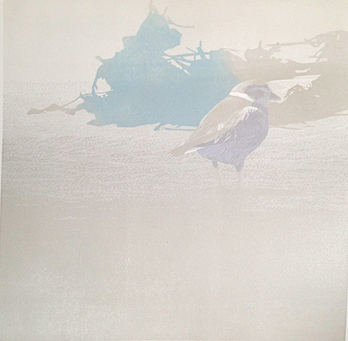
The blue is nice, but let us confuse the issue a little more by adding another non-gray color to the mix. How about a sort of light ochre? These blobby shapes behind the bird are beach detritus, mostly dark seaweed and eel grass, but with a few twigs and other things mixed in. Ochre could be a nice twig color.
 |
| Step 8 spot ink |
Again I want to contain the color, so I cut a mask to fit in the top portion of the block. Initially I tried to print the ochre right after the blue, but the newsprint mask stripped off the freshly-printed blue ink, so I had to stop and wait a day or two.
 |
| Step 8 mask |
It's both amusing and annoying how the addition of the ochre color changes the way the camera reads the color balance. I've tried to adjust the balance in this photo, but the upper background still reads as ridiculously pink. No. It's gray, I promise.
 |
| Step 8 printed |
So now I have these strange color shapes to contend with. I think for the next color pass I am going to go back to a transparent gray, which I hope will make things feel a little more cohesive again.
Or not. There's one more little bit of oddly bright color that needs to be in this image and now may be the time to do it. Hm. Could be a fiddly bit of inking, though. I might have to make... a plan!


No comments:
Post a Comment