Sunday, February 16, 2025

Linocut in Progress: That missing blue, and the trouble that came with it.

Part of why I decided to tackle the current linocut in progress was that it gave me an opportunity to work with a different and unexpected color palette. Spoiler alert: This image is mostly ochres and browns. 

But one of the most important elements of the image IS the blue one might expect from reflections on a bird on water. However, I've already got significant amounts of yellow ochre on the paper. I considered doing the blue patch immediately after the lightest yellow... from a get-the-color-right-and-give-it-some-luminosity standpoint it would have been the correct decision. But even when I cut a mask to try to contain the very distinct shapes, this blue is going to affect everything that goes on top of it. By cutting away and printing a second yellow before this step, I narrowed down the size of that affect.

It's hard to explain... so let me show you how it went. 

First... I cut a mask.

Or, more precisely, I cut a stack of masks. In a perfect world I would have made even smaller, more precise shapes... but it's just too difficult (read: impossible) to hand cut more than a dozen identical masks out of newsprint. Maybe if I had some sort of machine to cut them. But, no. I have me, and I have an Xacto knife.

Masks cut, it was time to mix the blue. It needs to be fairly opaque to cover the ochre that's already here, but I don't want to add so much white it looks chalky. Careful. Careful.

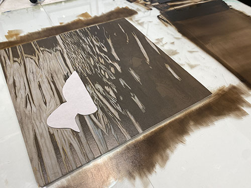
Step 4 rollup

You can see several color attempts at the upper edge of my work surface here. I knew the yellow underneath would darken this blue, so I made it as light as I dared without going chalky. Here it is masked on the press.

And printed.

Step 4 printed

Meh. I didn't love it. It looks quite dark, and a little bit gray... which was expected. I decided to go ahead and put this color on all the prints anyway, and resigned myself to a second blue run over the top of this one that would hopefully push things the direction I wanted.

I tried this:

Test blue for Step 5

Which brightened the blue but made it too dark. I am pretty sure I went ahead and printed this on all the prints, although I don't seem to have taken a photo. It's too dark, but it's very transparent and it will add some more "influencing" color to the blue that ultimately goes on top.

Because of course I mixed and tested a couple more blues and eventually settled on this. More white added than I wanted. Chalkier color. But not much else to be done. I had already sent a couple of prints to the reject "tester" pile.

Step 6 ink rollup

 I think you can see that I took advantage of having a sub-optimal blue already on the prints by carving a few little areas that would allow the "wrong" blue to still be present. Why not? A little more color variety never hurt anything.

Same mask shape applied:

Step 6 mask

And the resulting prints:

Step 6 printed

It wasn't perfect, but it was time to move on. There were several more darker layers to go around these blue shapes, so I just hoped additional darker values would visually brighten things up. 

Whew. That was a lot of work to get a little color on less than a third of the entire image. Let's hope the rest of this is a little more straightforward! 

(Spoiler alert #2: It wasn't. Not particularly, anyway.)


Friday, February 14, 2025

Linocut in Progress: New year, new image

 Okay... I realize we are already halfway through February, but I've studiously avoided too much social media since the beginning of the year, which somehow has included not posting work in progress.

And, full disclosure: This image gave me some headaches early on, so not posting took away at least a little of the "performance anxiety" that gets added when I'm publishing progress in real time. 

Enough excuses! Let's start a linocut!

Reduction linocut in progress: Step 1 spot ink rollup

I don't think I've had an image start quite this boring in a long time... but here we go. No surprises here– the subject matter is a bird on the water. But it's a bird with a white belly, and I wanted a slight value shift in the reflection of that belly. Just a skosh of light gray needs to be here, so I did some spot inking and cut the first of what would end up being several newsprint masks.

Step 1 mask

Step 1 printed

Honestly, it hardly seems worth the effort, since most of this little patch of gray will still be covered by other colors, but there are few things worse than getting all the way to the end of a process and realizing if you'd only done one small thing FIRST, the end result would be better. *

(* Okay, there are a LOT of things worse than this. But when it happens, the disappointment is real!)

On to Step 2! A very straight-up color roll. But... whhaaaaaaaaaaat? What is with all this yellow? Where is Sherrie Standard Step 2 Blue?

Step 2 rollup

Step 2 printed

Yep, that's yellow. (Well, a pale yellow ochre, but you know what I mean.) And just wait. It's going to get worse. 

But as an aside– Come on, birders. I bet you already know what species this is.

Remember how I said three sentences ago that the yellow was going to get worse? Not kidding. No photo of the ink rollup, but it's pretty obvious what happened here.

Step 3 printed

At this point I was already questioning the wisdom of getting this much ochre on the page this early. Let's call that foreshadowing, and leave the headache that resulted from this decision for my next post, shall we?


Linocut in Progress: That missing blue, and the trouble that came with it.

Part of why I decided to tackle the current linocut in progress was that it gave me an opportunity to work with a different and unexpected ...