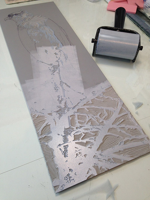
My process can best be described as creating a problem, finding a solution to it, and then finding a solution for the new problem I just created. If it sounds like I am joking, then you are either not a printmaker or you are a printmaker who is way better at this than I am.
While linocut at its most basic is pretty straightforward, there are two aspects of my process that combine to create what sometimes feels like an infinite number of non-ideal situations.
The first is that I work in reduction. This means all colors of an image are produced from a single block. At each stage I remove more material from the linoleum block, "reducing" the printable surface. If I make a mistake and remove material from the block too soon... well... depending on the seriousness of the error I can either live with it or consider options like using another block.
The second is that I use a lot of transparent ink, layering colors as one might layer watercolor washes.
Put these two things together with all the other variables... such as the order of carving and the way ink, paper, and lino behave on any given day... Yep. It's a recipe for magic or disaster or (usually) some combination of both.
The major hurdle for this particular image is the darn background, which I want to be a rich, consistent blue. This can be technically challenging in lino, especially when working at a larger scale. I started to write an explanation of all the issues I am juggling in my head when trying to work out the order of carving and printing here... but it just kept getting longer and less comprehensible and more likely to put you to sleep. So I'll try to just address things as they come up.
 |
| Step 6 rollout |
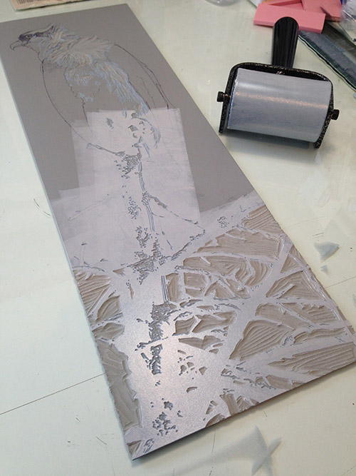
After Step 5 (more blue for the background) I needed to mitigate some of the blue in the branches on which the bird is perched. After much hemming and hawing I decided that I could go ahead and remove the background areas in the lower area of the image, between the branches. Even on a flat blue day the sky is generally a little paler towards the horizon, and the only other way to confine a non-blue color to the branches would be to cut a bunch of tiny newsprint masks. Or wipe color from the branches for every print. Either method would be time consuming and difficult.
I could, however, cut a mask to protect the upper portion of the image without too much difficulty. So that's what I did. You can see above that I didn't roll ink in the upper portion of the block where it wasn't needed, and in the photo below you can see the mask on the block, allowing the color to print on the main branch but not the bird or the background.
 |
| Step 6 mask |
And here's the result. So much to talk about here.
First of all, you might have noticed that the color on the block looked like a pale, pale brown (it was). It was also more opaque. I used a lot of "mixing white" to create the color, which is not completely opaque, but I didn't want the color to go too "chalky" at this stage, which can happen with more opaque white.
If you remember your basic color theory, colors that are opposite on the color wheel tend to gray each other out... so... a pale (we could say orange-y) brown over a blue? It's gonna go gray. I knew that, but wanted to at least nudge things in the right direction.
The other thing you might notice is that there appears to be a line/slight color change in the blue in the lower third of the image. This is an issue that cropped up early on... let's see if I can explain it.
In an ideal world one would roll out ink using a roller that is both wider than the longest dimension of the block AND of a diameter large enough that one revolution would cover the entire surface of the block.
I'm not sure I've explained that well, but if you've ever painted a wall with a roller you might know what I mean. The first revolution of the roller leaves the heaviest layer of paint, but the second time it goes around there's less paint to deposit.
The same thing is true when rolling out ink, and on large, flat areas it's easy to get lap (overlap) marks. I didn't notice them on the first, very pale, layers that were printed, but on several prints the issue magnified as more ink layers were added.
Enough prints had the problem that I decided to go ahead and print one more transparent blue layer... with a little stippling (carved dots) through the area where the lap mark occurred to visually disguise it.
 |
| Step 7 detail |
Capisce?
Stippling would hopefully work for the lap mark problem, but I don't want this blue to go everywhere, so it's time for more masks! Thankfully I saved the cutouts from the previous mask for the bottom of the block, and I cut an additional rough bird shape to fit over... the bird. Of course. I didn't have to be too precious about this, because the edges of the bird will ultimately be (mostly) dark... and I knew it would be better to cut the mask too small than too large.
 |
| Step 7 masks in place |
Here's the rollup. Even though I had the mask for the bottom portion of the branches, I didn't bother to ink that area. Slightly less area to clean up? Works for me.
 |
| Step 7 roll up |
As a result of the funny mask this poor osprey (for that's what it is, if you hadn't guessed by now) looks like an overgrown finch rather than a raptor, but never fear, the proper shape of the beak will appear later.
The stippling fix worked better than it appears in the photo... there's just something about digital photography (in questionable light) that tends to bump up contrast where it's not wanted. And of course there's wet ink glare, but you get the idea.
Now, thank goodness, aaalllllll the background material can come out and I can focus on the branch and bird. I think the shadowed areas have gotten too dark, and the branch is too dark, also, so I see some more ink mixed with white rather than transparent base in the immediate future.
All this carving will be quite satisfying, and I'm looking forward to getting the rest of the image resolved soon.
Thanks for sticking with this weirdly long and wordy post. I hope at least some of it made sense. If you made it through, give yourself a gold star for today and eat an extra cookie as a reward. You deserve it, after all.