Thursday, April 22, 2021

Linocut in Progress: The big osprey finish

 Well. I see by going back and rereading my own post that I anticipated only two more color passes to finish the osprey linocut. Yeah. You all know me better than that. But honest... I wasn't too far off.

So, where were we? Right. Step 11. 
Reduction linocut in progress, Step 11 rollup

The ink rollup for this step was a transparent medium gray-brown, although in this photo it looks rather dark. Here are Steps 10 and 11 side-by-side (although I should probably say Steps 11 and 10, since that's the order they're in). 

As I hoped, this pass served to unite the darker tones across both the bird and the snag it's perched on. It was so close at this point, and I really wanted to finish it in one more color pass, but deep down I suspected it would need another. But a girl can dream, can't she? 

Here's the rollup for Step 12, a darker, but still transparent, gray-brown. There's not a lot of material left on the block at this stage, and after every inking I had to take time to wipe stray color from the lower carved areas because it was hard to ink the tiny shapes without running over the sides. Time consuming. But that's printmaking for ya.

Step 12 rollup

Printed it looked like this...

Steps 12 and 11 side-by-side

So, so close. I noted with much relief (printmaking pun not intended) that the addition of this dark really pulled all the other values in to line. I had been uncertain about whether the color and value of the shadows in the bird's white chin and belly were correct, as well as the color of the lichen; with this pass it all seemed to come together.

I'll say it again: So, SO close. But I wasn't quite satisfied with the wings... they seemed a little too flat. And if I was going to put some more darks in the wings then I needed to add a few in other parts of the bird to keep the value range harmonious. But... bird only. The tree snag was finished. I removed almost ALL the material from the block until I was left with this:

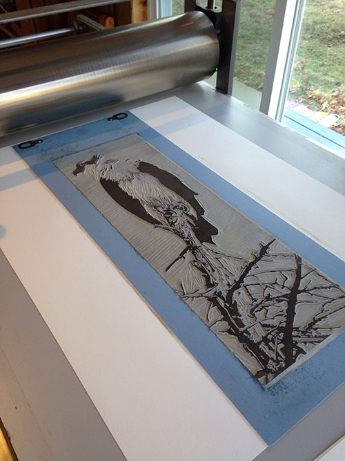
Step 13 rollup

The ink used for Lucky Step 13 was the unaltered leftover ink from Step 12. I didn't want to change the color, just the value. 

The result?

Sentinel
Reduction linocut, Edition of 16

Quite satisfactory. Technical issues early in the process meant I had more losses than usual, but I still ended up with a solid edition of 16. 

For the first time in over a year I suddenly have a lot of projects and a workshop schedule to contend with, so I'll be juggling studio time around all the other moving targets. It's a bit overwhelming, but it's a more familiar kind of chaos, and for that I'm really grateful. The covid situation is improving, but we're not out of the woods yet, so please enjoy a little more interaction with the larger world, but stay vigilant... like the osprey!

Thursday, April 8, 2021

Linocut in Progress: The big catch-up...

Reduction linocut in progress: Step 7 vs Step 8. 

Readers, you deserve better, but on this particular image I have totally dropped the documentation ball. I have a number of excuses, not one of which is particularly good, so let's just see what I can do to rescue the situation. A lot has happened since I last checked in.

In the photo above... hmmmm. On the left, Step 7, which was the state of the image after my last post. After Step 7 I removed ALL the background material from the block. Step 8 was two semi-opaque, white-ink-heavy colors applied at the same time. The slightly warmer color (as shown below on the right) was rolled on the bottom of the block, the cooler on the top portion and they were printed simultaneously.

Both inks of the Step 8 color pass.

At this point I thought things might move ahead in a more straightforward manner, but I was, alas, mistaken.

First up... the eye. The only yellow spot on the image. There was no point in fussing about with a full-on color pass for such a tiny shape, so I cut a mylar "stencil" and pounced the color onto each print by hand. Easy enough.

Pochoir technique for the yellow eye. Step 8.5?

This technique is called pochoir. It was used particularly in the hand-coloring of fashion plates in the 1920s and 30s, but I don't think the osprey will mind the association. They strike me as rather posh creatures, even if their breath no doubt smells of fish.

After the yellow, the Ugly Duckling Stage was upon us. While I was pochoir-ing the aforementioned eye, I decided to do the same to beef up some of the color in the lichen on the tree snag. (Sorry, no photos, I forgot.) It seemed fine until I applied the Step 9 color. More on this in a paragraph or so.

Step 9 rollout

Step 9 was a sort of... orangey brown?... applied only to the lower portion of the block. Something about this ink made the "beefed up" lichen green look positively minty when photographed. I tried to correct the color in the photos, but in the end gave up. Don't be alarmed when you see it. 


Here's the rollup of Step 10, with Steps 9 and 10 hanging on the wall behind. The Step 10 ink was a transparent warm gray over the entire block.

Steps 9 and 10, printed

See what I mean about the lichen color looking so alarming in Step 9? It didn't look that bright in real life, but wow... weird color metering on the part of my ancient phone camera. 

As you can see with Step 10, the lichen color metered a little better. Not so lurid. The Step 10 ink looks different in the top half of the image (more gray) because of course it's transparent and interacting with the colors beneath it. 

I think just two more color passes should get me to the end of this image– a transparent gray to pull out some more contrast in the tree and then the darkest bits of the bird. It would be great to be able to finish this weekend, as I've got some deadlines looming and it would be great to have this one complete and drying on the rack before too many days go by.

Linocut in Progress: Finishing up the dipper

 It can't be avoided anymore. It's time to address the details of this bird.  As many have figured out from the bird's silhouett...