Sunday, March 6, 2022

The Concord Museum is Alive With Birds

The Concord Museum, in collaboration with the Museum of American Bird Art at Mass Audubon, has just opened a lovely new exhibition that explores some of the life and legacy of William Brewster (1851-1919). Brewster spent more than 30 years studying natural history on his farm in Concord, was one of the earliest advocates for bird protection in America, and was the first president of Mass Audubon.


The exhibition Alive With Birds: William Brewster in Concord includes paintings, sculptures, and a linocut (mine!) from the MABA collections, as well as artifacts from the Concord Museum, Harvard's Museum of Comparative Zoology, and the Chesterwood Archives at Williams College. Excitingly, some of Brewster's field journals are on display, and the exhibition touchingly pairs excerpts from his observations with artwork from contemporary and historical bird artists, including John James Audubon, Louis Agassiz Fuertes, Charley Harper, and Lanford Monroe. 


"Trunk Show," reduction linocut by Sherrie York, paired with 
Brewster's observations of the behavior of downy woodpeckers at his farm in Concord.

"Alive With Birds" is open now until September 2022, so if you find yourself in the Concord area this spring or summer, do stop in to take a look. The museum also has some lovely historical exhibits and artifacts... including one of the very lanterns used to signal Paul Revere to begin his famous ride! 

Monday, January 24, 2022

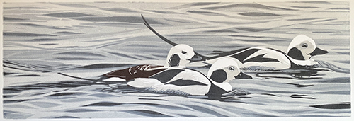
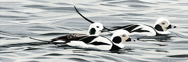
Linocut in Progress: The big finish? Yes, eventually.

Okay, enough is enough. Let's try to wrap up this current linocut, shall we? Where are we?

Right. Step 10.

After fiddling around with some spot inking in Step 9, I took my widest gauge and removed almost all of the background material from the block. There are a few small areas within the water that will still get a few more darker touches, but in general the water is finished. Which feels very odd to me, since it's all so subtle and gray. But that's what this piece is!

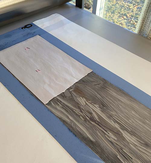
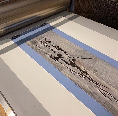
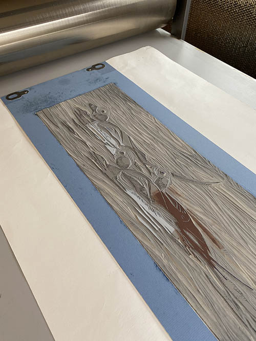
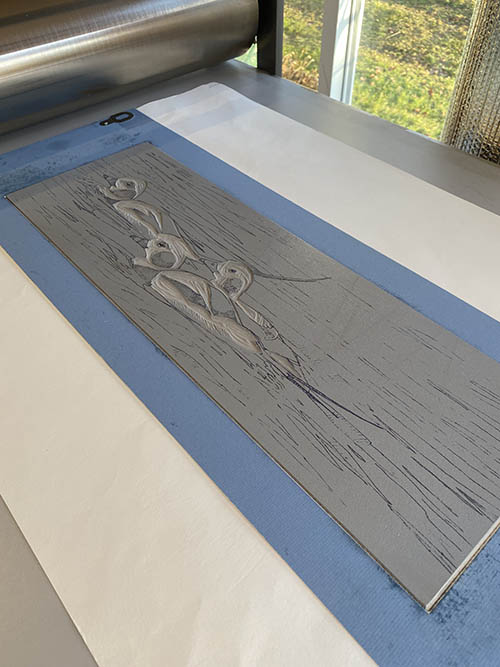
So now we're ready to print Step 10, which appears rather alarmingly dark on the block, but it's a transparent gray and will hopefully not feel too jarring once it's on the prints...

Reduction linocut in progress: Step 10 ready to roll

And indeed it's not too bad. 

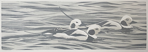
Step 10 printed

I think it's all getting very close now, which feels strange to say because it's all so.... soft. And gray. But that was the point of the image... winter-plumaged birds in a winter-gray sea. But it just feels strange. Did I say that already? Strange.

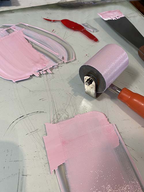
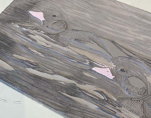
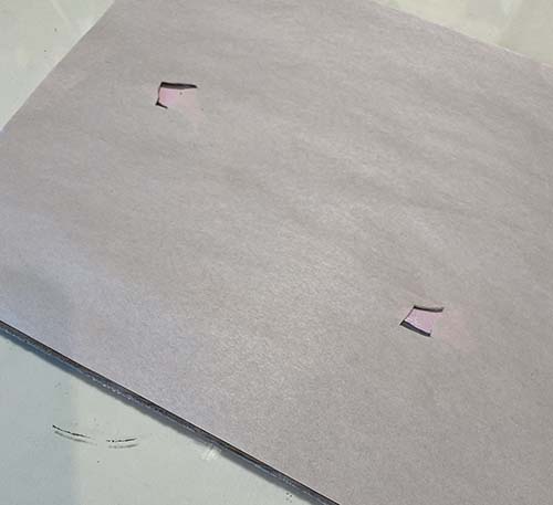
But first! There's a tiny-but-critical bit of spot inking which needs to occur, because the male long-tailed duck (for that's what these are) has a bit of pink in its bill. Can't forget to put that in! I cut a teeny tiny mask and mixed a teeny tiny bit of pink ink and...

Pink ink!

Pink rollup!

Mask with tiny pink shapes!

On the press!

As a side note... I could get away with this not-covering-the-entire block mask because the prints were very dry. If the prints had been at all tacky, they might have stuck to the exposed areas of the block. This is bad. Trust me. Voice of experience.

So technically I guess we call the Printing of the Pink Beaky Bits Step 11, although it hardly qualifies as an entire step. Maybe more like a wobble. 

At this point I believed I could be finished with just one more color pass. I carved away most of the material remaining on the block... until all I had was this:

Step 12 rollup, a dark not-quite-black

Printed they looked like this:

Step 12 printed. Is that the end?

I thought that was going to be the end, and even posted a photo of them hanging to dry in my studio. But after a couple of days something still bothered me. Something was missing. 

I decided the problem was that everything just felt too cool and flat. I had been aiming for cool, flat light... but perhaps I went too far. Technically the faces of the male birds could be a little warmer in color, which would be the obvious fix except for the fact that all the material in their faces had been carved away ages ago.

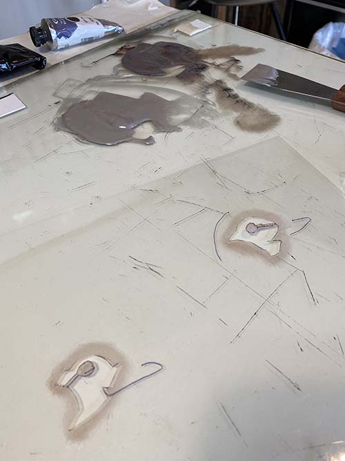
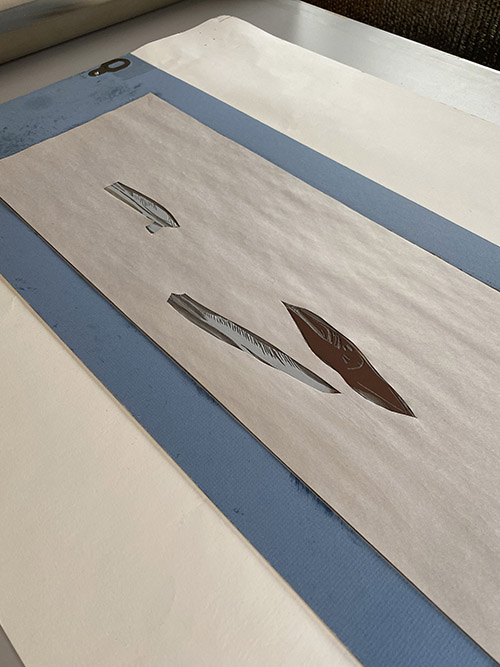
Enter pochoir. I've written about this technique a few times previously. It's a tried-and-true old method of hand coloring prints... with a stencil. I traced the shapes I wanted onto a piece of acetate and cut them out with an Xacto knife. They looked like this:

Stencil for pochoir technique.

Because my inks are so transparent, I ended up using the darker pile of ink for this step. The stencil was placed on top of each print and the color pounced into the area with a stiff brush. I then removed the stencil, placed a small piece of clean newsprint over each area of wet ink, and rubbed it gently with the heel of my hand to "strip" any excess ink.

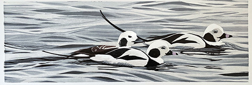
And.... 

NOW it's finished. I originally thought the title would be "Three's a Crowd," but I'm not sure that's it. Sitting with an undetermined title is easier than sitting with an unfinished print, though, so while I'm thinking about that I will be getting something else underway. Stay tuned!

Wednesday, January 19, 2022

Linocut in Progress: Stumbling along

Oh, SO bad me! I have continued to work on this linocut, but have been extremely remiss in the documentation arena. To be honest, the process of this entire piece has been weirdly uncomfortable... I think because the color palette is so strangely monochromatic for me. I haven't felt at all certain of my decision-making. 

But here's how it's been going:

Step 7! It was a "simple" transparent gray over the entire block, mostly building up interest in the water and undertones in the birds. Did I photograph the rollup? Apparently not. But here's where the piece stood after printing...

Reduction linocut in progress: Step 7 printed

Things started to move a little faster after this step, as I started taking out big swathes of lino. Step 8 was another gray pass, although I think it had a little blue in it to keep things in the cooler realm. These are winter-plumaged birds in an overcast winter sea. 

Step 8 printed

At this point I realized that I had potentially let the female bird get a little too cool, since her overall plumage leans more into the brown range. Plus I had let the grays at the bottom edge of the male birds get too dark. Eek! For step 9 it was time to cut a newsprint mask and do some spot inking.

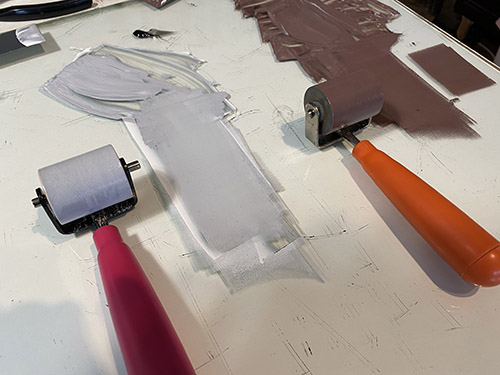
Here you can see an opaque pale gray and a semi-opaque light brown ink... and two little 1"-wide brayers ready for action.

Inks for Step 9

Here's the block on the press with the two gray areas and one brown area rather sloppily inked. But never fear....

Step 9 inked

...here it is with a newsprint mask in place. This mask will protect the prints from stray color and/or marks from the un-inked portions of the block coming in to contact with the surface of prints. 

Step 9 mask

This seems like the precise moment at which I should reveal a strange-looking photo of the prints after printing Step 9. But did I take one? Apparently not. Again. Yeah. I've been a bit unfocused lately. (Read: A lot unfocused. For a while now.)

So... all I can say is... yep... they looked strange. And in the next post I'll hopefully wrangle them back into some slightly less-strange state. Because that's what I do! Stay tuned.

Wednesday, December 29, 2021

Linocut in Progress: Into the subtle blues...

Well. 

Despite the uproar that is the holidays (even for those of us grinches who don't necessarily feel celebratory), I have been spending a little time in the studio. I have three subtle color passes with which to catch you up (wow, that was a sentence), and if you don't have time to read a narrative right now the summary goes like this: Step 4: Okay, Step 5: Disaster, Step 6: Back on track. Hopefully. 

It's a mildly cinematic arc, and from time to time I wonder if I shouldn't turn Brush and Baren into a vlog, but for now you're stuck with old skool still photography. And honestly, hair-pulling isn't one of my better looks, especially on video.

STEP 4! 

Time to get away from subtle grays and engage the subtle blues. Yep, it's time to work on the water. The overall tone of this image is going to be soft and subtle all the way through to the end, I think, so we're sneaking up on these next stages. 

As you can see in the upper edge of this photo, it took a little bit to find a blue that felt just right, but I got there eventually. 

On the press you can barely see that the block has any color on it...

And the resulting print stage is similarly... um... not dramatic.

Reduction linocut in progress: Step 4 printed

In fact, in this photo you can barely tell there's any blue at all... but, trust me. 

This step was achieved before the winter solstice, and the prints hung on the drying rack for about a week before I could get back to them. When I finally did... disaster struck.

I use a LOT of transparent base in my ink mixing. For probably close to a decade now I've been using the Graphic Chemical 1911. It's not a relief printing ink, specifically, but it can be worked to a good consistency, and it has served me well. From time to time, however, I've received a batch that might have been a bit old... and took a lot more effort to get into shape. 

At the conclusion of Step 4 I had used up the last bits of my open can of 1911, so for Step 5 I cracked a new one, from a shipment I received maybe a month ago. I was alarmed to see that there was some discoloration and skinning along one edge, but thought I could work around it. This turned out to be a bad decision.
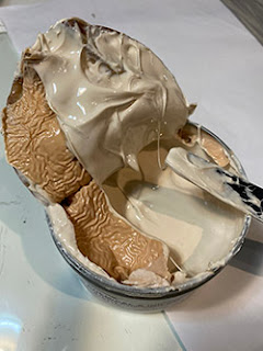
Second can. Worse than the first.
It's hard to explain the problem, but the short description is that although the ink seemed to work to the proper consistency, I couldn't get it to roll out evenly OR transfer evenly from block to paper. I tried changing the press pressure a bit, since the ambient humidity had changed since the last session and the previous ink was very dry. I also added some Setswell, which loosens the body of the ink and helps with adhesion. I tried and tried and tried, and soon I was halfway through the edition with very mixed results. I did finally get to something sort of workable and finish the run, but it was painful. 

And yes, I did open a second can of 1911. And it was worse. 

I cleaned up and turned out the lights and walked away. 

Here's what the linocut looked like at the end of Step 5, though. Mostly.
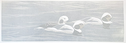
Step 5 printed. Painfully.

The next day I went back to carving, because that's what one does. But it was clear I needed to solve my ink problem. I do have a third can of 1911... but it's from the same order and I have no reason to believe it's going to be any better. 

I dug around through all my ink stash, and voila! I found a small tube of Cranfield's transparent base. I bought it to try some time last year, but had never used it. 

The base is very loose right out of the tube... much softer than I ordinarily like, but it mixed well with my pigmented inks (some of which are also Cranfield, so no surprise there) and rolled out nicely. And in fact the entire color pass went off without a hitch. Whew.
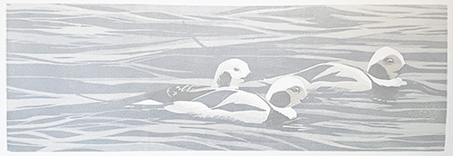
Step 6 printed. Without problems. Whew.

So. The good news is that I seem to have a solution for my problem. The bad news is two-fold. First... I don't have any more of the Cranfield base, so forward motion is stalled. (But I do now have some on order.) The second problem is that the Cranfield product is almost twice the price of the 1911. (sigh) But what price does one put on lowered anxiety levels in the studio, eh? 

There are some small details of the birds' beaks that will require some spot inking and masking, so probably this will be a good time to turn my attention to that step... and of course I need to carve for Step 7. Yes, I'm going to experience some more delay with this piece, but it could be much, much worse. And I'll start the new year with a new solution for my transparency needs, so that's a positive! 

So, friends of linocuts, Brush and Baren, crazy studio antics, and... well... me... Thank you all for sticking with me through the last couple of very strange years. Here's hoping that the new year brings us all more opportunities to see each other in person and to share some joy and laughter and beauty. See you in 2022!

Tuesday, December 14, 2021

Linocut in Progress: And we're off! In a blaze of... gray.

And here it is the middle of December! How the heck did that happen? 

I've been flailing around a bit since the completion of the merganser linocut, not certain what I wanted to do next. I do have a list of "requests," thematic ideas that have been mentioned to me or that I want to explore, but somehow none of them grabbed my attention. Oddly, it was something quiet and (yes, yes, here's that word again:) "simple" that came to the front of the line. Let's see how it goes, shall we?

We're having a couple of gray days here just now... a skiff of snow, but not really enough to measure. A mere dusting. That's fine with me... I'm sure there are plenty of snow days ahead and I am happy to wait for them. And since the first two (and probably three) color passes on this image were grays, well... it just seemed appropriate.

Yep. That's gray, alright.

So. It's gray. It's very transparent. And we're working with that format that I just can't seem to get away from! Long and skinny, 8" x 24." Even with just one color pass, though, I'm guessing there are a few bird geeks enthusiasts out there who can already identify the species. 

Reduction linocut in progress, Step 1 printed

Off to a good start... a little more carving and... let's print another gray! This color was made from leftover scraps of the first color with a little tiny bit of warmth added by using a skosh (technical term) of sepia. (And this gray ink, BTW, was actually a leftover from the merganser linocut. Another reason to love traditional oil-based inks.)
Step 2 printed, more gray. Can you tell what they are yet?

So here's that second, warmer gray printed. Have you identified the bird species yet? I'll give you a hint: They are in their winter (non-breeding) plumage. 

Still not sure? Okay. Let's print another gray, but this time... ooooooh. Let's cut a mask. Because not cutting a mask by the third step just wouldn't be, well... Sherrie enough.

It's a bird! It's a plane! It's a newsprint mask!

Intriguing, eh? I did manage to keep it not too fussy, and the trickiest part of this entire step turned out to be finding the appropriate gray. Again I wanted to warm it up a bit, so I started with the leftovers of the previous pass and added yet another skosh of sepia. 

Pick a gray, any gray.

Aaaannndddd.... here we are, all printed.

Reduction linocut in progress, Step 3 printed

Have you identified them yet? No? Here's another hint: they used to go by another name. The new name is a bit boring, but descriptive. 

From here I'm moving on to some pale blue-grays. (Because: water.) The entire image is going to be much more subtle (I hope) than the merganser piece, with a softer and less contrast-y color palette. At least that's where I think we're headed. Only time and rolling out some ink will tell.

Thursday, November 18, 2021

Linocut in Progress: Finishing the merganser

 Ooph. This has been "one of those" linos. Every time I thought I was about to be finished, I discovered I was not. But now it really IS finished. Well, probably. (Wince.)

When we last left our hero, she was living under the delusion that she had but two steps to go: correcting the color on the bird's beak, and "one last dark." The phrase "one last dark" should probably always be written in quotes, and when uttering the words aloud one should employ air quotes. At least when one is me. 

First to the beak. For which I have no documentation whatsoever, because I was too aggravated to remember to take any photos. Actually, no. It looks like documentation-wise I will show you the alleged "last dark" step first. 

We'll call it Step 16.

Reduction linocut, Step 16 printed

This probably was Step 16, since images I have of this stage do not show the adjusted beak (and, as we will see at the end, cheek color). The color was another transparent gray over the entire block... this time a little cooler than the previous sepia color pass. It was supposed to be (quote it with me now) "the last dark," but despite putting my fingers in my ears and singing Coldplay to drown out the nagging in my head, I sort of knew I was going to have to revisit this. But! On to the bird's head, which was also contributing to the cacophony. 

A merganser's beak is really quite red, but when turned into the light it can appear more pinkish. The problem is that the side of the bird's face doesn't really appear to be as light as it should be to suggest a pink bill. So there are two problems to solve with teeny, tiny shapes. Probably NO ONE but me will care about this. But I do. So I must tackle it.


It took almost an entire day, I kid you not. Wrong colors, wrong shapes, wrong values. Ugh. So, no. There are no photos of me mixing and printing and stripping the color back out and changing it and trying again. (I did even try a red-red, but ICK!) I'm still not convinced I got it entirely correct, but it got to the point where I just had to walk away. (And eat some supper... maybe that would help?)

Anyway... here's a little detail of the more pale cheek and the pinky beak color. Seriously. I spent an entire day on that. And what do I call it? Step 17? Steps 17 through 47? We'll call it 17 (cheek) and 18 (beak) and move on.

After supper I walked back into the studio and looked at the prints hanging on the drying rack and felt my heart sink. 

Yes. It absolutely needed "one last dark." 

By this time I was so over the process (it happens sometimes) that I decided I would just power on, stay up, and get the thing done once and for all. I went at the block with a vengeance... using my largest sweep tool most of the time, and getting it down to the just smallest bits of necessary dark.

Like this.

Step... um... 19? block. "One last dark."

I'm pretty much committed to this being the last stage now. I mean, how much more lino can I carve away and still have anything to print? Thankfully....

Step 19... The last dark. No, really. I'm serious this time. No quotes.

See what I mean? Definitely needed it. 

So, she's done. Kind of. 99.9% done. I am disturbed by the too-dark (oh, now it's TOO dark!) eye. This is a not-too-complicated fix... I can strip back a tiny bit of the color... but it's a tiny shape and delicate areas around the eye are still wet, so I will wait a day before getting in there with a pin-head sized piece of paper to pull off some ink. 

The other thing she will need is a title, although at the moment the front runner is "Why do the things I think will be straightforward always turn out to be the opposite," and that's too long, even for a piece this size. (Which, by the way, is 18" x 18"– about 46 x 46cm for those of you using a modern, reasonable measuring system.) (Another potential is "Out of the Blue," but we'll see.)

Thanks for sticking with me through this one. The big question to answer now is, "What's next?"

Monday, November 15, 2021

Linocut in Progress: Crawling towards the finish

It's been a busy few weeks, with reasons good (a visit in Massachusetts with bird artist colleagues at the outstanding exhibition of friend and fellow artist Cindy House) and not so good (paperwork) keeping me away from the studio more than I'd like. But progress is being made, even if it's hard to see.

My last post celebrated the widening of the green palette of this image without applying any more green ink, and that happened one more time before I went on the road for a few days. Here's where things stood after the application of another transparent gray layer, for Step 12.

Reduction linocut in progress: Step 12

This was feeling pretty good, but a few alarming things were happening. The first was that the bird's head had gotten too dark, and the second was that the warmer reflections of the bird's head in the water had lost some of their oomph.

Yep. It's a job for spot inking and masking. (sigh) Fussy things like this seem so much more tedious when the end of an image seems like it should be near but keeps getting farther away. Nothing to be done but carry on. 

Here's Step 13, such as it was. Luckily the prints had been drying for 5 or so days while I was away, so this casual approach to both inking and masking was no problem.

Step 13 mask and spot ink in place

Here's the lightened head and reflections. Perhaps a little too far in the other direction, but never fear, I'm going to cover most of this back up. 

Step 13 printed (Glare-y photo, sorry) 

Yes, that's what I said. Lighten it all, and then swing it all back the other way again. I did some small amounts of carving.. tiny details that probably 90% of viewers won't even notice, but I needed to know they were there. And then another spot ink and masking adventure.

Step 14 mask and spots

Here are Steps 13 and 14 side-by-side. You would have spent an entire day doing this, too, right?

 Steps 13 and 14 detail

I admit I was quite grumpy when The Day of Steps 13 and 14 was over. It was a lot of work with not much to show for it. The one good thing about printing small shapes over a small area with small amounts of ink is that the prints were dry enough the next day for me to do something a little more satisfying and meaningful. So... a layer of transparent sepia went over everything. It looks alarmingly dark on the block, but trust me. There's a lot of transparency there.

Step 15 rollup, sepia

See what I mean? NOW we are finally getting close. At least I think we are. I thought we were close three steps ago, but that's how things roll around here.

Step 15, printed

So what's left? The bird's beak needs a color adjustment... it should be redder than this. That's not a huge thing, but it will take time to do correctly. And then I think one last dark for that last bit of contrast... just a few spots in the water and the bird. Don't quote me... but I think I should be obsessing about the next project by Wednesday. ;-) 

Sunday, October 31, 2021

Linocut in Progress: Greens... without using green!

It's been one of those weeks. As I mentioned in my last post, a couple of weeks ago I finally broke down and bought a new computer to replace the ten-year-old one that had ceased updating and was starting to have some issues. The new machine sat on the floor in its box for an entire week before I was brave enough to set it up, because I knew the cascade of issues I was about to unleash. 

It's been another week where many hours were lost to transferring a terabyte of information between incompatible machines and installing additional memory chips and downloading new software. But as of last night I think I am finally more or less functional... still some loose ends to tie up, but the major headaches are hopefully behind me. 

It was just as well that I had that distraction, because after the steps you're about to see, these prints became just too wet to forge ahead. I tried... and made a mess... so had to walk away and deal with a techno headache instead. Wheeeee.

But once again I'm getting ahead of myself in the storytelling. Let's see where we are right now..

Reduction linocut in progress: Step 10 on the press

The goal for these next few steps was to add some value changes to the green without making it any brighter. The best way to do that seemed to be to use a transparent warm gray... it's a mix of a skosh (technical term) of black and another skosh of sepia in a whole lot (the anti-skosh) of transparent base. And hey! Let's roll it over the entire block, no masks required. 

Step 10 printed

Not bad, not bad. We were headed into the olive-y realm with the green... and that was okay. Plus a hint of definition was developing in the bird. 

Works for me. Let's do it again! More carving, more black/sepia/transparent base.

This time, however, I wanted to avoid letting the bird's head get any darker... so I cut some funny little head-shaped masks.

Step 11 on the press

Yes, a good call. We're seeing some subtle value changes in the water and a bit more in the bird, but the head hasn't gone too dark. Seems like we're* on the right track. 

(This would be the printmakerly royal "we." You, me, the tools, the ink, the paper, the weather...)

Step 11 printed


Step 11 on the left, Step 10 on the right.
It's like one of those "spot the differences" puzzles we did in grade school.

I was starting to feel really excited to finish up the water... one... maybe two... more passes with a gray to create darker values in the green... and then the finishing touches on the bird! Yes, let's go!

Or not. I tried to print the next color pass, but the prints were just too wet and the new ink layer printed speckly and gross. Nothing to do but clean it all up and walk away for a few days. (How lucky that I had Computer Hell to keep me occupied instead, eh?)

It's possible that I'll be able to get back to it tomorrow. Everything's still a bit tacky tonight, but hopefully by tomorrow afternoon the prints will be dry enough to get that next color pass down. I had hoped to have the entire thing finished before I run away from home for a few days this weekend... but it's not looking promising at the moment. But we're getting close! "We" need to catch that bird before she swims away!

Monday, October 25, 2021

Linocut in Progress: Moving away from the blues

Alright, then. Enough of these infernal and eternal blues! It's time to print something else. 

Which honestly will only create another blue, but it won't be a bright one and it will set the stage for some other things to happen. Because, Readers, we're printing a transparent gray. 

Yep. Just gray.

Reduction linocut in progress, Step 8 rollout. Thrilling, eh?

It doesn't look like much, but it's very exciting because it's printing over everything, including the bird. No masks at all! What will happen?

This!

Step 8 printed. Yawn.

Yeah, not really exciting after all, eh? In fact most of the toned-down blue created by this gray ink will get covered with subsequent colors, but I think it was crucial to tone things down a wee bit at this stage. Because just you wait... ain't nothing subtle going to happen next. 

We're printing... green!

And not just any green. A weird yellow-y green, because of course there's lots of that pesky blue on the print already and it's going to influence whatever I put down. I want the green to stay on the warmish side for now, so alarming chartreuse-y hue for the win! (I hope.)

Step 9 rollout. Don't be afraid!

It's something, isn't it? This is actually the improved color. The first one I mixed was entirely too brilliant lime in attitude and made things look like a circus. This color looks bright in the rollout and on the block, but the hope is that it will cooperate with the already-printed tones when laid over the top of them. 

Of course I didn't want to take any chances with this color in the bird, so a new mask was required.

Step 9 mask

NOW something exciting is happening, eh? Just look at the difference from Step 8 to Step 9! Wheeeeeeeeeeeeee!

Steps 8 and 9 side-by-side. Wheeeeee!

Believe it or not, most of this bright green will be covered by other colors, but it was important to establish it as the undertone for things that will be happening next. In fact I think the next color pass will probably be another gray... but we'll see how I feel after I spend some time staring at this stage hanging on the wall. The prints are quite wet now, so a little drying time will be necessary before anything more can be added. 

Step 9 printed

We're going to have a stretch of rain here on the coast for the next couple of days... so what better time to hunker down in the studio? 

And honestly, I need to get away from computers for a bit! I finally bit the bullet and bought a replacement for my 10-year-old desktop machine... but of course the transition from my old system is not smooth. I've had to order cable adapters to get the two machines to talk to each other... and of course the cascade of software that no longer works is also giving me headaches. I'm sure once I get it all sorted out I will be a happy camper... but... OOPH. It's almost as tedious as four (or was it five?) layers of blue ink. 

Onward.

SWLA's "The Natural Eye" at the Mall Galleries, London

 Um... so this happened: What's that big red dot next to my chickadees? I have two linocuts on exhibit at The Natural Eye , the annual e...