 |
| Reduction linocut in progress: Step 5 rollup |
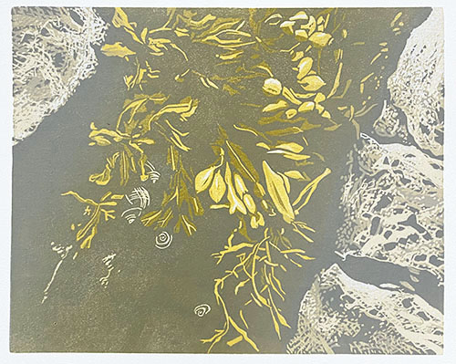
For this roll-up I deepened the yellow once again with the addition of some more red, and I mixed a lovely warm beige-y color. I got out my trusty old skool Speedball brayers so I could control the application of ink to the block a little better. I used a small 2" roller to apply straight beige to the rocks (you knew that was what they were going to be, right?), and I used a blended roll on the 4" brayer in a tricky way. I ran the color first in one direction, and then turned the block around to run the blended roll in the other direction! This kept the yellow in the middle-most parts of the block and the blended-to-beige bits towards the outer edges.
 |
| Step 5 printed |
You might also notice some lighter-colored blobs in the lower part of the image. I used a paper towel to wipe the color out of these few spots before I printed each time. There are some details going in here that could benefit from being less yellow, and it doesn't hurt to minimize ink layers whenever possible.
 |
| Step 6 rollup |
And now it's time for a bit more drama. The ink roll up looks ominous on the glass, but I promise it's not so alarming on the print. Remember there's a lot of yellow in the middle already to minimize the depth of the green.
 |
| Step 6 printed |
Well, okay. Maybe it does seem a little alarming. But we're in the middle stages of this image, and long time readers (and other printmakers) will know that this is when things often get a bit funky. Nothing to do but cross our fingers and hope I got this right.
As an aside... you might notice the ink coverage looks a bit splotchy in the lower portion of the image. Not to worry... there is a lot more to be done down in this area and the splotchiness will be covered by subsequent colors.
Like this:
 |
| Step 7 rollup |
Back to the big roller, because this color pass is just a semi-transparent gray across the entire block. I would have liked to make it even more transparent, but after the complete fiasco of using a lot of transparent base, I am really, REALLY head shy.
But I think it worked okay....
 |
| Step 7 printed |
So! What's next? I think it's time to start working more on the areas around the rockweed (yes! this is an image of seaweed). I think the rocks only need one (okay, maybe two) more darks, and those will be most along the edges closest to the rockweed. Next color? Something orangey-browny, I think. We'll see how I feel after the next stage of carving.


No comments:
Post a Comment