Sunday, May 3, 2020

Linocut in Progress: The third color pass... for Print Day in May!

Alrighty, then! It seems like there's some actual progress happening in the studio! Amazing.

The new linocut in progress is another long, skinny format.... the same dimensions of the harlequin duck piece that I finished back in March before the world went topsy-turvy.

This image has a fair amount of white in it, also, so there was some carving to do before I printed the first color. Here's the pale, transparent blue first pass:

Reduction linocut in progress, Step 1
Again.. these funky skinny formats are hard to see, but these images are a little bit bigger if you click on them.

As often happens, the first color pass seemed like it might be too dark, but I decided to just charge ahead, pretending to be confident that the contrast will sort itself out once some darker values are set down.

The second color pass was a transparent gray made from scraps of the blue plus a little packet of a sort of lavender-gray that was leftover from the Canada goose piece finished a couple of weeks ago.

Reduction linocut in progress, Step 2

So far so good. These first two colors still seem a little dark, but the next color pass should sort that out. It's going to be quite a bit darker, and visually that should appear to lighten the previous.

But first! Saturday was the annual Print Day in May celebration, and printmakers all around the world were busy working in their studios and sharing images of their activities on social media. I decided to be brave and a present a short LIVE program on Facebook... because... why not? I knew I wanted to share a little information about my process, but I also wanted to be able to print during the program. I carved like mad on Friday to be ready to print the third color pass.

Hey look! It's me in my studio... with Presston! (He's the big steely-featured beast next to me.)

It took me a few minutes to sort out the audio and commenting controls when the live broadcast started, but once I got going it was fun to share what was happening in the studio, and really fun later to hear from folks far and near who had tuned in. Thanks again to everyone who took the time to hang out with me!

Reduction linocut in progress, Step 3

And, whew! Printing went smoothly.  As I had hoped, the blue and gray of Steps 1 and 2 now appear less contrasty and more connected to the white areas, and oooh.... what's that? By golly, I think I see the silhouettes of two birds starting to appear. (Secret insider info: There will be more than two birds in this image, but can you tell how many yet?)


So now it's back to the carving table. It feels like I might be able to get through this print in fewer than 10 color passes... but then I thought that on the last image and didn't quite make it. However it goes, I feel like I've got a good start, and I'm looking forward to moving this along this week.

There will be a few distractions, though.. as this week we're also gearing up for World Migratory Bird Day! The official day is May 9, although WMBD celebrations take place all year long in different parts of the world. Unfortunately many events have had to go virtual this spring, but the folks at WMBD and Environment for the Americas will be working hard to share lots of fun information online. Who knows... you might even see a thing or two pop up from me next weekend... stay tuned!

Friday, April 24, 2020

Starting a new linocut: Business as not-quite-so-usual

While human communities around the world remain in isolation, nature's wildlife communities are going about business as usual.

I had a birthday at the beginning of this week, and to celebrate I took myself and my sketchbook out for a walk on a nearby trail. Maine's landscape is still very gray and brown, but there are signs of spring everywhere. Skunk cabbage is one of the earliest blooming plants... its strange maroon flowers appearing even before its leaves.

Skunk cabbage in bloom...

The eastern phoebes are back, also, and busy reclaiming their nesting spot under the eave of my front porch. Earlier this season my landlord added a gutter to my roof because snow melt and rain were dripping on to my steps and causing serious icing problems. It's not a pretty solution, but the phoebes seem to appreciate the snazzy new perch that was added while they were away.


In the studio the progression of the season has been a bit bumpier. The phoebes might not be affected by the emotional, physical, and financial distractions of a global pandemic... but the rest of us sure are! Personally I find myself able to work only in fits and starts, with serious focus issues.

With all that's going on, I was thrilled to take a walk the other morning and discover inspiration for a new linocut! The weather down at Pemaquid Point was wild... sun, then clouds, then snow and wind... and the seas were fierce. There weren't many birds about, but then... oooooh! A group of more than a dozen black scoters appeared, bouncing in and out of the waves as they fed near shore. Black birds, bright yellow-orange beaks, and rich blue water? Yes, please!

I had so many potential combinations of birds and waves that it was hard to choose what to do first, but I finally settled on a composition and set to work on the line drawing.

line drawing for new linocut

I don't usually share this stage of the process on Brush and Baren because I like the element of surprise as an image unfolds. But, hey! This time I already told you we're doing scoters and waves. Talk about a spoiler.

When I have the line drawing finished I transfer it to the lino. In this case the image involves a fair amount of white, so I have carving to do before I can print the first color. I've already trimmed and tabbed the paper, so everything's ready to roll.

It's a relief (printmaking pun intended) to have something to work on again. Thanks for sharing the journey... at appropriate physical distance. Be well, everyone.


Tuesday, April 7, 2020

Linocut in Progress: Finishing the geese....

Spoiler Alert: Nope. I didn't finish in ten color passes.

Like all of us, I've been trying hard not to dwell on the challenges of life during a global pandemic. Everyone's got challenges, and everyone is trying to find their way through unfamiliar territory. The greatest issue for me right now is that March was supposed to be the start of my busy teaching season, and of course all my workshops are cancelled for an undetermined period of time. Galleries remain closed, as well... all of which is wreaking havoc with that minor life detail known as income.

But when I can push those concerns aside and focus on today, then I can say that I really appreciate having the unexpected time to do a few things around the house and to work in the studio. Because, hey! It's only the end of the first week in April and I've already finished 3 new linocuts!

When we last left our heroine, she had turned her attention to completing the birds and their reflections. It was hard to call the water finished, to be honest. So simple.... so quiet. Shouldn't I put some big, dramatic... something... in there?

No.
Birds.
Focus on birds now.

Step 9 ready to print. Spot ink and mask.

So here's Step 9, all inked up in a transparent brown and ready to print. I'm using a newsprint mask here to protect the already-printed areas from any potential stray bits of color. I didn't remove all of the background material on the block, both to hedge my bets about whether I was going to need another color in the background and to support the prints as they travel through the press. If the press roller were to dip down into uncarved background and then have to jump back up on the the beak of the first adult bird.... well. Slipping... crunching... mooshing. All sorts of bad things could happen.

Reduction linocut, Step 9 printed.

This was feeling pretty good. I liked that the birds were starting to show some form and the overall feel was still very peaceful.

So I mixed a darkish, transparent brown-black for what I thought would be the final color pass, number ten. You can see there's not much to print in the birds... and you can also see the material still left on the block that will support the roller. And you can see why I need a mask, since there's so much color outside the bird's necks.

Step 10 rollup (Yes, there was a mask, but no photo of same)

Of course I neglected to take a photo of the mask at this stage, but it was basically the same one I used in Step 9. Here was the print at the end of Step 10. Is it finished?

Step 10 printed

Well... bummer. I don't think so. It's okay like this... but the morning after I printed Step 10 I still felt that the darkest bits of the adults (and maybe a little section of the twigs that have the stray chick's attention) need one last bit of oomph.

Step 11 spot inking. Hardly anything left!

And we're talking little bit... because there's hardly anything left on the block to take ink. This color looks completely black in the photo, but it's really a leftover scrap of the Step 10 color with a tiny bit of black added.

Step 11 masked

New mask to contain the color. Probably one of the easiest masks I ever cut. Amazing.
And here it is, all finished!

"Come Along, Dear..." Reduction linocut, 12" x 18"

The title of this piece was known long before I even drew it up in the lino... in fact I've been thinking about this concept for a couple of years. It's a quiet family outing... the adults are creating very few ripples because they are moving slowly to accommodate the speed of their offspring. One curious chick is distracted by a twig. A parent lets the little one wander for a bit... and then gently encourages the young explorer to rejoin the group..."Come along, dear." 

Thursday, April 2, 2020

Linocut in Progress: Big changes, quiet mood

As if it weren't difficult enough to focus right now, the weather gods have elected to grace us with rainy, dreary weather here on the coast of Maine. I find it extra challenging to get anything done when the whole world is insisting I take a nap in front of the wood stove.

But somehow I've managed to move this print forward in the last few days. The previous orangey-brown color pass was a bit alarming, and I didn't want to have to stare at it for too long, so I rolled out a nice transparent purpley-gray (I have such great color descriptions, don't I?) and ran it over the entire block. At last.

Hey! There are some birds in this linocut! Step...um... 7

That's okaaayyyyy... but somehow it still feels a bit too wishy washy. Ethereal would probably be a kinder word. I'd probably use kinder words if those nap gremlins weren't whispering in my ears. Again. Now. Constantly.

After a bit more carving in the foreground water I was ready to print Step 8. You can see from the roll-out photo that I'm using a variant of the previous purpley-gray color, but with a little twist. The darker-looking ink is semi-opaque, while the lighter is a much-more-transparent version of about the same hue. I did this in part because I felt the background was looking a bit "splotchy," and an ink with a little more oomph would (I hoped) even things out. I did not want the foreground to go dark, however, so the more transparent ink was applied to that area.

Step 8 ink rollout

I dunno. I really like this color. Maybe it's just the influence of the weather this week....


Oops! I realized after I had cleaned up that I took this photo without the block on the table!

Okay, I think that might be it for the water. Maybe. Mostly. (Wait, did I say the print was looking wishy washy? Clearly it's not the print.... it's me!)

I'm definitely going for a softer mood with this image than the last two bird/water pieces I've completed, and that kinder, gentler tone is turning out to be less-comfortable territory for me. Sometimes I find it hard to resist the temptation of big visual drama. But I'd like this piece to feel quiet and gentle... without getting too sentimental.

Step 8 printed... on to the details of the birds!

At any rate... here's where we are at the end of Step 8. There are still many details of birds and their reflections to do, but I might be able to pull them together in just two more color passes. What do you think? Can I be three-for-three in finishing a reduction print in ten passes or fewer? Stay tuned!

Friday, March 27, 2020

Linocut in Progress: Out of Order

Have you ever noticed how the simplest ideas can sometimes be the most complicated to execute? Well... you would have noticed if you were me. I've spent a lot of time on the current linocut the last couple of days, and all I've really managed to do is confuse myself.

The issue is the balance of warm and cool tones... basically blues vs browns. This image has some of each reflected in both the water and the birds, but since I'm working in reduction this presents problems with order of printing. How do I prioritize for the influence of one color next to or over another? I have a sinking feeling that I have already messed this up, but there's naught to do but carry on and see where this piece takes me.

Step 5, spot ink and mask

Here's a good example. After the previous color pass the print was dominated by blue, but of course the bodies of Canada geese (for that's what these are) are brown. These brown bodies are very light in the sun, dark in the shade, and, just to make things more complicated, reflected in the water. But they aren't reflected in the water at the exact same value at which they appear on the birds, are they? Nooooooo, of course not.

So for Step 5 I cut yet another mask, once again to contain color. I spot inked a light tan-ish color, and got this:

Reduction linocut in progress, Step 5 printed

That all seemed fine. I spent... gosh... a lot of hours... carving and carving at this point. I thought I knew what color I wanted to print next... a sort of purpley-gray. But I pulled one print and decided that was a mistake. There were some warm undertones in parts of the water and a mid-tone to do on the birds, and I decided I should do that first. I cleaned up the block, and the brayer, and the glass, and rolled out the warmer color.

Step 6 ink rollout

It seemed quite alarming rolled out on the glass, but it was fairly transparent and my first test print seemed pretty good, so I went ahead and printed it.

Step 6 printed

Once I finished this color pass, I went back to my first (rejected) test print and ran this orangey-brown on top of the purple-y gray, just to see what it looked like. ARGH! It made EXACTLY the color I want next! But now it's too late, because in a test of my purpley-gray over the top of the orangey-brown color that I did print... well. It's not right. I should have stuck with my first inclination for color order. Rats.

It's not the end of the world (or the print), I don't think. It just means a change of tack and mixing a new ink color. But hey, I have lots of time. It's not like anybody's going anywhere right now, eh?

Monday, March 23, 2020

Linocut in Progress: Changing my mind

It's been several weeks since we've had any snow here on the coast of Maine... so it was a bit of a surprise to check the weather forecast this morning and see a prediction of 3-7 inches of white stuff tonight. I filled up the bird feeders and brought in more wood for the stove... and spent the morning in the studio.

There weren't many areas of the linocut in progress that were going to retain the transparent gray I printed in Step 2. So few, in fact, that I had considered cutting masks and spot inking instead of running gray over the entire block, but the shapes I needed were going to be so tiny that cutting a mask would be ridiculously difficult and probably not very effective. I knew that printing a gray over the entire block would affect all the colors that would follow... but how bad could it be, really?

Well.

After I printed the gray I decided on a straightforward light blue across the entire block for Step 3. I put a little white ink in my mix, on the theory that it would cut down on the influence of the previous gray. 

Reduction linocut, Step 3 printed

It did, but after the prints sat overnight I was concerned that the blue still felt too gray. Much hemming and hawing ensued. 

I had initially considered a blended roll, with the blue changing from top to bottom. This can be really effective for suggesting a sense of depth in the image, but in this case a major element of the composition is very complex horizontal lines of reflection. If I leave the color flat, it could really emphasize the abstract nature of those lines. What to do?

I decided to try to beef up the blue along the bottom half of the image. I knew that I didn't want this more intense color to influence the light-struck backs of the adult birds, so I cut some more masks. When I used masks on Step 1 my goal was to keep the ink contained to a small area. This time my goal was to keep ink out of a small area.

The first idea, masks included

I printed this on probably 6 of my 20 sheets before I started second-guessing myself. I just wasn't convinced it was the right approach.

So I tried a print with a flat blue over the entire block.

Yep, I think that's going to be better. (sigh)

Changing my mind

So... I crossed my fingers that I had mixed enough ink and carried on printing the flat blue for Step 4. Then I went back and ran blue along the top of first six prints that had only been printed on along the bottom. They're not great, but I think they'll be okay once the other colors go on top.

Here's where the print stands now. It's quite clear how gray that first blue pass was when you see it in the areas that were masked off for this stage.

Step 4 printed. It's not a gradation, just an artifact of overhead light.

It's still impossible to really get a sense of where this image is going, but I think all that will change at the next step. There is a LOT of carving to do before that can happen, though... so go wash your hands and find some enjoyable way to occupy your time, and I'll check back in a few days.

Saturday, March 21, 2020

Linocut in Progress: Inside Out and Backwards

It's amazing how quickly things change. Just over a week ago I was finding it hard to get anything done because I was distracted by the looming specter of too many projects and not enough time.  Now it's absolutely the other way around, with workshops, travel, and exhibitions being cancelled or postponed left and right. I'm still distracted, but for totally different reasons. I don't know about you, but global pandemic was definitely not on my A-list of Imminent Challenges.

Still, relief printmakers are no strangers to thinking inside out and backwards. I know I'll feel better if I get some work done, so I've launched a new linocut. Naturally it's already turning out not to be particularly straightforward. Which does seem to be a worldwide theme just now.


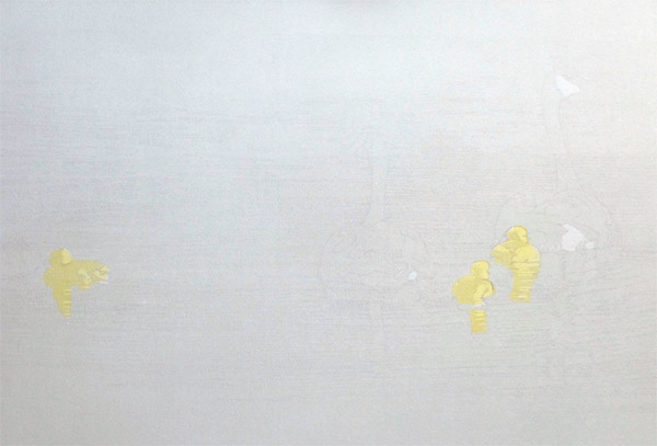
The image calls for three little blobs of yellow, widely spaced on the page. Yay! Yellow! A bright and cheery color in an otherwise rather gray week (both literally and figuratively).

There's also going to be a lot of blue. Goodness knows I don't need the interference of yellow in blue... so before any lino was carved I found myself cutting little newsprint masks. Like this:

Newsprint masks

Ink mixed, masks cut... I spot inked two areas of the block. Like so:

Yellow spot-inked on the block

And then I carefully placed my newsprint masks. Like this:

Spot ink, masks in place

And I printed this thoroughly exciting start:

Step 1 printed. Exciting, isn't it?

The best part about that step was how fast it was to clean up. 

You've probably been able to suss out the subject by careful scrutiny of the photos above. If you haven't... well... I'm not going to tell you yet. Give me at least a little bit of fun here.

Step 2 printed. Slightly embiggenable if you need more clues.

As usual, the photography of this step leaves a lot to be desired. But basically it's just a transparent gray printed over the entire block. And just like magic I now have white, gray, and two shades of yellow on my image. Nifty.

There's not a lot of carving to do before the next color pass, but I'm debating the use of another round of masks. This time they would shield small areas from ink rather than define a space for ink. Maybe. Possibly. Or maybe I can just plow forward without masking. It's all a big question mark right now... but at least it's the sort of question mark for which I feel confident I can find an answer.

Wednesday, March 4, 2020

Linocut in Progress: Swimming to the finish...

Spoiler alert! I did manage to finish this piece in 10 color passes! That's two editions in a row, by golly. Don't expect it to happen again any time soon.

But I am jumping ahead. Let's go back to Step 9, shall we?

Step 9 ink rollup

And here we are. Although I have to stop momentarily to go off on a tangent and have a little chuckle, because....

Some times when I take a meal break I will watch a random video that YouTube suggests for me. Today's offering was, weirdly, about organizing/decorating tiny studio apartments. But, hey! I just realized that there IS a connection. Not that it's one YouTube would have known about, mind you.

The narrator of the video I watched spoke frequently of the need to have every piece of furniture in a small space serve multiple functions. A chair that is also a storage compartment. A sofa that's also a bed.

If you can follow my (sometimes odd) logic... It's the same thing with every color pass on a reduction linocut. In the case of Step 9, I was trying to 1) create some deeper shadows in the waves, 2) "gray down" a sort of triangular shape within the overall image to contrast with the brighter foreground colors already printed, 3) define some details in the birds, and 4) keep all those elements cohesive.

And that was a much shorter wish list than I sometimes have for a single color pass.

So here's the multitasking Step 9 printed:

Reduction linocut, Step 9 printed
As always, embiggenable with a click.

Unfortunately this photo is a bit shadowed on the right hand side, so the overall value/tone difference between that area of the background and the area to the left isn't terribly clear... but it's there.

At this point it was so, so close to being finished... but I still wanted to get one more darker tone in there. I didn't want to go as dark as black. That would definitely be too much. But I wanted a few more little bits of contrast that would sharpen the birds but still keep them settled in the water.

Step 10 rollup

Yes. This ink color really is as brown as it looks. Printed over blues it will read as a warmer gray (I hope)... but the female bird IS brown, so I want to be sure that she reads that way. Remember that funny little tan shape I printed a few steps back? Part of the reason for that was to create a warm undertone in the shadowed parts of the female.

BTW: I took this photo of the ink rollup early in the print session, when I thought I could leave the rest of the background material on the block since I wasn't going to ink it. However, it turned out the prints weren't quite dry enough. The areas of "dry," un-inked lino stuck to the still-tacky prints and pulled up bits of ink. So much for saving time! I had to stop and carve all of that material away.

Reduction linocut, Step 10 printed. Final!

This photo is a bit better than the previous in terms of light. I think you can see the subtle differences in the background, and in the area immediately around the birds, and in the birds themselves!

So, whew. I think it's done. I'll let it sit for a couple of days while I walk in and out of the room and scowl at it... that's my usual MO.

Which means it's time to start thinking about what's next. I'm feeling some pressure to get another image started right away, because in a few more weeks my schedule really starts to ramp up again with workshops and some travel. Once that happens, studio time will be erratic straight through to August. What does it mean if I'm already looking forward to autumn and the spring hasn't even arrived yet?

Thursday, February 27, 2020

Linocut in Progress: Almost there!

Work... or at least the person doing the work, continues to stumble forward with the current reduction linocut in progress.

Step 7 could hardly be called a step... as it only involved the addition of two orangey spots and one tan spot on the birds. That's a male harlequin duck in the lead of the foam, and his female companion moving to intercept him. Female harley ducks are mostly brown, but there are a couple of areas of this particular bird that are hit by sunlight... hence the odd little tan shape. These areas were printed by hand rather than mucking about with the press, and I have my fingers crossed that it will all eventually resolve into something coherent. I might even have my toes crossed, also.


Step 7 detail


And look! "Artistic" photography... I took the photo on an angle to try to avoid the glare of wet ink, but that meant the birds looked like they were tipping up on their tails. Go ahead, make fun of me, but I am that person who has to align her yoga mat and her furniture with the wood or tile on the floor. It was a real wrench to decide whether I wanted the edges of the photo squared up or the birds turned in their appropriate direction for the purposes of this post. I went with the birds, and you will also... if you know what's good for you.

Step 8 rollup

Step 8! Thankfully there's a clear separation between the background and foreground material on the block at this stage, so I could ink each area separately. A transparent browny-gray was rolled in the background, and a gray-green in the foreground.

The working environment. Such as it is.

Clever viewers will note that the print on top in this photo is post-printing of Step 8, while the lower print is still at Step 7. Yes, it's a subtle change, but so, so necessary. Here's where we are now:

Step 8 printed.
Click to embiggen.

It's hard to believe that I still have quite a bit of carving to do when there is so little material left on the block, but I do. HOWEVER... it does look like I might get this one together in just 10 color passes again. I'm on a roll! Of less rolling. Which doesn't make sense now that I think of it, but you know what I mean.

Friday, February 21, 2020

Linocut in Progress: Building Waves

Once again it's a good thing I like blues and greens, because I am spending a lot of time with them right now. At this stage I must start building some contrast, but OOPH. There are so many tiny decisions to be made about what to carve away and what to leave in the foreground area!

The background is going to be very contrasty and dark, and the foreground is overall lighter... but I have to bring bits of the dark into the light (and vice versa) to keep it all cohesive. How much is too much, and do I use carving or ink value... or some combination of both... to accomplish my intention? (The answer is, of course, C... a combination.... because we are talking about me, and if there's a way to make a complicated thinking process even more so, that's where I go. In fact I live there.)

For Step 5 I took out more material than is obvious, since the water is so visually chaotic to begin with. But I think you'll at least notice that the background is getting a bit more activity, as well. I used scraps of leftover blue and green ink from Step 4 to mix another, slightly darker and more color-dense blue-to-green blended roll.

Reduction linocut in progress: Step 5
Click to embiggen. Please.

Step 5 was pretty satisfying. I felt that some more action was developing in the background and the color and value were pretty good. Onward!

Over several hours and a couple of Rogers and Hammerstein musical videos I carved many new details in the background, and removed great swathes of material in the foreground. Here's what the block looked like before I printed Step 6.

Step 6 block carved

And here's the result. It took me a couple of tries to get the value right; my first attempt was entirely too dark and I had a visual mess. But although I did manage to find a good value progression it's not entirely dark enough in the shadowed sides of the background waves, so this means.... one more pass to finish the water.

Reduction linocut, Step 6 printed.
Embiggen it!

Before I can finish the water, though, I need to address the ducks. Yes! Plural. There are two of them. The male out front is pretty obvious, but slightly above and to the left of him is the female. Right now she's just a shadow at the edge of the wave, so she needs to be brought to light... literally! There's also a wee tiny bit of rust color to be added to the male, which I will do by hand, rather than try to ink and print on the press. 

It's all very wet right now, so will need to sit for a couple of days. A brief slowdown is okay with me. I've been feeling like I'm fighting a cold for the past week –the irritating kind that doesn't get either better or worse. To deal with it I've discovered that the only reasonable action is random napping. 

In fact I feel a nap attack coming on right now, so I think ....zzzzzzzzzzzzzz. 

Monday, February 17, 2020

Linocut in Progress: Embracing a theme...

Ah, February! All around me people are commenting on how quiet it is... and my "Are you NUTS?" face is getting such a workout that it might just get stuck this way. Quiet? In my dreams.

No... not even there.

Whatever... let's squeeze in some studio time so we can give those elevated eyebrows a rest, shall we?


As usual, I've gone off a bit half-considered when it comes to how I want this piece to unfold. What attracted me to the idea isn't much visible in the work so far... although maybe a little more so after Step 3. Just a straight up blue over then entire block this time, with plenty of transparency in it.

Reduction linocut in progress, Step 3

We're* headed for what I hope will be big drama. (*That's the Royal "We," in case you're wondering... which includes you, of course.)

The foreground is near the shore... so churning up lots of foam and disorganized chaos. Behind all of this are some more regular and quite dark waves... a sort of yin/yang, light/dark, quiet/chaos theme. At least that's the idea. (And when I think about it, the whole raised-in-disbelief eyebrows vs. scrunched-down-in-a-scowl-trying-to-figure-out-what-gets-carved-out-next eyebrows situation is thematically appropriate*.)

The chief concentration of blues will be in the background, with the foreground sporting more gray-greens. To that end I took some of the leftover greens I mixed for Step 2 and mushed them together. This was followed by a mushing together of some leftover blues and grays, with the addition of a little more blue.

"Mushing together," for those of you who don't know, is a highly skilled and technical process of precise color mixing.


After exercising my mushing skills I rolled out a nice blue--to-green blended roll, and commenced with the printing of Step 4. Oooh. Purdy.

Reduction linocut in progress, Step 4
Embiggenable with a click, so you can actually SEE it.

Remember 'way back at Step 2 when I was a little concerned that my first gray might have been too dark? Yeah, not a problem. Visually it has practically disappeared already.

And speaking of disappearing... most of the foreground material is going to disappear from the block now. There are a few areas that will interact with the darker background colors to come, but not a lot. I think the water will require 2 more color passes, and then there are some details of the birds to sort out. (Birds? What birds? Yes... there are two birds in here.)

So... carry on, everyone... I'm headed back to the studio for some carving.

(*Thematically appropriate eyebrows? Wow. Perhaps I should cut down on the caffeine.)

Linocut in Progress: The final step... twice. No. Three times.

 Okay, let's wrap this thing up, shall we? How much more can there be? There's almost nothing left on this block! The background is ...