
Nope, I haven't fallen off the face of the planet, although some days it definitely feels like I'm hanging on by my fingernails. It certainly doesn't help that I feel like I'm on a printmaking cliff with the current reduction linocut in progress. I move a little bit forward and then spend a long time pacing back and forth, staring into the abyss.
Which seems a bit dramatic for something that ultimately will be just ink and paper, but, hey. It's where I'm at right now.
Part of my utterly convoluted path is driven by attempts to accomplish somewhat conflicting tasks with each color pass. I've already mentioned the challenge of horizontal shapes of one color that intersect with vertical shapes of another color. I'm also trying to increase contrast and color in some sections of the block (namely the lower third) while keeping the color and value range quiet in other sections (namely the upper third).... while also keeping it all coherent. I don't want the finished image to look like a parfait of unrelated color bands.
(sigh) Remember the good ol' days of single color prints?
 |
| Linocut in progress: Step 8 rollup |
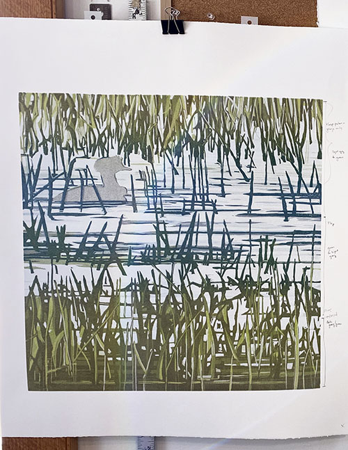
So here we are with the rollup for Step 8, a good example of me getting in the weeds. Literally.
 |
| Step 8 printed |
Okay, onward.
At this point I REALLY wanted to get that last dark blue into the water so I could take out all those horizontal shapes in the middle and be done with them. So I decided to just be brave and mix up a dark blue, as well as a darker dull green.
It was a disaster.
 |
| When good color goes bad |
I hated everything about this. Nothing to do but clean up everything and start over. Block. Rollers. Ink slab. More than an hour to reset it all.
 |
| Step 9 rollup |
I decided that I needed to get those green grasses across the center established more before I could move on to the final blue. Ugh. Will this never end?
 |
| Step 9 printed |
Okay. It's better, color and value-wise. Surely I'm making some progress now, although of course it all still feels too green.
 |
| Do you know what I'm supposed to carve out now? Me, neither. |
 |
| Making a carving map |
My flipped photo is then computer-printed (not printmaker-printed) onto paper. The color doesn't usually match that great, but it doesn't matter. I get out the colored pencils and draw on my printout... and since I'm adding darker marks to the page, these bits that I am drawing indicate the parts of the block that I will KEEP for the next stage of printing. Everything else will get carved away.
Whew. I hope that makes sense!


yep, that blue wasn't nice!
ReplyDeleteLove the map idea.
I might have said I never met a blue I didn't like, until that one! ;-)
DeleteWow Sherrie this is incredible. I love reading your blogposts to see how you tackle such a difficult, complex image. You are amazing. And crazy.
ReplyDeleteHi Wendy! Thanks... this one is definitely making me work for it! (Crazy? Yep. Surprised about it? No. ;-) )
Delete