Monday, June 24, 2024

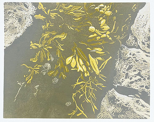
Linocut in Progress: The drama builds!

Okay, maybe not drama. But contrast! We're getting in to a bit more contrast and a lot more of me flying by the seat of my pants. 

I mean, look at this crazy color combo:

Reduction linocut in progress: Step 8

As you can see, I'm trying to keep cooler grays to the outer edges of the image, and to warm up the center.

Step 8 printed

There were two hiccups at this point. 1) I forgot to wipe the color out of the four little roundish shapes that will be periwinkles and 2) while I like the rusty color, when I came back to it the next day it seemed a bit too dark. 

I could maybe not solve both problems with the same step, but I could at least move them back in the right direction. 

Check out this crazy color combo:

Step 9 rollup

The dark looks like black in the photo, but it's more of a transparent dark gray made with sepia, prussian blue, and some transparent base. The peachy color looks good, but it won't print this light over the existing color unless I add some opaque white... and I don't want to do that. Let's see what happens.

Step 9 printed

Okay, that feels better. I think we're getting close now. Two more color passes? I still need to resolve the periwinkles, and I think they will require some spot inking to nudge them where I want them, colorwise. And there's at least one dark to go... probably it will involved some blended color again. I have to think about it.

Unfortunately there will be a bit of a suspenseful delay of progress now, as I am headed out to Massachusetts for a couple of days. A delightful gathering of my wildlife artist colleagues will be taking place at the Museum of American Bird Art on Wednesday, and I'm looking forward to catching up with everyone. Back to work on Friday!

Friday, June 21, 2024

Linocut in Progress: In the Weeds. And the Rocks.

Okay! Carrying on with the current linocut in progress. I did promise things would get a bit more visually interesting from this point... let's see if I was right.

As you have probably surmised by now, I have a certain amount of color moving through the center of this image, and less color on the outside edges. I need to keep building tones in all areas of the print, so it's time to employ some blended color.  

Reduction linocut in progress: Step 5 rollup

For this roll-up I deepened the yellow once again with the addition of some more red, and I mixed a lovely warm beige-y color. I got out my trusty old skool Speedball brayers so I could control the application of ink to the block a little better. I used a small 2" roller to apply straight beige to the rocks (you knew that was what they were going to be, right?), and I used a blended roll on the 4" brayer in a tricky way. I ran the color first in one direction, and then turned the block around to run the blended roll in the other direction! This kept the yellow in the middle-most parts of the block and the blended-to-beige bits towards the outer edges. 

Did that make sense? Maybe it will when you see the result. 

Step 5 printed

You might also notice some lighter-colored blobs in the lower part of the image. I used a paper towel to wipe the color out of these few spots before I printed each time. There are some details going in here that could benefit from being less yellow, and it doesn't hurt to minimize ink layers whenever possible. 

Step 6 rollup

And now it's time for a bit more drama. The ink roll up looks ominous on the glass, but I promise it's not so alarming on the print. Remember there's a lot of yellow in the middle already to minimize the depth of the green.

Step 6 printed

Well, okay. Maybe it does seem a little alarming. But we're in the middle stages of this image, and long time readers (and other printmakers) will know that this is when things often get a bit funky. Nothing to do but cross our fingers and hope I got this right. 

As an aside... you might notice the ink coverage looks a bit splotchy in the lower portion of the image. Not to worry... there is a lot more to be done down in this area and the splotchiness will be covered by subsequent colors. 

Like this:

Step 7 rollup

Back to the big roller, because this color pass is just a semi-transparent gray across the entire block. I would have liked to make it even more transparent, but after the complete fiasco of using a lot of transparent base, I am really, REALLY head shy. 

But I think it worked okay....

Step 7 printed

So! What's next? I think it's time to start working more on the areas around the rockweed (yes! this is an image of seaweed). I think the rocks only need one (okay, maybe two) more darks, and those will be most along the edges closest to the rockweed. Next color? Something orangey-browny, I think. We'll see how I feel after the next stage of carving.

Wednesday, June 19, 2024

Linocut in Progress: Back to Work

Well! Once again, it's been a while since Brush and Baren has seen some love, and I appreciate everyone who stops by to check in with the posts even when they are so erratic. 

Excuses this time? I was away! Far away in another hemisphere! Six weeks of my spring this year was spent having a second autumn... in New Zealand. It was my first visit there– a chance to spend time with a friend I hadn't hugged in 30 years and to run around seeing as much flora and fauna as possible. There's a lot to say about the trip... but for now I'm going to say, "It was amazing," and leave it at that. 

My post-travel re-entry was a bit bumpy, but I'm finding my rhythm again, and happy to be back in the studio.

I'm working in a smaller format than I have for quite some time; this print is just 8x10 inches. The first step was equally modest... just a plain gray rectangle with no material removed from the block.

Reduction linocut in progress: Step 1 printed

Although the block is smaller than usual it appears I have not abandoned my tendency to make everything rather complicated. But let's not panic yet. I carved... well, perhaps it's more accurate to say I chipped, some small areas of the block where I wanted the gray to remain. I rolled up a nice, creamy pale ochre for the second color pass.

Step 2 - rollup

Not much to see here... although if you squint you might see the cooler gray bits showing within the warmer tone.

Step 2 - printed

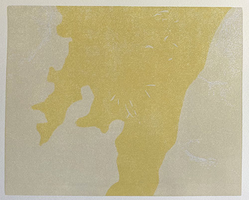
Subtle base established, it was time to get the brightest colors in place. I don't want this bright yellow to interfere with all of the image, so I cut some newsprint masks to contain it in a wobbly shape through the center of the block.

Step 3 rollup and mask

This photo of the print after Step 3 is a bit dark, but you get the idea.

Step 3 printed

I'm guessing the subject matter has been illusive up to this point, but a little sleuthing in the photo below might give you a hint of where we are headed. Or not. 

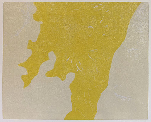
In the photo these two yellows look quite similar, but I promise they are different. The Step 4 color was started using the leftover ink scraps from Step 3, but I warmed and deepened it with the addition of some red (you can see the little blob of it in the photo). 

Step 4 rollup and mask

I used the same mask shapes to contain this yellow, too. (Again with the questionable photography! I've been printing and photographing at night... that's my excuse.)

Step 4 printed

Not much to show for four color passes, but things are going to get a bit more dramatic very soon! Stay tuned.

Linocut in Progress: The drama builds!

Okay, maybe not drama. But contrast! We're getting in to a bit more contrast and a lot more of me flying by the seat of my pants.  I mea...