Showing posts with label columbine. Show all posts

Saturday, June 27, 2020

Reduction linocut demo video!

Back in the day when one could reliably make plans I intended to go home to Colorado for a couple of weeks this summer. While I was there I was scheduled to present a hands-on printmaking demonstration at Ann Korologos Gallery in Basalt, which represents my work.

Since I couldn't be there in person this summer we thought it might be fun to do the program virtually. If you were following along here on Brush and Baren as I worked on the new linocut of columbine you might remember I mentioned that I was shooting some footage and trying to be diligent about recording all the steps. 

Well! I can finally share with you the completed video! It's a solid 15 minutes long, so you might want to make some popcorn or at least get a cup of tea before you hit play. I hope you enjoy it!


Thursday, June 11, 2020

Linocut in Progress: Columbine in full bloom!

Oh, you should see Maine right now! It's ridiculously green. I spent most of my life in the high desert, and while we had our verdant moments and secret pockets of rich vegetation, it wasn't anything like this overwhelming wall of... just green... that we have here in the early summer.

There's been a lot of green in the studio for the last week, also. Once I had proved that the columbine linocut didn't need to be scrapped, I was anxious to get on with it. Naturally, the faster one wants to finish the slower the ink layers dry. It's a conspiracy, I swear.

Anyway... somehow we are at Step 10, and somehow I missed taking any photos of the ink rollup. I've been trying to take photos and video throughout the development of this linocut, so I can put together a video for the team at Ann Korologos Gallery. I was supposed to be in Colorado right now, as I mentioned before, and had a demo and artist talk on the gallery schedule. It's still going to happen... but now it will be virtual!

All of which is to say that I'm guessing the ink rollup was recorded in video and not photography, so you'll just have to imagine it. It was another blended roll... a darker and bluer green blended to a  darker and more olive-y green. Like this:

Reduction linocut, Step 10 printed

At this point I was really hoping the next color pass would pull the entire thing together, but I had my doubts. The background is a wee bit boring, but I don't want to go too crazy and have it interfere with the main subjects, the twin blooms. (Oooh... maybe that will be the title! Or not.) I also want to beef up the contrast with some darker values, but I don't want to go SO dark that the flowers appear washed out again.


Ink scraps saved in wax paper

Luckily I have plenty of ink with which to search for the appropriate colors. I think I've mentioned before that one of the reasons I still like to work with oil-based inks is that I can save leftover bits of color by wrapping them in wax paper. The ink scraps will usually stay viable for several weeks this way, and I often use "leftovers" from a previous color pass as a base for mixing new colors.  For Step... hm... 11 (!!!) I started with the leftovers from Step 10 and added in some leftovers from the previous black scoter print! Because that's how I (ahem) roll. (See what I did there?)

Step 11 rollup

Step 11 printed

At this stage I put a little video clip of the reveal on my Instagram feed and asked the question, "Is it finished or is it ain't?" Most people seemed to think it was finished, but you know me! I felt it need just a little more interest in the background and some small darker bits in the stems and leaves.

Ugh. Step 12.

Back to the ink scraps to mix up this strange green-brown... very transparent.

I had to squeeze in "just one more color" of course. Step 12 ink rollup.

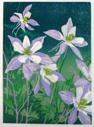
Yes. That's what it needed. NOW it's finished.

Columbine, reduction linocut, 6" x 8" Edition size? Probably 18, I still have to sort them.
This image is slightly embiggenable with a click.

I'm not sure what's up next in the studio. I need to take some time now to work on the video of this image, plus I still have plenty of work to do for my online course. And I need to develop a virtual field sketching class for the Farnsworth Museum. Yikes. That's a lot of a whole other kind of thinking! Best get started. 

Monday, June 8, 2020

Linocut in Progress: A near-disaster averted.

Aaaaaaaanndddd.... as anticipated, we have reached the "ugly duckling" stage of this linocut, the point at which I question every choice ever made in my entire life, especially the one that involved putting ink and paper together for a living.

There's really no good reason for this print to already be at Step 7 and only have the blooms of the flowers resolved, but that's where things stand. It's time to start thinking about stems, leaves, and the still-avoided background.

The first question to answer is "How the heck are we going to get green over all this lavender?"

Just as a reminder, here's what the last step (number 6) looked like:

Where we last left our hero: Step 6

That's a lot of lavender... and it's nice and harmonious. It's going require the serious pulling up of my Big Printmaker Pants to move on from here.

I knew whatever color I printed next would need a lot of opaque white ink in it. It's impossible to get back to "white white," even if I used straight white ink on the image, but I can at least get things moving in the right direction. I mixed up a sort of "pistachio ice cream" pale green:

Step 7 ink rollup... pale, pale green

And I got this:

Reduction linocut, Step 7

Not what you were expecting, I bet. It was sort of what I was expecting. I had hoped for a little bit lighter value, but the grayness was no surprise. Remember your basic color theory, everyone! Colors that are opposite on the color wheel (blue-orange, green-red, purple-yellow) tend to dull each other out. A yellowy green over a lavender just does what it has to. I went ahead and finished this color pass just as it was, because I couldn't really see a way to get a better solution at this point. I crossed my fingers I could fix it in the next pass.

And I did. I mixed a brighter, but still loaded with white, green for Step 8, and now things look undeniably vegetative. But there's a new problem. The flowers look SO washed out! The richness of the lavender seems to have faded away with the addition of these last two color passes.

Reduction linocut, Step 8

Yes, I admit it. I considered scrapping the entire thing at this point. Because if I have to darken the flower petals the only way to do that would be to cut a second block... and trying to match those shapes? It didn't bear thinking about.

So after a day or two of nail biting I decided I should go ahead and try one more color pass to see if I could bring the blooms back to life. If not... well... I was resigned to the need for a do-over.

Step 9 rollup

I decided that if I was potentially going to pitch the entire thing anyway I might as well go for the bold, so I mixed up a blended roll of dark-to-light (and bright!) green.

Step 9 printed

Hooray! That worked okay, didn't it? The flowers are back to their lovely lavender selves... and the background seems to at least have a direction.

And speaking of the background... there's no more time to avoid decision-making here. I would like to keep things from getting too visually complex... let the two blooms continue to be the focus. Perhaps I'll keep the upper part of the background a solid shape and muck around a bit more with the foliage in the foreground. Time to make a couple of computer printouts and get out the pencils and see what I can sort out.

Friday, June 5, 2020

Linocut in Progress: Because I don't know about you, but I could use some beauty just now

Progress, while distracted, continues in the studio. I have been hesitant to write about creative struggles when there is so much destruction going on in the world. How did we human beings get ourselves to this point? And how do we get ourselves out? So many burdens, so many problems to solve! Climate change, global pandemic, racism, violence. Isolation, fear, anger. Murder.

Like a lot of us, I have found myself swinging between cautious optimism and overwhelming despair. Between no sleep at all and a struggle to get out of bed.

I have had little enthusiasm for image-making (or much of anything else) lately, but I am thankful that printmaking is such a process. Once a critical decision is made (carve this area, mix that color ink), there are long periods of more or less mindless repetition when one is actually printing. Roll ink, register the block, print. Roll ink, register the block, print. What focus I can muster is dedicated to craft, as I strive to be as consistent and precise as possible.

And beautiful. More than ever, it feels necessary to create something beautiful. The blue columbine is a lovely wildflower, although there is a tragic and violent connection to this bloom, also. Twenty years ago, a horrific shooting took place at a high school named for this, the Colorado state flower. 

Reduction linocut, Step 4 printed

Probably somewhere in my last post I made the mad assertion that this linocut would be a simple one. I should really stop saying such things, so that we can all be surprised when it finally does happen. 'Cause it ain't gonna happen this time. Again.

Step 5 printed

Luckily I didn't have to make choices about color for these stages, only value. I added a little bit of blue to darken the lavender, but that was all.

Step 6 printed

It feels quite satisfactory at this point, very harmonious. But in the back of my mind I know that problems are brewing, because of course I need to add some greens now... and how is that going to work with such a dark lavender base in the background? I predict a few difficult stages ahead as I try to balance color and value and as I try to find the overall picture. I have no plan beyond this stage, really... I haven't considered what to do with the background or how to resolve a couple of elements that aren't visible at this stage.

All I know for sure is that I want the end product to reach for a balance of boldness and sensitivity, contrast and harmony. Which, I think, are important qualities to strive for outside the studio as well. Shall we give it a try?

Saturday, May 30, 2020

Linocut in Progress: Or perhaps I should say linocut in bloom!


Blue columbine. Delicate... showy. And the quintessential symbol of summer in Colorado. I had plans to be back home in the Centennial State right now, but of course that's all been scuppered by the pandemic.

Instead I am in Maine, which is celebrating the bicentennial of its statehood this year.

There are wild columbine which grow here also, but they are the smaller red ones. Nice. But not the blues. (To be fair... these aren't open yet...)


Not being able to visit my home state right now also means I've had to postpone some artist talks and workshops and demos that were scheduled there. Disappointing on so many levels.

BUT! Through the wonders of technology, I can at least try to make up for a little of it. I decided to start a small (6 x 8-inch) linocut of columbine, AND I am making a point to document all the stages of its development with photos and video. The goal is to create a virtual demonstration that will be shared with the good folks at Ann Korologos Gallery in Basalt, where I was supposed to present a program this week. In the meantime I can keep you up to date on progress, least.

To begin with, here's a drawing I made, based on some reference photos I have from... wow! More than ten years ago.


I decided that compositionally I liked the flowers facing the other way around. This will seem confusing when you look at the block, because the image has the same orientation as the drawing. But remember that it will print in reverse... so forwards is actually backwards.


I could have made this even more confusing by explaining that I first scanned the drawing into the computer and flipped it backwards so that when I printed it on paper and flipped it facedown on the lino to transfer it would come out right way around again. Which is really the wrong way. But don't worry. I won't tell you that.

Step 1! Carve away any areas to remain white, and print a lovely pale lavender-blue.

Reduction linocut, step 1, printed

Step 2! Oh, crud. Those yellow centers. Spot inking already! Oh well, at least it's a small piece and there are only two areas that need yellow. A little carving, a few newsprint masks....

Step 2, newsprint mask for spot inking

Et voila! Yellow contained and printed.

Reduction linocut, step 2, printed

That didn't take very long, so I went ahead and carved and printed for the third color pass. Another transparent blue-y lavender.

Reduction linocut, step 3, printed

As you can no doubt tell by now, I'm doing a little "frame breaking" with this composition. It's been a while since I used this particular design approach... something leftover from the days when I did a lot of page design as a paste-up artist. (Paste-up! Who remembers paste-up!?!?!)

So far things seem to be moving along nicely. I don't have any real concept of where I'm going with this once I get the blooms sorted out. In the back of my mind is the knowledge that I will want some greens in here, and I've already compromised that a bit with so much lavender.

But that's the trick with reduction printing. One needs to decide where one wants the "purest" color early on. Layering greens over this lavender-y color will mean I won't likely get "pure," bright greens. But layering the lavender over the green would have been less appealing... I'm highlighting the blooms more than their greenery, so they get priority in the order of layers.

It all sounds good in theory, but sometimes reality throws a curveball. We'll see what happens in the next few color passes!

Monday, June 10, 2013

Linocut in progress: Columbine final step

Okay then! One final step put a little more interest in the lower left corner of the columbine reduction linocut, and I'm going to call it finished.

Step 10: Adding back a bit of dark.

Finished!
Working a large edition like this one was a good experience. On the one hand I felt I had more latitude to experiment with color, but once I settled on that color it was harder to maintain over a long run. In the end I think I'll have an edition of 40 from the original 50.

Work in the print studio is liable to be a bit erratic over the next couple of months, for reasons both personal and professional. I think it's safe to say there won't be ANY new prints in July, as I'll be on the road for workshops for most of the month. I'm aiming to get something underway here through the remainder of June, but we'll see how it goes. I've got contract work in process, an art fair to prepare for, and a few tasks far more odious which will require energy and attention.

But stay tuned! If nothing else, it might be time to start posting a bit more fieldwork than I have been lately. My friend Debby Kaspari is in Panama with her sketchbooks right this minute and the images she's posting are making me pretty darn twitchy to get after it myself. You can see what Debby's been up to over at Drawing the Motmot. Tell her I said hi!

Thursday, June 6, 2013

Linocut in progress: Columbine Part 4

Still poking along here with the columbine linocut.

I decided that I wanted more color variety in some of the stems, so I took a deep breath and put another lighter color over the existing dark.

Step 8

Looks a wee bit scary, doesn't it?

But never fear, most of it went away in the next pass. I carved a few stems and then printed a dark blue-green to light yellow-green pass to get the image back on track.

Step 9 (Sorry about the wet ink glare.)

Might just be one pass left, I'm not sure. I like the feeling of the background blend now, but I would like to define some more foliage in the lower foreground. Could be just a partial blended roll will do the trick.

What a difference a color pass makes.

Monday, June 3, 2013

Linocut in progress: Columbine Part 3

Who was it that said, "Life is what happens while you're busy making other plans"?

There's a lot of "life" happening here at the moment, which is putting a bit of a damper on my studio time and focus capacity. I had hoped to have this columbine linocut finished by now, but it's just poking along. Ah well...it is what it is, I guess.

Step 6
Here's a second darkish pass to start defining the background. I've decided that the upper background isn't going to have much more activity than it already has, although there will still be some darker bits in the lower background. Still have to sort that out.

Step 7
It's not particularly "normal" to go back and add a lighter color over a darker, but I neglected to work the centers of the flowers before I moved on to the background. It's okay, though... I rather like the tonal variety I got here. If I wanted a more solid yellow I could put a second layer here, but I think they'll be okay as is.

I might be able to wrap this up in two more color passes... it all depends on how the next one plays out. The background feels a bit too bright to me, so I'm going to try to tone it down. We'll see!

Monday, May 27, 2013

Linocut in progress: Columbine Part 2

Carrying on with the blue columbine reduction linocut. Not a lot to show in terms of steps, but plenty of drama...

Step 4
Difficult to tell here, but this was a third purple-blue color. And then? Whoosh! Big change!

Step 5

It took a few tries to hit the right tone with this step... a blended blue-green to yellow-green. I'm still a little worried that it might have been too much dark too soon, but I'm hoping it's okay. We'll find out on the next pass.

The surprise here is that I'm doing a big (for me) edition. I'm starting with 50+ prints, a far cry from my usual 15-20. It's a small image, just 5x7-inches, but fifty is a lot for me to print with a baren.

It IS awfully fun to see them all lined up (back-to-back, even!) on a full drying rack, though.


Sunday, May 26, 2013

Linocut in progress: Columbine

There's been a bit of steamroller postpartum here at Brush and Baren. I've been looking through sketchbooks and photos on a quest for a new, strong linocut image and coming up short. It all seems so... pedestrian.

When I'm feeling a little "stuck" like this it sometimes helps to work on something smaller, less intimidating. Something I can experiment with and stumble around with until I get my groove back.

Enter the columbine, in 5 x 7 format.

Step 1

The blue columbine (Aquilegia coerulea) is Colorado's state flower and the namesake for everything from bike shops and dental offices to a high school and its tragedy. I hadn't considered that when I started this piece, but given that it's Memorial Day weekend here in the US perhaps it's appropriate for more than just a creative jumpstart.


Step 2
Step 3

Fieldwork Friday: Flashback

In 2025 I was delighted to be awarded a place in the Maine Master Naturalist Program  student cohort. It's not an easy gig to get; the c...