Tuesday, August 23, 2022

Linocut in Progress: Back into the studio!

Goodness. 

I knew it had been a while since I posted anything here, but good grief! More than two months? That is rather appalling, and it doesn't seem possible.

But then, that's summer. It always seems to disappear in a morass of busy-ness punctuated by stretches of lethargy when it's too hot and humid to move or even think. 

A couple of weeks ago the weather, my schedule, AND my attitude started to improve, and I got myself back into the studio. I've been feeling for some time that I wanted to try something a bit different, so I dug out a large piece of lino (18 x 24 inches!... about 46 x 61 cm) and drew up a complex image that I (ahem) intended to print in a single color.

If that quote about roads and good intentions just popped into your mind, well.... you're not wrong.

It took less than a day for me to stray from the path and wonder if perhaps a little color wouldn't hurt. I decided to carve for white and then print a layer of rough color... nothing special or careful... and then I would carve for the "final" black layer.

Step 1 rollup

Sure. Why not? I mean, if I hated it, I could always just finish the carving and print as straight black-and-white. Right? Right?

Step 1 printed

I slapped some color on to the block willy-nilly and printed it. Okay. Interesting, sort of. Any edition I might come up with will be variable, but I don't hate the idea. 

Althooooooough.......hm.

This color seems a little too sketchy. It would probably be distracting under a single black layer. "One more" random color pass to even things out couldn't hurt, could it?

Step 2 rollup

I carved the block some more, darkened the leftover inks from the first color pass, and did a second haphazard roll-up.

Step 2 printed

In general I felt better about that decision, but the color overall seemed a little too bright. Too yellow. (Which is hard to tell in this photo... the light has been terrible for photography lately.) If I were to go ahead and carve the entire image and then plop straight black over this...well... I don't think it will look as nice as it might if I tone things down a bit. 

(You can absolutely see where this is going now, can't you?)

I carved some more, telling myself the entire time that I could still print a "plain old black-and-white version" because I hadn't crossed the threshold of removing material from the block that would create awkward visual holes in the image. I mixed a color that was very greenish, and another slightly warmer gray... and printed a third layer.

Step 3 printed

Okay.

That's more like it. I can go ahead and just cut the whole block now for a final pass. Four steps... that's more than I expected, but okay. This is a BIG block. It's taking a long time to carve even for these not-very-intricate stages. It will be good to just focus on carving for several days and be done with it.

Except that, of course, that's not what I did. Because as the prints sat there staring at me with their mottled ochre-and-gray attitudes, the little voice in my head started suggesting that the color could be just a bit more interesting if I stopped and did "just one more" stage. 

Sure. Just one more.  

Tuesday, May 24, 2022

Linocut in Progress: Wrapping up the loon

Alrighty, then! Let's wrap up this loon linocut so it can swim off to new horizons.

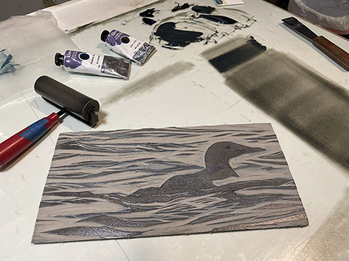
We've finished with blues, although because I am working with transparent color, everything will continue to stay in that blue range. For Step 6, though, I'm rolling out a nice gray.

Reduction linocut in progress: Step 6 rollup

Looking good! I quite like how well the bird seems to be settled down into the water. Loons and cormorants are both heavy-bodied birds, and their low posture in the water is really characteristic. (Cormorants sit so low that sometimes all you can see is their head and neck, like a mini Loch Ness monster.)

Step 6 printed

Now we have the tiny (not-quite-1/4-inch-diameter) area of the loon's surprising red eye to contend with. In this case it's fairly shadowed, so doesn't have to be bright, but it does need to be there. This calls for some pochoir! I cut a little stencil from a piece of acetate, and "pounced" this color directly on to the prints. 

The really exciting thing about this print has been how fast it's been drying. I guess that's usually true for something that's only six color passes in to the process, but it has seemed to go along faster than usual. Smaller image, warmer days, less ink because so much of the block is already carved away... all these things contribute. But it was so nice to be able to just pop in and pounce this little red shape without having to wait long.

Step 7 pochoir stencil

It looks a bit alarming here as just a big, flat red spot, but I'm counting on subsequent layers in the bird to tone that down. Let's move on!

Hardly worth calling a step, but here's Step 7 printed

Oops. And then I got distracted and didn't take a photo of the Step 8 rollup. Although I think it was the same as Step 6 or perhaps a wee bit darker. I almost always save leftover ink at any print stage, and if the next color pass is in a similar or related hue, I will use the previous ink to start the mix for the next. Kind of like continuing to add vegetables every day to stretch a pot of soup. Or maybe like sourdough starter. You get the idea. 

There's very little surface left on the block now. Here's Step 8... 

Step 8 printed

Really, really close now, which means... hey! I might actually finish this in fewer than ten color passes! When was the last time THAT happened? It's certainly been a while. 

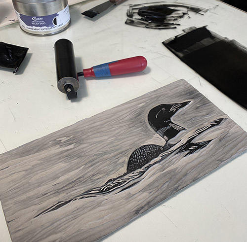
Step 9 rollup

The Step 9 rollup was almost-but-not-quite black, maintaining a good bit of transparency. As you can see on the block, the only places this color will be printed are the bird and its reflection. 

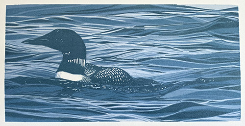
"Lone Loon" reduction linocut, 6" x 12", edition of 16

And there it is! An entire reduction print of 9 colors in about a week! Whew. It was really nice to spend some concentrated time in the studio, especially since I am now moving at high speed to prepare for the busy summer season. I've been framing, labeling, transporting, hanging work... all the glamorous bits of the artist's life. (It's all about "stuff into the car, stuff out of the car.")

I've got a bit of excitement on the not-too-distant horizon... an opportunity to get away with a sketchbook and my thoughts for a couple of weeks. More about this as it comes closer!

Wednesday, May 18, 2022

Linocut in Progress: Onward with the loon

Continuing with the little loon linocut... it's a festival of blues. Not really a blues festival, though. That's a whole other thing. (sigh) Remember concerts?

But I digress. 

The strange phenomenon of how relative colors change the overall look seems to be even more dramatic when trying to photograph an image with a lot of blue in it. Digital cameras just freak out for some reason. At this point I had started to add a slight greenish tone to my blue inks, but in the photo of the completed Step 3, you really can't tell.

Reduction linocut in progress, Step 3 printed

For the next step I decided that I wanted to create the impression of an overall lighter shape zig-zagging through the waves. I removed a good amount of material from the block in this area and then printed another blue. So of course, weirdly, when Step 4 was printed the effect of the previous greenish tone in Step 3 became more apparent. 

Step 4 printed

Yeah, really. Why do I even try to take photos at each stage? It's all so visually confusing.

Let's add something a little more green again and see what happens, shall we?

Step 5 rollup

And hey, while we're at it, let's do a little video of the reveal at Step 5, just for fun.


It might not look like anything's happening, but look in the darkest shapes and you can see that they've been broken up a bit more. Lower right corner is a good spot to compare with the previous photo. 

Step 5 printed

Part of me wanted to just jump in with the final dark at this stage and call it finished, but you know me. I have to complicate things a bit more first. It's kind of a rule!

Sunday, May 15, 2022

Linocut in Progress: Something for Print Day in May!

Print Day in May has come and gone for another year. PDiM is an annual, international event founded by printmaker Robynn Smith. It's a day that unites thousands of printmakers around the world, as we work wherever we are–studios, print shops, kitchens, and picnic tables– and share our processes with audiences live and virtual.

I wanted to be finishing a piece on the actual day, which this year was May 7. (PDiM always takes place on the first Saturday in May.) I got a bit of a late start, and for a while I wasn't certain I would get there in time, but whew! I did. I worked small and... dare I say it?...with a "simple" image. 

So here we go! 

First color... let's go!

If you follow me on any other social media channels you know that this piece features a common loon, so no reason to be cagey about the block in the early stages. The format this time is just 6" x 12", and it was amazing how quickly I could proceed at that size. 

(Note to self.)

So, as is often the case, the first step was a pale blue. In the interest of full disclosure, however, I will confess that I printed this first step twice, because I was having all sorts of weird problems with streaky ink coverage. I ended up stopping and completely re-adjusting the press, which wasn't the entire problem, but it did help.

Reduction linocut in progress: Step 1 printed

So, yep. Bird in water. Who is surprised? No one. Absolutely no one. 

And it's water on a sunny day, so it's blue, blue and more blue!

Step 2 printed

I could jump on in and show you the next blue step. And the next. But what's the fun in that? Better to have a little suspense, even if it's faked. (Because I said so, that's why.)

Instead, I'll show you a little peek at my studio with the new prints underway. You'll recognize a few things on the back wall, I think. All have been documented here on Brush and Baren at some time. I'm getting ready to install some shows in the next couple of weeks, so I've got framed work stashed everywhere. I do rather like this group all together, though. It's going to be lonely when I send them all off to hopefully find adoptive homes!

Sunday, May 1, 2022

Art at the Grill / Damariscotta, Maine


Things are starting to ramp up for the summer season in Maine, starting with an exhibition at the Damariscotta River Grill. Rather than the usual art opening, DRG is offering a special Prix Fixe Dinner on May 19, with a portion of the proceeds funding a scholarship for a local student who will pursue an education in the arts. 

Reservations are required, contact the Damariscotta River Grill (207) 563-2992. (A click on the image above will embiggen it for better readability. Honest.)

Thursday, April 14, 2022

Linocut in Progress: The image is done, but the adventure is just beginning!

Reduction linocut in progress, Step 9 revisited

In my last post I tried to explain my concerns about the visually too-light appearance of the bird's heads.  

I'd been watching (and, let's admit it, agonizing over) this phenomenon of visually-changing value since the first stages of the print, and at this point I decided something needed to be done. But the portions of the block that created the birds' head shapes have long been carved away. To make an adjustment to the value I either have to cut a second block for just those shapes (tedious, time-consuming, and difficult to register) OR... do a little pochoir action. 

Pochoir it is! 

Pochoir stencil

I placed a sheet of clear acetate on top of a print and traced the shapes I wanted to ever-so-slightly darken. I cut these out with a sharp Xacto blade, and used this stencil to "pounce" color directly on to each print. I don't seem to have taken a close-up photo of the "before" and "after" stages, but I think when you see the final image you'll be as relieved as I was that the heads did not disappear. We'll call this brief, undocumented, side trip into another technique.... hmm... Step 9 1/2, shall we?

So! Problem solved (hopefully), it's on to Step 10! 

Step 10 rollup

The nice thing about there being so little material left on the block at this stage is that I could do some spot inking with two different dark values. The shadows in the rocks, sand, and birds' legs are a lighter, warmer, more transparent color than the details of the birds' faces, which are not-quite-black. 

Ready to roll. The final pass?

Step 10 printed

Hmmm. I do not have a sense of triumph here. It's nice, but something is missing. Some little bit of oomph or sparkle or... something.

I think the birds need some bling. Something small. Tiny, even.

Oh. 

I know. 

How about some tiny, tiny bits of bright orange in the legs and beaks? Yep. I think that's it. Pochoir to the rescue again! 

Tiny pochoir bits, Step 10 1/2

Did I mention these bits would be tiny? So tiny. But in the end, so necessary.

"Companions," reduction linocut, 12" x 12", edition of 12

Yep. NOW it's finished. And the intended recipients for the first print of the edition have seen it and approved, so I can tell you now that it's an image to celebrate a wedding! This pair of plovers is headed out on a new adventure... sometimes across smooth sand, sometimes tripping along rocky shores... sailing through gentle waters or holding on tight over wind-swept waves. Wherever the path takes them, they'll travel it together, and I wish them success and delight every step of the way! 

Friday, April 8, 2022

Linocut in Progress: Look! More gray! And ominous foreshadowing

It's a bit funny. This image had so many similar passes of subtle changes of gray values that I sort of lost track of how many stages there actually were. Looking through my photos I sometimes couldn't tell if I was on a new color pass or if I'd taken the same shot at the end of one printing day and the beginning of another. In some ways this image had started to feel as though I, too, was wandering across the uncertain and shifting terrain of a sandy beach. 

I'm pretty sure this was Step 7. The print has gotten to that nail-biting stage when I think it's getting close to the end, but with every new color pass the goal seems to move farther away. Not quite right yet. It's not quite right.

Reduction linocut in progress, Step 7 printed

It's time to get brave and head for some darker values. But not TOO dark yet. The challenge is always that while each new value added to the image doesn't actually change the colors already printed, visually our brains adjust and color/value relationships change. 

Not sure what I mean? Look what happened with Step 8:

Step 8 printed

Look at how pale the birds' heads appear now. They aren't really any lighter than they have been all along, but adding a darker value around them makes them appear lighter.

This is probably accurate from a biological standpoint, but from an aesthetic one... hm. This is always a tricky balance for me... what is true to the "logic" of the scene vs. what is true to the heart of the scene. Piping plovers are pale and they do blend in with their beach habitat. But in this case they are also the main characters in an unfolding story of partnership and adventure. They are a calm oasis in a busy world, and I don't want them to get lost. I was worried that once the really dark markings were in place, their pale heads would visually disappear. 

I decided to procrastinate this decision by making one more, slightly stronger in value, color pass. This would give me a good idea of how the final, darkest color pass might affect the overall image.

You can see there's not a whole lot of material left on the block at this stage, and the ink is a transparent dark warm gray.

Step 9 rollup

Step 9 printed

Hm. Yep. I think I'm going to have to do something about those heads. But not until next time! 

Wednesday, April 6, 2022

Linocut in Progress: The Unbearable Lightness of Grays

Okay! Things are getting really exciting now, because we're going to use... um....

More gray.

Sure, it's that sepia-infused warm gray. But it's gray. These next couple of steps were so similar that there didn't seem to be a reason to take photos of ink roll-outs and inked blocks, because they all looked pretty much the same through the camera. So without further ado, here's Step 4 printed:

Reduction linocut in progress, Step 4 printed

Even if the color isn't dramatic, we can definitely see some details starting to emerge, particularly in the sandy substrate and background stones. Step 5 brought more details (look at all those tiny chips of lino in the sand), and a slight overall warming of environment.

Step 5 printed

It's always interesting, and, I admit, a little aggravating, to see how much the visual relationships of the values (lights and darks) can change with each color pass. For example... I was worried that the shadows in the front of the faces of both birds were too dark in Step 4, but if you look at that and then flip to Step 5, you can see that the dark beaks and first suggestion of the dark "forehead" band make the shadows fall in line. 

Oh look, gray ink... 

Just for fun, here are Steps 4 and 5 hanging alongside each other in the studio... and... oh! I had forgotten! There was a very slight cool-to-warm shift in the gray from top to bottom of the image, created with a blended ink roll. It looks far more dramatic on the inking slab than it does on the prints.

But, okay. Now we need to really start thinking about a hint of color. These birds are piping plovers, a species considered either threatened or endangered throughout much of their range. They are tiny little birds, mostly gray (!) and white with some dark markings around their heads, but they also have yellow-orange legs and a bit of yellow-orange in their beaks. Can't forget that! 

Step 6 rollup

I wanted to print the yellow-orange at this stage, because I wanted to maintain some brightness, and subsequent gray layers will only make this harder to achieve. The tricky thing was that I wanted to contain this color only in the small areas of legs and bills.. AND a skinny little ring around their dark eyes!  Even my little 1-inch brayer left ink where I didn't want it on the block, soooooooo....

Time for a mask!

Step 6 masks

I am suddenly reminded of the 1960s-era kids' game, "Operation." (Yes, dating myself here.) The game board was the cartoon shape of a male character on an operating table. (Who thought this would be a funny game concept?) There were cutouts in the shape of "ailments"– a "funny bone," a "wrenched ankle," "spare ribs."  The cutouts were ringed with metal, and the "ailments" were small plastic pieces set into the cutouts. The entire thing was electrified with a battery, and the goal was to remove the parts with a pair of tweezers without touching the metal sides and triggering a buzzer. 

So silly.

ANYWAY! This mask made me think of that game... you can keep your opinions about my mental state to yourselves, thank you very much.

The masks did the trick, though. See?

Step 6 printed

The yellow-orange seems alarmingly bright and discordant, but surely I'll be able to bring everything back into harmony. Right? Right?

As with most of my linocuts, this is the point at which I started to think, "Oh! I might get this done in fewer than 10 passes!"

(Sigh) But of course I was wrong. So, so wrong. 

Friday, April 1, 2022

Linocut in Progress: Special Project!

Nope, it's no April Fools Day joke! I am finally going to give everyone a peek into what I've been doing for the last month. I'm sorry that I didn't do this as the piece was unfolding, but one of the things I am discovering in my experience of the not-quite-post-pandemic universe is that I still lack the capacity for multi-tasking that I used to enjoy. 

Yes, that's right. I'm blaming it on the pandemic. It has nothing to do with an impending milestone birthday. 

ANYWAY...

I hope to make up for my delayed process description by taking this back a step further than usual. Yes, indeed, I am showing you some preliminary sketches. What?


Long-time readers (and there are some of you out there who have been with me since 2006! Gluttons for punishment, you are! But, thanks!)... 

Wait, where was I? Right. Long-time readers will know that I rarely show preliminary sketches when describing the process of creating reduction linocuts. This is partly because I like the element of surprise as work unfolds in blog posts, but also partly because, well, I don't actually do too many preliminary sketches. Most of my compositions are cobbled together from a couple of different photographic resources. I usually create a line drawing based on those references, transfer it to the lino, and worry about working out the details as I go along. 

Probably I could save myself hours of later agony if I would think things through more carefully before jumping in, but what would be the fun in that? Think of the boring blog posts! "This is what I decided ahead of time and this is what I did." Yawn. 

But this project was different, because it was a request from a collector for a special occasion. The request included suggesting some elements of a location I've never visited, which made it tricky and required a couple of tries to get right, compositionally. So... pictured above are some of my early ideas. The drawings are rough, but it was an interesting exercise. 

In the end we settled on a square format. (I love a square format.) There was a fair amount of carving in the first stage, because the design includes a zigzag of white from top to bottom, but for the first color pass I also cut a newsprint mask to contain the blue in a specific area of the block. Did I take a photo of that mask? No, of course not. (sigh) But there's the first pass, printed:

Reduction linocut in progress, Step 1 printed.

So we were off to the races. Most of this image is going to be a subtle dance of grays and tans... because the location is a beach and the inhabitants are piping plovers. So let's jump in with the first gray.

Step 2 rollout

By golly, there are a lot of too-dark grays up there in the right corner. Some of that was on purpose because I knew I'd need them later, but that first dark was WAYYY too dark. I'm working with a new-to-me brand of transparent base, and discovering that I have to use a much lighter hand for some reason. 

(Side trivia for US printmakers: Does anyone recognize from the tube the brand of black relief ink being used here? Yes, I do still have a small stash. And I'm still bitter.)

Step 2 printed

Here's Step 2 printed, and already I think you can get some orientation for the overall composition. The square format is defined, and the location of the birds is clear. That odd blue swatch makes a little bit more sense... and hopefully will resolve more over time.

So let's see what's up with Step 3! Oh, look. More gray. This version has been warmed up a little bit with some sepia in a lot of transparent base.

Step 3 rollup, and hey! The full block revealed already! 

Here's Step 3 printed.

Step 3 printed

It looks alarmingly dark already in this photo, but it's really not. Taking photos of subtle gray steps... well... the camera always wants to beef up the contrast. 

But, hey... we're off to a good start so far. Don't let it lull you into a false sense of security. I know I didn't. Stay tuned!

Sunday, March 13, 2022

Online Puzzles with the Woodson Art Museum!

Some months ago the Woodson Art Museum, home of the spectacular annual exhibition, Birds in Art, starting sharing online jigsaw puzzles of work in their permanent collection. 

I have been deeply honored to have several of my pieces accessioned there over the years, so imagine my great delight when some of them started appearing as puzzles! There are presently four of my images on the Woodson puzzle page (right now they are the last four on the page, scroll down!), along with dozens of others. 

Here are the direct links to "my" puzzles. You can change the number and size of the pieces, as well as invite other people to play with you... so... have fun!

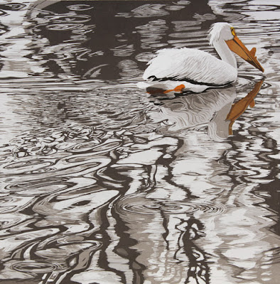
Cruisin' - (American White Pelican)


A Tern of the Tide (Common Tern)


Shower With a Friend (Wood Ducks)


Oops. I guess I don't have a big image of this.
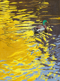
Ripples (mallard)


Sunday, March 6, 2022

The Concord Museum is Alive With Birds

The Concord Museum, in collaboration with the Museum of American Bird Art at Mass Audubon, has just opened a lovely new exhibition that explores some of the life and legacy of William Brewster (1851-1919). Brewster spent more than 30 years studying natural history on his farm in Concord, was one of the earliest advocates for bird protection in America, and was the first president of Mass Audubon.


The exhibition Alive With Birds: William Brewster in Concord includes paintings, sculptures, and a linocut (mine!) from the MABA collections, as well as artifacts from the Concord Museum, Harvard's Museum of Comparative Zoology, and the Chesterwood Archives at Williams College. Excitingly, some of Brewster's field journals are on display, and the exhibition touchingly pairs excerpts from his observations with artwork from contemporary and historical bird artists, including John James Audubon, Louis Agassiz Fuertes, Charley Harper, and Lanford Monroe


"Trunk Show," reduction linocut by Sherrie York, paired with 
Brewster's observations of the behavior of downy woodpeckers at his farm in Concord.

"Alive With Birds" is open now until September 2022, so if you find yourself in the Concord area this spring or summer, do stop in to take a look. The museum also has some lovely historical exhibits and artifacts... including one of the very lanterns used to signal Paul Revere to begin his famous ride! 

Linocut in Progress: The final step... twice. No. Three times.

 Okay, let's wrap this thing up, shall we? How much more can there be? There's almost nothing left on this block! The background is ...