Monday, February 22, 2016

Linocut in Progress: Going from dark to light

Most of the time in the reduction printing process I apply color layers from light to dark, but not always! It's true that darker colors cover lighter ones more readily than the other way around, but sometimes it's desirable (or just plain neccessary) to put a light color over a dark.

Enter the female buffleheads in this image. Overall the females are brown, but on their breasts and bellies they are light gray, almost white in some places. Up to this point every color pass has been very much on the blue end of the spectrum, and I want to warm things up a bit. I could have, and probably should have, masked some of this blue out in earlier stages, but I was so involved in thinking about the water that I just let it slide.

Now I have to contend with that decision.

I cut a newsprint mask that would cover every part of the block except the two female birds and the beaks of the males. I inked only the birds before printing, but the mask helped to keep extraneous color from going where I didn't want it, AND it protected the prints from the uninked areas of the block.

This pass was a solid white.

Bufflehead linocut in progress: Step 7

You might be saying to yourself, "Um... I thought she said she printed white?"

I did, but I didn't want to apply the ink too heavily (I've got at least three more colors to put on these females) so the thin layer of white looks gray. I thought it would be okay, but I was out of the studio for a couple of days and when I got back I decided it was a little too dark. And still too blue.

So I hit those same areas again with a white that had just a little brown added.

Bufflehead linocut in progress: Step 8

THAT's the tone. Not much of this will remain, except in beaks and the breast of the lower female, but it's a good undertone for the light brown bits that will come next.


Wednesday, February 17, 2016

Linocut in Progress: Contemplating water

One of the biggest challenges of reduction printing, for me, is judging color value (lightness or darkness). I can't tell you how many times I've put down colors that looked strikingly different from each other, only to have them look like the exact SAME color two or three passes later.

If I were printing multiple blocks... or better yet, if I were a painter, I could go back and "fix" the offending color. But with reduction printing, once I've gone on to the next step I can't really go back.

In some cases I've been known to cut a second block, but most of the time I just do a lot of scowling and try to figure out how to live with the problem. Remember that when I show you where we are now with this bufflehead linocut.

Bufflehead linocut in progress: Step 5

At Step 5 things are looking pretty good. This pass was just a transparent light gray; my intention was to both darken the underlying colors and to tone down some of the brightness. Yep, that worked.

And then came Step 6. I really like the feeling of transparency in the water, but I want to build some more depth. After another carving session I put a little more black pigment in my existing transparent gray ink and made a print pass:

Bufflehead linocut in progress: Experimental step

Whoa! WAYYYYYY too dark! This might be okay in a few areas, but not everywhere like this! Ugh. Scrub off the block, remix the ink. Try again.

Bufflehead linocut in progress: Step 6

Unfortunately the photo doesn't really seem to show much difference between steps 5 and 6 now, but maybe you can tell the some more of the brightness has been taken out of the darker areas.

So now what? I'm on the fence about the water. It seems to me that it could use a wee bit more dark in some places, especially once the darkest bits of the male birds are in place. (Male buffleheads are pretty strikingly black and white.) But I don't want to overpower the birds, either. Ugh. What to do?

I need to cogitate for a little bit, but I think what I'm going to do is go ahead and turn my attention to the birds. This will require a bunch of fussy masking that I wanted to avoid, but I don't see a better way to handle it at this point. Wish me luck!

Sunday, February 14, 2016

Announcing two new gallery affiliations!

Since it's Valentine's Day, it seems appropriate to announce two lovely new relationships in my linocut life! This past week I delivered work for the first time to these fine galleries. Please stop in and say hello whenever you're in the neighborhood:


Ann Korologos Gallery
211 Midland Avenue, Basalt, Colorado

"The best gallery in Aspen... is in Basalt!" The Ann Korologos Gallery specializes in art and artists of the West, and represents a wide variety of styles and media. I am especially excited to join three other respected printmakers also represented here: Leon Loughridge, Joel Ostlind, and Paula Schuette Kraemer.


Tam O'Neill Fine Arts
311 Detroit Street, Denver, Colorado

Nestled in the heart of the Cherry Creek neighborhood, Tam O'Neill Fine Arts is all about works on paper! With an emphasis on antique prints and historic maps, this gallery is a print-lover's dream stop. And yes... they carry original Audubon prints. What could be a better match?

Tuesday, February 9, 2016

And now for something a little different

Here in Heart of the Rockies I'm still carving away for the next color pass on the bufflehead linocut, with periodic time outs for things like framing and packing finished prints. Later this week I'll venture up the Front Range and over the Continental Divide on a three-day road trip to deliver the aforementioned framed and packed work to galleries. More on this soon!

Since there's not much to see on my block, I thought I'd share some vintage relief printing from British Pathé. I love these old films, even with their eye-rolling narration. This one features print blocks carved by a woman wielding a router, the effective "beat-it-with-a-stick" method of creating flocked wallpaper, and William Morris designs. You're welcome.


Thursday, February 4, 2016

Linocut in Progress: Slowly

Today's progress was the printing of a transparent blue-to-green blend. The green seems a little bright, but most of this will be covered by one more darker layer. Which of course means more water carving. I love carving and printing water... but right now I'm starting to get a little impatient for faster progress. And I'm getting nervous about the ducks.

Linocut in progress: Buffleheads, Step 4

I think that once the water is resolved I'm going to need to overprint white on all the birds. Or at least on the females. Eek. Don't know. Will have to give it some serious thought... but I know there's going to be a rather intense ugly stage. (Ugly duckling stage, of course.) Stay tuned, could be a choppy ride.

Saturday, January 30, 2016

Linocut in Progress: Emerging

Finally got through the first stage of water carving on the linocut in progress. With a blended roll already printed there's no real reason to get all crazy about trying another right away. A straight-up transparent blue will let the blend show through and will smooth those places where the blend printed unevenly.

Reduction linocut in progress: Step 3

Sorry about all the glare on the inked block. Wet ink + overhead lights = bad photography.

Transparent blue ink rollup

I'm jumping through a few mental hoops now, trying to decide what the next step is. I'm fairly certain that I will go ahead and finish the water. I hesitate because the birds all need light gray beaks, which will be a little harder to get back to once I put in the darker water. (And, okay, because I'm impatient and want to jump on ahead to something other than a few more hours of water carving.) But I think it will be important to preserve the transparency of the water as much as possible.

It's shirt-sleeve weather here today but there's snow arriving tomorrow that looks like it might continue through Tuesday. As long as I have enough hot chocolate here to sustain me, I'll be quite content to ride out the storm in the studio.

Monday, January 25, 2016

Linocut in Progress: Short, short, looooonnnnng

Short, short, looonnnnggggg.... that's a reference to the carving time for the first three steps of the new linocut. Although it also sounds a bit like dance steps.

Step 1: The bright white bits of the birds were carved out first. Satisfying to have a suggestion of the subject already on paper. This first blue is very transparent, you can see here the proportion of pigment to transparent base.


And the result on the paper:


Step 2: The next bit of carving went even faster... I'm leaving a wee bit of this blue in the whites on the birds, and to suggest some reflection in the water below the top-most male.

The inking gave me a few minor fits, which look exaggerated here because I beefed up the contrast on a photo taken in poor light.

I was having trouble getting even tone on the outside edges so put one torn sheet of newsprint under the block on the outside edges only. (Torn because I expected it to leave a little mark and I didn't want it to be a hard straight line.) It's amazing how much difference a single sheet of newsprint can make in the amount of pressure. The newsprint did leave an edge, but since most of this will be covered I'm not too worried. And, as I mentioned, it looks much more exaggerated in the photo than it does in real life.


So those were the two "short, short" steps. The next pass involves MUCH carving of water... Will be a looonnngggggish time before I'm ready to print again.

Thursday, January 21, 2016

Linocut in Progress: All the stuff that comes before

This evening I had a brief text message exchange with a friend who is working on a boat off the coast of Florida. It sounds so romantic, but even from his few short words it was clear that there was a bunch of decidedly UN-romantic drama going on out of the public eye.

Which of course made me think of linos. (Full disclosure: Most things make me think of linos.)

No, really. Because right now I'm in the decidedly un-romantic preliminary stages of a new piece. No carving. No ink. No lovely thick paper. And I realized I haven't shared this portion of my prep in a while, so lucky you! Here it is, from the beginning....


It starts with a walk. (A lot of things start with a walk.) This time of year our small Sands Lake is host to a much wider diversity of waterfowl than it is in the summer. Among our winter visitors are several pairs of buffleheads, which I love for the males' striking black-and-white plumage and their spunky attitudes. I have a fair number of photos and a few sketches of them... but I also remembered a great image my friend Tony took several years ago of a female with a little crab in her bill. Armed with this reference (and Tony's permission to dig through his photos), I fussed around until I came up with a design I liked. I showed you a corner of this preliminary drawing last week as a bit of a tease.

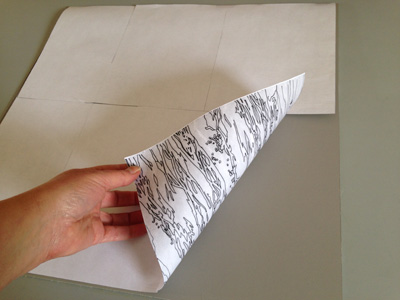
Once I had the drawing sorted out I scanned it to my computer and enlarged it to the 18 x 18 format I'm using for the image. I printed it out in sections on a laser (toner) printer, and pieced it together.


Here's a questionable photo of the trimming and taping together in progress.


And now for the stinky part. Because I printed this out on a laser printer I can transfer the image to the lino using a Chartpak blender marker. This is un-pigmented, straight-up xylene. Nasty stuff. Open windows required (or use it outside), don't inhale too much, and dispose of all the remnants IMMEDIATELY. I don't always use this method, but for an image this complicated it saves me having to draw and re-draw and re-draw. It goes like this:


Tape the toner-printed drawing face down on the lino.


Rub the back of the paper with the blender pen. I also stop from time to time and burnish the whole thing with something like a bone folder. The pen dissolves the toner and transfers it to the lino. Sometimes it works better than others... it depends on how dark the toner is, and sometimes how fresh it is. It's okay, I'm not going for perfect here.


Very bad photo of the finished transfer. It was better than it appears here... not perfect, but good enough for the re-draw. The nice thing is that the image is now reversed without me having to think about it. And the marker-soaked paper went directly to the outside trash.


And this is what I've been doing today. Going back over the image with Sharpie pen... refining some shapes. The toner transfer would probably hold up for at least the first color pass without doing the Sharpie bit, but I don't want to take the risk of losing it when I clean up.

After I get the drawing done I'll scrub the whole block down with mineral oil and probably a little green cleaner to avoid having the Sharpie lines transferring to my prints. It's going to be fun (I hope!)... you know me and complicated water... can't get enough of it. And four birds... that's a new one. I'm anxious to get the first ink layer down on paper, but ARGH! I have to do a boatload of framing the next couple of days, so it will likely be next week before I can get it underway.

Tuesday, January 19, 2016

Getting down to (art) business in the new year

We interrupt our regularly-scheduled linocut adventure to bring you the following announcement from Alyson Stanfield, the Art Biz Coach.

It was Alyson who first encouraged me to start blogging, and it's been a great experience for me, both personally and professionally. She's full of great, practical ideas for artists who are struggling to be business people, and she always shares them with a smile.

This week she's offering a FREE "must-have-checklist" for your art business. (And a 3-part video series.) She'll ask for your email address, and I encourage you to sign up for her weekly email message. I confess that I don't read ALL of them all the way through, but even after 9 years I still find useful nuggets and encouragement when the going gets tough.

And, yes...  we really will be back to linos tomorrow!

Thursday, January 14, 2016

Linocut in (semi) progress: A hint


I've squared-up a piece of lino 18" x 18," so I guess my next piece is going to be another large-ish one.

Here's a corner of the drawing-in progress. Gee... what do you think it will be? (Bonus points if you can tell me the species and sex of the featured fowl.)

It's gonna be another crazy one, but I'm looking forward to it. Aiming to get the drawing finished today, but probably won't get it committed to lino until next week since I'm headed out of town again for a few days. I'm being pulled in so many different directions right now that it's going to feel really good to sit down and just CARVE for a while.

Friday, January 8, 2016

Coors Western Art Show (and what comes after)

Well, it's been quite the week! First thing Monday morning I headed to Denver for the preview, Young Guns, and Red Carpet Gala openings of the Coors Western Art Show.

According to the show's website, the Coors Western Art Exhibit & Sale began as the joint inspiration of Coors Brewing Company and the National Western Stock Show. Since 1993, Coors and the National Western have worked together to develop what is now considered one of the finest western art exhibits in the United States. It was my first time in this major exhibition, which annually raises hundreds of thousands of dollars to provide college scholarships for students from rural areas.

And, wow! It was an excellent experience! By the time I left on Tuesday night I had sold all of my work on the wall and at least three additional pieces. I am so pleased to have my work headed to new homes, and to have that work support young scholars throughout the west. Many thanks to exhibition curator Rose Frederick, coordinator Krista Hanley, and the many kind and enthusiastic volunteers who worked so hard to make the event successful. Special thanks to Lynne and Carla, "my" personal volunteers, who helped keep me going and who handled the critical paperwork aspect!

The only photo I had time to take! Before the event began.

Between Monday night's Young Guns event and Tuesday night's Red Carpet Gala we also had a chance to take a behind-the-scenes tour of the Colorado History Center. Among the treasures brought out for us to examine up close were woodblocks and prints from the WPA era. Great fun!

Getting up close and personal with WPA-era prints.

The CHC also hosted a panel discussion, "Discerning Printed Works on Paper." YES! A program about prints and printmaking! The panel was moderated by Seth Hopkins of the Booth Western Art Museum, and included collector Doug Erion, woodcut printmaker Leon Loughridge, and gallerist Tam O'Neill. Fun and interesting, although I had to wince every few minutes. One of my pieces was included in the slide show that cycled behind the panelists and the top few inches were cut off! That evening at the show I had several people tell me they were happy to see the piece in person, since they couldn't figure out what it was in the slide! Oops.


I returned home Wednesday evening and spent yesterday catching up and following up. Today will be more of the same.

But next week it will be back to the studio! Spring exhibition deadlines are looming, both applications and events. While I was away I learned I will have two pieces included in the "Animalia" exhibit at the Loveland Museum this summer, but before that I need to be sure I'm ready for the Colorado Governor's Show, which opens at that same venue in April. April may seem a long way off, but for a printmaker that's practically tomorrow! Time to stop messing about online and get back to work.

Linocut in Progress: The final step... twice. No. Three times.

 Okay, let's wrap this thing up, shall we? How much more can there be? There's almost nothing left on this block! The background is ...