Monday, October 25, 2021

Linocut in Progress: Moving away from the blues

Alright, then. Enough of these infernal and eternal blues! It's time to print something else. 

Which honestly will only create another blue, but it won't be a bright one and it will set the stage for some other things to happen. Because, Readers, we're printing a transparent gray. 

Yep. Just gray.
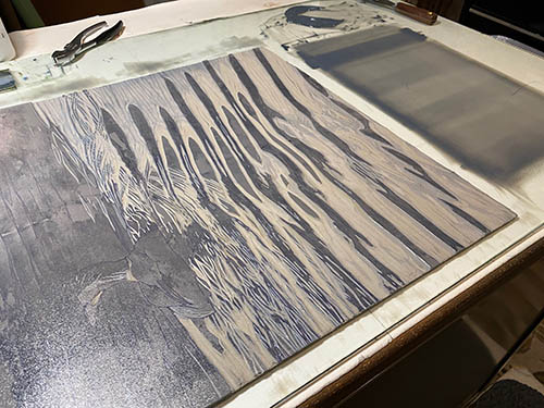
Reduction linocut in progress, Step 8 rollout. Thrilling, eh?

It doesn't look like much, but it's very exciting because it's printing over everything, including the bird. No masks at all! What will happen?

This!

Step 8 printed. Yawn.

Yeah, not really exciting after all, eh? In fact most of the toned-down blue created by this gray ink will get covered with subsequent colors, but I think it was crucial to tone things down a wee bit at this stage. Because just you wait... ain't nothing subtle going to happen next. 

We're printing... green!

And not just any green. A weird yellow-y green, because of course there's lots of that pesky blue on the print already and it's going to influence whatever I put down. I want the green to stay on the warmish side for now, so alarming chartreuse-y hue for the win! (I hope.)

Step 9 rollout. Don't be afraid!

It's something, isn't it? This is actually the improved color. The first one I mixed was entirely too brilliant lime in attitude and made things look like a circus. This color looks bright in the rollout and on the block, but the hope is that it will cooperate with the already-printed tones when laid over the top of them. 

Of course I didn't want to take any chances with this color in the bird, so a new mask was required.

Step 9 mask

NOW something exciting is happening, eh? Just look at the difference from Step 8 to Step 9! Wheeeeeeeeeeeeee!

Steps 8 and 9 side-by-side. Wheeeeee!

Believe it or not, most of this bright green will be covered by other colors, but it was important to establish it as the undertone for things that will be happening next. In fact I think the next color pass will probably be another gray... but we'll see how I feel after I spend some time staring at this stage hanging on the wall. The prints are quite wet now, so a little drying time will be necessary before anything more can be added. 

Step 9 printed

We're going to have a stretch of rain here on the coast for the next couple of days... so what better time to hunker down in the studio? 

And honestly, I need to get away from computers for a bit! I finally bit the bullet and bought a replacement for my 10-year-old desktop machine... but of course the transition from my old system is not smooth. I've had to order cable adapters to get the two machines to talk to each other... and of course the cascade of software that no longer works is also giving me headaches. I'm sure once I get it all sorted out I will be a happy camper... but... OOPH. It's almost as tedious as four (or was it five?) layers of blue ink. 

Onward.

Saturday, October 23, 2021

Linocut in Progress: It's time for masks!

We're just a week away from All Hallows Eve, so it's time to be thinking about masks! Well, it's time to be thinking about masks no matter what celebration might be approaching... because we're making a reduction linocut with some crazy contrasting color and we need to be sure we're putting our best face forward. (See what I did there?)

For Step 5 I got into the spirit of the season (Spirit! Get it?) and mixed up a rather pumpkin-y color. Thankfully this color will only appear in small areas of the finished image, so I could just do a little spot inking....

Reduction linocut in progress: Step 5 spot inking
And to be sure that ink was contained even more, I cut some newsprint masks. It's always a bit tedious to cut masks, but at least I kept the shapes simple this time.

Step 5, mask in place

I'm not sure whether the result should be called a trick or a treat. Possibly just an alarming foray into the ugly duckling (or in this case "ugly merganserling") stage.

Step 5, printed

After that little digression into a complementary color it was time to go back to... blue again. Still. More blue. The goal is to put some subtlety and interest into the reflections of sky in the water. The tricky thing is that eventually every other... water stripe, I guess we can call them(?)... will actually be reflecting trees, not sky, and will be green. It's not too troublesome to put green over blue, but I don't want the values to get too dark too soon. Nothing for it but to add another transparent layer, though. 

Step 6, rollup

I debated for quite a long time about whether I wanted to run this blue in the background of the upper fourth of this image, but in the end decided to cut another (even more simple... hooray!) mask for that section. Whether or not this will turn out to be a good decision remains to be seen.

Step 6, mask

But it was a simple rollup and a simple mask, and Step 6 moved along at a nice pace. 

Step 6, printed

I apologize for the thoroughly bad photography. I am often trying to shoot sample photos at less-than-optimal times of day... and these are looking quite dismal. 

So let's go ahead and throw in yet another step, with a photographic representation that looks a little better. Bring on Step 7!

Yes. We're at seven steps already and we're still messing about with blues. This is mildly annoying to me, even though it's no one's fault but my own. But I'm aiming for a subtlety that apparently requires stealth and a certain amount of slow sneaking up on it. At least that's my excuse for now.

Back to blue we go, although this time we're going for a bit of a blended roll.

Step 7, rollup

Some darker values closer to (and in the shadow of) the bird, fading to not much at the bottom of the image. Let's give that a try.

Step 7, printed

Okay, I think we'll settle on that. It's all a bit bright now, but I think that can be remedied with a transparent gray pass next time around. Let's give these a couple of days to dry and see what sorts of new problems we can make for ourselves, shall we?

Saturday, October 9, 2021

Linocut in Progress: Finding Blue

It seems as though every linocut I make goes through a phase in which I spend a lot of time carving– but when I print the next color pass, not a lot seems to have changed. 

And yes, oh perceptive reader, we are at that stage.

Carving, carving, carving. Print some blue! This blue:


(Oh wait... perhaps I should mention the roughly bird-shaped mask first.) 

The creature-to-be in this image has a rusty-red head, some of which appears bright and coppery in the sunlight. From our highly-developed understanding of color theory, we can predict that an undertone of blue in those areas might not be conducive to creating the warmth we intend. Therefore: mask out the bird shape to avoid printing blue in that area. Capice?

Reduction linocut in progress: Step 3 printed

So here's our nice transparent blue printed. It's okay... but I am ultimately going for a much brighter blue in some of the water reflections. It does appear that something has happened at this stage, but not nearly enough to justify the amount of time I spent carving. Oh, well. 

It seems like a really simple statement ("For the next stage I want a brighter blue"), but holy cow did I have trouble getting to the right one! I should have taken a photo of the multiple different blues I mixed (most of which are now wrapped up in wax paper for use on another day). I've got at least three prints that have been moved to the "tester" section of the print queue... wrongly-blued sheets that will be first up for future color passes.

ANYWAY.... I decided to keep this blue out of the upper third of the image entirely, which precipitated another round of mask cutting. 

I also decided that I wanted to minimize the amount of blue ink in a few areas of the water that will reflect the bird's head, but rather than cut a lot of finicky little masks, I just wiped these areas right before printing each sheet. 

At the end of Step 4 printing it looks like this:

It's a lot of blue, but by the time I'm finished less than half of what we see now will remain. At the moment I think the next step will be to put down those bright copper colors previously mentioned so I can carve those bits out of the block and forget about them. I do need to put at least one more blue in the water... and then... whee! I think I can do some greens! Yep. Lots of green to come in this one. 

Stay tuned.

Sunday, October 3, 2021

Linocut in Progress: Yes! Back to work.

Here it is October. 

'Way back in August I remember telling people how happy I was that my schedule was going to slow down in September. Workshops over... the peak of the summer gallery season waning... time to get into the studio! 

What I didn't realize was that I wasn't going to be changing velocity.... only trajectory. I've still been quite busy, just in a slightly different direction from how I spent my summer. 

Which meant September escaped, and now it's October. And although I'm afraid of jinxing it by saying so, things finally do seem to be settling down a bit. I'm ready to refocus... into the work of exploring some new ideas and new linocuts. 

And I'm not easing back into it. Oh, no. That would be too reasonable. I'm going straight for a large 18 x 18-inch piece. Just because.

Step 1 rollup

I spent (read: wasted) a lot of time agonizing over the quest for a Great Image Idea. I haven't worked on a proper reduction print since May, and I put a lot of pressure on myself to ramp up in a hurry. Honestly, I am a horrific boss... the kind I would never wish on anyone else... the kind with unreasonable expectations and poor people management skills.

Luckily my only employee (me) put her foot down and demanded that SOMETHING be started... Great Image Idea, or no. So that's how we got to rolling out a transparent gray on what you might be able to tell is an image with some water in it. And yeah, there's a bird there, too. Here's what Step 1 looked like:

Reduction linocut in progress: Step 1 printed

It's been raining here off and on the last couple of days, so the light in the studio is a bit poor, especially when it comes to photography, so apologies in advance for the questionable bit you're seeing here. (The blueish tinge in the lower left, for example, is not the ink, but a shadow of me.)

It was so satisfying to get that first color pass down, though. When I haven't printed in a while I can convince myself that there are a hundred reasons why I'm not very good at this (and put pressure on myself to find a Great Image Idea before I can start again). But finally printing a first color pass on paper almost always settles me down.

Step 2 rollup

So... Step 1 printed, I immediately carved for Step 2. This was going to be a subtle shift in color temperature without much change in value, so again a quite transparent ink. A smidge of cobalt blue in a big pile of transparent base did the trick. I managed to mix EXACTLY how much ink I needed this time, which almost never happens. I was getting nervous about 3/4 of the way through the print session, worried that I was going to run out of ink, but I managed to scrape together (literally) just enough for all 23 sheets*. 

(*I don't usually start with an odd number of sheets of paper, but I accidentally prepped an extra, so went ahead and used it. 'Cause, you know. It's been a while. I expect a higher loss percentage when I'm out of practice.)

Step 2 printed

 Again we have some questionable photography happening. The color is probably better on the right side of the photo, but you can see the slight contrast of shapes better on the left edge. This is not a blended roll... the warm left edge is an artifact of uneven artificial light. 

Surprisingly, I think the next color pass is already going to drop us into the realm of some more dramatic color. There is already a biggish decision to be made at this point, however... there's definitely some masking in my future, but how much and when is yet to be determined. Stay tuned!

Monday, August 30, 2021

L.L. Bean Fall Catalog Cover!

 Well. 

This just happened.

Fall 2021 catalog, request yours at L.L. Bean
 
Back in July I received a surprising email from the folks at L.L. Bean, the outdoor clothing company based in Freeport, Maine. The author of the email wanted to talk about my linocut "Homeward Bound," and its potential as the cover for their autumn catalog. 

I admit I was so surprised that I did a little online research to make sure the query was legitimate before I responded. (The amount of scam email that targets artists borders on ridiculous, after all.) Reassured, I sent back an enthusiastic "Yes!" and was delighted to work with the project team, who seemed to be as excited as I was about the collaboration. As far as I know, this is the first time they've worked with a printmaker for the catalog cover.

The catalogs should be "in home" as of today, but of course I myself am NOT home at the moment... I am in Colorado! Luckily a friend in Wisconsin received hers yesterday and sent me a photo to prove it really happened. 

So... thanks again to the team at L.L. Bean for their commitment to working with artists! I'm honored to be part of that tradition.

(If you're not on the L.L. Bean mailing list, I think that you will ultimately be able to request a catalog through their website.)

Wednesday, August 25, 2021

It's that time... Birds in Art and Project Postcard

 September approaches, and with it comes the annual delight that is the Birds in Art exhibition at the Woodson Art Museum in Wisconsin. 

Birds in Art is the museum's flagship show, and a touchstone exhibition for wildlife artists around the world. It is always such an honor to have one's work selected, and indeed one of my pieces will be included in the show when it opens on September 11. 

But before the show begins, there's always the fun task of creating a couple of new little pieces for the Project Postcard event that accompanies the opening. Birds in Art artists create and donate 4 x 6-inch artworks which are then sold for a flat amount. Funds raised through Project Postcard are used to purchase work from the exhibition for the museum's permanent collection.

I am always happy to participate in the event, particularly since my own work has been purchased via the Project on more than one occasion. Of course I can't show you what I've submitted before the sale happens... but I can give you a hint. Any guesses?

Sunday, August 22, 2021

In-Person Demo at Ann Korologos Gallery


It's hard to believe, but it's been nearly four years since I left the mountains of Colorado for the coast of Maine. Harder still is the realization that I haven't been back since I moved! Like the rest of us, my travel plans for 2020 were scuttled, so even though I still have some trepidation about it I am glad I can make at least a short journey this week.


I will be kicking off the adventure with a live, in-person printmaking demonstration and conversation at the Ann Korologos Gallery in Basalt. This coming Thursday, August 26, 4:00-6:00pm. Reservations are required. Please call the gallery at (970) 927-9668 or email art@korologosgallery.com. I hope to see some local peeps there!

Tuesday, July 27, 2021

Coming up at the Wendell Gilley Museum!

Yes, indeed! It's time for live, in-person printmaking workshops at the Wendell Gilley Museum in Southwest Harbor, Maine!

Friday, August 6, 9:00am-3:00pm: Two-color Reduction Printing

Saturday, August 7, 9:00am-noon: One-color Introduction to Relief Printmaking

All materials will be provided! We'll be working with the easy-to-carve "speedy cut" type of block material, so classes will be appropriate for ages 10 and up. Details on the Wendell Gilley Museum website "Events" page.

Monday, July 5, 2021

Printmaking workshop and presentation at the Wendell Gilley Museum, Maine

The 2020 edition of the Woodson Art Museum's flagship Birds in Art exhibition is on national tour, and hooray! It's in Maine at the Wendell Gilley Museum in Southwest Harbor. My linocut, A Tern of the Tide, is included in the exhibition, so I am delighted to be presenting some workshops and a talk about my process at the Gilley on July 16 and 17.

July 16: Single color intro to relief printing workshops. Choose either 9:00-noon or 1:00-4:00. 

July 17: A live presentation about my process that will also be streamed via Zoom. 7:00pm

Details and registration information available on the Gilley Museum's website.

Pemaquid Summer


 It's a spectacularly beautiful day here in midcoast Maine today, which is a wee surprise since the last week and a half has been all over the place, weatherwise. Record high heat (with attendant humidity, ugh) followed by almost record low temps, clouds, and rain. Wacky.

Somewhere in there I managed to carve out this little linocut of the lighthouse at Pemaquid Point. Although it's about 6.5 miles from my house, it IS literally at the end of the road I live on... so it's always nice to think of it as the lighthouse at the end of my street. In the winter time it's a favorite place to walk (in the summer it can be very crowded with visitors), and I have really loved watching many of the different aspects of coastal weather from this spot.

"Pemaquid Summer" is 5 x 7 inches, printed on 300# Arches watercolor paper and then hand painted. I waffled for a long time about whether or not I should limit the edition or leave it open, but in the end I decided that the projected lifespan could be 50. I haven't printed nearly that many yet (ran out of paper!), but it will be nice to have something that I can print in small batches from time to time when I'm either avoiding work on another project or longing for studio time when other commitments are keeping me away. A rather summery sort of attitude, in more ways than one.

Monday, June 28, 2021

There went June! What's next?

Sneaking in work on a little single-color linocut

Wow. Talk about mental and physical whiplash. I don't know how it is where you are, but in my particular corner of the universe things went from zero to warp speed in the space of about 48 hours. In May we were still masking, distancing, isolating, and, I admit, hand-wringing about the future. Suddenly it's the end of June and I feel like things are not only back to the "usual" summer busy-ness... but beyond it.

So far this month, let's see... I've led 7 days of in-person workshops, narrated three Puffin Watch cruises, designed and illustrated a big interpretive sign project, and framed a pile of artwork for galleries and shows. Oh. And I took a class and had visitors from out of state. 

Whew. Is the summer over yet? Oh, wait. It's only just started!

SO. What's coming up in July? More puffin cruises with the Hardy Boat out of New Harbor. (Look for me on weekend trips.) An online class for the Farnsworth Art Museum. Workshops and a presentation for the Wendell Gilley Art Museum. And, hopefully, I'm going to get a little studio time in there somehow!

Linocut in Progress: The final step... twice. No. Three times.

 Okay, let's wrap this thing up, shall we? How much more can there be? There's almost nothing left on this block! The background is ...