Monday, February 20, 2023

Linocut in Progress: Okay... what, now?

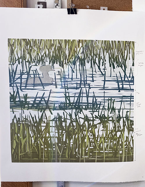
Progress continues to be slow on the current reduction linocut, but there IS progress. 

I'm still struggling with the balance of blues and greens, so of course for the next color pass I went all out...  There's a bright green blended to blue in the lower third, a straight blue across the middle, and a gray-to-blue blend in the upper third of the image.

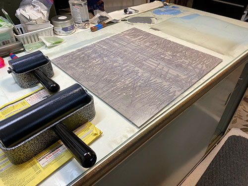
Reduction linocut in progress: Step 10 rollup

All that bright color looks SO alarming in the rollup!  But remember... these are transparent colors, so they will be affected by everything else underneath them.

Like this...

Step 10 printed

Okay, phew. I think we're finally getting somewhere. I think the grasses are close to being finished, which is good because I really need to get those birds sorted out!

But not yet. Here's the rollup for Step 11. Yes, eleven, and I'm still messing around with the grasses. But at least the color is getting more simple. A straight blue and a straight gray...

Step 11 rollup

Step 11 printed!

Yes, I think the background is really getting close now. The upper third is 95% done... maybe just a few more tiny darks at the final stage, but I'm going to take most of the material out of that portion of the block now. The grasses in the center third are mostly done, also... it's just that I still want to get the darkest bits of the water to look a bit more blue.

The bottom third will have a few more darker shapes, but it, too is getting close. Which is a good thing, because 11 layers of ink are a LOT. Many layers of ink can add unwanted texture to a print, which can make it hard for subsequent layers to adhere. Also... drying times can get soooooo slow... subsequent passes can slide... or reject... or even pull up bits of paper if ink is too tacky. 

Which is why I have been doing a lot of stripping.

Wait, what? 

Yes, stripping. When I print a new color pass, I immediately take a sheet of clean newsprint, place it over the wet print, and rub it with my palm. This lifts excess color but doesn't remove it entirely. It does tend to lighten the newly-printed color a bit, so the contrast is less strong, but it speeds up drying time and evens out the print surface a bit. I don't always do it, but on this particular print I started using the technique after maybe the third color pass. One more step to an already-many-stepped process, but you do what you have to do, eh?

So. Goals for the next color pass: Finish the water. Finish the grasses? Define some details of the birds! There are a few light shapes that will probably have to be masked in before I can get to the details, which will be mostly gray and brown. Onward!

Wednesday, February 15, 2023

Linocut in Progress: Creative cliffs and carving confusion

Nope, I haven't fallen off the face of the planet, although some days it definitely feels like I'm hanging on by my fingernails. It certainly doesn't help that I feel like I'm on a printmaking cliff with the current reduction linocut in progress. I move a little bit forward and then spend a long time pacing back and forth, staring into the abyss.

Which seems a bit dramatic for something that ultimately will be just ink and paper, but, hey. It's where I'm at right now. 

Part of my utterly convoluted path is driven by attempts to accomplish somewhat conflicting tasks with each color pass. I've already mentioned the challenge of horizontal shapes of one color that intersect with vertical shapes of another color. I'm also trying to increase contrast and color in some sections of the block (namely the lower third) while keeping the color and value range quiet in other sections (namely the upper third).... while also keeping it all coherent. I don't want the finished image to look like a parfait of unrelated color bands. 

(sigh) Remember the good ol' days of single color prints?

Linocut in progress: Step 8 rollup

So here we are with the rollup for Step 8, a good example of me getting in the weeds. Literally. 

In the top of the image I want to add another subtle value without adding color. Okay. A transparent gray. But I will ultimately want the bases of those same grasses to have a little more color and contrast to help them settle into the whole image, so I want to keep them in a green range. That's a blend for the larger roller, gray-to-green, which can then be flipped around to cover the middle section.

In the foreground I want a little more contrast and warmer color, so that calls for a more browny-gray rolled across the bottom edge. Separate brayer.

Add of course I'm still masking the birds. 

Step 8 printed

Okay, onward.

At this point I REALLY wanted to get that last dark blue into the water so I could take out all those horizontal shapes in the middle and be done with them. So I decided to just be brave and mix up a dark blue, as well as a darker dull green.

It was a disaster. 

When good color goes bad

I hated everything about this. Nothing to do but clean up everything and start over. Block. Rollers. Ink slab. More than an hour to reset it all.

Step 9 rollup

I decided that I needed to get those green grasses across the center established more before I could move on to the final blue. Ugh. Will this never end?

The warm gray/brown color from my previous attempt was just too dark, so I added more transparency. I also made rich olive-y green that I blended with it on the larger brayer. Rolled across the top, then flipped to roll across the bottom. Plain green on the smaller brayer across the middle.

Step 9 printed

Okay. It's better, color and value-wise. Surely I'm making some progress now, although of course it all still feels too green. 

But look at the block now. It is a confusing mess. How am I going to keep track of what I need to carve away next?

Do you know what I'm supposed to carve out now? Me, neither.

Aha! Have I ever shown you a MAP?

People ask me all the time how I keep track of what I am supposed to be carving, and my answer is usually that I make it up as I go along. (Which is true.) I have a drawing on the block... I look at what I've printed so far... I look at my reference drawings and photos and whatever else I'm using and I make decisions about what to carve away next. 

But every once in a while that seat-of-my-pants method comes back to bite me in... well... the seat of my pants. Or what is IN the seat of my pants. You know what I mean.

It's at times like this that I am super happy to put a little technology to work for me. I take a photo of the print at its current stage. I download it to my computer and flip the photo horizontally so I am looking at the current stage of the print in the orientation of the block. Because, remember– The print itself is a mirror image of what I'm carving on the block.

Making a carving map

My flipped photo is then computer-printed (not printmaker-printed) onto paper. The color doesn't usually match that great, but it doesn't matter. I get out the colored pencils and draw on my printout... and since I'm adding darker marks to the page, these bits that I am drawing indicate the parts of the block that I will KEEP for the next stage of printing. Everything else will get carved away. 

Whew. I hope that makes sense!

On we go. Will I finally get to add some blue in the next color pass? It's a mystery to all of us, quite frankly. A real (ahem)... cliffhanger. Stay tuned.

Monday, January 23, 2023

Linocut in Progress: Not looking like much!

The current linocut in progress is an odd one, to be sure. It seems like I carve and carve for hours, and then when I print it barely looks any different than the previous color pass. Am I in some sort of weird loop in the space-time continuum? 

Don't believe me? Take a look at this:

Step 6 rollup

Blues! Nothing but blue ink, over the entire block. Of course these are transparent blues, so the greens will still look green. Like this:

Step 6 printed

See? It all still looks very much like the previous two or three passes. But I was feeling pretty good about everything at this point... although still troubled by what to do about the grasses in across the middle that are still blue. But, hey. Carve now. Worry about color later.

Step 7 rollup

But of course I did have to worry about color eventually. I've an idea now that I'd like to keep the background grasses less contrasty than the foreground... so had an idea that I could use a green-to-gray blended roll to keep the background grasses green, darker the blues of the center section... and then keep the tips of the foreground grasses light while darkening the bases of them. And there's NO blue ink in this color pass.

Step 7 printed


See what I mean? Although if you flip back and forth you will be able to see the subtle differences.

So now it's back to carving again. The things that are bouncing around in my head as I do this?

- It's probably time to start some carving to define the bird(s). 

- Will one more transparent gray finish off the background grasses in a suitable way?

- How MUCH contrast should I aim for in the foreground grasses? And should the next color pass be of warmer temperature?

- How will I resolve the water/grass intersections in the center portion of the image? I think there's only one more little bit of dark blue value to go, so can I get away with shifting to some paler greens first? Or should I go ahead and do the dark blue across the entire center, then carve away the last of the water, and probably have to resort to using some more opaque color in the grasses there? Will this opacity look out of place when everything else is so transparent and luminous? 

So many questions! 

But, as before... the first thing to do is carve away the areas that I know I would like to remain the color they are, so I'll solve the what-to-put-on-top-of-it questions later. (I did mention that avoidance was one of my better skills, right?)

Monday, January 16, 2023

Linocut in Progress: Thinking about the little things....

Okay. Music-facing time is imminent. Actual thinking is required, and there's no way around it anymore. Problems with the current linocut in progress must be solved.

But first! Let's add some more color! Because although resolving the green-across-the-middle issue is still an issue, brightening of the top and bottom of the image seemed like a good way to dodge the problem for one more color pass. 

But slow down, there! One thing we do NOT want to do is put more color layers on the bird(s), where they will only complicate later needs. Time to cut some masks.

Making masks

It's just a bird shape, right? Shouldn't be too complicated. But of course there are some blades of grass that DO want some more color in them, so those areas need to be left printable. What we have here are four individual little pieces that must be cut out (x 24) and placed on the block for each print pass. (Remember Sherrie's mantra: That will make things more complicated and tedious? Let's go there!)

It's difficult to tell from the photo, but to make the masks I put a piece of clear acetate over the block and traced the shapes onto it. I then used this for a pattern to transfer the shapes to newsprint. In the end I think I cut 14 of each of the shapes, because most of the time I was able to use the same mask on two prints in a row. 

Step 5 rollup with masks in place

Here's the inked block on the press with masks in place:

On the press

And here's the Step 5 print:

Linocut in progress: Step 5 printed

Okay. That's pretty good... although I am aware that masking the bird(s) is going to be a thing for a little while longer. At least until I can get the greens-across-the-middle problem solved. 

But oh, those grasses! I think I mentioned before that the photo I'm looking at for inspiration is very fuzzy and washed out, with no distinct shapes. (It was taken from a distance with a lot of zooming in.) Relief printing, by its very nature, is a process of carving distinct shapes. My challenge here is to decide which parts of these grasses to emphasize and which to leave indistinct... and then to figure out how to do "indistinct" with distinct shapes. I dunno. Am I explaining this well? It's muddled in my head, too, so perhaps not. 

ANYWAY. It's easy to get lost in all of this, so as I am carving I am using a trick learned 'way back when from the delightful printmaker Jean Gumpper. 

A green map!

My tendency is to just jump in and start carving, but as I said, this piece is making me slow down and think. (How rude.) For the next stage of carving I have taken to working out a bit of a map. As I make decisions about what I want to carve away, I first use a colored pencil to define the shapes ON the block. This way I can keep track of where I've been and consider areas carefully. The pencil color was chosen as a bit of a reminder, too, that what I am thinking about is the areas I wish to remain the brighter green. 

So I guess I'm sort of making myself a "carve-by-number" map, eh? Hey. Whatever it takes. 

Onward.

Saturday, January 14, 2023

Linocut in Progress: No, really. I'm still here.

December. It's a thing. And it's a thing that I am glad is behind us. 

Hooray for a new year.!.. one which I hope will bring a bit more cheer than the last few have. It's hard to tell at the moment, since winter has finally arrived in Maine. Well, sort of. We've been on a rollercoaster of too warm with too much RAIN... with brief forays into a wee bit of snow and entirely too much ice. We're in a gloomy patch right now– gray, windy, rainy... with the dreaded freezing rain in the forecast for today. Ugh.

So, hey! I should be in the studio, right? 

And so I have been. Let's catch up, shall we?

The current linocut in progress has turned out to be more challenge than might have been wise this time of year. It's got some tricky color shapes to work out... horizontal marks in one color, vertical in a different color. And the image is inspired by a super-fuzzy, washed out photo full of indistinct shapes that I have to interpret as actual shapes. It's a lot of thinking for someone whose brain is as fuzzy as the photo these days. 

But, onward.

Linocut in progress: Step 3 rollup

Step 3! Let's do some color! Here's where the horizontal-one-color-vertical-another problem is already obvious. I've done a blended roll here, blue to green. While I have a roller wide enough to cover this entire block (18 x 18 inches), I don't really have the space in this studio to roll it out. I'm making do by using a smaller roller to run the blend in one direction and then turning the block to run it in the other direction. Get it?

Step 3 printed

Okay. The water is getting close, but you can see the problem here. There are grasses across the middle that will also want to be green (vertical), but of course I don't want green (or too much green) in the horizontal water shapes. The image is entirely too fussy for me to get excited about cutting masks for all that, but it's a problem I still haven't quite solved for myself. 

One of my best skills is avoiding big decisions, so let's pretend it's not a problem and go back to carving. 

Step 4 rollup

In fact, let's avoid the green problem by going back to gray instead! Yes, good plan. Here's the rollup for step 4, managed the same way with a smaller roller. Actually, TWO smaller rollers, as you see here. The larger one is only 8" wide, so running the blend from each end leaves an un-inked section across the middle. This gets filled in with the smaller 4" roller. Because adding as many steps as possible to each color pass is also one of my best skills. 

(For print equipment geeks out there, these beautiful brayers are made by Takach Press. They will set you back a pretty penny, but they are worth it. A joy to use. )

So, here we are with the printing of Step 4:

Step 4 printed

I am really looking forward to being finished with the water, but we're not quite there yet. I'd like to brighten up the greens a bit... and I can't forget that there are bird(s!) to keep track of, also. I predict masking in the future of THOSE shapes, at least. Stay tuned!

Monday, December 12, 2022

Dusting off the press....

Yes. It has been an unconscionably long time since a post has appeared here at Brush and Baren. I have lots of excuses, and a few of them are even legitimate, but let's skip all that and just get back to work, shall we?

Because, yes, there's finally lino moving about in the studio again. I flailed around for a long time looking for ideas that would translate nicely into small images, because I'm overdue for some fresh work in a small format. But I just couldn't come up with anything that said, "I'm an interesting small design," so I've given up and gone back to something largeish. Just can't help myself. 

18 x 18-inch lino! Here we go...

The first stage of this image was... or at least should have been... super simple. No white in the image, so no carving. Just print a big blue square and be done with it.

New linocut in progress, Step 1!

Nice transparent blue, easy peasy.  Although this time of year the light in my studio is... um... questionable... and I didn't notice right away that there was a spot along the upper right edge that wasn't printing well. (Insert ominous music here.)

Step 1 printed

Twenty-four big blue squares printed, it was time for carving! It seemed to take a very long time, considering how much material was removed, but perhaps I am just out of practice. 

Eventually I decided I was ready for the next color pass. Staying subtle for the moment... but I wanted some variety of hue, so I mixed a blended roll of transparent blue and gray. I used my 8-inch brayer for the blend, so ran the color across the top of the block, then turned the block around and ran it across the bottom. For the final step I used my 4-inch roller to run plain blue through the center.

Step 2 rollup, two-color blend

Which ended up looking like this: 

Step 2 printed

Sort of. The photo is a bit more contrasty than reality. But you get the idea. 

But remember that ominous music? This is when I discovered the printing flaw from the previous color pass. Can you see that it's still there along the upper right edge? Maybe a third of the way down the image and a tad to the left there's a light spot. Argh.

It's been a long time since I've run across this issue. Like, years. I THINK the problem has to do with oils in the block itself... because it's not something that seems to be easily fixed by adding ink or pressure. I did sand the lino a bit before I started, but I don't usually spend much time on this step unless I see obvious flaws in the block. 

It's the sort of problem that grows exponentially... if not addressed early, subsequent ink layers will just get more spotty. 

So I slowed down. Inked those areas carefully. Padded the pressure in that area.  AND... hand rubbed each print after it had gone through the press, just in that area. 

It's not perfect, but it's better, and the good news is that the area in which the problem is happening isn't going to require more than one or two additional layers of ink, and the design will accommodate the light spot just fine. 

But for now it's back to carving! Time to put on The Muppet Christmas Carol and settle in. 


Thursday, October 13, 2022

The September Rollercoaster

It's been too long since I've shared anything here at Brush and Baren, but, ooph. What a rollercoaster of a September I had! Put your hands in the air and ride along with me....

The UP: 

I was able to attend the opening of Birds in Art at the Woodson Art Museum for the first time since 2019. I knew it would be good to be at this superb venue with the tribe of bird artists gathered once again, but I don't think I realized just how good it would be. My poor pandemic-weary heart got a much-needed energy boost. 


Woodson Art Museum entrance
Visitors taking in the view at Birds in Art

The DOWN:

Unfortunately, the day after I returned home I realized I felt a bit... odd. Achy and congested. Sure enough, That Wretched Virus had caught up with me. My symptoms were never terrible... I've certainly had much more difficult respiratory/sinus infections in my life. But holy cow, the fatigue! I couldn't do much more than sleep for the first week, and it was four weeks before I really felt myself again. 

The UP:

Luckily I was feeling probably 80% by the end of September, just in time for the reception for my solo exhibition, "Moments & Reflections," on view now at the Wendell Gilley Museum in Southwest Harbor, Maine. The next day I also enjoyed getting together with some enthusiastic participants in an introductory relief printing workshop. 

Exhibition views at the Wendell Gilley Museum


The DOWN:

I intended to dawdle a bit around Mount Desert Island before I headed back home the following day, but unfortunately the weather turned quite windy. There was also a known issue with my car that was scheduled for repair the next day, but of course it decided to act up again and I decided the best plan was to just bolt back down the coast. (Plus I still wasn't feeling entirely up to par.)

The UP:

This week I am finally feeling more or less myself again... just in time to enjoy some spectacular autumn color here on the Pemaquid Peninsula. The manic nature of summer is finally giving way to a more measured pace (although somehow my calendar isn't getting any less busy) and I am looking forward to some good time in the studio over the next few months. 

Autumn color on the Pemaquid River.

Saturday, August 27, 2022

Linocut in Progress: Remember when this was going to be a simple single-color image?

Yeah, it was a thought, anyway. 

But that ship has left the harbor, as they say, so there's naught to do but complicated it all a bit more before wrapping things up. 

I think by now you can see there has been an intense amount of carving to this point. It's a lot to keep track of! But here we are, ready to print Step 6 (colors, um.... 12 and 13, I think). 

Step 6 rollup

In this photo the dark value for the rockweeds looks very blue, which indeed it was. After I took this photo I corrected the color a bit and toned it down before I pulled any more prints. Here's how it all looked after that correction:

Step 6 printed

I'm feeling good about the rockweed, but the crab is a bit behind because of printmaker neglect. (Although notice how even though the color looked intensely orange on the rollup, the crab now looks a light peachy color. That's the effect of putting a bright transparent color over a semi-transparent white that was printed over gray. Are you confused now?) 

What else should I fuss over? Oh, of course. The periwinkles (little sea snails). There are a few in this image, but they've gotten lost. I'll try the semi-transparent white ink trick again to see if I can't lighten them up.

Here's the roll up, spot ink only, on the press:

Step 7 spot ink (colors 14 and sort of 15)

You can probably tell I was doing this late at night (note the dark window behind the press), which is no doubt why I didn't take a photo of the print at this stage. And of course I forgot to go back and do it in the daylight before I went on to the next step. 

Not much changed, although the periwinkles became alarming. Fingers crossed I can tone them back down in the next pass.

Step 8 rollup

Which iiiiiis... press pull Step 8 (colors 16 and 17). This time it's a nice crabby brown and a dark gray made from sepia and leftovers of the previous too-blue dark. (Always save and use your ink leftovers. They can create a tasty color!)

Step 8 on the press....

You can see here that the areas of the block that define the rocks have been mostly carved away by now. I'm thinking this will be the final stage of dark for all of the image except the crab. 

Step 8 printed

We're in the home stretch now! I'm still not thrilled with how the periwinkles are standing out (even more predominantly here), so they'll get spot inked with one more dark. 

Step 9 (color 19) rollup

Aaaaaannnnndddddddd.....

All done! This image slightly embiggenable with a click.
As-yet-untitled reduction linocut, 24" x 18" Edition of 10.

Whew. That was definitely more than I thought I was headed for, but I'm not mad about it. In fact, I am weirdly inspired to jump in to another piece with similar subject matter. I'm a huge fan of an intertidal zone, and there is so much to explore!

But first I think I need a nap.

Friday, August 26, 2022

Linocut in Progress: The Saga of Just One More

So this supposedly simple thing has, as is typical for a certain printmaker you know, gotten somewhat less simple. A single-color linocut idea has turned into a multi-color reduction lino epic, and we're not finished yet.

Step 4 rollup. Tasty, if I do say so myself

But seriously. When one gets a chance to mix and use these yummy colors, how can one refuse?

All the purdy step 4 colors

In terms of individual passes through the press this image is at Step 4, but color-wise we are on colors 7, 8, and 9.  My attempt to try something radically different from my usual process has run right off the rails, EXCEPT for one thing. In my usual process it's likely I would be on a press pass of 7 or 8, because I would have made a point in the early stages to mask areas and ink more selectively. For this image I have done zero masking, and have let colors overlap where they will. This has led to some parts of the image having... what shall I call it? Not really color bleed. More like color creep. 

I am, indeed, allowing color outside the lines. 

Which is all to say that while this isn't drastically different from my usual process, it does represent at least a little relaxing of my (ahem) control issues! 

Here's where things stood after the application of some greens, reds, and more gray.

Linocut in progress: Step 4 printed

I suppose it might have worked to stop at this point, carve for a final black pass, and call it done... but I was teetering dangerously on the fence. Have I gone too far in the addition of color to be able to jump to a single final pass and have it be successful? Am I at the point at which I need to abandon all pretense of trying to keep things "simple?"

Step 5 rollup

I decided I needed a mid-dark value so the jump to a final dark wouldn't be too harsh. Plus... I had unfortunately been ignoring the crab, too. It had gotten a bit too dark and needed lightening.  But surely after "just one more" color pass I'd have a good feel for where I was. Right?

I rolled up a nice olive green for the entire block, and ran a semi-transparent white over the crab.

Step 5 printed

At this point I felt we were at the good news/bad news stage. The good news was that I was starting to feel quite optimistic about the image overall. The bad news was that the "keep it simple" line definitely had been crossed. Plus there's the problem of the crab that needs resolution. Yep. It's anybody's guess how this finishes now!

Tuesday, August 23, 2022

Linocut in Progress: Back into the studio!

Goodness. 

I knew it had been a while since I posted anything here, but good grief! More than two months? That is rather appalling, and it doesn't seem possible.

But then, that's summer. It always seems to disappear in a morass of busy-ness punctuated by stretches of lethargy when it's too hot and humid to move or even think. 

A couple of weeks ago the weather, my schedule, AND my attitude started to improve, and I got myself back into the studio. I've been feeling for some time that I wanted to try something a bit different, so I dug out a large piece of lino (18 x 24 inches!... about 46 x 61 cm) and drew up a complex image that I (ahem) intended to print in a single color.

If that quote about roads and good intentions just popped into your mind, well.... you're not wrong.

It took less than a day for me to stray from the path and wonder if perhaps a little color wouldn't hurt. I decided to carve for white and then print a layer of rough color... nothing special or careful... and then I would carve for the "final" black layer.

Step 1 rollup

Sure. Why not? I mean, if I hated it, I could always just finish the carving and print as straight black-and-white. Right? Right?

Step 1 printed

I slapped some color on to the block willy-nilly and printed it. Okay. Interesting, sort of. Any edition I might come up with will be variable, but I don't hate the idea. 

Althooooooough.......hm.

This color seems a little too sketchy. It would probably be distracting under a single black layer. "One more" random color pass to even things out couldn't hurt, could it?

Step 2 rollup

I carved the block some more, darkened the leftover inks from the first color pass, and did a second haphazard roll-up.

Step 2 printed

In general I felt better about that decision, but the color overall seemed a little too bright. Too yellow. (Which is hard to tell in this photo... the light has been terrible for photography lately.) If I were to go ahead and carve the entire image and then plop straight black over this...well... I don't think it will look as nice as it might if I tone things down a bit. 

(You can absolutely see where this is going now, can't you?)

I carved some more, telling myself the entire time that I could still print a "plain old black-and-white version" because I hadn't crossed the threshold of removing material from the block that would create awkward visual holes in the image. I mixed a color that was very greenish, and another slightly warmer gray... and printed a third layer.

Step 3 printed

Okay.

That's more like it. I can go ahead and just cut the whole block now for a final pass. Four steps... that's more than I expected, but okay. This is a BIG block. It's taking a long time to carve even for these not-very-intricate stages. It will be good to just focus on carving for several days and be done with it.

Except that, of course, that's not what I did. Because as the prints sat there staring at me with their mottled ochre-and-gray attitudes, the little voice in my head started suggesting that the color could be just a bit more interesting if I stopped and did "just one more" stage. 

Sure. Just one more.  

Linocut in Progress: Did You See That?

Put on your deerstalkers and get out your magnifying glasses, because we're back to trying to sleuth out the order of operations on this...